 Replace the call to _pg_chartpie with _pg_chart. This function produces bar, column, and line charts depending on the value of the second argument for _pg_defaultchart.
The code for the PIE.C program needs only minor alterations to produce bar, column, and line charts for the same data:
 Replace the call to _pg_chartpie with _pg_chart. This function produces bar, column, and line charts depending on the value of the second argument for _pg_defaultchart.
 Give new arguments to _pg_defaultchart that specify chart type and style.
 Assign titles for the x axis and y axis in the structure env.
 Remove references to array explode, which is applicable only to pie charts.
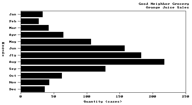
The following example produces a bar chart for the store owner's data. The result is shown in Figure 10.2.
/* BAR.C: Create sample bar chart. */
#include <conio.h>
#include <string.h>
#include <graph.h>
#include <pgchart.h>
#define MONTHS 12
typedef enum {FALSE, TRUE} boolean;
float far value[MONTHS] =
{
33.0, 27.0, 42.0, 64.0,106.0,157.0,
182.0,217.0,128.0, 62.0, 43.0, 36.0
};
char far *category[MONTHS] =
{
“Jan”, “Feb”, “Mar”, “Apr”,
“May”, “Jun”, “Jly”, “Aug”,
“Sep”, “Oct”, “Nov”, “Dec”
};
main()
{
_chartenv env;
int mode = _VRES16COLOR;
/* Set highest video mode available */
if( _setvideomode( _MAXRESMODE ) == 0 )
exit( 0 );
/* Initialize chart library and a default bar chart */
_pg_defaultchart( &env, _PG_BARCHART, _PG_PLAINBARS );
/* Add titles and some chart options */
strcpy( env.maintitle.title, “Good Neighbor Grocery” );
env.maintitle.titlecolor = 6;
env.maintitle.justify = _PG_RIGHT;
strcpy( env.subtitle.title, “Orange Juice Sales” );
env.subtitle.titlecolor = 6;
env.subtitle.justify = _PG_RIGHT;
strcpy( env.yaxis.axistitle.title, “Months” );
strcpy( env.xaxis.axistitle.title, “Quantity (cases)” );
env.chartwindow.border = FALSE;
/* Parameters for call to _pg_chart are:
* env - Environment variable
* category - Category labels
* value - Data to chart
* MONTHS - Number of data values
*/
if( _pg_chart( &env, category, value, MONTHS ) )
{
_setvideomode( _DEFAULTMODE );
_outtext( “Error: can't draw chart” );
}
else
{
_getch();
_setvideomode( _DEFAULTMODE );
}
return( 0 );
}

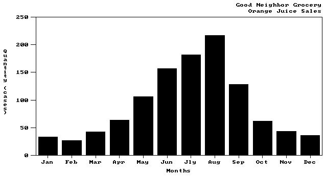
The grocer's bar chart becomes a column chart in two easy steps. Simply specify the new chart type when calling _pg_defaultchart and change the axis titles. To produce a column chart for the grocer's data, replace the call to _pg_defaultchart with
_pg_defaultchart( &env, _PG_COLUMNCHART, _PG_PLAINBARS );
Replace the last two calls to strcpy with
strcpy( env.xaxis.axistitle.title, “Months” );
strcpy( env.yaxis.axistitle.title, “Quantity (cases)” );
Note that now the x axis is labeled “Months” and the y axis is labeled “Quantity (cases).” Figure 10.3 shows the resulting column chart.

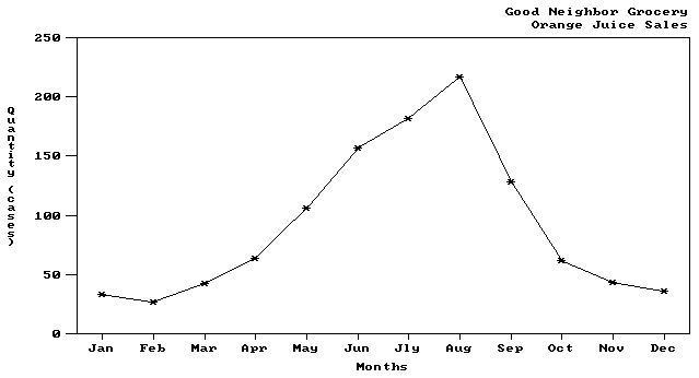
Creating an equivalent line chart requires only one change. Use the same code as for the column chart and replace the call to _pg_defaultchart with
_pg_defaultchart( &env, _PG_LINECHART, _PG_POINTANDLINE );
Figure 10.4 shows the line chart for the grocer's data.
