George Moore
Created: April 2, 1992
ABSTRACT
This article describes the use of TrueTypeÒ fonts in the MicrosoftÒ WindowsÔ version 3.1 graphical environment. It explains the concepts of digital typography and discusses the steps for displaying a bitmapped character on a target device, a process that is invisible to developers in the Microsoft Windows environment.
In most digital type systems, whether implemented on a computer or in a printer, the system goes through a few basic steps to display characters on the target device:
1.Load the font outline and feed it to the rasterizer.
2.Scale the outline to the correct size.
3.Fill the outline with pixels, creating a raster bitmap.
4.Transfer the raster bitmap to the display device.
With TrueTypeÒ in MicrosoftÒ WindowsÔ version 3.1, the steps are:
1.Load the font and feed it to the rasterizer.
2.Scale the outline to the correct point size for the correct resolution of the device.
3.Apply the hints to the outline, distorting the contours to build a hinted, or grid-fitted, outline.
4.Fill the grid-fitted outline with pixels, creating a raster bitmap.
5.Scan for dropouts (optional).
6.Cache the raster bitmap.
7.Transfer the raster bitmap to the appropriate display device.
A printer’s basic input/output system (BIOS) loads a font when it has to locate the font in ROM, or it can download a version of the font stored in local printer RAM. In a computer, the operating system loads a font when it has to locate the font file on disk. In Windows version 3.1, TrueType fonts are stored as TTF files in the SYSTEM subdirectory of the Windows directory. In the AppleÒ MacintoshÒ world, these TTF files are known as the raw sfnt resources. On the personal computer, all TrueType fonts are stored and used in Motorola format using big-Endian byte ordering. All Intel and other little-Endian implementations of the TrueType rasterizer swap bytes on the fly to maintain binary compatibility with the Macintosh. The user can install TrueType fonts by running the Control Panel or through an application that uses the new CreateScalableFontResource function in conjunction with the AddFontResource function.
When the user selects a TrueType font from a menu, Windows attempts to locate the TTF file on the disk and present it to the TrueType rasterizer that is a part of the graphical device interface (GDI) in Windows.
In a TrueType font, character shapes are described by their outlines. A glyph outline consists of a series of connected contours and lines, which are defined by a series of points that describe second order (quadratic) B-splines. The TrueType B-spline format uses two types of points to define curves: those that are on the curve and those that are off the curve. Any combination of off and on curve points is acceptable when defining a curve. Straight lines are defined by their endpoints.
Generally, most professional font foundries such as Monotype store their digitized outlines in their internal libraries in a format known as Ikarus. URW, a company in Germany, developed Ikarus, and it has become the standard international interchange format for unhinted digital fonts. Monotype uses SplineLab, a tool from Project Solutions, to convert the Ikarus data to a raw, unhinted, skeletal TrueType file. You can convert and manipulate TrueType outlines from a number of different formats with shrink-wrapped commercial tools such Font Studio version 2.0 from Letraset and Fontographer version 3.5 from Altsys.
In a TrueType font file, the on and off curve point locations are described in font units, or FUnits. An FUnit is the smallest measurable unit in the em square, which is an imaginary Cartesian coordinate square in some arbitrary high-resolution space that is used to size and align glyphs. The number of FUnits per em, or more simply units per em, determines the granularity of the em square. The greater the number of units per em, the greater the precision available in addressing locations within the em square. The em is a historic measurement in typography that refers to the space that completely contains the capital letter M of any given font design. Although this is not strictly true in the world of digitized fonts, it is still a reasonable rule of thumb. All TrueType fonts distributed by Apple and Microsoft are built with an em square of 2048, but the TrueType rasterizer lets you build any font with any arbitrary em square size to a maximum of 32767 from coordinate locations (–16384,–16384) to (16383,16383). Outline scaling is fastest if the units per em value is a power of 2.
The first step in this process is converting FUnits to device space, which depends on the physical resolution of the target output device.
The Cartesian coordinate values in the em square can be converted to values in the pixel coordinate system by the following formula:
(FUnit value) * (point size of the letter) * (resolution)
-----------------------------------------------------------------------------------
(72 points per inch) * (units per em)
For example, let’s calculate the advance width for the letter p in a particular font (the advance width is how wide the character will be, including the space before and after the letter). This particular character is at 18 points on a VGA resolution screen (96 dpi). The advance width of the letter that is defined in the device-independent space is 1250 FUnits, and the units per em is defined for this font as 2048:
1250 * 18 * 96
------------------------ = 14.65 pixels wide
72 * 2048
At 300 dpi, the same letter is the same physical size, but because the pixels are smaller, it takes 45.78 pixels to represent the same character. At 1200 dpi, it takes 183.11 pixels. The computed x-resolution size is used for metrics such as the widths of characters; the y-resolution is used for ascender, descender, and linegap values.
In reality, scaling actually involves using the above formula with a standard 2-by-2 transformation matrix. The transformation can be computed as:
Sx(Cos theta)–Sy(Sin theta)
Sx(Sin theta)Sy(Cos theta)
Sx is the scale factor formula from above, with the resolution value set to the x-resolution of the target device. Sy is the y-resolution, and theta is the rotation angle in counterclockwise degrees from the vertical. This formula handles all rotations, shearing, and stretching of outlines. Applications for Windows version 3.1 can directly manipulate this transformation matrix with the GetGlyphOutline function.
An em square size of 2048 may not sound particularly high, but it provides an effective resolution much higher than the actual resolution of the high-end 2500-dpi phototypesetters that are on the market today. If you do the math, you find that a motion of 5.89 FUnits in the em square space actually corresponds to a motion of just one pixel at 2500 dpi at 10-point. Thus, if you use 10-point text with an em square of 2048, your phototypesetter needs an actual resolution of about 15,000 dpi (or 225 million dots per square inch) before the granularity of the em square outline starts to affect the number of pixels turned on or off on the actual physical outline. Phototypesetters with a resolution of 15,000 dpi are not likely to come on the market in the next couple of years.
When you display type on a particular physical device at a specific point size, you gain an effective resolution measured in pixels per em (ppem). The formula for calculating ppem is:
dots per inch
ppem = point size * --------------------------------
72 points to an inch
The raster bitmap patterns formed for a glyph at any particular resolution are the same regardless of how big those pixels are (assuming no optical scaling is going on, which I’ll discuss later). For example, the ppem value for a 30-point glyph is 30*96/72, or 40 ppem. The 40 ppem bitmap pattern of the character at 30 points on a 96-dpi device is exactly the same as the 10-point version of the same character on a 300-dpi device. This is because 9.6*300/72 equals 40 ppem, and 9.6 points rounds to 10 points (if that particular font tells the rasterizer to round values to the nearest pixel).
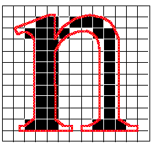
Device independent outlines are stored in a TrueType font; unfortunately, most low-resolution devices cannot do them justice. Compromises always occur, usually in the form of the outline fitting poorly to the pixels on the output device. This is where hinting comes in. Hints are used to produce legible characters from the high-resolution outlines on low-resolution physical devices below 800 dpi (depending on the size of the character). To see why this happens, examine the drawing of an n outline in Figure 1. The lines represent the pixel grid of the output device.
Figure 1.
Almost every outline-scaling system uses a simple method to determine which pixels to turn on or off: If the center of the pixel falls inside the outline, turn it on; if the center of the pixel falls outside the outline, turn it off. You will notice that the left vertical stem of the n encompasses the centers of a two-pixel column and will therefore be two pixels wide. However, the right vertical stem incorporates only a one-pixel center column; therefore, the left stem will be twice as wide as the right stem, even though both stems are exactly the same width in the original outline (shown in red).
Hints are used to distort an outline in a systematic fashion to produce legible text. In this case, the typographer might tell the hinting mechanism to move the two stems slightly further apart (Figure 2).

Figure 2.
In this way, both vertical stems are exactly two pixels wide. The higher the resolution of the device, the less you need hints, because you have more pixels to play with. If you assume the above example was on a 96 dpi screen, at 300 dpi you would have a little more than three times the grid density, and so an off-by-one pixel error at 300 dpi would only be 1/3 the size of the same off-by-one pixel at 96 dpi. However, even at 300 dpi, hints are important until you start to reach 100 ppem.
Hints distort outlines in the TrueType rasterizer by executing a rich set of instructions that let designers specify how to render character features. These instructions form an assembly language for font hinting. Within the TrueType rasterizer is a software-based interpreter, much like the hardware-based CPU in a computer. The interpreter processes a stream of ordered binary instructions that take their arguments from the interpreter stack and place the results back on that stack. All opcodes are one byte, but the data can be either a single or a double byte (word) depending on the instruction.
The following example of TrueType code is a subsection of the hints used for the letter B in Times New RomanÒ:
SVTCA[X]
SRP1[], 44
SRP2[], 4
SLOOP[], 3
IP[], 51, 36, 0
CALL[], 16, 31, 27, 22, 33, 35 // backward Serif 22->21->16
CALL[], 15, 31, 27, 9, 33, 34 // forward Serif 9->10->15
IUP[X]
IUP[Y]
RS[], 8
JROF[], #LRnd0, *
SRP0[], 0
ALIGNRP[], 1
The TrueType instruction set is fully programmable, with loops, conditionals, branching, math operations, and so on. As you can see from the example, Monotype has defined a subroutine that contains all the hints necessary to manipulate the serifs of Times New Roman (the CALL[] statements). Besides the good programming practice of saving code space, this also guarantees that all serifs in a particular font are rendered identically at any point size, thus preserving beauty and harmony within a typeface. Because most of the complex problems associated with executing hints can be resolved at compile time, the small, fast, dumb rasterizer can execute the code quickly at run time.
The executable portion of the TrueType code can be classified into three main sections (ranked from least to most specific):
1.The code that is executed when the font is first loaded. This code is called the font program and is stored in the fpgm table in the font file. In the Monotype-produced fonts for Windows version 3.1, the fpgm is generally used for subroutine definitions.
2.The code that is executed any time a point size, a transformation, a device resolution, or a spot size changes. This code is called the control value program and is stored in the prep table.
3.The code that is attached to individual glyphs and is stored in the glyf table.
This arrangement offers great flexibility for certain operations that specific events can trigger within the rasterizer. The code to manipulate the font-wide serif subroutines would probably go in the font program (fpgm) and actually be called in the individual glyph program. However, the code that ensures that the center of the e doesn’t close up at small point sizes would go only in the glyph program. Because the code can be localized to specific events, you can use similar subroutines stored in the font program for all members of a typeface family (light, regular, demibold, bold, heavy, black, and so on), which maintains visual consistency across the entire family.
The control value program is run to set up values in the control value table (CVT), which allows common control values to be applied across all glyphs in a font. For example, you might want all glyphs in a font to jump from a stem width of two pixels at 17-point to three pixels at 18-point, again for visual consistency. You can do so easily by plugging the right values into the CVT in conjunction with the move indirect relative point (MIRP) opcode. You can also use the CVT to pass information between the elements in a composite glyph, a special kind of glyph that can be built up from several elements within a font. A good example of composite glyphs is the accented characters located above ANSI 0x7F, such as \sgmlansi193. In this case, you can simply take the glyph of the A and merge it with the acute accent to form a completely new glyph that is actually composed of two elements. This saves both code space and hinting time. You can also use composite glyphs in conjunction with any transformation to save space within a font. For example, if the font design allows it, you can create the comma, open single quote, close single quote, open double quote, close double quote, and baseline double quote with various transformations of a single font element that needs to be hinted only once.
If you change the size of the character, the resolution of the device, or the transformation of the outline (by rotation, skewing, and so on), you must reexecute the hints for that specific raster bitmap pattern. In the Microsoft and Apple TrueType system fonts, hints are turned off during any nonstandard outline transformation. Only for rotations of orthogonal angles (90, 180, and 270 degrees) are hints used, because the alignment of the outline to the grid is the same in those cases. Some hinting algorithms that are rotation invariant can be executed in TrueType, but we do not use them. Most other digital font formats do not provide hints under rotation either (however, some versions of the Intellifont rasterizer leave hints on under rotation so that they can use the “black distance” information to embolden the font if a bold version is not available). You can easily turn off the execution of hints under rotation with the INSTRCTRL[] opcode.
Writing raw TrueType instructions can be a time-consuming, error-prone chore, just like writing in any form of assembly language. Good tools, such as TypeMan from Type Solutions,* can help. TypeMan first makes a best-guess for the hinting of the font by running its own autohinter on the glyphs. It then lets you tweak the generated code in a high-level language format that is compiled into raw TrueType instructions. Like any good compiler, it checks syntax, resolves linking problems, and does other housekeeping duties within the fonts. Because the TrueType instruction set is a superset of all known hinting methods, you can convert any other hints to TrueType hints. Several font foundries are using this approach to produce their initial set of TrueType fonts. They simply take their existing hinted fonts and recompile them in TrueType format. Thus, a large library of fonts can be created rather quickly. Because the hints are transferred directly, the quality of the resulting bitmaps is not degraded.
Other companies, such as Bitstream and Agfa Compugraphic, take their existing fonts, convert their own hints to TrueType hints, and then go back and do extra work on the font. They have developed a production environment that lets them take their existing library of outline fonts and add the hinting and font file structure needed to support new font technologies.
TrueType is the only digital type system available on the personal computer or the Macintosh that provides this arbitrary, user-defined, flexible, algorithmic hinting mechanism. It works for many languages, because the hinting algorithms for Latin fonts are different from those for Kanji, Chinese, Korean, Arabic, Hebrew, Devanagari, Telugu, Kannada, Sinhalese, Bengali, Gurmukhi, and so on.
To first fill an outline with pixels efficiently, decompose the curves into scanlines to create an edge list (sometimes called an edge table). The edge list contains all edges of the contours sorted by their smaller y-coordinates so that the filling algorithm does not have to calculate intersections with the outlines at every pixel location.
This is a quick step. All the filling algorithm has to do is to decide whether the center of each pixel is enclosed within the outline. If it is, you simply turn that pixel on; if it is not, leave it off.
“Tune in, turn on, and drop out” was the motto for millions of people during the 1960s, and it can be applied to portions of digital typography today. Tuning the outline for the grid, turning pixels on, and checking for dropouts are three major components of any font-scaling system.
A pixel dropout occurs whenever a connected region of a glyph interior contains two black pixels that cannot be connected by a straight line that passes only through those black pixels. In Figure 3, the curve goes between two rows of pixels and results in dropout.

Figure 3.
You can test for potential dropouts by looking at an imaginary line segment connecting two adjacent pixel centers. If this line segment is intersected by both an on-transition contour and an off-transition contour, a potential dropout condition exists. The potential dropout becomes an actual dropout only if the two contour lines continue in both directions to cut other line segments between adjacent pixel centers. If the two contours join immediately after crossing a scanline (forming a stub), a dropout does not occur, although a stem of the glyph may become shorter than you want.
Depending on the glyph shapes, dropout control can be a time-expensive operation. Thus, it is an optional step that the TrueType SCANCTRL[] opcode can turn on or off. You can turn SCANCTRL[] on or off on a per-character basis, depending on the size of the glyph (its ppem value). For example, a character such as the letter ‘I’ generally does not have dropouts even at low ppem values; so you can speed its rasterization by turning SCANCTRL[] off. However, imaging the @ character is difficult because of its delicate curves; you might want to leave SCANCTRL[] on for even large sizes (in some Windows version 3.1 fonts, SCANCTRL[] for the @ symbol is left on up to 60 ppem). The individual font vendor can weigh the tradeoffs with dropout control. For example, a vendor selling barcode fonts probably wouldn’t need it at all.
Steps 6 and 7 are not so much a part of the rasterizer as they are a part of the environment in which the rasterizer is implemented.
For most Latin fonts that have only about 200 characters, a cache of any reasonable size makes the speed of the rasterizer almost meaningless. This is because the rasterizer runs only once, the first time you select a font or a new point size; thereafter, the bitmaps are transferred out of the cache to the screen or page buffer. If you are editing a document with a particular font, chances are that 99.9 percent of the time the font is used on the screen as it is being transferred from the cache.
In Windows version 3.1, all TrueType bitmaps at all ppem values are cached automatically in the kernel’s private memory area. Because the Windows kernel uses all unused memory in the system as its cache, you can have a font cache of several megabytes. If you are running in protected mode on an 80386, Windows also pages bitmap caches to the swap file when physical memory is filled. Thus, you could have 32 MB of virtual font cache on an 8-MB machine. With the advent of the new virtual disk driver in Windows version 3.1 running in protected mode (called fastdisk), loading cached bitmaps from disk is faster than rerendering the character from scratch. The kernel uses a least recently used (LRU) system to discard old data when memory fills up or when an application asks for extra memory in low-memory conditions. But generally speaking, not much is ever flushed from the cache because most swap partitions are so large in relation to the data being cached. This situation is in stark contrast to third-party font-scaling solutions that use a smaller fixed cache that cannot be dynamically allocated to other programs. These take memory away from applications in low-memory conditions and do not make the best use of free memory when it is available.
The caching keys that GDI uses in selecting the prerendered raster bitmaps are specific to the transformations applied to the glyph and to the effects of optical scaling (which is a venerable typographic concept that allows for changes in the shapes of the glyphs, depending not only on the ppem value but also on the point size).
This step is also implementation specific. Most printers have a dedicated blting chip that can quickly blast bitmaps from the local printer cache to the page buffer.
Under Windows version 3.1, the hardware in your machine determines how this step is accomplished. If you have a video card that contains a hardware blter (which is generally a swell thing to have under Windows anyway), the font bitmaps can be quickly moved from the cache through a direct memory access (DMA) transfer. If you have a normal video subsystem in your personal computer, Windows transfers the bitmap through software, which is still reasonably quick.
Communicating the metrics information in the font to applications in the system is as important as transferring the bitmaps to the screen. The new TrueType functions return many useful values, such as left and right sidebearing values for individual characters, x-height of the font, em square size, subscript and superscript size values, underline position, strikeout position, typographic ascent, typographic descent, typographic linegap, and the italic angle of the font (useful for making an insertion cursor match the angle of the font).
*For information about TypeMan and other tools, call 603-382-6400.