 TrueType is WYSIWYG (what you see is what you get). The appearance of a font on the screen and on the printed page is exactly the same.
David Weise and Dennis Adler
Created: April 4, 1992
Revised: August 13, 1992
ABSTRACT
Applications designed for the MicrosoftÒ WindowsÔ graphical environment can use four kinds of font technologies to display and print text: raster, vector, device, and TrueTypeÒ. Versions of Windows prior to 3.1 used raster fonts and vector fonts; Windows version 3.1 introduces TrueType. TrueType provides a number of advantages over raster and vector fonts:
TrueType is WYSIWYG (what you see is what you get). The appearance of a font on the screen and on the printed page is exactly the same.
TrueType fonts are device independent; they print to any printer.
TrueType fonts are platform independent; they work with Windows and on the AppleÒ MacintoshÒ.
TrueType fonts are simpler to implement and simpler to use. Install Windows, and you are ready to use TrueType.
A font is a complete assortment of characters that have common design and size. The design of a font includes its weight (light, normal, demibold, and bold), stress, color (a measure of its darkness), shape (round, oval, or straight), x-height, posture (oblique and italic), and the presence or absence of serifs (the short crossline at the end of the main strokes). Fonts are grouped in families. For example, Ribald is a font family that consists of face names, such as Ribald Bold. Face names generally denote weight and posture but not size.
The size of a font is measured in points; a point is almost exactly 1/72 of an inch.1 Most of the computer industry has conveniently defined the point as exactly 1/72 of an inch. Point size originally measured the vertical length of the lead slug that supported characters in printing shops. Point size only loosely refers to the size of the characters. The following example shows the font heights for the same letters in Times New RomanÒ, PalatinoÒ, and ArialÒ at 12 points:
The point size does not limit the height or the width of the character; the characters can be larger than, equal to, or smaller than the shoulder of the lead slug (see Figure 1).
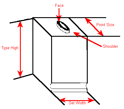
Figure 1. Lead Type
The evolution of type technology removed limitations on font design that lead slugs imposed. An example from the PostScriptÒ 35 is LinotypeÒ Palatino. Linotype introduced the “hot setting” of lines of type, which allowed Linotype to design Palatino to be taller than it could have been using slugs. In a similar fashion, the introduction of phototypesetting and digital font technology has removed some limitations but unfortunately introduced others.
In traditional composition, the em is a unit of measurement exactly as wide and high as the point size being set. It is called em because the letter M in early fonts was usually cast on a square body. In digital font technology, the em square is a logical rectangle against which digital glyphs (the visible parts of the characters) are laid out. The em square is used to scale fonts to a specific point size. Because the height of the em square is given in pixels, it can be considered the point size in device units. For example, a font could be referred to as a 50-ppem (pixels per em square) font. The pixel size determines the physical point size. A 75-ppem font on a 300-dpi device is an 18-point font; on a 150-dpi device it is a 36-point font. The number of pixels required for the desired point size is computed using the resolution of the output device and the em-square size as follows:
ppem = (point size/72) * device resolution
Thus, a 12-point font on a 72-dpi display is at 12 ppem; on a 300-dpi device it is at 50 ppem.
Glyphs can also exceed the horizontal width of the lead slug, producing overhangs and underhangs. For example, in the word first, glyph overhang occurs between f and i. In the word Ajax, the descender of the j underhangs to the left under the A.2 (Almost all italic fonts have an overhang-underhang property.) The width of the lead slug can be viewed as the advance width of a character (see Figure 7). The lengths of the parts of the glyph beyond the edges of the lead slug are called the right and left sidebearings, and these lengths can be positive or negative.
The point size of a font does not determine the amount of space between lines (the line spacing). Given the point size, the typographer determines the shape and the size of the glyphs, but the typesetter determines the line spacing. The point size of the font influences the line spacing, but other considerations are line length, font color, and the size of the largest glyph in the line. Line spacing is also measured in points and is generally denoted as font size/line spacing; for example, 24/26 refers to a 24-point font on a 26-point line. The spacing in the vertical direction beyond the font size is called external leading and equals 2 points in 24/26 (see Figure 2).
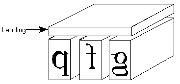
Figure 2. External Leading in Typesetting
Line spacing is measured from baseline to baseline (see Figure 3).
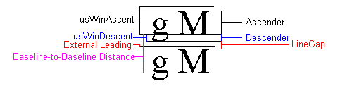
Figure 3. Normal Baseline-to-Baseline Measuring
In metal-based typography, line spacing can be solid, that is, no space between lines, 1-point spacing, 2-point spacing, and so on. However, negative external leading (for example, 24/22) is not possible. Under some circumstances, negative external leading is desirable. For example, if a title is set on more than one line and in all capital letters, negative external leading can bring lines of text closer together. Although some fonts may use it, a font designed with negative external leading is problematic for the MicrosoftÒ WindowsÔ graphical environment because many applications and printer drivers do not support it. Therefore, Windows version 3.1 locks external leading at zero; that is, external leading can never be less than zero, regardless of what the font metrics specify. Two other metrics are generally used to describe font design: the maximum ascender and the maximum descender (see Figure 4).
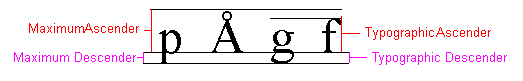
Figure 4. Maximum Metrics vs. Typographic Metrics
The maximum ascender is the height above the baseline of the tallest glyph in the font. The maximum descender is the distance below the baseline of the lowest glyph in the font. The ascender and descender are typographical concepts; the font designer can determine them arbitrarily. A reasonable approximation of these measurements is the top of the f and the bottom of the g. These characters are illustrative because the eye perceives rounded characters as taller than straight characters. For rounded characters to appear to have the same height as flat characters (such as the t or d), rounded ascenders must be slightly taller and rounded descenders must be slightly lower (see Figure 5).
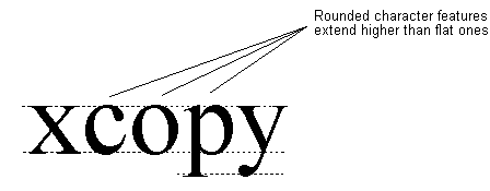
Figure 5. Round Heights
Beginning with Windows version 1.0, the suggested line spacing has been:
line spacing = maximum ascender + maximum descender + external leading
Applications can use these measurements to produce good approximate spacing between lines of text of different point sizes.
To offer a measure of device independence and excellent output, Windows exposes graphics device interface (GDI) fonts at two levels: logical and physical. At the logical level, the application asks GDI for a font by specifying attributes independent of device considerations. The logical font is an argument to the CreateFont function. When the font is requested for a specific device (that is, when it is selected into a device context [DC]), that output device determines how the font looks on its display surface.
In Windows version 3.0, physical fonts were bitmaps.3 (See Figure 6. The metrics shown, except one, are easily related to typographical concepts.)
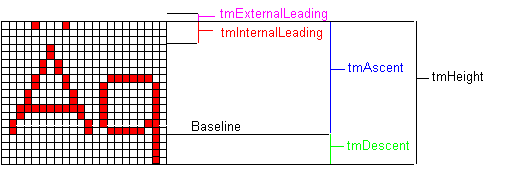
Figure 6. Bitmap Metrics
However, Windows version 3.0 does not contain any character metrics that allow Windows or applications to place characters that have overhangs or underhangs properly; in effect, the advance width of the character equals the width of the bitmap (see Figure 7).
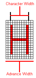
Figure 7. Character and Advance Widths for Bitmap Fonts
Unattractive text can result. For example, placing glyphs from an italic bitmap font without overhang produces text that is much too long. In Windows version 3.0, GDI typically simulates both bold and italic glyphs (at least to the screen and to dumb printers). For example, to make a font bold, the TextOut function double-strikes the text string; that is, GDI has the device put the string to the display surface and repeats the output request to the display driver with the string displaced to the right by one pixel, regardless of the point size or pixel size. The character width returned for bold glyphs is one greater than that returned for normal glyphs. The advance width is still the width of the base glyph.
GDI simulates italic fonts with multiple display string-outs. Starting from the bottom of the descender, the clipping area of the string-out is set to be 2 pixels high. After every two pixels, the string is displaced to the right 1 pixel, and the string-out is performed again. This routine is repeated for the height of the font and displaces the baseline of all glyphs to the right by an amount based on the length of the descender. The larger the font, the greater the displacement. Because the character width returned for italic glyphs includes the additional width generated by the simulation (tmHeight/2), this character width cannot be used as the advance width. The advance width for italic glyphs is still the width of the base glyph.
Because applications generally need the advance width, not the character width, Windows returns a field in the TEXTMETRIC structure called tmOverhang, which is the difference between the advance width and the character width for simulated fonts. Cursor placement and text insertion are based on the advance width. For example, an application could find it difficult to place the insertion point before an italic 18-point period on a VGA display. The advance width could be 3 pixels, the character width could be 12 pixels, and the period could have been displaced 4 pixels to the right. The application may be unable to locate the period and place the insertion point in the middle of the previous glyph. Using overhang to derive advance widths from character widths introduces other complications. For example, using the GetTextExtent function on a string returns an answer that is different from the sum of the GetTextExtent function performed on the characters that make up the string.
If a Windows version 3.0 application requests a font at a size for which a bitmap is not available, GDI generates additional bitmaps by stretching an available bitmap an integral amount. The resulting glyphs are not always attractive (see Figure 8).

Figure 8. Stretched Bitmap Characters
WYSIWYG (what you see is what you get) means that what the user sees on the screen matches the printer’s output. Strictly speaking, the user should be able to overlay the printed output with the monitor output perfectly—every character and graphic element would align. For best WYSIWYG, a bitmap is required for every aspect ratio and for every point size of a font and for every printer and display resolution that an application might use, which consumes a great deal of disk space. In addition, acquiring or generating these bitmaps irritates users.
The original designers of Windows used the LOGFONT structure as the complete definition of a font. This structure has been updated for Windows version 3.1 and now has the following form:
;/*
LogFont struc ;*/ typedef struct tagLOGFONT { /*
lfHeight dw 0 ;*/ int lfHeight; /*
lfWidth dw 0 ;*/ int lfWidth; /*
lfEscapement dw 0 ;*/ int lfEscapement; /*
lfOrientation dw 0 ;*/ int lfOrientation; /*
lfWeight dw 0 ;*/ int lfWeight; /*
lfItalic db 0 ;*/ BYTE lfItalic; /*
lfUnderline db 0 ;*/ BYTE lfUnderline; /*
lfStrikeOut db 0 ;*/ BYTE lfStrikeOut; /*
lfCharSet db 0 ;*/ BYTE lfCharSet; /*
lfOutPrecision db 0 ;*/ BYTE lfOutPrecision; /*
lfClipPrecision db 0 ;*/ BYTE lfClipPrecision; /*
lfQuality db 0 ;*/ BYTE lfQuality; /*
lfPitchAndFamily db 0 ;*/ BYTE lfPitchAndFamily; /*
lfFaceName db LF_FACESIZE DUP(0) ;*/ BYTE lfFaceName[LF_FACESIZE]; /*
LogFont ends ;*/ } LOGFONT;
The following table describes most of the fields of the LOGFONT structure.
| Field | Description |
| lfHeight | The desired font height of the characters in logical units (mapping-mode dependent). If lfHeight is a negative number, its absolute value specifies the character height of the font in logical units. Although zero is a valid value that allows Windows to choose an “appropriate” height, its use is discouraged because Windows has no idea what an “appropriate” height is. |
| lfWidth | The desired width of the characters, in logical units (mapping-mode dependent). When this value is set to zero, Windows chooses a font based on the height. A nonzero value causes the TrueTypeÒ rasterizer to produce a font with the requested width. The font is shrunk or stretched. |
| lfWeight | Specifies normal or boldface. In Windows version 3.0, two values are recommended: 400 is normal and 700 is boldface. With TrueType, lfWeight can take the following values:
0Don’t care WINDOWS.H defines weights from 100 to 900 in increments of 100. |
| lfItalic | Specifies italics when nonzero. |
| lfUnderline | Specifies underlining when nonzero. |
| lfStrikeOut | Specifies that the font has a line drawn through the characters when nonzero. |
| lfCharSet | The character set of the font. The character set has five identifiers: ANSI_CHARSET, OEM_CHARSET, SYMBOL_CHARSET, SHIFTJIS_CHARSET, and DEFAULT_CHARSET. |
| lfOutPrecision | Specifies the desired output precision. More accurately, it specifies whether the application wants a vector, a raster, a device, or a TrueType font. The OUT_STRING_PRECIS value requests a raster font, the OUT_STROKE_PRECIS value requests a vector font, and the OUT_DEFAULT_PRECIS value covers the don’t-care case. The OUT_CHARACTER_PRECIS value is unused. If font names collide in Windows version 3.1, OUT_RASTER_PRECIS forces the raster font; OUT_DEVICE_PRECIS forces the device font; and OUT_TT_PRECIS forces TrueType. |
| IfClipPrecision | In Windows version 3.1, the low four bits should be set to zero. The top four bits are new flags to be discussed later. |
| lfPitchAndFamily | You can use the C OR operator to combine two identifiers for this field. The lower two bits specify the pitch of the font—DEFAULT_PITCH, FIXED_PITCH, or VARIABLE_PITCH. The upper four bits specify the font family—FF_DONTCARE, FF_ROMAN, FF_SWISS, FF_MODERN, FF_SCRIPT, or FF_DECORATIVE. |
| lfFaceName | The name of a typeface (such as Courier, Helv, or Tms Rmn, under Windows version 3.0). WINDOWS.H includes an LF_FACESIZE identifier that equals 32, which is not the maximum number of characters allowed for the typeface name but is the size of the string that the EnumFonts function returns. When dealing with face names, Windows ignores case. |
The definition of a logical font provided by the LOGFONT structure includes some inherent limitations, such as the lack of obliqueness as an attribute, the separation of attributes from the name of the font itself, that point size is not used as a measure of the height of the font, that width can be considered independent of height, and that a font mapper cannot be made to do face name substitution. Most of these limitations were first imposed by the hardware on which Windows was originally designed to run.
GDI provides the MM_TWIPS mapping mode because font sizes are typically given in points. Most applications, however, use MM_TEXT (device units) as their mapping mode (often because the bitmap fonts that Windows supplies are tuned to MM_TEXT). When an application uses MM_TEXT, it must convert from points to logical height (in most cases, to device units).
Internal leading is not a traditional typographical concept. Windows includes it so that applications can select the point size of a font correctly. (As described previously, the font height that the LOGFONT structure gives is not the same as the point size.) Internal leading is the difference between the em square size and the font height:
internal leading = font height – em square
Internal leading is not the space reserved for diacritical markings because portions of characters may extend outside the em square, nor does internal leading have anything to do with the placement of the first line of text on a page. In Windows version 3.0, the vertical metrics that the GetTextMetrics function returned to applications were sometimes wrong for device fonts. Hewlett-PackardÒ and PostScript printers use files associated with fonts that the drivers refer to in order to return these metrics. The metrics that Hewlett-Packard printers return can be inconsistent; depending on the cartridge installed, the line spacing can vary for the same font. The PostScript driver always returns complete, correct information for Windows version 3.0 and later. An application that implements these metrics incorrectly does not get the proper point size, and the line spacing varies from printer to printer.
Applications based on versions of Windows earlier than 3.1 cannot use the physical dimensions of a font because bitmap fonts are tuned to logical inches. With TrueType, however, applications can use either physical or logical inches. The physical dimensions of a screen correspond to the dimensions a user might discover by measuring the screen with a ruler (although the video driver has no way of knowing the dimensions of the screen). The logical inch is generally 30 percent to 40 percent larger than a physical inch. The logical inch is a measure Windows uses for presenting readable fonts. Developers of Windows applications are encouraged to use a logical inch instead of a physical inch. Applications determine the dimensions of output devices by using the GetDeviceCaps function, which returns both physical and logical dimensions. Printers treat physical and logical dimensions the same; differences arise only with video displays.
An actual 10-point font is hard to read on a VGA display and is nearly unreadable on an EGA display. A 10-point font is not necessarily more readable on displays with higher resolution. People generally read paper at a distance of approximately a foot but read displays at about two feet; so although you can read 10-point type on paper, it is difficult to read on displays.
The logical inch being larger than the physical inch solves the problem of text being legible on the display, but it introduces two problems. The first is that screen text is not WYSIWYG, that is, the screen is not a scaled version of the printed page, especially if graphics are included. If the graphic is a bitmap, scaling it to match the text size introduces artifacts. The second problem is inefficient use of screen space, that is, fewer characters reside in the same amount of space.
In addition to the problems with font metrics, font technologies in versions of Windows earlier than 3.1 presented other font-specific difficulties. These included the widths of characters being both device dependent (which interfered with printer portability) and mapping-mode dependent (which interfered with metafiles), the role of the logical inch (which interfered with WYSIWYG), and that too little typographical information was returned about the physical font (which interfered with the production of perfect-looking documents). The fundamental issue was the inability to lay out fonts at a level of abstraction higher than the device. The absence of logical widths for the glyphs in a font precluded composing a logical document that was device independent.
Because of the problems above, most applications designed for Windows version 3.0 compose for the printer and make the screen match, and users can select only those fonts that the target printer supports.
The new urban myth is that scaled fonts result in instant WYSIWYG. In reality, if screen and printer resolution are different, true WYSIWYG is impossible. Most users are satisfied if the line breaks, paragraph breaks, and page breaks are the same on both devices and if line endings are the same in justified paragraphs. A WYSIWYG document, however, is not necessarily formatted exactly the same on different printers. Developers of Windows applications are encouraged to make the best use of the available output device for both quality and performance, realizing that portability and WYSIWYG are different objectives. WYSIWYG applies only to the correspondence between a given monitor and a printer.
Printer portability is WYSIWYG taken one step further: A document is formatted identically across all output devices—all displays and all printers. Printer portability may extract a price in performance and/or quality. For example, although using TrueType on a LaserJetÒ IIP is faster than using downloaded soft fonts, using TrueType on the LaserJet III may be either faster or slower than using device fonts.4 Quality sometimes decreases on lower-resolution devices (for example, screens) when the document is laid out for higher-resolution devices (for example, printers); in such cases, the character spacing on the lower-resolution device is probably not optimized.
Document portability is the concept that a document appears the same, for example, on an IBMÒ PC running Windows and on an AppleÒ MacintoshÒ; this could also be called platform portability. By extension, if a document appears the same on both platforms, it could also appear the same in different applications on either platform.
TrueType or any other font-scaling technology is not always sufficient to allow printer portability because devices may have different resolutions. Even when fonts are portable across printers, glyphs designed or rasterized for particular resolutions will have different pixel widths. In applications that use the TextOut function, for example, different character widths can lead to different line lengths, which can change line breaks, which can change paragraph placement, and so on. TrueType allows for logical widths by exposing the design width of characters. TrueType characters are designed against a 2048-by-2048 grid.5 The design width is the width of a character in these grid units. Applications that lay out the document at the highest printer resolution attempt to distribute the error in white spaces. However, this method is not always successful. It fails, for example, when all glyphs are one pixel smaller at 600 dpi than they are at 300 dpi. (In this case, fonts go from a width of 45 at 600 dpi to a width of 23 at 300 dpi, to a width of 12 at 150 dpi, to a width of 7 at 75 dpi, and so on.) It is likely that white space will be insufficient to absorb the larger glyphs at the lower resolutions. Characters would have to overlap to preserve the line breaks. Even best-case widths, for example, all widths doubling, going from 300 dpi to 600 dpi (for example, 30 -> 60, 41 -> 82, and so on), do not guarantee that line breaks will be the same if an application justifies text on both the left and the right. Another half pixel of white space at the lower resolution might allow one more word on the line. At the higher resolution the pixel is there, and the line breaks change. (Of course, similar problems occur in the vertical direction.6)
Another problem with printer portability is justification. For example, for italic text to left-justify and right-justify correctly, the leftmost and rightmost glyphs on each line must align vertically. The application must know the left sidebearing of the beginning glyph and the right sidebearing of the ending glyph7 and position each glyph in the line appropriately.
As another example of problems to be aware of, assume that advance widths of all characters are the same across two printers of different resolution, say 40 pixels at 150 dpi and 20 pixels at 75 dpi. The advance width of scalable fonts is composed of the glyph width plus the sidebearings. Although a rasterizer might force the sum to be correct (that is, linearly scaled), the individual A, B, and C widths (see the “Character Spacing” section) could each be off by one pixel. This error moves the location of the character slightly.
When a font is used (that is, selected into a DC), GDI determines the physical representation of the logical font. In Windows version 3.0, the choices were device, GDI raster, and GDI vector fonts. To choose among them, GDI calculates a closest matching GDI-based font to the requested logical font, asks the target device driver for a closest match among the device fonts, and then selects the closest two for the most appropriate physical representation. In most cases, device fonts are selected rather than GDI fonts. When TrueType is installed, GDI also calculates a closest match for the TrueType fonts available and then chooses from among the three. If GDI determines that TrueType is the closest match, the TrueType engine produces raster characters that are presented to the raster device. For devices that do not have raster font capabilities, such as HPÒ PCLÒ and PostScript, the device driver must ask the TrueType engine for the glyphs in a form it finds most suitable.8 Only the device driver knows how to convert from a TrueType format into a format that can be downloaded to the device.
In Windows version 3.0, no text operations could be done to printer-compatible memory DCs because getting the glyphs out of the printer and into system memory was impossible. With TrueType, however, this operation is possible.
In Windows version 3.1, both the EnumFonts and the EnumFontFamilies functions enumerate fonts using the NEWTEXTMETRIC structure instead of the TEXTMETRIC structure used in Windows version 3.0. Because the new structure is a superset of the old one and because GDI allocates the memory needed, applications designed for Windows version 3.0 simply ignore the new information. Applications aware of Windows version 3.1 expect this extended structure when running under version 3.1.
When a TrueType font is used, GDI changes the way it simulates underlines and strikethroughs. Because TrueType fonts contain metrics for the placement of these lines, GDI follows these guidelines to achieve document portability.
To determine the font type, applications use the EnumFontFamilies function. (Although you can use both EnumFonts and EnumFontFamilies, using EnumFontFamilies is recommended.) Along with other information, the EnumFontFamilies function returns flags that specify whether the font is a raster font or a vector font and whether the font is a device font or a GDI font. To support scalable TrueType fonts, the flag that denotes a vector font is overloaded to mean a scalable font. In Windows version 3.1, a new flag has been added to denote a TrueType font.
Enumerating point sizes for a scalable font is unnecessary. The PostScript printer driver, for example, enumerates its fonts as scalable device fonts. GDI enumerates TrueType fonts as scaling GDI fonts. Although enumerating TrueType fonts in this way presents no problems for the display, a problem arises when TrueType is built into printer device drivers. Some older applications check the device to determine whether it produces scalable fonts; these applications ignore the scalable/vector bit in all fonts enumerated by nonscaling devices. Although TrueType can create any size font for the printer, these applications show only one.
A few applications use an unorthodox approach to determine whether a font is a raster or a vector font. The tmCharSet field in the TEXTMETRIC structure denotes vector fonts as OEM_CHARSET instead of ANSI_CHARSET because vector fonts do not contain the complete ANSI character set. Marking them as OEM_CHARSET also keeps the font mapper from using them instead of an enlarged raster font (where appropriate) because a large penalty is associated with using the wrong character set. Because vector fonts are slow and typically unattractive compared with raster fonts, most applications do not want to use them. Even if a vector font contains the complete Windows ANSI set, it must be marked OEM_CHARSET for backward compatibility. Vector fonts can be selected by face name after enumeration or by specifying OUT_STROKE_PRECIS for the lfOutPrecision field of the LOGFONT structure.
For a GDI raster font, the character pixel box that contains the glyph gives the advance width of the glyph as well (see Figure 7). Typographically, this width is inaccurate for all italic fonts and for most roman fonts (for example, the j and y glyphs). To place the characters correctly, GDI requires the advance width that the font designer intended for each glyph. From information the TrueType rasterizer supplies, GDI constructs what is known as ABC spacing. The B spacing is the width of the black part of the glyph. The A spacing is the distance that is added to the current position before placing the glyph. After the glyph is placed, the B width is added to the current position. The C width is then added to the current position to account for the white space to the right of a glyph. The total advance width is given by A+B+C. The A and C widths are the sidebearings discussed previously (see Figure 9).
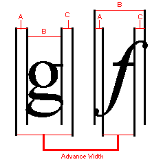
Figure 9. ABC Spacing Metrics
ABC widths save space; the white space does not have to be stored as part of the glyph. The real strength of ABC widths, however, is that A and/or C can be negative, which makes underhangs and overhangs possible. An application can also use ABC spacing (or similar information) to justify text. For example, when right-justifying roman fonts using GDI raster fonts, the advance width is assumed to be the character width. Thus, the white space to the right of the glyph in the bitmap is aligned, not the glyph itself. In other words, the white space in the character bitmap definition displaces the black part of the glyph to the left of where it should be. Using only the correct advance width to place characters also leads to similar problems. ABC widths are exposed to applications because text justification with greater precision is outside the capabilities of GDI. By using ABC widths, applications also have more flexibility in placing and removing white space when justifying text, because they have more information that allows them to control intercharacter spacing more precisely.9
For TrueType fonts, the GetCharWidth function returns the proper ABC-based advance widths. Both the HP PCL and PostScript drivers have always returned the proper advance width as the character width, so applications that use these drivers need not be modified. When an application calls the ExtTextOut function, GDI uses the complete set of ABC widths to fill in the lpDx parameter of ExtTextOut, which gives information to the display drivers that allows them to place the characters correctly. In this fashion, all font styles, including italic fonts, can be placed properly on the page.
In Windows version 3.1, ligatures and kerning are still supported by escapes to printer drivers; that is, GDI does not support ligatures and kerning directly. TrueType fonts can contain kerning tables, which can be accessed with the GetFontData function.
The largest impediment to attaining WYSIWYG under Windows arises when no screen font matches the widths of characters in the target printer font. The usual approach is to match the average width of the characters with as little variation in specific characters as possible. Closer matching is achieved with a technique known as metric coercion—forcing character metrics to match an ideal. The two basic methods of metric coercion are width and shape. Width coercion simply forces the character widths (that is, adjusts the spacing between words and characters), and shape coercion transforms each character to force it into a bounding box. Width coercion is preferred over shape coercion.
To achieve a high degree of WYSIWYG, applications that left-justify and right-justify text use the ExtTextOut function to place every character exactly. If the string is short, the ExtTextOut function uses width coercion to distribute extra white space among words and characters. The application always determines the positioning of this white space, and it can do so in various ways—each having advantages and disadvantages. The typographically correct solution is to keep words together and place the white space between them; however, the results may be visually disturbing—too much space between some words, for example. Another option is to distribute the white space between words and between characters; this can also reduce readability. Still another option is to place every character where it would appear on the printed page; although this approximates WYSIWYG better than the first two approaches—it helps align columns, and it allows for checking rivers10—it can have a negative impact on readability. A similar problem occurs for text that would be too long for justification if the screen widths were used. In this case, white space must be subtracted from the line. Sometimes, the only way to force a line to fit is to overlap characters, even though overlapping characters has a negative effect on readability.
An application can use shape coercion to force the width of each character. Shape coercion deforms glyphs to fit the given widths. Because the widths of deformed glyphs still do not match the printer font perfectly, use the lpDx parameter of the ExtTextOut function to place the characters. Lines can be too long, but the possibility is reduced. The cumulative error in any line must still be accounted for during justification. Furthermore, even after all this effort, the resulting characters are often unattractive because shape coercion deforms not only the original glyph shape but also the carefully designed interrelationships between glyphs, that is, the proportions of a font that strongly contribute to readability.
Windows version 3.1 does not include a function to deform individual characters. GDI, however, uses the lfWidth field of the LOGFONT structure when creating a font. An application can use this field to scale the width of a font independently of its height.
TrueType fonts have some metrics defined by Apple Computer, Inc. that do not correspond one-to-one with Windows bitmap fonts. Macintosh applications use these metrics. The table below shows the relationships between Windows version 3.0 metrics and TrueType metrics. For backward compatibility, GDI returns Ascent = usWinAscent and Descent = usWinDescent.11 Internal leading is defined as expected (note that unitsPerEm is TrueType’s name for the em-square size). Apple’s suggested line spacing for a TrueType font is given by LineGap + Ascender + Descender.12 The external leading definition logically follows.
| Windows version 3.0 | TrueType (from the TrueType Font Files specification) |
| tmAscent | usWinAscent |
| tmDescent | usWinDescent |
| tmInternalLeading | (usWinAscent + usWinDescent – unitsPerEm) |
| tmExternalLeading | max(0, LineGap – (usWinAscent + usWinDescent) – (Ascender – Descender)) |
Some applications need access to all TrueType metrics to lay out a document as perfectly as possible. An application that needs to lay out a document that is portable between Windows and the Macintosh also needs these metrics. An application can use the GetOutlineTextMetrics function to fill in an OUTLINETEXTMETRIC structure with TrueType metrics. (See the Windows version 3.1 SDK for a description of this function.)
Windows version 3.1 includes 13 outline fonts: Times New Roman, Times New Roman Bold, Times New Roman Italic, Times New Roman Bold Italic, Arial, Arial Bold, Arial Italic, Arial Bold Italic, Courier New, Courier New Bold, Courier New Italic, Courier New Bold Italic, and Symbol. The design widths of these fonts match the widths of the 13 core PostScript fonts and Apple’s System 6.0.5. These widths were chosen to achieve document portability.
The original designers of Windows used the EnumFonts function to present fonts to applications that respected font families. An application could enumerate either font families or the members of a family. Because of problems with applications, however, families could have only four specific members: regular, bold, italic, and bold italic. Among other information, the EnumFonts function returns a pointer to a LOGFONT structure, which stores the weight represented as a number and italic denoted by a flag. Representing weight as a number has advantages and disadvantages. The advantages are language independence and the ability to compare weights across different fonts. For example, bold has the assigned weight of 700, extralight is 200, and heavy is 900. One disadvantage is that an application has no idea which name to present to the user, but a more important disadvantage is that a Windows application expects only the four basic variations in a font family. In versions of Windows earlier than 3.1, the solution was to enumerate members other than the basic four with a different face name. For example, a user has Ribald, Ribald Bold, Ribald Ultra Bold, Ribald Italic, Ribald Light, and Ribald Extra Light Italic. Ribald Bold and Ribald Italic are suppressed under Ribald, and the others are enumerated as Ribald, Ribald Ultra Bold, Ribald Light, and Ribald Extra Light Italic. Users who have many installed fonts thus have unwieldy font menus in Windows version 3.0 applications.
If the above set were installed, how does GDI know which the basic four styles are for compatibility with Windows version 3.0? TrueType fonts have flags for the basic four, but sometimes a font family can have more than one member that is used for bold. For example, Avant Garde, one of the PostScript 35, usually has Avant Garde Demi as the bold version, but Avant Garde Bold also exists. The bold flag could be set on both. Windows takes the easy way out: It regards the first font it encounters in WIN.INI with the bold bit set as the bold version and enumerates the other with a different face name.
In Windows applications earlier than version 3.1, the font mapper may have produced unexpected results.13 If the specified font did not exist, the font mapper sometimes matched the point size, the serif characteristics, and the fixed or proportional characteristics and sometimes matched only the point size. In Windows version 3.1, if a font with the specified face name does not exist, Windows always selects a TrueType font and matches the requested point size, serif characteristics, and fixed or proportional characteristics. If the face name corresponds to a bitmap font, only the bitmap is used at all point sizes, stretched as appropriate. This is for compatibility with Windows version 3.0 applications. If both bitmaps and a TrueType font exist for a face name, the bitmap font is used at point sizes at which bitmaps match the bitmap font; the TrueType font is used at all other point sizes.
Applications that require TrueType fonts exclusively can use OUT_TT_PRECIS in the IfOutPrecision field of the LOGFONT structure to tell the font mapper to realize only TrueType fonts for the logical font. This is important for applications that use object linking and embedding (OLE) because metafiles scale much better when they use TrueType fonts exclusively.
To help with face matching, TrueType font files have PANOSEÔ numbers. The PANOSE system classifies faces according to 10 attributes. Each attribute is rated on a scale, and the resulting values are concatenated to produce a number. With this number and a mathematical metric to measure distances in the PANOSE space, one can determine “nearest neighbors” (best match). The PANOSE number is part of the OUTLINETEXTMETRIC structure that the GetOutlineTextMetrics function returns. Windows version 3.1 does not use PANOSE data in its font mapping.
Multiple fonts in a system can have the same name—for example, a Courier device font and a Courier GDI bitmap font. However, few applications present a face name to the user more than once; the application discards duplicates. If a Windows version 3.0 application had multiple fonts with the same name, generally the font presented to the user was the first one that GDI enumerated to the application. In a Windows version 3.1 application, TrueType fonts are always enumerated first. An application can use OUT_RASTER_PRECIS, OUT_DEVICE_PRECIS, and OUT_TT_PRECIS to choose between technologies in the case of a tie. OUT_RASTER_PRECIS and OUT_DEVICE_PRECIS are ignored if no names collide.
Any printer driver that uses the brute driver for fonts works transparently with TrueType fonts. Because the screen fonts match the printer fonts, WYSIWYG is achievable.
In Windows version 3.1, the standard Windows Tms Rmn bitmap font is renamed MSÒ Serif, and the standard Windows Helv bitmap font is renamed MS Sans Serif. Although this change may confuse some users who are accustomed to the old names, it does not affect the majority of Windows users. Most applications use font menus and dialog boxes to list fonts that the printer supports, that is, fonts that the target printer can actually print. For example, if the target printer is a PostScript printer, Tms Rmn is not on the user’s font list. Similarly, if the target printer is an HP PCL printer, only those fonts in the printer and in the installed cartridge appear on the user’s font list. Tms Rmn and Helv may appear in Windows if the target printer uses those names; thus, the change in bitmap font names does not affect current HP PCL users.14 In Windows version 3.1, only users of dot matrix printers see MS Serif and MS Sans Serif rather than Tms Rmn and Helv in font menus and dialog boxes.
To prevent current documents from having to change because of this change in font names, Windows version 3.1 has name aliasing for fonts. The font mapper uses the new [FontSubstitutes] section in WIN.INI for font-name aliasing. The default section aliases Helv = Arial and Tms Rmn = Times New Roman. If an application requests one of the former, the font mapper aliases the name to the latter. If a user wants to alias Tms Rmn and Helv to TrueType fonts, the user can update this section.15 By adding to this section, users can remap any face name; for example, a document designed with ITC Garamond can be remapped to TT Garamond. Although fonts generally keep the same names across international borders, names can change, for example, Courier to Courrier in France. Documents crossing international borders will benefit from name aliasing.
A few applications assume that Tms Rmn and/or Helv are installed at all times. These applications do not enumerate fonts by face name to verify that the font is installed; rather, they enumerate fonts by attributes, passing in Tms Rmn or Helv. To prevent these applications from failing under Windows version 3.1, the EnumFonts and EnumFontFamilies functions check the alias list in WIN.INI. If an alias exists, GDI enumerates the font as if it were actually installed.
At very small point sizes on low-resolution devices, even hinted glyphs are not readable enough for constant daily use.16 (Hinting algorithmically distorts scaled font outlines to improve the appearance of bitmaps at specific resolutions.) Some fonts, such as German Blackletter, cannot be made to look good at smaller sizes. TrueType font files include a metric that is the lower limit of readability, given in terms of ppem; this is the otmusMinimumPPEM field of the OUTLINETEXTMETRIC structure. This metric is for informational purposes. For applications, GDI still rasterizes below this value. At very small sizes (below 11 pixels per font height), GDI uses tuned bitmap fonts in place of ANSI_CHARSET and FF_ROMAN or FF_MODERN or FF_SWISS fonts.
TrueType fonts can scale linearly, nonlinearly, or optically, depending on how the typographer designed them. In linear scaling, the character width is scaled and rounded to the appropriate ppem. In nonlinear scaling, hinted character widths can be larger or smaller than the scaled widths. Generally, characters within fonts are nonlinear for readability.17 In optical scaling, the proportions of the stroke widths are changed to preserve their optical width and color (based on how the eye perceives the characters).
Some of the core fonts in Windows version 3.1 scale nonlinearly. Windows-based applications have always worked with fonts that do not scale linearly; such fonts present no problems. Windows-based applications can also support optically scaled TrueType fonts today.
Although applications have no problems with ABC width fonts on printers, applications may have minor problems with ABC width fonts on the screen. Redrawing problems may appear for some glyphs at the ends of lines, even in roman fonts. Applications that assume they are using character widths instead of advance widths calculate the end of the last glyph in the line incorrectly; the calculation can be off by several pixels. If a glyph with a negative A space starts a line, the A space is to the left of the start position defined in the TextOut function. Pieces of glyphs can remain at either end of a text line after scrolling, or highlights may not fully encompass all selected characters. Typically, however, scrolling is not a problem because many applications use the ExtTextOut function to clip or redraw complete lines past the margins.
Because the members of a font family, such as bold and italic, derive from different outlines, the font height metrics do not necessarily match in all cases for TrueType fonts. The font height metrics do match for bitmap fonts because the metrics are preserved when Windows simulates bold and italic. The height metrics of fonts in Windows version 3.1 match; but again no typographical rule stipulates that the heights must match.
Usability issues fall into three categories:
Tasks that are easier with TrueType
Tasks that are more difficult with TrueType
Issues that TrueType introduces
The two most important problems that TrueType solves are matching fonts to the target printer and presenting legible fonts at any size on all devices.18 Many applications use fonts on the screen that cannot be printed. For example, if you create a document with Microsoft Word for Windows and print it on a LaserJet with the Microsoft Z cartridge, font sizes and styles (small caps is an example) appear on the screen but do not image on the printer. Using a printer that supports scalable fonts, such as a PostScript printer, solves most of this problem; however, when you switch printers, the document reflows, and line breaks and page breaks change. Even with TrueType, documents reflow when the target printer changes, that is, when the target printer has a resolution that is different from the original target printer. Although applications can use some of the new metrics to avoid reflowing, applications must be updated to take advantage of these metrics.
The scalability of TrueType fonts is their most obvious benefit. Virtually any point size is available on the printer and on the display. With TrueType, users no longer need to worry about the availability of point sizes on the printer or the display. Running a utility to create bitmap fonts or storing these bitmaps on disk is no longer necessary.
As previously stated, for Windows version 3.0 applications to use TrueType transparently, Windows uses the same enumeration and selection functions to present both TrueType fonts and bitmap fonts to applications.
All this added functionality comes at a price. Font dialog boxes will probably contain more font names than ever, and unless the application has been updated, the user can’t tell a TrueType font from any other font.
More fonts in dialog boxes
The availability of more fonts and the availability of TrueType fonts as well as bitmap fonts presents a challenge in displaying font names in font dialog boxes. Users of existing applications can choose to hide the names of all fonts except TrueType fonts by checking the Show Only TrueType Fonts In Applications check box in the Control Panel. (There is also a check box that enables and disables TrueType.)
New standard Font dialog box
The best solution to the problem of identifying TrueType fonts requires applications to update to take advantage of the standard Font dialog box for Windows version 3.1 (see Figure 10).
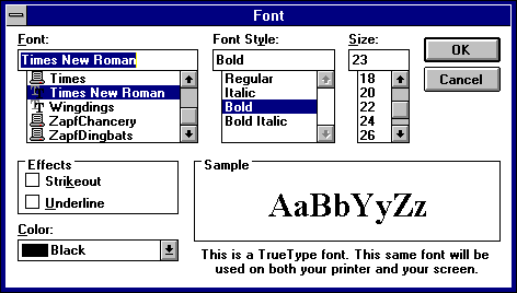
Figure 10. Standard Font Dialog Box
The advantages of this dialog box are:
It shows the user the font family name (for example, Arial) along with the styles (for example, Regular, Bold Italic, and other combinations of italic and weight) for the fonts actually installed.
It allows Windows version 3.0 simulations and effects to be applied, if the user wants them. When bold or italic simulations are applied, the user is warned that the font may not print as selected.
It displays weights or styles outside the four standard styles (regular, bold, italic, bold italic).
It informs the user which fonts are TrueType and which are not.
TrueType and Windows version 3.1 solve some problems but create some new ones.
Performance issues: disk space, memory use, and speed
The three most pressing performance issues for users of TrueType are disk space, memory use, and speed. Windows version 3.1 includes bitmap fonts as well as TrueType fonts, so more disk space is required for fonts than in earlier versions of Windows. Rasterizing fonts is not fast. To almost eliminate this performance hit, GDI caches glyphs. A large font cache could result in paging more segments out to disk in Enhanced mode, which could lead to lower overall performance, even in situations that were not “low memory” before. Because fonts are cached glyph by glyph as they are used, the total amount of memory used for the cache is smaller than if the corresponding bitmap fonts were in memory, which leads to a net performance gain. The only time the font cache uses more memory than fonts required under Windows version 3.0 is when multiple logical fonts would have been mapped to the same raster font. Typically, however, any additional swapping to disk is still faster overall than discarding the rendered bitmaps. The Windows memory manager usually does a good job of optimizing performance in these situations.
Switching from nonportable fonts to TrueType
The design of Windows version 3.1 encourages but does not force users to use TrueType fonts. Windows might enumerate only TrueType fonts for both printers and displays (if the Control Panel option is set), but it does not change the behavior of the CreateFont function. Applications that include custom fonts generally do not enumerate fonts, so this functionality is not problematic. The application typically adds custom fonts by using the AddFontResource function (that is, Windows does not load them at initialization), so the application is sure the font exists. Because the font mapper typically chooses TrueType fonts, font selection returns a non-TrueType font only if its name matches the name that the application requests.
Windows version 3.1 does not change fonts used in documents produced with earlier versions of Windows. Applications must change the fonts in a document or provide utilities that do so.
This section discusses the purpose and use of some functions added to Windows version 3.1 to support TrueType. (These functions are described in the Windows version 3.1 SDK.)
A design width is a type of logical width. Each glyph has a logical width and height independent of any rasterization problems or scaling transformations. Composed to a logical page, each character in a string has a place independent of the physical device width. Although a logical width implies that widths scale linearly at all point sizes, this is not necessarily valid for nonportable or most TrueType fonts. At smaller point sizes, glyphs are made wider relative to their height for better readability.
The outline of a font is defined in design units. The font designer copies paper drawings of fonts into digital outlines in a process known as digitization. As part of this process, the designer must use a digital design grid; the outline of the character is overlaid on this grid, and points on the grid are chosen to represent the outline. This process is similar to laying a drawing made on a transparent foil over a piece of graph paper and using the grid on the graph paper to assign values to the outline points.
Because a finer grid results in a more accurate outline, smaller grids yield better results. At some point, however, the improvements diminish. In the computer world, finer grids mean larger numbers, and a storage penalty results if the design grid is very small.
Because all original outline characteristics are stored based on digitization against this design grid, these unscaled, “native” values are called design units or font units. To scale design units properly, a divisor is needed—the em-square size. To scale any value in design units into real units (that is, into point size), simply divide the design units by the em-square size and multiply by the desired real units. For example, if the height of the character in design units is 540 and the em-square size is 1000, a 12-point version of this character (in inches) is:
(540/1000) * (12/72) = 0.54 * 1/6 = 0.09 inches
Note that the desired point size (12) is divided by 72 because in digital typography an inch is 72 points.
A font is then created that has a point size in device units equal to the size of em square. The ABC widths for this font are the desired design widths. For example, if the size of an em square is 1000 and the ABC widths of the 1000 device units font are 150, 400, and 150, a font that has a height of 10 in device units has widths of 1.5, 4, and 1.5. Because the mapping mode of MM_TEXT (that is, device units) is most commonly used with fonts, this is a simple calculation.
The EnumFontFamilies function enumerates fonts first by family and then by subfamily. A family consists of fonts that are related stylistically; for example, Ribald Bold, Ribald Extra Bold Italic, and so on, at all point sizes. The EnumFontFamilies function solves a problem that existed in earlier versions of Windows, in which a font such as Ribald Heavy was in a different family from Ribald or Ribald Demi. The “horizontal” style, such as condensed or narrow, is considered part of the family name, which is consistent with typographical correctness.
An application can use the GetGlyphOutline function to retrieve a TrueType glyph in one of two forms: bitmap or TrueType B-spline outline. For TrueType B-spline outlines, the format is the native TrueType format. Because GDI does not support B-splines or paths in Windows version 3.1, this outline is not useful to GDI. Any application developer who requires access to glyph outlines, however, can use this B-spline information.
Because Windows does not directly understand the native TrueType font file format, a standard FOT file is required for internal bookkeeping and enumeration. The CreateScalableFontResource function produces an FOT file that points to the TrueType font file. Once this FOT file is produced, current Windows applications can transparently use TrueType fonts with the AddFontResource and the RemoveFontResource functions. Applications can use the CreateScalableFontResource function to produce special fonts for logos, icons, and other graphics and also to produce embedded fonts.
Windows supports rotation of TrueType fonts in any increments or at any angle using the lfEscapement field of the LOGFONT structure.
Twenty-four typographical characters added to the ISO ANSI codepage for Windows for versions 3.0 and 3.1 are listed below. The left and right single quote characters were added for Windows version 3.0. The remainder are new for version 3.1.
| Character | Name | Windows ANSI | Unicode |
| \sgmlansi130 | baseline single quote | 130 | 201A |
| \sgmlansi131 | florin | 131 | 0192 |
| \sgmlansi132 | baseline double quote | 132 | 201E |
| \sgmlansi133 | ellipsis | 133 | 2026 |
| \sgmlansi134 | dagger | 134 | 2020 |
| \sgmlansi135 | double dagger | 135 | 2021 |
| ^ | circumflex | 136 | 02C6 |
| \sgmlansi137 | permille | 137 | 2030 |
| \sgmlansi138 | S hacek | 138 | 0160 |
| \sgmlansi139 | left single guillemet | 139 | 2039 |
| \sgmlansi140 | OE ligature | 140 | 0152 |
| ‘ | left single quote | 145 | 2018 |
| ’ | right single quote | 146 | 2019 |
| “ | left double quote | 147 | 201C |
| ” | right double quote | 148 | 201D |
| \sgmlansi149 | bullet | 149 | 2022 |
| ~ | tilde | 152 | 02DC |
| – | en-dash | 150 | 2013 |
| — | em-dash | 151 | 2014 |
| \sgmlansi153 | trademark ligature | 153 | 2122 |
| \sgmlansi154 | s hacek | 154 | 0161 |
| \sgmlansi155 | right single guillemet | 155 | 203A |
| \sgmlansi156 | oe ligature | 156 | 0153 |
| \sgmlansi159 | Y dieresis | 159 | 0178 |
Desktop publishing and sophisticated word-processing applications go to considerable lengths to make the screen mimic the printer. These applications are forced to reflow the entire document when a user selects a different printer. Some applications even change the way the fonts appear on the screen, in an attempt to show users the expected printer output. Applications that pay this much attention to achieving WYSIWYG benefit greatly from TrueType. Variations that occur in the document when a user switches between printers need no longer occur when the system uses the same scalable typefaces for both the printer and the screen.
TrueType delivers a higher level of WYSIWYG than was typically available with Windows version 3.0 because it works on every device. Most Windows applications lay out the screen based on the target printer. The fonts they enumerate for the user are the fonts that can be printed. Because TrueType fonts can be printed, they are enumerated by the printer driver to the application and displayed to the user as “printer fonts.” When the application and GDI match screen fonts to the printer fonts, the TrueType fonts are used on the screen as well.
Printer portability means that a document is formatted identically across all output devices—all displays and all printers—under Windows. Although TrueType allows the same font to be used across devices in Windows version 3.0 applications, line breaks may not be identical. This final step requires that applications update to take advantage of the design metrics that are exposed in Windows version 3.1. These metrics allow an application to compute the fractional portion of the spacing and make up the difference in the interword spacing, thereby reducing the round-off error from 0.5 pixel per character to 0.5 pixel per line.
Printer portability can potentially downgrade performance and/or quality, depending on such factors as the type of connection between the personal computer and the printer, the speed of the personal computer, the memory in the printer and the personal computer, the number of fonts, and the number of characters in each font.
Another impediment to printer portability is that different printers have different limits to the printable area. Even different production runs of the same printer can have different printable areas. If a document has been laid out to the margins of one printer, it may not format the same on a different printer. Glyphs that are in contact with the margins are problematic. Because the advance width, not the character width, is used for glyph placement, parts of the glyph may be beyond the printable area. Depending on the printer, the glyph is either clipped or dropped completely. TrueType does not introduce problems with printable areas, but the capabilities of TrueType make it easier for this problem to arise.
Document portability is the concept that a document should appear the same in Windows and on the Apple Macintosh. By extension, if a document appears the same in both environments, it could also look the same when imported into different applications.
TrueType does not provide immediate document portability, but it does remove a significant barrier from the realization of this goal. Because the same TrueType font works on the Macintosh, under Windows, and on all devices supported by both systems, the same characters and metrics can be exposed for all applications. When application developers consistently take advantage of these metrics, more portable documents will be produced.
Some difficult application issues are not yet resolved. For example, Windows and the Macintosh have noticeably different character sets. Although TrueType fonts contain the full default Macintosh and PostScript character sets, Windows does not allow applications access to the Macintosh characters. Likewise, a Macintosh application cannot gain access to the Windows characters in TrueType fonts. Localized versions of TrueType fonts will still be in use for both System 7 and Windows version 3.1, leading to even more difficult character-set problems when documents that use these fonts are transmitted to a system that does not have them.
Microsoft currently publishes a TrueType font files specification that tells font vendors how to create a single TrueType font for Windows, the Macintosh, and TrueImage. Although application developers need not concern themselves with font-portability issues, this discussion is included for completeness.
As part of the portability effort, Microsoft uses the same byte ordering in font files as Apple uses in its font files (Motorola). As a result, Windows fonts can be moved directly to the Macintosh, where they can be converted quickly into font suitcases for installation.19 If an installed Macintosh font does not contain the Windows mapping tables, the system maps “text” fonts (such as TimesÒ or ITC Zapf ChanceryÒ) from the Macintosh character set onto the Windows ANSI set. Novelty fonts (such as ITC Zapf DingbatsÒ), which have no character set to speak of, are not mapped; these fonts are taken along with the Macintosh character encodings. The decision whether to remap is based on a test that looks at the post table (which contains PostScript names). If the OS/2 metrics table is missing, Windows extrapolates as much information as possible based on other metric data in the font; anything that cannot be computed in a reasonable manner assumes a default value.
Creating portable fonts requires more than the right characters and the right character mapping tables. All metrics needed by all systems must be included, and all these different metrics must yield the same results. Matching metrics for the individual characters is not a problem; because the characters and their hints and metrics appear only once in the TrueType font, the same metrics are available across platforms (the platforms must expose the metrics, however). The more difficult problems have to do with line-spacing metrics, the determination of font styles, and matching these across systems.
Apple’s System 7 core TrueType fonts include metrics designed to be compatible with the bitmap fonts in System 6. The hdmx table will be used to force widths onto TrueType fonts that match those for the bitmaps at bitmap sizes. The name table (and its ability to group fonts by separating the family and subfamily names) is not used. Only the macStyle bits denoting regular, bold, italic, or bold italic are used. Apple’s line-spacing recommendations are less robust than those of Microsoft. The default recommended line spacing for a font is defined in Macintosh documentation as:
line spacing = ascent – descent + leading
The values for ascent, descent, and leading come directly from TrueType values, as outlined in the “Character Line Spacing” section.
| Macintosh | TrueType (OUTLINETEXTMETRIC value) |
| ascent | otmMacAscent |
| descent | otmMacDescent |
| leading | otmMacLineGap |
The clipping region (that is, the font height) for QuickDrawÔ is defined as ascent – descent. Instead of clipping misplaced pixels, QuickDraw deforms the entire character until all pixels fall within the clipping region. This occurs on screen only and can be overridden with a function call.
For their TrueType fonts, Apple has recommended that otmMacAscent – otmMacDescent = unitsPerEm, and otmMacLineGap = 0. This recommendation is based on the definition of point size for Macintosh bitmap fonts. Macintosh documentation defines the point size of a font as being equal to the line spacing (ascent – descent + leading). But, as noted in “The Correct Way to Choose Point Size,” earlier in this article, the typographically correct method for choosing a point size is based on the em square. By recommending that the metrics used to compute the line spacing also equate to the em-square size, Apple’s definition is corrected in a backward-compatible manner. Unfortunately, this recommendation fails on at least one standard font—Palatino. Because Palatino has ascenders and descenders that extend beyond the em square, the Macintosh would have to deform many uppercase letters for this font.
Palatino is not the only portability problem with Apple’s recommended spacing metrics. Windows and the Macintosh will have the same default line spacing for a font if and only if:
otmMacLineGap >= (tmAscent + tmDescent) – (otmMacAscent – otmMacDescent)
Unless the Windows and Macintosh font heights are equal, a font with a line gap of zero will yield different default line spacings on Windows and on the Macintosh.
TrueType fonts follow the recommendations presented elsewhere in this article, not Apple’s recommendations, and are therefore portable. The core fonts and all fonts from vendors that follow the Microsoft specification will have the same character widths, the same default line spacing, and the same character forms.
Despite some compatibility problems, TrueType and GDI accept Macintosh-only fonts. Metrics that are not present in Macintosh-only fonts are set to default values.
Font embedding, the technique of bundling the fonts that a document uses in the document itself, solves one set of portability problems. Embedding a font in a document, of course, means that the font is on the receiving end of the transmission. Font embedding is less a feature of TrueType than it is a licensing issue, although TrueType is the technology that makes font embedding possible.
For descriptions of all GDI functions, refer to the Windows version 3.1 SDK documentation.
A Windows application need not take any action to use TrueType fonts. TrueType fonts are included in the list of available fonts when GDI selects the physical font that most closely matches the requested logical font. When an application calls the EnumFonts or the EnumFontFamilies function to enumerate the fonts on a device, the RASTER_FONTTYPE bit of the FontType parameter of a TrueType font is not set, indicating that the font is scalable. In versions of Windows earlier than 3.1, RASTER_FONTTYPE specified whether the font was raster or vector. With TrueType, the definition of a vector font is overloaded to include the stroke/vector fonts (Modern, Roman, Script) and TrueType scalable fonts. Note that Windows vector fonts are scalable as well. DEVICE_FONTTYPE indicates whether the font is a device font or a GDI font. If the device can accept raster bitmaps, the DEVICE_FONTTYPE bit is not set for a TrueType font. If the device is some other device that supports downloading TrueType as soft fonts (for example, a laser printer), DEVICE_FONTTYPE is set. Note that the DEVICE_FONTTYPE bit simply tells an application that TrueType is supported in device-specific fashion; GDI is not bit-blasting bitmaps to the device.
The TRUETYPE_FONTTYPE value added to the FontType parameter that the EnumFonts and the EnumFontFamilies functions return helps determine whether a font is a TrueType font. A Windows application can also differentiate between font types using the tmPitchAndFamily field of the TEXTMETRIC data structure. The low four bits are currently used for:
| Device Font | Unused | Vector Font | Variable Pitch |
The unused bit indicates a TrueType font and so is set for TrueType fonts:
| Device Font | TrueType | Vector Font | Variable Pitch |
Applications can use the GetFontData function20 to save TrueType scalable fonts with their documents. The application reads the entire font file using this function with the DWORD table set to zero. The application must check the font’s license bit otmfsType bits 1 and 2 to ensure that embedding is permitted.
To determine that a font can be embedded, call the GetOutlineTextMetrics function and check the otmfsType field, bits 1 and 2. The values and their assigned meanings are:
| Bit # | ||
| 1 | 2 | Meaning |
| 0 | 0 | Read-write and read-only embedding is permitted. |
| 0 | 1 | Only read-only embedding is permitted. |
| 1 | x | Embedding is not permitted. |
Embedding any fonts for which embedding is not permitted (that is, if bit 1 = 1) or not following the guidelines below may violate the font vendor’s proprietary rights and/or the user’s license agreement.
After you determine which fonts can be embedded, you can read in the complete font using the GetFontData function (set the dwTable and dwOffset arguments to 0L to ensure that you read the entire font file, starting at the beginning of the font). The font data stream is stored with the document that uses the font; use the format that best suits your application. We suggest that you build a font directory in the document, noting which fonts are bundled (you should use at least the otmpStyleName, otmpFamilyName, otmTextMetrics.tmWeight, otmTextMetrics.tmItalic, and otmfsType fields that the GetOutlineTextMetrics function returns) and which are read-write or read-only embedded fonts.
If the read-only embedding bit is set for a font (that is, if otmfsType & 6 is TRUE), you must apply a form of simple encryption to the font data before storing it with the document. Although you can do so any way that you prefer, XORing the font data with a specific byte value that you choose and use consistently suffices (this method is also fairly fast).
When all fonts are bundled with the document, embedding is complete.
When an application encounters a document that contains embedded fonts, it must separate and install them for Windows to use. Precisely how an application does this depends on how the fonts were bundled, but in general the steps are as follows:
1.Resolve name conflicts before installing the fonts. For example, using each family name, call the EnumFontFamilies function to see if any style names are duplicated; the application must avoid duplication. If duplicate fonts are installed, Windows typically, but not necessarily, selects the first font installed.
The directory containing family name, style name, weight, italic flag, and otmfsType information suffices for the purpose of checking for duplicates.
2.For all fonts to be installed, access the bundled font and write all the data to a file, decoding any fonts that are read-only embedded. Read-write embedded fonts should use the TTF file extension. Read-only embedded fonts cannot use TTF and should avoid FOT and FON; these fonts should have an entirely different file extension, for example, TTR.
You need not place the font files in any specific directory. We suggest, however, that you place read-write embedded fonts in the Windows or application directory and that you place read-only embedded fonts in a temporary file directory.
3.Use the CreateScalableFontResource function to create font resource files for each TrueType font unbundled. Use the FOT extension for read-write embedded fonts, and ensure that the first parameter is 0. Use a different extension for read-only embedded fonts, for example, FOR; the first parameter must be 1. Use the AddFontResource function to install each font resource file. Place the FOT and FOR files in the same directory as the font itself.
Read-only embedded fonts, once installed, will never appear in an enumeration list (that is, from EnumFonts or EnumFontFamilies). Further, they cannot be selected by any application that does not specifically call for them both by name and with a specific lfClipPrecision flag set. The flag is CLIP_EMBEDDED and is OR’d into the lfClipPrecision field of the LOGFONT structure.
Because users can use read-write embedded fonts on an ongoing basis, offer them the option of installing read-write embedded fonts permanently. To install a font permanently, catenate the family and style names into one string, and insert this string with the FOT file name in the WIN.INI [Fonts] section. (See the documentation on WIN.INI for details on the format of this section.)
You must never install read-only embedded fonts permanently. You must remove them from the system and from the hard disk when the document in which they are bundled is closed.
The fonts are now ready to use with the document in which they were bundled. If a document contains one or more read-only encapsulated fonts, however, the user must not be permitted to edit the document. The user can only view the document on the screen or print it. Before any editing can occur, the application must strip away and delete the read-only embedded fonts. To delete the fonts, the application must:
1.Call the RemoveFontResource function for each font to be deleted.
2.Delete the font resource file for each font.
3.Delete each TrueType font file for each font.
Documents with read-only embedded fonts are themselves read-only and print-only. The document cannot be edited until every read-only embedded font has been removed. This option should be provided to the user.
When the document is closed, read-write embedded fonts can be installed on the user’s machine. The user can delete the fonts through the Control Panel, however, if the above installation process was followed.
Because Windows resources are normally available to all Windows processes, all fonts that are installed with the AddFontResource function are typically available to all other applications that are active at the time. To prevent a read-only embedded font from being used in other documents, Windows suppresses the enumeration and availability of these fonts. As noted above, this is controlled by the first parameter of CreateScalableFontResource. If this parameter is set to 0, the font is considered “normal.” If it is set to 1, the font is considered “read-only embedded” and will not be enumerated under any circumstances. Further, the font can be selected only if the CLIP_EMBEDDED flag is set in the lfClipPrecision field of the LOGFONT structure. This should prevent other active applications from making use of your application’s read-only embedded fonts.
If, for some reason, you are unable to delete one or more FOR files, don’t worry; all you waste is disk space. If, however, you are unable to delete one or more TTR files, the application should make every effort to delete these files later (for example, when the application itself exits, when the application starts up again, or after an elapsed period of time). The application is not responsible if circumstances beyond its control prevent it from deleting a font (for example, if the system crashes before the application can delete a font).
| Character position | ATM Enhanced ANSI | Windows 3.1 Enhanced ANSI for TrueType fonts |
| 130 | unsupported | baseline single quote |
| 131 | unsupported | florin (latin small letter script f) |
| 132 | unsupported | baseline double quote |
| 133 | unsupported | horizontal ellipsis |
| 134 | unsupported | dagger |
| 135 | unsupported | double dagger |
| 136 | unsupported | circumflex |
| 137 | unsupported | per mille sign |
| 138 | unsupported | S hacek (uppercase) |
| 139 | unsupported | left single guillemet |
| 140 | unsupported | ligature (latin capital letter o e) |
| 145 | unsupported | left single quote |
| 146 | unsupported | right single quote |
| 147 | left double quote | left double quote |
| 148 | right double quote | right double quote |
| 149 | bullet | bullet |
| 150 | en-dash | en-dash |
| 151 | em-dash | em-dash |
| 153 | unsupported | trademark |
| 154 | unsupported | s hacek (latin small letter s hacek) |
| 155 | unsupported | right single guillemet |
| 156 | unsupported | ligature (latin small letter o e) |
| 157 | diminutive 1 | unsupported |
| 158 | tilde | tilde |
| 159 | circumflex | Y dieresis (uppercase) |
The following font compatibility issues require special attention from application developers:
Choosing point size using the lfHeight field of the LOGFONT structure. For a description of how this field is used, see “The Correct Way to Choose Point Size.”
Enumerating TrueType fonts. See “Font Enumeration” for a description of using the EnumFonts and EnumFontFamilies functions.
Character line spacing: TrueType and the Macintosh. For differences in how TrueType and the Macintosh handle character line spacing, see “Character Line Spacing.”
Removal of the Tms Rmn and Helv font names. For a discussion of the removal of the Tms Rmn and Helv font names, see “MS Serif and MS Sans Serif.”
ABC widths and pixels at the ends of lines. For a description of some compatibility problems introduced by using ABC character widths, see “ABC Widths Can Cause Minor Compatibility Problems.”
New standard Font dialog box. The new standard Font dialog box is a good solution to the problem of presenting the wide variety of fonts in a comprehensible way. For a description of this dialog box, see “New Standard Font Dialog Box.”
1The two common measurements for metal-based typography are the pica point and the didot point. The pica point is 1/72.08246 of an inch and is used predominantly in the United States; the didot point is 1/69.54103 of an inch and is common in Europe and Brazil. In digital typography, the pica point is almost universally accepted.
2In most fonts, the descender of the y underhangs to the left, but in Times New Roman and Arial it does not.
3Windows also supports vector (also called stick) fonts that are generated with line segments. Although this discussion is limited to bitmap fonts, the same typographical concepts apply to vector fonts. Device fonts can also be considered bitmaps.
4TrueType is faster on the LaserJet IIP because it sends to the printer only the characters needed to image the text; a soft font must send every character it contains to the printer. Because the time to rasterize the characters is negligible compared with the time to download them to the printer, TrueType is invariably faster. If every character in the soft font were required, TrueType would be somewhat slower (although again, the time to rasterize the characters on the computer will be negligible compared with the download time). On the LaserJet III, the relative speed of TrueType to the scalable device fonts varies with the size of the characters, the type of connection between computer and printer, computer and printer memory, and so on.
5Microsoft and Apple core fonts are designed on a 2048-by-2048 grid. TrueType supports any integer grid size up to 16384 by 16384. Font manufacturers choose the actual grid size. Grid sizes that are integer powers of 2 scale faster.
6The Macintosh exposes design fractional widths; in fact, the Macintosh equivalent of the Windows TextOut function sums and rounds the fractions. However, the Macintosh does not use fractional heights. Applications on the Macintosh must take this into account if they require printer portability.
7A careful examination of professionally typeset justified text shows that rounded characters are slightly wider than straight ones. This is to overcome the same optical effects that affect their height.
8See the Microsoft Driver Development Kit (DDK) for TrueType DDI functions that have been added for device support.
9See the Windows version 3.1 Software Development Kit (SDK) for a description of the GetCharABCWidth function.
10A river is a series of white spaces that appear to form a continuous line running through several lines of text.
11The usWinAscent and usWinDescent values are calculated from the bounding box for the entire Windows ANSI character set. If the font contained only the Windows ANSI character set, usWinAscent would be identical to yMax, and usWinDescent would be identical to –yMin.
12\i LineGap, Ascender, and Descender are metrics defined by Apple and must not be confused with the typographic ascent or descent. This is discussed further in the “Portable Fonts” section.
13Typically, applications have worked around the limitations of the font mapper by enumerating all fonts in the system, selecting the best font, and passing the LOGFONT structure associated with this font to the CreateFont function.
14Hewlett-Packard no longer uses Tms Rmn or Helv in new printers. Thus, as users upgrade to PCL 5, Tms Rmn and Helv will change to CG Times (WN) and Univers (WN) in font menus and dialog boxes.
15Remapping in WIN.INI does not change the names of fonts. Windows still only enumerates fonts that actually exist. A user cannot force Arial to appear as HelveticaÒ in font menus. The substitution section simply nullifies the name penalty for a substitute pair in the font mapper.
16TrueType fonts are hinted to be very readable, even in sizes as small as 8 points, on a VGA.
17This is most often seen with characters such as W, which, to be legible at smaller sizes, require one or two more columns of pixels than linear scaling allocates. To improve readability, the character is made slightly wider and the linear advance width is sacrificed.
18The only device on which TrueType fonts currently do not work is the plotter; vector fonts must still be used for plotters.
19The format of TrueType font files follows precisely the format of Apple's sfnt resource. To convert an MS-DOS binary TrueType font into an sfnt requires editing the file information, setting Type to “sfnt” and Creator to “bass”. The sfnt is then ready to be integrated into a standard Macintosh font suitcase. To move a font suitcase to Windows, an application need only extract the sfnt portion from the data fork and move that unaltered to Windows for installation using Control Panel or the CreateScalableFontResource function.
20See the Windows version 3.1 SDK for a description of this and other functions.