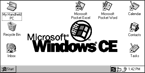
The desktop forms a visual background for all operations. It provides a familiar interface for accessing documents, launching applications, switching between tasks, browsing the file system, and performing other services. The components of the H/PC desktop include a work area, a taskbar, and application shortcuts or icons, such as the Recycle Bin and Inbox. Though you cannot programmatically control the appearance of the desktop, it is important to understand its specifications, so that you can design your interface accordingly.

H/PC desktop
The H/PC desktop is similar to other Windows desktops. It contains file, folder, and shortcut icons that can be positioned anywhere on the desktop. Unlike other Windows-based platforms, however, the H/PC has a virtual border around its desktop to prevent icons from being fully obscured by the screen edge or taskbar. The desktop does not permit users to position an icon's (0, 0) point beyond the boundaries defined by the following rectangle coordinates:
(–16, –16), (464, –16), (464, 198), (–16, 198)
Additionally, the browser in the H/PC is integrated with Pocket Internet Explorer, which means that it contains two views: an HTML view to display Internet content and a File view to display a folder's contents. The browser assumes the appropriate view depending on how it was launched. If it is launched by opening a folder, it assumes the File view. If it is launched by pointing to a URL, is assumes the HTML view. Each view in the browser contains it own toolbar. The File view toolbar contains controls similar to the Windows Explorer toolbar. The HTML toolbar contains controls similar to the Internet Explorer toolbar.
The taskbar is used to switch between open windows and to access global commands and other frequently-used objects. It contains a Start button, window buttons, and a status area. It also contains a Desktop button that provides quick access to the desktop from any application. Because H/PC applications do not have title bars, users identify a running application primarily by the icon and text displayed on its taskbar button.

H/PC taskbar
By default, the taskbar is the topmost window in the shell. When fully displayed, the taskbar is 26 pixels tall and either 480 or 640 pixels wide depending on the resolution of the display. The taskbar for the H/PC v2.0 supports autohide functionality. While hidden, the taskbar is 5 pixels tall. When a user hides the taskbar, a notification is sent to all applications that the usable vertical screen is increased by 21 pixels. To reactivate a hidden taskbar, each H/PC touch screen contains a 2.5 mm tap region around all four edges of the display. This, combined with the height of the taskbar, provides a generous tap region for activating the taskbar.
The H/PC taskbar also contains the following elements:
The Start menu has two components: the main menu and cascading menus. The main menu has a maximum height equal to 240 pixels, the height of the display. Thus, the menu displays only the number of items that can fit into this region. If the contents exceeds this number, the menu displays as many items as possible in alphabetical order. The width of the main menu cannot exceed 120 pixels. Any menu items wider than 120 pixels are cropped. The cropped text is replaced with ellipses.
Cascading menus are also displayed in alphabetical order. They have a maximum height of 240 pixels. If the number of items displayed exceeds the height of the screen, the menu adopts a multiple column mode and shows the remaining menu items in the adjacent column.
Like other Windows-based platforms, main and cascading menus use the 16-by -16-pixel icon associated with the menu item. Items that cascade to additional menus are appended with a triangular arrow.
The H/PC displays window buttons for all open parent windows. Window buttons are 23 pixels tall; button width is equal to the width of the available taskbar tray area divided by the number of buttons. The maximum button width is 1/3 of the available tray area. The minimum button width is 26 pixels. All window buttons display an icon and caption. The icon is 16 by 16 pixels so that the window button is always able to display the entire icon. The caption truncates as the width of the button decreases in size. Activated window buttons do not have bold captions.
The Desktop button provides quick access to the desktop. When the button is pressed, it brings the desktop forward, into focus, effectively hiding the current application. When the desktop is in the foreground, the Desktop button appears depressed to denote the desktop is being displayed. Pressing the Desktop button while the Desktop button appears depressed causes the previously active application to reactivate. The Desktop button is 23 by 22 pixels, the size of the standard toolbar button, and is located on the far right edge of the taskbar.
You can add a status indicator to the notification area of the taskbar. Indicators are represented by graphics supplied by your application. They contain information that is global in nature or needs monitoring by the user when working with other applications. When adding a status indicator to the taskbar, provide a pop-up window that displays additional information or controls for the object when the user taps the indicator icon. Also provide one that displays commands for the object when the user performs an ALT+Tap action on the indicator icon. Carry out the default command defined in the pop-up menu when the user double-taps the indicator icon. Display a ToolTip that indicates what the status indicator represents, and provide the user with an option not to display the status indicator.
Status indicators are 16 by 16 pixels, except for the clock, which occupies a fixed space. All status indicators are placed 3 pixels to the left of the clock with 0 pixels between each indicator. If you add a status indicator to the taskbar, you must define its access method. The methods supported by the taskbar include Down-Tap, Up-Tap, Double-Tap, and ALT+Tap.