| In this topic |
| Using AFC User Interface Controls | Previous | AFC |
Overview of AFC User Interface Controls
The com.ms.ui package (UI package) of the Microsoft® Application Foundation Classes (AFC) provides a rich set of user interface controls designed for Java applets and stand-alone Java applications. This article introduces the controls that are available in the UI package. It also covers topics that apply to all UI controls—topics such as creating controls and handling events generated by controls. Subsequent articles in this series provide specific details and examples of how to use each type of control.
AFC UI Controls
The UI package includes classes for the following types of user interface controls:
- Buttons
- Menus
- Choice and list controls
- Static controls
- Edit
- Scroll bars
- Band and band box controls
- Status and progress controls
- Tree controls
- Tool tip control
- Viewers (including tab, split, column, scroll, and marquee viewers)
- Dialog boxes (including message box, property sheet, wizard, find-text, color chooser, and font chooser dialog boxes)
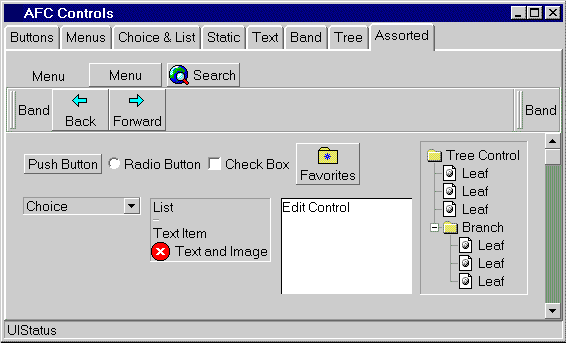
Here's how some of these controls appear on the screen:

This screen includes tab viewer, menu, band box, button, choice, list, edit, tree, and scroll bar controls. If you're familiar with programming graphical user interfaces (GUIs), you're probably familiar with the operation of most of these types of controls. In AFC, the UI controls are designed to be very flexible and easy to use. For example, it's just as easy to construct a menu that contains images as it is to construct a menu that contains text or a menu that contains both text and an image. In fact, the UI package is so flexible that you can create some pretty imaginative controls (like a menu containing a tree control) that may (or may not) be very useful.
There are many classes in the UI package. It might seem confusing which of these classes actually correspond to UI control objects and which classes exist mainly as helper classes used by one or more controls. For some controls, there is a one-to-one correspondence between a class and a control—other controls require you to use more than one class to create them. The following table summarizes the classes in the UI package that correspond to UI control objects.
| Control Type | Control Name | Class Name |
| Button | Push button | UIPushButton |
| Radio button | UIRadioButton | |
| Check box | UICheckButton | |
| Choice | Choice | UIChoice, UIEditChoice |
| List | UIList | |
| Menu | Menu | UIMenuButton, UIMenuList, UIMenuItem |
| Static | Item | UIItem |
| Graphic | UIGraphic | |
| Text | UIText | |
| Edit | Edit box | UIEdit |
| Scroll bar | Scroll bar | UIScrollBar |
| Band box | Band box | UIBandBox, UIBand |
| Status | Status | UIStatus |
| Progress | UIProgress | |
| Tree | Tree | UITree |
| Viewer | Scroll viewer | UIScrollViewer |
| Column viewer | UIColumnViewer | |
| Split viewer | UISplitViewer | |
| Tab viewer | UITabViewer | |
| Marquee | UIMarquee | |
| Tip | Tool tip | UITip |
| Dialog Box | Message box | UIMessageBox |
| Find-text dialog | UIFindReplaceDialog | |
| Color chooser | UIColorDialog | |
| Font chooser | UIFontDialog | |
| Property sheet | UIPropertyDialog, UIPropertyPage | |
| Wizard | UIWizard, UIWizardStep | |
| Find text | UIFindReplaceDialog |
Note The text, graphic, and item controls can be used to create stand-alone static controls. These controls, however are most often used to represent text and images used by other controls.
In addition to the classes in the preceding list, there is a set of AWT compatibility classes that enable you to use AFC UI controls in AWT containers. The AWT compatibility classes, which have similar names as corresponding AFC classes, use a AwtUI prefix. For example, the AWT compatibility class for the UIPushButton class is AwtUIPushButton.
Note Top-level UI controls such as message boxes, property sheets, and tool tips do not have corresponding AWT compatibility classes because they are not child controls and are not hosted by a container.
Using AFC UI Controls
The paradigm for using AFC UI controls is based on the paradigm for using AWT components. These are the steps required to create an AFC UI control:
- Create an instance of the control.
- Use the add method to add the control to a container.
For example, the following line of code creates a new raised-style push button control labeled "Search" and adds the control to its container:
add (new UIPushButton ("Search", UIPushButton.RAISED));
Usually, the code that creates a control appears in the constructor for a panel (UIPanel) or in an object that extends a panel. The add method is a Container method that is inherited by panels.
This example illustrates one implementation of the add method—there are more complex variations of add that enable you to specify additional information when you add components.
Handling Events
AFC UI controls support two event models:
- The JDK 1.02 event model (action, handleEvent, etc.).
- The JDK 1.1 event delegation model (addComponentListener, mouseClicked, etc.)
You can use either event model in your AFC UI components, but you shouldn't attempt to mix the two models within a component. All examples in this series of articles use the JDK 1.02 event model.
Using Text and Images in Controls
Creating most AFC controls requires that you supply some text or an image when creating the control. These controls use UIText objects to represent text and UIGraphic objects to represent images. To represent both text and images, the controls use UIItem objects. Controls accept these objects interchangeably, which enables you to create controls that use text, images, or both easily.
Many AFC UI controls have a constructor that takes a String parameter to create a control that contains only text. This is a shortcut, so you don't have to create a separate UIText object just to pass some text to the control.