
| In this topic |
| Using AFC User Interface Controls | AFC |
Using Static, Button, Menu, and Choice Controls
This article provides details on how to use the static, button, menu, choice, and list user interface (UI) controls.
Static Controls
Static controls aren't actually controls at all—by definition, they don't accept or respond to user input. But they are an important user interface component and are used as elements of most other user interface controls. For example, the text in a menu control or in a list box is a UIText object, which is a static control. The following diagram shows the class hierarchy of static controls.
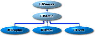
There are three basic types of static controls:
- Static graphic control (UIGraphic), which is used to represent an image.
- Static text control (UIText), which is used to represent text.
- Static item control (UIItem), which is used to represent both an image and text.
The following is an illustration of various AFC static controls.
![]()
There are a total of eight static controls in this illustration: four static text controls (the label on the left and the three commas), one static graphic control (the folder), and three varieties of static item controls (the print buttons). The following example is the source code for a panel that contains these controls.
class StaticPanel extends UIPanel
{
  // Constructor
  public StaticPanel()
  {
    Toolkit toolkit = getToolkit();
    Image hotprint = toolkit.getImage("HotPrint.gif");
    Image hotfavorites = toolkit.getImage("HotFavorites.gif");

    add(new UIText("Examples of static controls:"));
    add(new UIGraphic(hotfavorites));
    add(new UIText(","));
    add(new UIItem(hotprint, "Print"));
    add(new UIText(","));
    add(new UIItem(hotprint, "Print", 0, UIItem.ABOVE));
    add(new UIText(","));
    add(new UIItem(hotprint, "Print", 0, UIItem.ONLEFT));
  }
}
Button Controls
AFC offers four basic types of buttons:
- Push buttons (UIPushButton)
- Radio buttons (UIRadioButton)
- Check boxes (UICheckButton)
- Repeat buttons (UIRepeatButton)
Radio buttons are extensions of check boxes—the main difference between them is their appearance. Repeat buttons appear and operate like push buttons. However, instead of firing a single action event when pressed, repeat buttons continue to fire action events until released. The following diagram shows the class hierarchy of button controls.
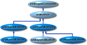
The following illustration shows the appearance of three types of AFC buttons. The buttons shown here are all text-only buttons—AFC also supports buttons displaying images and buttons displaying text and images.
![]()
Here's the code for a class that is a panel that contains the buttons shown in the previous illustration.
class ButtonsPanel extends UIPanel
{
  private UIPushButton pushbutton;
  private UIRadioButton radiobutton;
  private UICheckButton checkbutton;

  // Constructor
  public ButtonsPanel()
  {
    // Create buttons and add to ButtonPanel
    add(pushbutton = new UIPushButton("Push Button",
                                      UIPushButton.RAISED));
    add(radiobutton = new UIRadioButton("Radio Button"));
    add(checkbutton = new UICheckButton("Check Box"));
  }
}
Note that the push button is created with the UIPushButton.RAISED style. If you don't specify the raised style, the push button appears only as text and won't look like a button until it's under the mouse cursor. The following table summarizes the styles that you can use when you create buttons:
| Style | Description |
| Raised (UIPushButton.RAISED) | Button appearance is raised. This style applies only to push buttons. |
| Toggle (UIButton.TOGGLE) | Button alternates between two states (on and off). |
| Three-state (UIButton.TRITOGGLE) | Button alternates between three states (on, off, and indeterminate). |
To create a button with an image instead of text, supply a UIGraphic object to the button's constructor. To create a button with both text and an image, supply the constructor a UIItem object.
Menu Controls
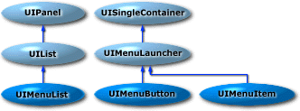
Like other AFC controls, the AFC menu controls are discrete, stand-alone controls that can be used anywhere in Java programs. There are three basic classes used to create menus:
- UIMenuItem, which represents a single menu item. A menu item can be text, an image, or another control, such as a check box.
- UIMenuList, which represents a list of menu items. You can use the UIMenuList.add method to add menu items to a menu list.
- UIMenuButton, which represents the button that is used to activate the menu. Like the push button control, a menu button can be either the raised or flat style. The default menu button style is raised.
The following diagram shows the class hierarchy of menu controls.
The following illustration shows the appearance of a menu control before and after activation.
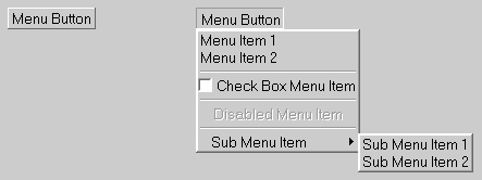
The menu includes a check box menu item, a disabled menu item, menu separators, and a cascading menu list. Here's the code for a class that is a panel that contains the menu shown in the previous illustration.
class MenusPanel extends UIPanel
{
  // Constructor
  public MenusPanel()
  {
    // Create a menu list and add some menu items
    UIMenuList mainmenulist = new UIMenuList();
    mainmenulist.add("Menu Item 1");
    mainmenulist.add("Menu Item 2");
    mainmenulist.add(new UILine());
    mainmenulist.add(new UICheckButton("Check Box Menu Item"));
    mainmenulist.add(new UILine());
    UIText disableditem = new UIText("Disabled Menu Item");
    disableditem.setEnabled(false);
    mainmenulist.add(disableditem);
    mainmenulist.add(new UILine());

    // Create a sub menu list and add to main menu
    UIMenuList submenulist = new UIMenuList();
    submenulist.add("Sub Menu Item 1");
    submenulist.add("Sub Menu Item 2");
    mainmenulist.add(new UIMenuItem("Sub Menu Item",
                                    submenulist));

    // Create a menu button for main menu and add to panel
    UIMenuButton menubutton = new UIMenuButton("Menu Button",
                                               mainmenulist);
    add (menubutton);
  }
}
To create a menu separator, add a UILine object to a menu list. To create cascading menus, create a secondary menu list and add it as a menu item to the primary menu list. You can also create menu items with images by using static graphic (UIGraphic) and static item (UIItem) objects as menu items.
Menu Controls Event Handling
Menu controls fire events on the items they contain, not on the actual menu control object. Consider the following code fragment.
UIMenuList menulist = new UIMenuList();
UIText item = new UIText("Apples");
menulist.add(item);
When the user selects the "Apples" menu item, the menu control fires an action event on the UIText object specified by the item parameter.
You can also add textual menu items to menu lists by specifying a string as shown in the following example.
UIMenuList menulist = new UIMenuList();
UIText text = (UIText) menulist.add("Oranges");
In this case, the UIMenuList.add method creates a UIText object from the specified string. When the user selects the "Oranges" menu item, the menu control fires an action event on the UIText object specified by the text parameter.
Choice and List Controls
Choice and list controls enable users to choose one or more items from a list of available choices. Choice controls (UIChoice) are similar to drop-down list boxes in Win32—they display only the currently selected item until they are activated and present a list of available choices. List controls (UIList) display available choices along with the currently selected item. You can also create list controls using the UIList.MULTISELECT selection mode to enable users to select multiple items from the list. The following diagram shows the class hierarchy of choice and list controls.

The following illustration shows the appearance of two choice controls and a list control. The first choice control is shown before activation and the second one is shown after activation.

Here's the code for a class that is a panel that contains a choice control and a list control.
class ChoicePanel extends UIPanel
{
    // Constructor
    public ChoicePanel()
    {
        UIChoice choice = new UIChoice();
        choice.addString("Choice A");
        choice.addString("Choice B");
        choice.addString("Choice C");
        add (choice);

        UIList list = new UIList();
        list.add("List Item A");
        list.add("List Item B");
        list.add("List Item C");
        add(list);
    }
}
Note To create a scroll bar with a list control, you must add the list control to a scroll viewer control (UIScrollViewer).
Choice and List Control Event Handling
Like menu controls, choice and list controls don't fire events directly on the choice or list control objects—they fire events on the objects contained by the controls. Choice controls fire an action event when a user chooses one of the items available in the drop-down list. List controls don't fire events unless a selection is made with a double-click mouse action.