[This is preliminary documentation and subject to change.]
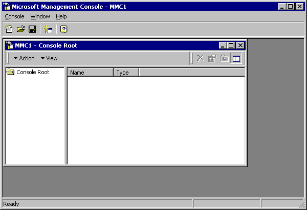
When you first see it, an MMC user interface may look and feel a lot like an MDI version of Explorer. By itself, MMC provides no management behavior and has almost nothing visible in its windows, as shown in the following graphic:

As you can see, the MMC parent frame has a master menu and toolbar. The master menu offers file and window management, along with Help, features that are typical of an MDI parent.
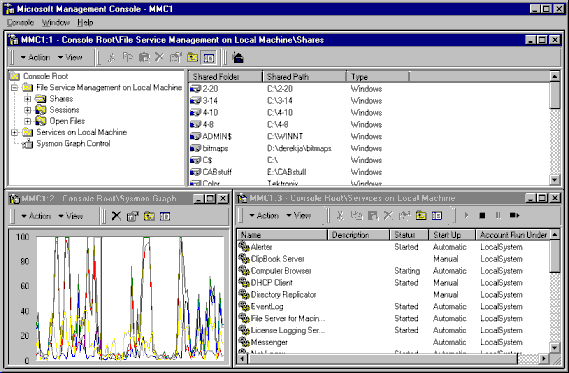
A complete MMC console, however, might look like the one shown in the following illustration:

The MDI child windows provide a variety of views. Each of these child views includes a command bar, a scope pane, and a result pane. The command bar contains both pop-down menus and buttons. The scope pane (the one on the upper left) is a tree view control that displays the tool's namespace, the tree-formatted listing of all visible nodes. Each of these nodes represents a manageable object, task, or view. The scope pane need not be visible in all views.
Each child window's result pane (the one on the upper right of the preceding illustration and the two in the lower part of the parent frame) displays the result of selecting a node in the scope pane. In many cases it lists the contents of a folder, but in other cases it provides a management-related view (such as the performance graph in this example)that can be Web- or ActiveX control-based.
MMC, as shown above, can be configured to provide powerful management tools. MMC is also designed to offer a scaled-down view that is more approachable to less-experienced administrators. In its simplest form, MMC can appear as a task-oriented set of icons.