Laying out a Wizard can take a tremendous amount of time and energy. Most Wizards go through quite a few interface iterations between initial concept and final deployment. Interface design is both an art and a science. A complete discussion of dialog/Wizard design is beyond the scope of this book. For our purposes, you can consider the following list a starting point for the physical layout of a Wizard:
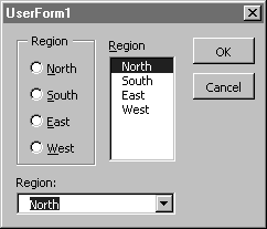
While most of these steps are obvious, "Decide which controls to use for each input" requires additional explanation where lists of data are concerned. The three main choices for presenting lists are radio button groups, list boxes, and drop-downs.

If you stick with radio buttons because your user tells you, "We haven't added any regions in 35 years," you may be forced to do a redesign if the user's boss decides to add "All Regions" or any other unexpected options. The list boxes allow you to update the lists without having to redesign the page layout. You can save yourself quite a bit of future headache by not using radio buttons to present lists.