by Tom Mitchell
New Java programmers must adjust to the concept of using AWT layout managers. Developers coming from Visual Basic, Windows SDK, or other windowed backgrounds are often surprised to find that, with Java, the user interface is built dynamically by code at runtime. Many Java-integrated development environments have been introduced that assist programmers by generating the user-interface layout code for them. In the end, however, you’ll want to understand all the layout managers available in the Java Development Kit (JDK) and how to use them effectively.
The GridBagLayout class has the most flexibility and functionality of the layout managers included in the JDK. It’s also the most complex. Many programmers avoid it completely, choosing either to use a simpler layout manager or none at all. In this article, we’ll explain how GridBagLayout works and how to use it—when we’re finished, you should find it far less intimidating. We’re assuming you have a conceptual understanding of layout managers. If you need a refresher, refer to the JDK documentation that you can view from the InfoViewer.
The GridBagLayout class has had some enhancements in the JDK 1.1 release, but functionally it’s virtually unchanged. The content of this article is applicable to both JDK 1.x and 1.1, unless explicitly noted otherwise.
So what’s the big deal about the GridBagLayout manager? Like all the other layout managers, it’s extended from the Object class and implements the LayoutManager2 interface. This is a change in JDK 1.1. In JDK 1.x, the layout managers implemented the LayoutManager interface. LayoutManager2 extends the LayoutManager interface, adding some new methods intended mainly for tool builders.
GridBagLayout differs from all the other layout managers in the complexity of the layout. While other layout managers allow simpler, predictable positioning and sizing of components into fairly uniform layouts, GridBagLayout has the flexibility to lay out components of varied sizes into an aligned layout, without requiring that all rows and heights be identical. That’s an intimidating description—but the individual concepts are fairly easy to understand.
The key to understanding GridBagLayout is understanding the GridBagConstraints class. Every component added to a GridBagLayout will have an associated GridBagConstraints object. The GridBagConstraints class specifies the criteria that will be used to size and position the component.
The GridBagConstraints class defines 11 constraints, or rules, used by the GridBagLayout class to perform its job. Each constraint exists as a variable in the GridBagConstraint class and, along with a group of constants, can (and should) be used to set the variables in a readable manner.
Generally, you’ll make an instance of a GridBagConstraints object in your application or applet, set the object variables appropriately, then associate the object with a component using GridBagLayout’s setConstraints() method. The setConstraints method will make a copy of the GridBagConstraints object so you can change its contents after the setConstraints call without affecting the component layout. In fact, we usually reuse one GridBagConstraints object each time we add a component to the layout. There’s no need to make new instances of the GridBagConstraints class for each component.
Setting or changing the constraints will often affect the sizing and positioning of other components in the layout. For that reason, we recommend not using the positional add(Component, Position) method to add components to the layout. Its effect on other components and the overall layout will make your code more difficult to understand. Now, let’s take a look at the 11 GridBagConstraints variables you must set.
The anchor variable tells the layout manager how you’d like the component justified if its display area is larger than the component size. The variable has nine possible values, allowing the component to be aligned to any corner, any side, or the center. You can use the constant CENTER (the default), EAST, NORTH, NORTHEAST, NORTHWEST, SOUTH, SOUTHWEST, SOUTHEAST, or WEST to set the value. Other values will cause the GridBagLayout manager to throw an IllegalArgumentException.
The fill variable indicates how the component should be resized if its display area is greater than its requested size. This variable has no effect if the weightx or weighty values are set to 0. You can use the constant NONE (no resizing), VERTICAL (resize the component to fill the display area vertically, but not horizontally), HORIZONTAL (resize the component to fill the display area horizontally, but not vertically), or BOTH (resize vertically and horizontally) to set the value. The default value is NONE; invalid values will result in no resizing.
The gridheight variable indicates the requested height of the component (in grid cells). Its default value is 1, and its effect will vary depending on the constraints of other objects in the layout. If the number of rows in the layout is less than the gridheight value, the component will be equal to the container height.
This variable has two special values identified by constants in the GridBagConstraints class: REMAINDER indicates that the component should be the last one in its column (and receive any remaining space). RELATIVE indicates that the component should be the next-to-the-last component in its column.
The gridwidth variable indicates the requested width of the component. Its default value is 1, and it causes the same behavior in regard to width that the gridheight variable does for height.
The constant REMAINDER indicates that the component should be the last one in its row (and receive any remaining space), and RELATIVE indicates that the component should be the next-to-the-last component in its row.
The gridx and gridy variables indicate respectively the horizontal and vertical grid-cell placement of the component. The GridBagConstraints constant RELATIVE indicates that the component should be placed to the right of (for gridx) or below (for gridy) the previous component.
The insets variable specifies the amount of space between the component and the edge of the display area on the top, bottom, left, and right sides. It defaults to 0 for all sides.
The ipadx and ipady variables indicate, respectively, the horizontal and vertical padding of the component beyond its minimum size. The GridBagLayout will multiply each of these values by two and add the products to the minimum horizontal and vertical sizes when laying out the components.
The weightx and weighty values indicate how any extra vertical or horizontal space should be distributed. GridBagLayout will consider the weighty of a row to be the maximum weighty of the components in that row and the weightx of a column to be the maximum weightx of components in that column. Unless you specify a value for at least one component in a row and column, the components will all be positioned in the center of their containers.
Because of the number of variables involved and the near-infinite number of ways they can interact with each other, it takes some time to get comfortable with GridBagLayout. Let’s work through a simple example that will illustrate a few of its behaviors.
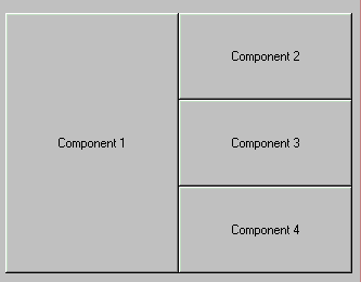
Our example consists of four buttons placed in an applet, as shown in Figure A. The code for the applet is shown in Listing A.
Figure A

Our example shows a simple GridBagLayout.
Listing A: gridbag.java
import java.awt.*;import java.applet.Applet;public class GBDemo extends Applet{Button button1 = new Button("Component 1");Button button2 = new Button("Component 2");Button button3 = new Button("Component 3");Button button4 = new Button("Component 4");public void init(){GridBagLayout gb = new GridBagLayout();GridBagConstraints gbc = newGridBagConstraints();setLayout(gb); // set the applet layoutgbc.fill = GridBagConstraints.BOTH;gbc.weightx = 1;gbc.weighty = 1;gbc.gridheight = 3;gb.setConstraints(button1, gbc);add(button1);// reuse gbc, only change what we need togbc.gridheight = 1;gbc.gridwidth =GridBagConstraints.REMAINDER;gb.setConstraints(button2, gbc);add(button2);gb.setConstraints(button3, gbc);add(button3);gb.setConstraints(button4, gbc);add(button4);}}
The code is very simple. In the applet’s init() method, we instantiate a GridBagConstraints object, gbc; set the variables to the values we want; associate the object with button1; then add button1 to the layout. Reusing the same gbc object, we modify a few of the constraints, associate it with button2, and add button2 to the layout. Finally, we use the unchanged gbc object to set the constraints of button3 and button4, then add them to the layout.
Take a look at the final layout in Figure A. Because the gridheight for the button1 constraints is 3, its height is equal to that of all three rows. Buttons 2, 3, and 4 all have a gridheight of 1 and a gridwidth of REMAINDER—this value causes each of those components to use all the remaining space in their rows and forces each of the next components onto a new row.
Now let’s make a few small changes and observe the effect. We changed the caption of button3 with this statement:
Button button3 = newButton("Component 3 has a very long caption");
This change increases the width of the button3 component and, therefore, the width of the entire column. We could have accomplished the same effect by increasing the weightx variable of one of the components in column 2.
Next, we changed the value of button1’s gridheight constraint:
gbc.gridheight = 2;
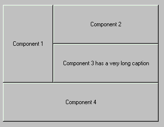
The effect of this change is twofold. The height of button1 is decreased, as you probably expected—but notice that button4 now has a width equal to that of the entire applet. This is because the gridwidth value of REMAINDER causes it to use all the remaining row space, even if it’s the first component in the row. If we added another button with the same constraints, it would be placed on the next row and would also take up the whole row width.
Figure B shows the modified applet. Notice that button3 and button4 still have identical constraints, but they’re sized and positioned much differently.
Figure B

Our example applet looks like this after modifications.
One other note about this example: To keep it short, we set only the values of the variables we wanted to change. For maintenance purposes, it may be a better practice to always explicitly set the contents of each variable. Doing so would make the code clearer and would also let the code continue working if the default values of the parameters ever change.
In this article, we covered the basics of the GridBagLayout and GridBagConstraints classes and how they work together to lay out the components in a container. GridBagLayout is always full of surprises, however. To get comfortable with this class, you should spend a few hours playing with it. Simply modify constraints one at a time and observe the effect on the component, as well as all the other components in the layout. Once you’ve mastered GridBagLayout, you’ll find that it’s a valuable tool for laying out dynamic user interfaces that must look good on a variety of platforms.
Tom Mitchell is co-author of Professional Java Fundamentals, published by WROX Press. He’s a senior product developer at The Molloy Group. You can reach him at tjmitch@nac.net.
Copyright © 1998 The Cobb Group, a division of Ziff-Davis Inc. The Cobb Group and The Cobb Group logo are trademarks of Ziff-Davis Inc. All rights reserved. Reproduction in whole or in part in any form or medium without express written permission of Ziff-Davis is prohibited.