Owner-Drawn Menus
You should always provide an alternative to owner-drawn menus, especially if they have a purely graphical appearance.
Owner-drawn menus are a flexible means of presenting a customized appearance, by making a menu item a combination of graphics and text, or graphics alone. For example, a menu might allow the user to select from a series of colored rectangles or select a line thickness from examples, which are easier to understand than purely textual representations (such as 3 points, 4 points, and so on).
However, owner-drawn menus are incompatible with most types of accessibility aids that need to identify the names of each menu item. Therefore, you should provide an option that replaces graphics menus with standard, textual menus when an accessibility aid is being used. The following techniques can be used as short-term solutions:
- Menu items can be redesigned to include both graphics and text. For example, a menu item for selecting line width might display a sample of a line followed by text stating the width. This redundancy would also be useful for a sighted person doing layout based on a written standard, which requires lines to have a particular thickness.
- The user can be given a choice of graphics or text. If he or she chooses text, the application can revert to standard rather than owner-drawn menus. This is a good use for the Screen Reader Present flag, a global flag that tells all applications when the user is relying on a screen review utility. When that flag is set, the application can use the textual values instead of (or in addition to) the graphical presentation.
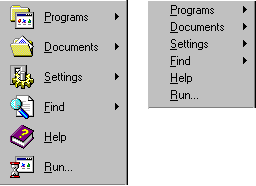
The following illustration contrasts the use of an owner-drawn menu using text and graphics with the use of a standard menu using only text.

