Attaching Textual Labels to Controls and Graphic Objects
Some types of controls, such as buttons, have their own textual labels. Screen review utilities have no trouble describing such controls to the user, and voice input utilities can recognize the label name when it is spoken as a command. However, other objects, such as edit controls or graphical objects, are typically labeled by placing a static control nearby.
The Windows Interface Guidelines for Software Design describes guidelines for the placement of labels so that they are consistent across all applications. Proper labeling helps make the interface more consistent between applications and more usable for everyone; it also helps accessibility aids. Proper labeling allows a screen review utility to infer the relationship between a static control and the control associated with it. If a static control ends in a colon, the screen review utility knows it is a label and looks for an unlabeled control either to its right or directly below it. When the utility describes the control to the user, it can use the label from the static control.
If a static control label and the control it refers to are not arranged in a standard pattern, it may be difficult for both sighted users and screen review utilities to determine which label applies to which control, or even that the two are related. A control and its label should not be separated by too great a distance, and a text label should not have unlabeled controls both beneath and to the right of it.
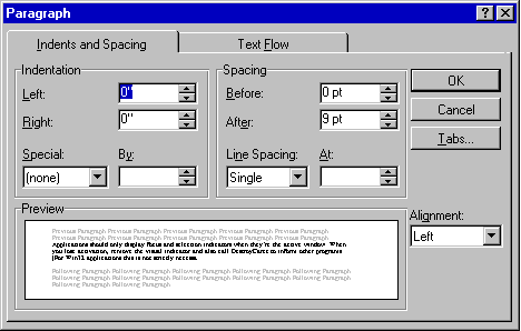
The following illustration shows the positioning of static control labels above and to the left of the unlabeled controls associated with them.

