Labeling Icons
If your application uses an icon or any type of graphic to represent an object or control, you should also display a text label with it. This arrangement is already familiar to users, and the combination of text and graphic helps shorten the learning curve for a new user. It also helps screen review utilities describe the object to a user who is blind and helps users associate a name with the control to activate or navigate to it by voice or other means.
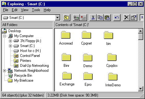
Following the normal guidelines, a text label should generally be placed immediately beneath a large icon or to the right of a small icon. When you place a text label beneath an icon, use the font, size, and color defined for icon titles in Control Panel to make it consistent with other applications. If you cannot display the text label visibly, at least make the label available in a tool tip control, as described previously.
The following illustration shows the proper positioning of text labels for both large and small icons.

