Labeling Controls Clearly
You should label controls and similar objects with names that convey information not dependent on spatial context.
A user who is blind or has low vision can only read a small portion of the computer screen at a time. A user who has tunnel vision or uses a screen enlarger will see a control and perhaps its immediate surroundings, while a blind user examining a control will have only its name, its type, and the name of the window and any group box it is in. They will not have any of the context provided by spatial arrangements.
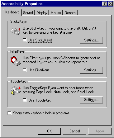
Labels do not have to be long and detailed. However, having several buttons with identical labels can be confusing if they are only distinguished by position. This confusion can be cleared somewhat if the position of the buttons in the tab order makes the association clear or if the buttons are within separately labeled group boxes.
The following illustration shows a dialog box where ambiguously named buttons are clarified by being placed in distinctively labeled group boxes and by having buttons immediately follow, in the tab order, the controls to which they are related.

