George Moore
Created: April 20, 1992
This article outlines the problems inherent in the linear scaling of fonts and how existing digital typographies have tried to solve them. Against this background, the nonlinear scaling solution found in TrueType® in Microsoft® Windows™ version 3.1 has clear advantages.
Nonlinear scaling is one of the great typographic strengths of TrueType® in Microsoft® Windows™ version 3.1 that cannot be matched by other font-scaling solutions. This feature results in higher-quality text that is more legible on low-resolution devices like computer screens and 300-dpi laser printers. Nonlinear scaling is not some vague promise for the future—it is implemented today in the TrueType fonts we ship with Windows version 3.1.
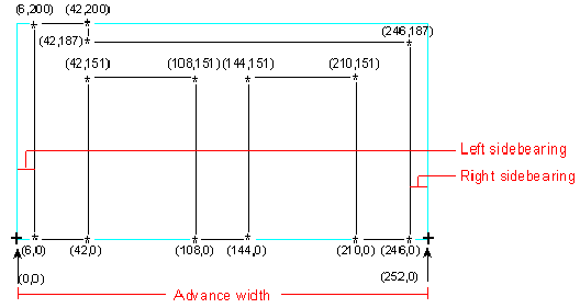
To understand why nonlinear scaling is important, we have to look at one of the more fundamental problems that occurs in digital typography. As you may recall from the article "An Introduction to Digital Typography Using TrueType," all digital typographic systems store extremely high-resolution outlines in the font itself; those outlines are scaled to the proper size for the target device. The outlines are then "hinted" to adjust the outline to better fit the pixel grid on the screen or printer. The introductory article does not discuss round-off errors during the scaling process. Such errors can be a major problem. Let's say you have a lowercase letter m outline that you are attempting to make legible at a small size on a 96-dpi (VGA-resolution) PC screen. The outline was originally stored as a series of quadratic B-splines in the high-resolution Cartesian em square space of the font file. In the following crude illustration, the asterisks (*) are used to denote on-curve control points in the original theoretical outline. The numbers beside an asterisk are the coordinates of the individual control points in the high-resolution space.

Figure 1. Outline of Lowercase Letter m
The plus signs (+) denote the starting and stopping points for the character, which includes the glyph shape and the space around it. The gap from coordinate location (0,0) to (6,0) is known as the left sidebearing. Likewise, the gap from (246,0) to (252,0) is called the right sidebearing. These gaps keep the character from running into the other characters on the line of text. In this case, both sidebearings are defined as 6 units in the em square space. As you can also see, the entire character occupies 252 units in the horizontal direction (known as the advance width) and 200 units in the vertical direction. Finally, each vertical stem is exactly 36 units wide (42 – 6 = 36 and 144 – 108 = 36) with a gap of exactly 66 units between each vertical stem (108 – 42 = 66 and 210 – 144 = 66).
Now, given these measurements, let's assume we have a scaling factor of 10 to 1, meaning that we have to scale the outline for a point size that is exactly one-tenth the size of the original outline. Therefore, the advance width (total character width) becomes 25.2 rather than 252. Likewise, the width of each stem becomes 3.6 rather than 36, and the gap between the stems becomes 6.6 rather than 66. This looks like an easy problem to solve because you just divide all the numbers by 10. But there's a danger in that. Physical display devices (screens and printers) cannot display anything smaller than a pixel, so you have to round all of the values to the nearest whole number. A pixel, by definition, is the smallest element that is used to display information. It's like a binary bit—it's either on or it's off. So the 3.6 pixel widths of the stems are rounded to 4 pixels and the 6.6 pixel widths of the gaps are rounded to 7 pixels. Likewise, each sidebearing of .6 pixels rounds up to 1 pixel.

Figure 2. Pixel Round-offs
Now we've got a real problem. If you add up the high-resolution widths in this character (6 + 36 + 66 + 36 + 66 + 36 + 6), the correct width of the character is 252 pixels, which rounds to 25 pixels after you apply the 10:1 scaling factor. The character should be 25 pixels wide; however, the character ends up being 28 pixels wide because, if you add up the individual rounded values (1 + 4 + 7 + 4 + 7 + 4 + 1), you get 28. The character grew by 12 percent because of round-off errors.
The 25-pixel answer is the linearly scaled value for that character. The 28-pixel answer is the nonlinearly scaled value for the character, sometimes called its "hinted" width because the hints are used to make the character wider at certain sizes. If you assume simple linear scaling, you have to somehow fit 28 pixels into a space reserved for 25 pixels. So what do you do with those extra 3 pixels? You could remove a pixel from the width of each stem, making each vertical stem only 3 pixels wide (instead of 4 as it should be according to nonlinear scaling). If each stem is 3 pixels wide, though, your letter m will not match the other letters in the same font at the same size. (The i, t, j, and others will still be 4 pixels wide because they don't have this rounding problem.) You could remove a pixel from the gap between each stem, making each gap only 6 pixels wide, but what do you do with the third pixel? You can't remove a single pixel from only one of the vertical stems because then they wouldn't match. You can't remove a pixel from one of the sidebearings because then the character would collide with the next one in the line. In short, you are stuck with a weird-looking, asymmetrical character if you try to base all of your calculations on the original width as stored in the high-resolution em square space of the font.
But the problem is even worse than I just described. At very small point sizes on low-resolution displays, there are sometimes not enough pixels to represent the character with any fidelity. Because of cumulative round-off error in the scaling process, you might need 7 pixels to represent a letter m that has a linearly scaled width of only 6 pixels. What do you do? You have the choice of the following shapes.
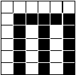
Figure 3.
In Figure 3, there is a 1-pixel space for the left sidebearing, but no right sidebearing at all, meaning the letter would run into the next one to the right of it.
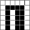
Figure 4.
Figure 4 shows that you could fix the problem in Figure 3 by deleting a single pixel from the center of the m, but now it is no longer recognizable as an m. In this case, you are trading legibility for correct spacing.
And these two examples involve only sans-serif faces. Imagine trying to squeeze serifs in there also! But this problem is not limited to computer screens. In reality, any font that you are trying to represent on a monitor screen or on paper below approximately 60 ppem (pixels per em) can have this problem with certain characters. And if you do the math from the ppem formula in Step 2 of "An Introduction to Digital Typography Using TrueType," you will realize that 60 ppem corresponds to around 14 points at 300 dpi. This means it is impossible to produce high-quality text at sizes of 14 points and below at 300 dpi if you base all of your calculations on simple linear scaling.
You'll notice that if you take this same letter m and try to render it on a reasonably high-resolution device, this rounding problem goes away. (To render high-quality text at sizes of 7 points and larger, you would need at least a 600-dpi printer; for text at sizes of 3.5 points and larger, you'd need at least a 1200-dpi printer.) If you have at least 252 pixels across, as in the example given above, there is absolutely no problem because the character will scale linearly. Now you've got two different devices (the screen and the printer), each with the same character at the same point size, and each reporting different widths. Both widths are right, but both are also wrong.
Under existing digital typography systems, such as the Intellifont format from AGFA (found in the HP® LaserJet® III printer and others) and the Type-1 format from Adobe (found in PostScript® printers), this problem of having two "correct" answers for the width of each character depending on its output device is an incredibly difficult engineering problem to solve. In fact, it's an impossible problem to solve. Remember, both of these systems were designed for printers. It took several years before Adobe Type Manager® (ATM) was made available for rendering type for the computer screen in Windows and on the Apple® Macintosh®. Because the font rasterizers originally existed only within the printer, there was no way to communicate the width of each character back to the host application. If you do the typographically correct thing and allow nonlinear scaling, the width of each character will depend upon both the point size you are trying to render and the resolution of your target device. The ideal width (that is, the nonlinearly scaled value) of a particular character may be one value at 5 points but an entirely different value at 6 points, yet another at 7 points, and so forth. And none of these may match the easily calculated linearly scaled values. If you allow nonlinear scaling, you cannot successfully predict the exact character widths until you actually try to render each character by applying the hints.
Historically, applications running on a host computer system connected to stand-alone printers attempted to determine line breaks and page breaks based on the widths of those characters. The application can calculate these various widths only by assuming that all characters at all point sizes will scale linearly. For linear scaling, the host application needs a list of the high-resolution widths for each character. It can then do the simple integer math itself to figure out how wide a character will be at a certain size without having to communicate with the printer.
These font-scaling solutions were later ported to Windows and the Macintosh. The primary output device for the Windows or Macintosh version of the rasterizer would be a computer monitor with a resolution of 96 dpi, a VGA-resolution screen. A large percentage of the time in these environments the text would be below 60 ppem (45 points at 96 dpi), so if you assume linear scaling, these characters would have to be wedged into a space smaller than they should normally fit. If those font-scaling programs allowed nonlinear scaling for the screen, they would break all existing applications and the millions of fonts already distributed. In the Windows and Macintosh environments, then, screen quality had to suffer because the quality of printed output, combined with backwards compatibility, was more important than good-looking screen fonts.
This scaling conflict between different output devices does not occur with TrueType because it was designed from the very beginning to reside within the operating system of the host computer, not the printer. This way it could produce high-quality text for both devices, without having either device suffer because of the limitations of the other.
Most major applications care about providing WYSIWYG (what you see is what you get) line breaks and page breaks that appear the same on the screen as on the printer. When you start an application such as PageMaker®, Ami Pro™, Word for Windows, or WordPerfect® for Windows, one of the first things the application does is ask the operating system to provide a list of the widths of each character at the point size you are using. By building this list, the application can figure out how wide each word will be and, therefore, how wide each line will be. In Windows version 3.0 with the old-style bitmapped screen fonts, it was easy to calculate these line endings because the width information for each character was simply stored in the font itself, and no calculations were necessary. But with nonlinearly scaling outline fonts, determining line endings becomes a more complex problem.
The only way to figure out how wide each character will be after pixel rounding is to execute the hints for each character, because you cannot anticipate what the hints will do to the outline. But even on a reasonably fast 80386-based machine, the executing of all the hints for all of the characters in the font can take almost one full second. This is an unacceptable delay for most people, who are used to dealing with applications that don't have graphical interfaces. For this reason, each TrueType font contains a table called the HDMX (Horizontal Device Metrics), with precomputed widths for each character at some of the more popular sizes. In the Microsoft-distributed TrueType fonts for Windows version 3.1, we store these precomputed values from 9 to 24 ppem and then for 15 other popular larger sizes. When the application asks Windows for the widths of each character at 13 ppem, Windows pulls these precomputed values out of the HDMX table as necessary. The HDMX table in each font is not large, so the trade-off between disk space and execution speed is an advantageous one. The HDMX table is built by font vendors when they compile the TrueType font for distribution.
The addition of the HDMX table solves one problem, but it creates a new, smaller one. The font vendor includes only a limited number of ppem values in the HDMX table for the more popular sizes, but it's entirely possible that the font will scale nonlinearly outside the range of HDMX values. However, at a certain point the font will scale linearly because the resolution is high enough to provide the necessary pixels to faithfully reproduce the shape of the characters. When the font reaches linearity, the width calculations become easy. A "grey area," then, exists between the top of the HDMX table range and the bottom of the linear range. It would be unacceptable to take the time to execute the hints simply to find out the advance width for the sizes that aren't covered in the HDMX table. If an application asks for the widths of the characters at 75 ppem, they may be scaling linearly at that point, but the only way to be sure is to execute the hints. For this reason, we have defined another table in the font file called the LTSH (Linear Threshold) table. The LTSH table defines the point at which it is reasonable to assume linearly scaled advance widths on a character-by-character basis. Between the HDMX and the LTSH tables, the fonts appear on the screen fairly fast and with good typographic quality.
How do Windows or Macintosh applications cope with nonlinearly scaling fonts? How do they handle the fact that the scaled width of the letter W is different on the screen than on the printer? As it turns out, this is not a big problem. In Windows version 3.0, applications had to go to great lengths to make the widths of the old-style bitmapped screen fonts match the widths of the printer fonts. Applications would always calculate the widths for the printer and then try to make the screen display match. This was not as easy as it sounds because the character widths, as well as the character shapes, might be vastly different from the printer to the screen. For example, if the user selected the Avant Garde Gothic printer font, Windows might select the Helv screen font as the closest match—even though the two fonts share little in common. Applications used a number of tricks to accomplish this alignment feat. The most common algorithm used was to simply add or delete extra pixels between words so that the spacing of the characters within the words looked right, but the spacing between the words was off just a little. In this way, the line breaks would appear correct.
When using TrueType fonts on the screen and printer, Windows can now match the shapes of the characters better than before. Applications continue to do exactly the same thing as in the past, except now there is much more typographically correct font information available for the screen. The extra 1 or 2 pixels taken up by the W are simply absorbed in the interword spacing. However, if the typographer hinting the font made all, or most, of the characters take up extra space on the line, the words might start to run together because there are only a finite number of pixels between each word. For this reason, when Monotype produced the base 13 TrueType fonts included in Microsoft Windows version 3.1, they looked carefully at the history of fonts.
Monotype has been in business since 1897 and has almost 100 years of experience in designing and selling type—real type, the kind made of lead. Since Monotype had to make separate pieces of lead for each letter of the alphabet, they have created precise charts that give the distribution patterns of each letter of the alphabet. The letter A, for example, is used far more often than the letter X, so they would naturally make more A's for any given font. As it turns out, about 70 percent of all documents are composed of only 13 characters: a, c, d, e, h, i, l, n, o, r, s, t, and u. Anyone who has watched "Wheel of Fortune" can verify this. So when Monotype hinted our base Windows fonts, they were very careful to make sure that none of those 13 characters exceeded the linearly scaled advance width. This makes it much easier for applications to produce correctly justified text. Happily, the characters that are most likely to exceed their linear values, such as m and w, are not in the above list. This 70 percent figure holds up across all Western and Eastern European languages. In reality, the distribution pattern for the uppercase letters is slightly different from the lowercase letters, but we decided to use the same rules for both so that lines in all uppercase letters will not break differently from the same lines in lowercase letters.
So what does this mean for the end user? This technology has one purpose: to produce the highest quality text, given the physical restrictions of the output device. Take, for example, the Arial® Bold w in TrueType format. Because the letter w tends to have more round-off errors than other letters, Monotype allowed its hinted advance width to exceed the linear width on several occasions.
| Pixels per em | Point size at 96 dpi | Linear width | Hinted width | Difference |
| 11 | 8 | 8.6 | 10 | 1 |
| 12 | 9 | 9.3 | 10 | 1 |
| 13 | 10 | 10.1 | 11 | 1 |
| 14 | 11 | 11.4 | 11 | 0 |
| *15 | (not used) | |||
| 16 | 12 | 12.4 | 13 | 1 |
| 17 | 13 | 13.5 | 14 | 0 |
| 18 | 14 | 14.0 | 15 | 1 |
* If you do the math using the ppem formula mentioned earlier, you will notice that both the 14 and 15 ppem values round to 11 points at 96 dpi. Since you can have only one point size for any given ppem value, the 15 ppem value is not used and, hence, not shown on this chart.
As you can see, for 8, 9, 10, 12, and 14 points at VGA resolution, Monotype allowed the Arial Bold w to be slightly wider than it should be for legibility purposes.
If you have a copy of the ZOOMIN tool from the Microsoft Windows version 3.1 Software Development Kit (SDK), you can enlarge areas of the screen to see what pixel patterns are formed by the various letters in a particular font. For an example of the asymmetries caused by forcing a character to be linearly scaled, I have reproduced the pixel patterns formed by the letter M in Helvetica® (with ATM for Windows version 2.0) and Arial (with TrueType in Windows version 3.1) at the same point size on the same screen.
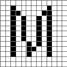
Figure 5. ATM: Helvetica at 13 pixels/em (or 10 points on VGA)
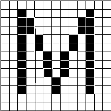
Figure 6. TrueType: Arial at 13 pixels/em (or 10 points on VGA)
As you can see, when ATM forces the letter to be only 8 pixels wide, the M looks a little attenuated. TrueType allows the character to be 9 pixels wide; thus, it regains the symmetry of a reasonable-looking character. If you wish to see this for yourself, make sure you turn off Bitmap Substitution in ATM under Windows; otherwise, you'll get the old-style Helv bitmap.
When you compare many letters (and spacing) at different point sizes, you'll notice that the base Monotype® TrueType fonts produce more legible, easy-to-read characters than ATM. Even if you leave Bitmap Substitution on under ATM, it doesn't help for those fonts for which no bitmaps are available. Windows does not distribute the bold or italic bitmapped versions of the Helv or Tms Rmn fonts, nor does bitmap substitution help in the case of fonts beyond the base 13 TrueType fonts included in Windows version 3.1.
The TrueType format is capable of producing the best-looking digital fonts in the world at every resolution. I have used Monotype to show how this happens with the Windows version 3.1 base fonts. The caveat to keep in mind is that it's possible to create TrueType fonts that do not yield these results. Some third-party vendors may create fonts that employ hinting algorithms that distort characters under some circumstances. There can be bad-looking TrueType fonts, created by people who don't know any better, just as there are bad-looking Type-1 fonts created by people who don't know any better. (Type-1 fonts are used by Adobe PostScript printers and by Adobe Type Manager for Windows.) The big difference, however, is that TrueType fonts do not need to be distorted; it is possible to create scaling fonts in TrueType that are very close to hand-tuned bitmaps.