Drawing the ShapeLabel Control
See Also
You can use graphics methods, such as Circle and Line, to draw your control, or you can create your control’s appearance using existing ActiveX controls and Visual Basic intrinsic controls. Controls you add to the UserControl to create its appearance are called constituent controls.
As its name suggests, ShapeLabel’s appearance is created using a Shape control and a Label control.
Note This topic is part of a series that walks you through creating a sample ActiveX control. It begins with the topic Creating an ActiveX Control.
To add constituent controls to the ShapeLabel control
-
In the Project Explorer window, double-click ShapeLabel to open its designer.
-
In the Toolbox, double-click the Visual Basic Shape control to place a Shape control on the ShapeLabel designer. If you haven’t used the Shape control before, hold the mouse over the Toolbox buttons until you find the one whose ToolTip is "Shape."
-
In the Properties window, set the following property values for the Shape control:
| Property |
Value |
| BorderStyle |
0 - Transparent |
| FillColor |
&H000000FF (Red) |
| FillStyle |
0 - Solid |
| Name |
shpBack |
| Shape |
2 - Oval |
Note To set color properties such as FillColor and ForeColor to specific colors, select the Palette tab of the color selection dialog.
-
In the Toolbox, double-click the Label control to add a label on top of the Shape control. In the Properties window, set the following property values for the Label control:
| Property |
Value |
| Alignment |
2 - Center |
| BackStyle |
0 - Transparent |
| ForeColor |
&H00FFFFFF (White) |
| Name |
lblCaption |
-
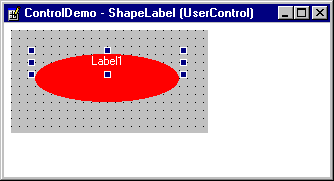
Use the bottom grab handle to change the height of the label so that it is slightly taller than the text it contains. ShapeLabel should look something like this:

-
Double-click the ShapeLabel designer to bring the code window to the front, and replace the code in the UserControl_Resize event procedure with the following:
Private Sub UserControl_Resize()
   ' Size the Shape control to fill ShapeLabel's
   '   visible surface area.
   shpBack.Move 0, 0, ScaleWidth, ScaleHeight
   ' Center the Label control vertically, and
   '   make it the same width as ShapeLabel.
   lblCaption.Move 0, (ScaleHeight _
      - lblCaption.Height) / 2, ScaleWidth
End Sub
-
When you’re designing a user control, remember that the area you have to work with is bounded by the ScaleWidth and ScaleHeight of the control. Nothing outside this is visible to the user of your control. Furthermore, the size of the client area will change at the whim of the user. The Resize event is thus one of the most important events in control design.
-
Be sure the ShapeLabel designer is in front, then press CTRL+F4 to close the window, putting the control in run mode. In the Project window, double-click Form1 to bring it to the front.
-
The two ShapeLabel controls should now appear as red ovals, with centered white captions that read, "Label1." Resize the ShapeLabels to test the Resize event code.
For More Information See "Drawing Your Control" in "Building ActiveX Controls."
Step by Step
This topic is part of a series that walks you through creating a sample ActiveX control.
