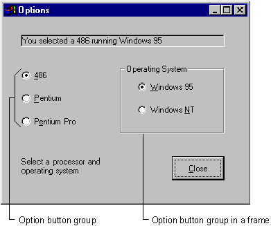
Option buttons present a set of two or more choices to the user. Unlike check boxes, however, option buttons should always work as part of a group; selecting one option button immediately clears all the other buttons in the group. Defining an option button group tells the user, "Here is a set of choices from which you can choose one and only one."
For example, in the option button group shown in Figure 3.11, the user can select one of three option buttons.
Figure 3.11 Selecting an option button

All of the option buttons placed directly on a form (that is, not in a frame or picture box) constitute one group. If you want to create additional option button groups, you must place some of them inside frames or picture boxes.
All the option buttons inside any given frame constitute a separate group, as do all the option buttons inside a picture box. When you create a separate group this way, always draw the frame or picture box first, and then draw the option buttons on top of it. Figure 3.12 shows a form with two option button groups.
Figure 3.12 Option button groups

A user can select only one option button in the group when you draw option buttons in a frame.
To group controls in a frame
Drawing the frame first and then drawing each control on the frame allows you to move the frame and controls together. If you try to move existing controls onto a frame, the controls will not move with the frame.
Note If you have existing controls that you want to group in a frame, you can select all the controls and cut and paste them into a frame or picture control.
While controls are independent objects, a certain parent and child relationship exists between forms and controls. Figure 3.12 demonstrates how option buttons can be contained within a form or within a frame control.
To understand the concept of containers, you need to understand that all controls are children of the form on which they are drawn. In fact, most controls support the read-only Parent property, which returns the form on which a control is located. Being a child affects the placement of a control on the parent form. The Left and Top properties of a control are relative to the parent form, and controls cannot be moved outside the boundaries of the parent. Moving a container moves the controls as well, and the control's position relative to the container's Left and Top properties does not change because the control moves with the container.
An option button can be selected by:
optChoice.Value = True
To make a button the default in an option button group, set its Value property to True at design time. It remains selected until a user selects a different option button or code changes it.
To disable an option button, set its Enabled property to False. When the program is run it will appear dimmed, meaning that it is unavailable.
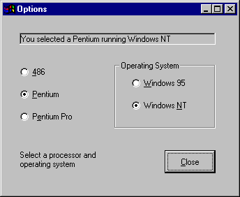
The form shown in Figure 3.13 uses option buttons to determine the processor type and operating system for a fictional computer. When the user selects a option button in either group, the caption of the label is changed to reflect the current choices. For a working version of this example, see Options.frm in the Controls.vbp sample application.
Figure 3.13 Option button example

The following table lists the property settings for the objects in the application.
| Object | Property | Setting |
| Label | Name Caption |
lblDisplay (Empty) |
| Command button | Name Caption |
cmdClose &Close |
| First option button | Name Caption |
opt486 &486 |
| Second option button | Name Caption Value |
opt586 &Pentium True |
| Third option button | Name Caption |
opt686 P&entium Pro |
| Frame | Name Caption |
fraSystem &Operating System |
| Fourth option button | Name Caption |
optWin95 Windows 95 |
| Fifth option button | Name Caption Value |
optWinNT Windows NT True |
The Options application responds to events as follows:
strComputer.strSystem.
The key to this approach is the use of these two form-level variables, strComputer and strSystem. These variables contain different string values, depending on which option buttons were last selected.
Each time a new option button is selected, the code in its Click event updates the appropriate variable:
Private Sub opt586_Click()
   strComputer = "Pentium"
   Call DisplayCaption
End Sub
It then calls a sub procedure, called DisplayCaption, that concatenates the two variables and updates the label's Caption property:
Sub DisplayCaption()
   lblDisplay.Caption = "You selected a " & _
   strComputer & " running " & strSystem
End Sub
A sub procedure is used because the procedure of updating the Caption property is essentially the same for all five option buttons, only the value of the variables change from one instance to the next. This saves you from having to repeat the same code in each of the Click events.
For More Information Variables and sub procedures are discussed in detail in "Programming Fundamentals."