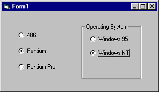
Option button controls are used to display options, usually in option button groups, from which the user can choose one.
Figure 7.39 The option button control

While option button controls and check box controls may appear to function similarly, there is an important difference: when a user selects an option button, the other option button controls in the same group are automatically unavailable. In contrast, any number of check box controls can be selected.
For More Information See "Grouping Options with Option Buttons" in "Forms, Controls, and Menus" for a demonstration of the use of option buttons.
You group option button controls by drawing them inside a container such as a frame control, a picture box control, or a form. At run time, the user may select a single option button from each distinct group of option buttons. For example, if you add option buttons to a form and option buttons to a frame control on the form, you have created two distinct groups of option buttons.
Figure 7.40 Creating option button groups

All option buttons that are added directly to the form become one group. To add additional groups, you need to place them inside frame or picture box controls.
To group option button controls in a frame or picture box, draw the frame or picture box first, and then draw the option button controls inside. At design time, option buttons contained within a frame or picture box control may be selected and moved as a single unit.
To select multiple controls contained inside a frame control, a picture box control, or a form, hold down the CTRL key while using the mouse to draw a box around the controls.
For More Information See "Using the Frame Control" earlier in this chapter for more information on drawing controls inside a frame.
An option button may be selected at run time in several ways: clicking it with the mouse, using the TAB key to shift the focus to the control, using the TAB key to select a group of option button controls and then using the arrow keys to select one within the group, creating a shortcut key in the option button's caption, or, by setting its Value property to True in code.
When an option button is selected, its Click event is triggered. Depending upon the functionality of your application, you may or may not need to respond to this event. Responding to this event is useful when you want to update a label control's caption to provide the user with information about the option that has been selected, for example.
The Value property of the option button control indicates whether the option button is selected. When selected, the value is changed to True. You can select an option button in code by setting its Value property. For example:
optPentium.Value = True
To make an option button the default within an option button group, set the Value property at design time using the Properties window or at run time in code, as shown above.
When you present the user with a dialog box containing option buttons, you are asking them to select options that will determine what your application will do next. You can use the Value property of each of the option button controls to determine which option or options were selected and then respond accordingly.
You can use the Caption property to create access key shortcuts for your option buttons by adding an ampersand (&) before the letter you want to use as the access key. For example, to create an access key for the option button caption "Pentium" you add an ampersand before the letter "P": "&Pentium". At run time, the letter "P" will be underlined and the user can select the command button by simultaneously pressing ALT+P.
Note To include an ampersand in a caption without creating an access key, include two ampersands (&&). A single ampersand is displayed in the caption and no characters are underlined.
To disable an option button, set its Enabled property to False. At run time, the option button will appear dimmed, meaning that it is unavailable.
The look of the option button control may be enhanced by altering the setting of the Style property and then using the Picture, DownPicture and DisabledPicture properties.