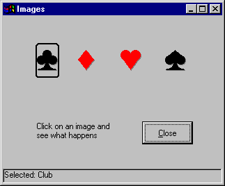
The form shown in Figure 3.18 uses four image controls, a shape control, a picture box, and a command button. When the user selects a playing card symbol, the shape control highlights the symbol and a description is displayed in the picture box. For a working version of this example, see Images.frm in the Controls.vbp sample application.
Figure 3.18 Image and shape control example

The following table lists the property settings for the objects in the application.
| Object | Property | Setting |
| Picture box | Name Align |
picStatus Bottom |
| First image control | Name Picture |
imgClub Spade.ico |
| Second image control | Name Picture |
imgDiamond Diamond.ico |
| Third image control | Name Picture |
imgHeart Heart.ico |
| Fourth image control | Name Caption |
imgSpade Spade.ico |
| Shape control | Name Shape BorderWidth Height Width |
shpCard 4 - Rounded Rectangle 2 735 495 |
| Command button | Name Caption |
cmdClose &Close |
The Images application responds to events as follows:
The code in the image control Click event looks like this:
Private Sub imgHeart_Click()
   shpCard.Left = imgClub.Left
   picStatus.Cls
   picStatus.Print "Selected: Club"
   shpCard.Visible = True
End Sub
Note that the first line in the Click event code assigns a value (the Left property of the image control) to the Left property of the shape control using the = operator. The next two lines invoke methods, so no operator is needed. In the third line, the value ("Selected: Club") is an argument to the Print method.
There is one more line of code in the application that is of interest; it is in the Form Load event.
shpCard.Visible = False
By setting the Visible property of the shape control to False, the shape control is hidden until the first image is clicked. The Visible property is set to True as the last step in the image control Click event.
For More Information For additional information on properties, methods, and events see "Programming Fundamentals."