When you're doing your own drawing, the only place you need to put drawing code is in the UserControl_Paint event procedure. When the container repaints the area your control is located on, the UserControl object will receive a Paint event.
If the built-in graphics methods of the UserControl object, such as Line and Circle, don't meet your drawing needs, you can use Windows API calls to draw your control. You can also "draw" text on your control using the Print method. Regardless of the drawing technique, the code goes in UserControl_Paint.
If your control has to change its appearance based on user actions, such as when the user clicks on the control, you can raise the Paint event by calling the UserControl's Refresh method.
Note While you cannot draw on the transparent parts of a UserControl with BackStyle = Transparent, it is possible to create controls with transparent backgrounds that are mostly user-drawn. See "Giving Your Control a Transparent Background," earlier in this chapter.
Important In Paint events, do not use DoEvents, or any other code that yields to other programs. Doing so will cause errors.
The following example demonstrates the basic principle of a three-state button, each of the three states being represented by a different bitmap. To work through the example, open a new Standard EXE project and use the Project menu to add a UserControl to the project. Place a PictureBox on the UserControl, and set object properties as follows:
| Object | Property | Setting |
| UserControl | Name | TripleState |
| PictureBox | AutoRedraw | True |
| Name | picStates | |
| Picture | (Any bitmap) | |
| Visible | False |
Note The example works best if the bitmap chosen for the Picture property changes color dramatically from left to right.
Add the following code to the Declarations section of the UserControl's code window.
Option Explicit
' Private variable keeps track of the current state.
Private mintState As Integer
A simple mechanism is used to provide the three states: Clicking on the control rotates through the states by incrementing the value of a private state variable each time the control is clicked. If the value becomes too large, it is reset to zero. Add this code to the UserControl's Click event.
Private Sub UserControl_Click()
   mintState = mintState + 1
   If mintState > 2 Then mintState = 0
   ' The following line causes Paint event to occur.
   Refresh
End Sub
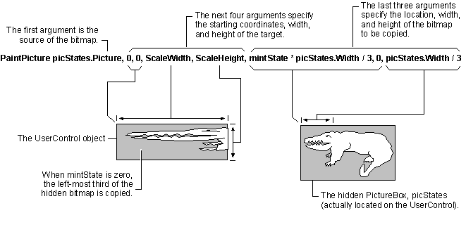
Add the following code to the UserControl's Paint event. When the Paint event occurs, the code copies one-third of the bitmap in the invisible PictureBox to the UserControl. Which third is copied depends on the current value of the private state variable mintState.
Private Sub UserControl_Paint()
   PaintPicture picStates.Picture, 0, 0, ScaleWidth, _
      ScaleHeight, mintState * picStates.Width / 3, _
      0, picStates.Width / 3
End Sub
Note Another way to provide a different appearance for the each of your control's states is to use the Select…Case statement.
When mintState is zero, its initial value, the first third of the hidden bitmap will be copied onto the UserControl, as shown in Figure 9.12.
Figure 9.12 Copying the first third of the hidden bitmap to the UserControl

Click the Close box on the UserControl designer, to enable its icon in the Toolbox. Double-click the icon to place a copy of the control on a form, and press F5 to run the project. Click on the control to change the state.
You can hide the form behind another window, or minimize and restore the form, to verify that the control correctly retains its state, and repaints accordingly.
Tip For better performance when drawing your own control, make sure the AutoRedraw property is set to False.
For More Information See "Drawing the ShapeLabel Control," in "Creating an ActiveX Control."
Using Windows API calls is discussed in "Accessing the Microsoft Windows API," in the Component Tools Guide.The PaintPicture method is discussed in "Working with Text and Graphics," in the Visual Basic Programmer's Guide.
In similar fashion, you can simulate other event-driven appearance changes, such as button presses. To animate button presses, put state-changing code in the MouseUp and MouseDown events. Regardless of the events being used, the principle is the same: change the state, and call the Refresh method.
If your control can get the focus, you will need a second state variable to keep track of whether your control currently has the focus, so that each time your control redraws itself it will show (or not show ) an appropriate indication that it has the focus.
The Windows API DrawFocusRect can be used to draw the type of single-pixel dotted line used to show focus in the CommandButton control. There is no comparable API for non-rectangular shapes.
For More Information See "How to Handle Focus in your Control," earlier in this chapter.
If you implement an Enabled property, you will need to keep track of whether your control is enabled, so you can provide a visual cue to the user when your control is disabled.
If you implement your control's Enabled property as discussed in "Allowing Your Control to be Enabled and Disabled," earlier in this chapter, you can simply test UserControl.Enabled to determine whether to draw your control as enabled or disabled.
The way you draw your control to indicate that it's disabled is entirely up to you.
Setting the DefaultCancel property of your UserControl object to True tells the container your control can be a default or cancel button, so the Extender object can show Boolean Default and Cancel properties.
You can examine the value of the DisplayAsDefault property of the AmbientProperties object to determine whether your control should show the extra black border that tells the end user your control is the default button. Show the border only when the DisplayAsDefault property is True.
Important Correct behavior for a button in Windows is to show the default border only if your control has been designated as the default button, and no other button has the focus. DisplayAsDefault is True only if both of these conditions are met. Other methods of determining when to display the border may result in incorrect behavior.
For More Information See "Understanding the Container's Extender Object," and "Using the AmbientProperties Object to Stay Consistent with the Container," earlier in this chapter.
If you want to display text on your user-drawn control, you can do so using the Print method in the UserControl_Paint event. For example, the following code would display "Push Me" on the TripleState control from the previous example:
Private Sub UserControl_Paint()
   Cls      ' Clear any previous text
   Print Spc(3); "Push Me"
End Sub
There is just one problem with the above example — the text will always be displayed in the default font, even if you have exposed the Font property for your control. Your control has no idea that the font has changed, so the Paint event isn't fired.
To circumvent this problem, you need to add a Font object to your user control and call the User Control's Refresh method in the FontChanged event of the Font object. The Font object must be declared using the WithEvents keyword in order to expose this event:
Option Explicit
Private WithEvents mFont as stdFont
For a complete example of using a Font object and the FontChanged event, see "Adding a Font Object to Your User Control" in "ActiveX Control Features."