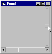
A FlatScrollBar control provides the same functionality as the standard Windows scroll bar, with the addition of an enhanced interface. The FlatScrollBar can appear in one of three ways: as the standard, three-dimensional (beveled) scroll bar; as a two-dimensional (flat) scroll bar; or, as a flat scrollbar with arrows that become beveled when the mouse pointer hovers over it.

The FlatScrollBar can serve as either a horizontal or a vertical scroll bar. The Orientation property of the control determines how the scroll bar is used.
The FlatScrollBar also gives you the ability to disable either of the scroll arrows. Scroll arrows can be disabled by default, or toggled in response to program activity. For example, you can deactivate the downward scroll arrow when the thumb reaches the bottom of the scroll bar, informing the user that she can no longer scroll down.
The Min and Max properties determine the upper and lower limits of a FlatScrollBar control; you can set these properties at either design time or at run time. At design time, change the value of either property using the property sheet. You can also right-click on the control and select Properties to invoke the Property Pages, and change the value of either property from there.
At run time, you can reset the Min and Max settings to accommodate different ranges. For example, if the size of a container changes, you can reset the Max value to reflect the container's new height or width.
The SmallChange and LargeChange properties determine how the FlatScrollBar control increments or decrements its Value property when the user clicks the control. The SmallChange property specifies how many units the thumb will move when the user presses the up or down (left or right) scroll arrows. The LargeChange property specifies how many units the thumb will move when the user clicks inside the area of the control but not on a scroll arrow or the thumb.
The FlatScrollBar control has three different interface styles. The interface used is determined by the setting of the Appearance property. Use the interface that best complements the overall look and feel of your program's user interface.
You can set the Appearance property to fsb3D to have the FlatScrollBar appear as a standard Windows scroll bar. Set it to fsbFlat to give the scroll bar a 2–D appearance. A setting of fsbTrack3D will make the scroll bar appear 2–D, but the scroll arrows and thumb will become beveled in response to the mouse pointer.
To give the user additional visual feedback when using the FlatScrollBar, you can disable scroll arrows in response to the Value of the control. This shows the user which scrolling options are available at any given time.
Arrows are specified according to their position, which changes based on the Orientation of the control. The left button of a horizontal scroll bar becomes the up button of a vertical scroll bar, and the right button becomes the down button. This relationship is reflected in the constant names used to specify the settings of the Arrows property.
Use the Arrows property to specify which of the control's scroll arrows are enabled. If you set the control to use only one arrow, the other will automatically be disabled. By default, both scroll arrows are enabled.
To disable the scroll arrows based on the control's Min and Max settings, enter the following code in the Change event of the FlatScrollBar control:
If FlatScrollBar1.Value = FlatScrollBar1.Min Then
    FlatScrollBar1.Arrows = fsbRightDown
ElseIf FlatScrollBar1.Value = FlatScrollBar1.Max Then
    FlatScrollBar1.Arrows = fsbLeftUp
Else
    FlatScrollBar1.Arrows = fsbBoth
End If