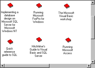
The ListView control displays data as ListItem objects. Each ListItem object can have an optional icon associated with the label of the object. The control excels at representing subsets of data (such as members of a database) or discrete objects (such as document templates).
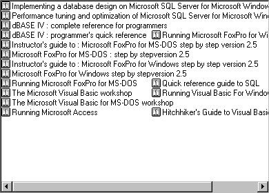
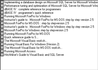
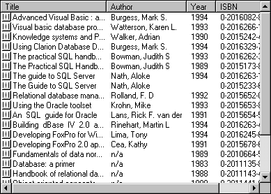
The ListView control can display data in four different view modes (as shown in the following figures). How you program the control depends on which of the different views you want the user to see (or select).
Each of these views has a particular advantage over the others. Some of these are listed in the following table:
| View | Advantage |
| Icon | Can be manipulated with the mouse, allowing the user to drag and drop the object and rearrange the objects. |
| SmallIcon | Allows more ListItem objects to be viewed. Like Icon view, objects can be rearranged by the user. |
| List | Presents a sorted view of ListItems object. |
| Report | Presents a sorted view, with SubItems allowing extra information to be displayed. |
ListView in Icon view

ListView in SmallIcon view
ListView in List view
ListView in Report view
To change the display mode, use the View property. The following code sets the View property to the Report view (3), using the intrinsic constant lvwReport:
' The name of the control is "ListView1"
ListView1.View = lvwReport
Using the View property, you can allow the end user to dynamically change the view. In the Form's Load event, the ComboBox is populated with View choices:
Private Sub Form_Load()
   ' Populate the ComboBox control. The
   ' ComboBox control is named "cmbChooseView."
   With cmbChooseView
      . AddItem "Icon"         '0
      . AddItem "Small Icon"   ' 1
      . AddItem "List"         ' 2
      . AddItem "Report"      ' 3
   End With
End Sub
In the ComboBox control's Click event, the View of the control can then be reset, as shown:
Private Sub cmbChooseView_Click()
   ' The name of the ListView control is "lvwDB."
   lvwDB.View = cmbChooseView.ListIndex
End Sub
A ListItem object consists of a label (the Text property) and an optional image which is supplied by an ImageList control. However, the ListView control, unlike other controls, can use two ImageList controls, which you set using the Icons and SmallIcons properties. Whether or not you use one or both ImageList controls depends on the intended display mode, as determined by the View property.
In the List, SmallIcon, and Report views, you can use a small icon to represent the ListItem object. One ImageList control (specified by the SmallIcons property) supplies the images for use in any of these three views. At design time or run time, set the SmallIcons property to the ImageList control that will supply these images. At design time, use the ListView control's Property Pages dialog box to set the ImageList for the SmallIcons. At run time, use the following code:
ListView1.SmallIcons = imlSmallIcons
In contrast, when the control is in Icon view, the control uses a different set of images supplied by a second ImageList control. Set the Icons property to this second ImageList control at design time using the Property Pages dialog box, or use the following code at run time:
ListView1.Icons = imlIcons
Note The size of the icons you use is determined by the ImageList control. The available sizes are 16 x 16, 32 x 32, 48 x 48, and Custom. For more information about the ImageList control, see "ImageList Control."
If you are planning to use more than one view, and you wish to display images, you must set the SmallIcon and Icon properties for each ListItem object. The following code first declares an object variable of type ListItem, then sets the object variable to a single ListItem object added to the collection using the Add method. The SmallIcon and Icon images are then set with the object variable reference:
Dim itmX as ListItem
Set itmX = ListView1.ListItems.Add()
' Assuming an image named "smallBook" exists in the
' ImageList set to the SmallIcons property.
itmX.SmallIcon = "smallBook"
' Assuming an image named "BigBook" exists in the
' ImageList that is set to the Icons property.
itmX.Icon = "BigBook"
After setting an image with the SmallIcon and Icon properties, the correct image will be displayed automatically when switching views using the View property.
A unique feature of the Report view is ColumnHeader objects. The ListView control contains a collection of ColumnHeader objects in the ColumnHeaders collection.
A ColumnHeader

The ColumnHeader object has a Text property that displays text when the control is in Report view. You can also set the Width property of each ColumnHeader, as well as the Alignment property (which sets the alignment of the text displayed in the ColumnHeader object). The following example code creates four ColumnHeader objects and sets their Text and Width properties:
Dim colX As ColumnHeader ' Declare variable.
Dim intX as Integer ' Counter variable.
For intX = 1 to 4
   Set colX = ListView1.ColumnHeaders.Add()
   colX.Text = "Field " & intX
   colX.Width = ListView1.Width / 4
Next intX
Notice that in any of the views except Report view, the ListItem object displays only one label — the Text property. But in Report view, every ListItem object can have several other text items. For example, the "Hitchhiker's Guide to Visual Basic…" also has an author ("Vaughn, William R."), year (1996), and ISBN number associated with it. Each of these text items are members of the ListSubItems collection. To create a ListSubItem object, use the Add method for the ListSubItems collection. Thus, to set the author, year and ISBN number of a ListItem object, the code might look like this:
' The control is named lvwAuthors. lvwAuthor.ListItems(23).ListSubItems.Add , , _ "Hitchhiker's Guide to Visual Basic and SQL Server" lvwAuthor.ListItems(23).ListSubItems.Add , , _ "Vaughn, William R." lvwAuthor.ListItems(23).ListSubItems.Add , , "1996" lvwAuthor.ListItems(23).ListSubItems.Add , , "1-55615-906-4"
Note The ListItems string array used in Visual Basic versions 4.0 and 5.0 has been supplanted by the ListSubItems collection.
Both the presence and number of ListSubItem objects depends on the presence and number of ColumnHeader objects. That is, you cannot create any ListSubItem objects if there are no ColumnHeader objects present. Further, the number of ColumnHeader objects determines the number of ListSubItem objects you can set for the ListItem object. And the number of ListSubItems is always one less than the number of ColumnHeader objects. This is because the first ColumnHeader object is always associated with the Text property of the ListItem object, as shown below:
First ColumnHeader and SubItems

Thus, if the number of ColumnHeader objects in the above example is 4, then the maximum possible number of members of the ListSubItems collection is 3.