
The Microsoft Tabbed Dialog control provides an easy way of presenting several dialogs or screens of information on a single form using the same interface seen in many commercial Microsoft Windows applications.
The Tabbed Dialog control provides a group of tabs, each of which acts as a container for other controls. Only one tab is active in the control at a time, displaying the controls it contains to the user while hiding the controls in the other tabs.
Figure 2.30 The Tabbed Dialog control

Before setting the number of tabs you want to add to the Tabbed Dialog control, you should first decide what your dialog box will contain and how it will be organized.
While you can set the numbers of tabs at both design time and run time, you will more than likely find that creating your tabbed dialog at design time is much quicker and easier. You can set properties at design time using the Tabbed Dialog Property Pages which is available by right-clicking the control and then selecting Properties.
Figure 2.31 Setting properties at design time
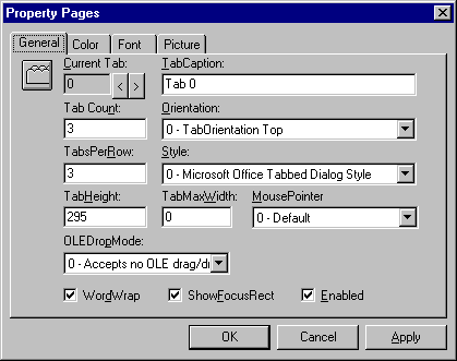
You set the Tab and TabsPerRow properties to define the number of tabs and rows in your dialog box. For example, if you want to a create a tabbed dialog that contains twelve tabs you set the Tab Count option to ‘12’ and the TabsPerRow option to ‘4’ — this creates a tabbed dialog containing three rows of four tabs each. By default, the number of tabs is set at 3.
When the number of tabs and rows has been set, each tab is indexed and can then be selected individually. For example, you can select individual tabs in the Current Tab option to change the TabCaption property. Tabs are indexed beginning at zero (0).
At run time, the user can navigate through the tabs by either clicking on them, by pressing ctrl+tab, or by using mnemonics defined in the caption of each tab. For example, if you wanted to create a tab called ‘Print’ and allow the user to access the tab with the keyboard combination alt+p, you set the TabCaption property to ‘&Print’.
Each tab in the Tabbed Dialog control is essentially a container for other controls. When you create a tabbed dialog box, you group controls together that perform similar functions, such as printing a document or setting display options for your application. Once you’ve determined how many tabs you need in your tabbed dialog box, you add whichever controls you need to perform those functions.
To add controls to individual tab pages at design time, first select the tab by clicking on it, then draw the controls on the tab page.
Note You should not add controls to individual tab pages using the double-click method. Double-clicking a control from the toolbox onto a tab page places that control on every tab in the Tabbed Dialog control.
For More Information See "Containers for Controls" in "Using Visual Basic's Standard Controls" in the Programmer’s Guide .
Depending upon the functionality of your application or a particular tabbed dialog box you create, you may want to disable some tabs in certain situations. You use the TabEnabled property to enable and disable individual tabs. When a tab is disabled, the text on the tab is grayed out and the user cannot select that tab. For example:
SSTab1.TabEnabled(2) = False
The TabEnabled property specifies the tab number, then disables it by setting the value to False.
Note Use the Enabled property to enable or disable the entire Tabbed Dialog control.
Using the Tabbed Dialog control properties, you can customize the look and functionality of your tabbed dialog box. You can set these properties at design time using the control’s Property Pages or at run time in code.
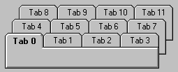
The Style property gives you two options for setting the style of your tabbed dialog box. By default, the Style property is set to display as a Microsoft Office tabbed dialog. The tabs that appear when this option is selected look like those in Microsoft Office for Microsoft Windows 3.1 applications. By default, the selected tab caption text is displayed in bold.
Figure 2.32 The Microsoft Office tabbed dialog style
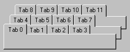
The second option available is the Windows 95 Property Pages tabbed dialog style. This tabbed dialog style conforms to the user interface standards developed for Windows 95. The selected tab caption text, unlike the Microsoft Office style, is not displayed as bold.
Figure 2.33 The Windows 95 Property Pages tabbed dialog style
To set this property at run time use the Visual Basic constants ssStyleTabbedDialog or ssStylePropertyPage to specify either style.
The TabOrientation property allows you to locate the tabs of your tabbed dialog box on either of the four sides (top, bottom, left, right). For example:
Figure 2.34 Tab orientation set to left
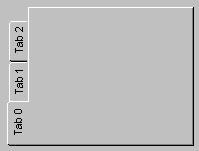
When you set the orientation of the tabs to something other than top or bottom, you must also change the font style of the tabs. Setting the tabs to left or right rotates the text vertically and only TrueType® fonts display vertically in the Tabbed Dialog control. Change the font style using the Font property or by selecting the Font tab in the control’s Property Pages. Arial is a common substitute for the Windows default sans serif font.
You can set this property at run time using the following Visual Basic constants: ssTabOrientationTop, ssTabOrientationBottom, ssTabOrientationLeft, and ssTabOrientationRight.
You can add pictures (bitmaps, icons, or metafiles) to any or all of the tabs in the Tabbed Dialog control. For example:
Figure 2.35 Adding a picture to a tab
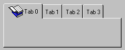
At design time, you set the Picture property for a tab by clicking that tab and then setting the property in the Properties window. At run time, you can set the Picture property using the LoadPicture function or the Picture property of another control or of a Form object.
Note When setting the Picture property at design time, the graphic is saved and loaded with the Form object containing the Tabbed Dialog control. If you create an executable file, the file contains the image. When you load a graphic at run time, the graphic isn't saved with the application.
Setting the Picture property affects the value of the TabPicture property for the current tab as well as displays the picture in the active tab.
Depending upon its size, you may need to resize the tab height to accommodate the image. Use the TabMaxHeight property to adjust the height of the tabs. The TabMaxHeight property sets the height for every tab in the control — individual tabs cannot be adjusted separately.
If you’re using the Microsoft Office style tabbed dialog, you may also need to set the TabMaxWidth property to allow both the image and the text to fit on the tab. If you’re using the Windows 95 style tabbed dialog, the TabMaxWidth property is ignored and the width of each tab adjusts to the combined width of the image and the length of the text in its caption.
When using the Microsoft Office style tabbed dialog, you may specify the exact width of the tabs using the TabMaxWidth property. Having done so, you can then allow tab captions to wrap to the next line, if necessary, by setting the WordWrap property to True. Although caption text will wrap, you are still limited by the height and width of the tabs. In other words, you may still get clipped or hidden caption text if the height and width are insufficient.
The Windows 95–style tabbed dialog sets tab width based on the length of the caption text; the TabMaxWidth and WordWrap property settings are ignored.
Once you’ve completed adding controls to each tab, you can finish designing your custom tabbed dialog box to resemble a standard tabbed dialog box. For example, if you want it to display like a standard Windows 95 Property Pages dialog box, follow these steps: