A TabStrip acts like the dividers in a notebook or the labels on a group of file folders. By using a TabStrip control, you can define multiple pages for the same area of a window or dialog box in your application.

The control consists of one or more Tab objects in a Tabs collection. At both design time and run time, you can affect the Tab object's appearance by setting properties, and at run time, by invoking methods to add and remove Tab objects.
To identify a tab's function, you can assign an image from the ImageList control to the Tab object. You must first associate an ImageList control with the TabStrip control, and this can be accomplished at either design time or run time.
To associate an ImageList control with a TabStrip control at design time:
Private Sub Form_Load()
   ' The TabStrip control is named "tabRTF," and the
   ' ImageList control is named "imlRTF."
   tabRTF.ImageList = imlRTF
End Sub
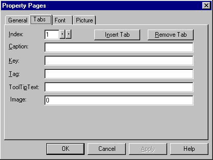
You can create Tab objects at both design and run time. To create Tab objects at design time, use the Property Pages dialog box.
To create Tab objects at design time
Figure 2.36 TabStrip Property Pages

To create Tab objects at run time, use the Add method for Tab objects.
Note One Tab object is created for you by default.
To create a collection of Tab objects at run time
The code below uses the Form object's Load event to create two Tab objects, then sets the Caption, Image, and Key properties of the new Tab object.
Private Sub Form_Load()
   ' The TabStrip control is named "tabData"
   ' Declare a variable, then use the Set
   ' statement with the Add method to create a new
   ' Tab object, while setting the object variable to
   ' the new Tab. Use the reference to set properties.
   Dim tabX As Tab
   ' Tab 1: Find text.
   Set tabX = tabData.Tabs.Add()
   tabX.Key = "find"
   tabX.Caption = "Find"
   tabX.Image = "Find" ' Assuming this image exists.

   ' Tab 2: Draw objects.
   Set tabX= tabData.Panels.Add()
   tabX.Key = "draw"
   tabX.Caption = "Draw"
   tabX.Image = "draw" ' Assuming this image exists.
End Sub
Tip Using the Add method without setting the object variable is more efficient than setting the properties with the object variable. In this case, the code above could be rewritten as:
tabData.Tabs.Add , "find", "Find", "find"
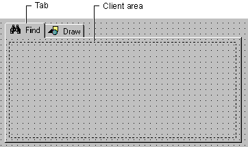
tabData.Tabs.Add , "draw", "Draw", "draw"The TabStrip control is commonly used to create tabbed dialog boxes. Each page in the dialog box consists of a tab and a client area, as seen in the figure below:

At run time, when the user clicks on a tab, you must program the client area to be reconfigured with a different set of container controls (discussed below in "Managing Tabs and Container Controls").
At design time, draw a container control, such as the PictureBox or Frame control, on the form. If you use a Frame control, you can set its BorderStyle property to be invisible at run time. Copy and paste the same control to create an array of controls; create one control for each Tab object you have created.
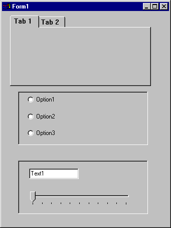
On each container control, draw the controls that should appear on a tab. Your form may appear something like Figure 2.37, below:
Figure 2.37 TabStrip at design time with two PictureBox controls

After you have created the container controls, there is one additional technique required to position them over the TabStrip control's client area: use the Move method with the ClientLeft, ClientTop, ClientWidth, and ClientHeight properties of the Tabstrip control, as shown in the code below:
Private Sub Form_Load()
   ' The name of the TabStrip is "tabRTF."
   ' The Frame control is named "fraTab."
   For i = 0 To fraTab.Count - 1
   With fraTab(i)
      .Move tabRTF.ClientLeft, _
      tabRTF.ClientTop, _
      tabRTF.ClientWidth, _
      tabRTF.ClientHeight
   End With
   Next i
End Sub
A tabbed dialog box contains more than one Tab object. As seen above, a Frame control (or other container control) should be associated with each Tab object. To efficiently manage the numerous Tab objects and container controls, the following strategy can be used:
The code to bring the proper container control to the front would then resemble the code below:
Private Sub tabRTF_Click()
   picRTF(tabRTF.SelectedItem.Index - 1).ZOrder 0
End Sub
Tip At design time, you can set the Index property of the control array to become a 1-based array. Because the Tabs collection is also a 1-based collection, the above code would then be rewritten:
picRTF(TabRTF.SelectedItem.Index).ZOrder 0
For More Information For an example of code implementing the strategy outlined above, see "TabStrip Scenario: Create a Tabbed Dialog Box."
The Style property determines whether the TabStrip control looks like
notebook tabs (Tabs),

or push buttons (Buttons).

The advantages of each are outlined below:
| Style | Possible Use |
| Tabs | Use the Tabs style to create Tabbed dialog boxes. With this style, the complete tabbed dialog, including the client area, is drawn for you. Your code must manage what appears in the client area. |
| Buttons | The Buttons style can be used to create a toolbar or task bar — in other words, when you do not need the client area, but prefer to have only the buttons as an interface element. Alternatively, you may wish to use the Buttons style when you do not need a well-defined client area drawn for you. |
Another feature of the TabStrip control is the MultiRow property. When this property is set to True, a large number of Tab objects appear in rows, as seen in the figure below:

If the MultiRow property is set to False, the same set of tabs appears in a single row, with a pair of scroll buttons at the rightmost end:

The TabWidthStyle property determines the appearance of each row, and, if TabWidthStyle is set to Fixed, you can use the TabFixedHeight and TabFixedWidth properties to set the same height and width for all tabs in the TabStrip control.