A Toolbar control contains a collection of Button objects used to create a toolbar you can associate with an application.

Typically, a toolbar contains buttons that correspond to items in an application's menu, providing a graphic interface for the user to access an application's most frequently used functions and commands. The Toolbar control can also contain other controls, such as ComboBox or TextBox controls.
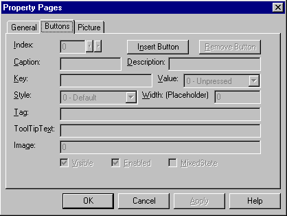
To create a toolbar, you must add Button objects to a Buttons collection; each Button object can have optional text and/or an image, supplied by an associated ImageList control. Set text with the Caption property, and an image with the Image property for each Button object. At design time, you can add Button objects to the control with the Toolbar Property Pages dialog box. At run time, you can add or remove buttons from the Buttons collection using Add and Remove methods.
To add other controls at design time, simply draw the desired controls on the toolbar. Alternatively, you can create a Button object with a Placeholder style and position the desired control over the button in a Resize event.
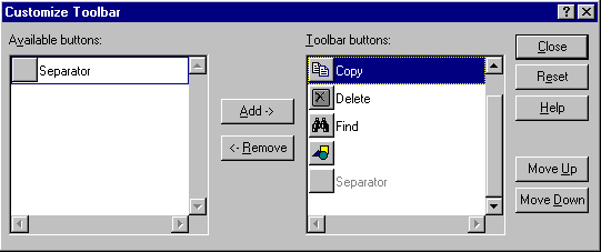
Double-clicking a toolbar at run time invokes the Customize Toolbar dialog box, which allows the user to hide, display, or rearrange toolbar buttons. To enable or disable the dialog box, set the AllowCustomize property. You can also invoke the Customize Toolbar dialog box by invoking the Customize method. If you wish to save and restore the state of a toolbar, or allow the end user to do so, use the SaveToolbar and RestoreToolbar methods.
The Toolbar control consists of one or more Button objects in a Buttons collection. At both design time and run time, you create Button objects. Each button can have an image, a caption, a ToolTip, or all three, as shown below:

Each button object also has a Style property (discussed below) that determines how the button will behave.
Toolbars usually feature icons that represent a function of the application. For example, an icon of a floppy disk is generally understood to represent a "Save File" function. To get your toolbar to display such images, you must first associate an ImageList control with the Toolbar control, and this can be accomplished at either design time or run time.
To associate an ImageList control with a Toolbar control at design time
To associate an ImageList control with the Toolbar control at run time, simply set the ImageList property to the name of the ImageList control, as shown in the example below:
Private Sub Form_Load()
   ' The Toolbar control is named "tlbTools," and the
   ' ImageList control is named "imlTools."
   tlbTools.ImageList = imlTools
End Sub
To create Button objects at design time
Figure 2.38 Toolbar control property pages

To create a collection of Button objects at run time
The code below uses the Form object's Load event to create one Button object, then sets the Key, Caption, ToolTipText, and Style properties of the new Button object.
Private Sub Form_Load()
   ' Declare a variable, then set using the Set
   ' statement with the Add method, create a new
   ' Button object, and set the object variable to
   ' the new Button. Use the reference to set
   ' properties.
   Dim myButton As Button
   Set myButton = tlbTools.Buttons.Add()
   myButton.Key = "left"
   myButton.Caption = "Align Left"
   myButton.ToolTipText = "Align Left"
   myButton.Style = tbrSeparator
End Sub
Tip Using the arguments of the Button collection's Add method is more efficient than setting the properties with the object variable. In this case, the code above could be rewritten as:
tlbTools.Buttons.Add , "left", "Align Left", _
tbrSeparator
An important property of the Button object is the Style property. The Style property determines how a button behaves — and the function assigned to the button can have a bearing on which style is applied to it. The five button styles are listed below, with their possible uses:
| Constant | Value | Possible Use |
| tbrDefault | 0 | Use the Default button style when the function it represents has no dependence on other functions. For example, a Save File operation can be performed at any time. Further, when the button is depressed, it springs back again when the function is finished. |
| tbrCheck | 1 | The Check style should be used when the function it represents is a toggle of some kind. For example, when using a RichTextBox control, selected text can be either bold or not. Thus, when the button is depressed, it stays depressed until it is pressed again. |
| tbrButtonGroup | 2 | Use the ButtonGroup style when a group of functions are mutually exclusive. That is, only one of the functions represented by the group of buttons can be on at a time. For example, text in a RichTextBox control can only be left-aligned, center-aligned, or right-aligned — it cannot be more than one style at a time. Note: although only one button at a time can be depressed, all buttons in the group can be unpressed. |
| tbrSeparator | 3 | The separator style has no function except to create a button that is eight pixels wide. Use the separator style to create a button that separates one button from another. Or use it to enclose the group of buttons with the ButtonGroup style. |
| tbrPlaceholder | 4 | The placeholder style functions as a "dummy" button: use this button to create a space on the Toolbar control where you want to have another control (such as a ComboBox or ListBox control) appear. |
You can easily place other controls, such as the ComboBox, TextBox, or OptionButton control, on the Toolbar control at design time.
To place other controls on the Toolbar control at design time
If the Wrappable property is set to True, the Toolbar control wraps automatically when the end user resizes the form. While Button objects wrap automatically, controls placed on them do not. To enable controls to wrap, first create a Button object with the Placeholder style, and draw the control in the space created by the button (as shown in the above topic). Then reposition the control over the button using the Move method in the Form object's Resize event, as shown below:
Private Sub Form_Resize()
   ' The Toolbar is named "tlbRTF"
   ' The Button object's Key is "btnFonts"
   ' The Combobox is named "cmbFonts"

   ' The ComboBox is placed over the position of the
   ' Button object using the Move method.
   With tlbRTF.Buttons("btnFonts")
      cmbFonts.Move .Left, .Top, .Width
      cmbFonts.ZOrder 0
   End With
End Sub
The ButtonClick event occurs whenever a button (except buttons with the placeholder or separator style) is clicked. You can identify the button that was clicked by its Index property or its Key property. Using either of these properties, use the Select Case statement to program the button's function, as shown in the example code below:
Private Sub tlbRTF_Click(ByVal Button As Button)
   Select Case Button.Key
   Case "OpenFile"
      ' Call a user-defined function to open a file.
      OpenFile
   Case "Bold"
      ' Call a user-defined function to bold text.
      BoldText
   Case Else
      ' Handle other cases.
   End Select
End Sub
In some cases, a function of your application may return an indeterminate state — a state that is a combination of two or more states. For example, if the user selects text in a RichTextBox, and some of the text is italicized, the button that represents italicized text cannot be either checked or unchecked; the text in the selection is both. To signify this indeterminate state, set the MixedState property to True. This dithers the image on the button to create a third state of the button's image.
A ToolTip is the text that appears above a button whenever the cursor hovers (without clicking) over a Button object.

You can add a ToolTip to any button at design time by typing the text you want to appear in the ToolTipText box of the Toolbar control's Property Pages.
At run time, you can dynamically change the ToolTip by setting the ToolTipText property for the Button object. The following code occurs in a CommandButton control that changes the Key and ToolTipText property of one button:
Private Sub cmdChangeButton_Click()
   ' The name of the toolbar is "tlbFunctions"
   ' Reset the Key and ToolTipText properties of
   ' a button with Key property value "1 funct"
   tlbfuncts.Buttons("1 funct"). _
   ToolTipText = "Function 7"

   tlbfuncts.Buttons("1 funct").Key = "7 funct"
End Sub
If you set the AllowCustomize property to True, the end user can customize the toolbar by double-clicking it. Double-clicking the toolbar displays the Customize Toolbar dialog box, shown in Figure 2.39 below:
Figure 2.39 Customize Toolbar dialog box

Alternatively, you can display the dialog box by invoking the Customize method.
If you allow your end user to reconfigure the Toolbar control, you can save and restore the toolbar by using the SaveToolbar and RestoreToolbar methods. For example, if several users use the same application but have different toolbar preferences, use the SaveToolbar method to allow each person to create a customized toolbar. Then create a login procedure that identifies each user, and uses that information to restore the user's personalized toolbar with the RestoreToolbar method.
The SaveToolbar method saves the current state of the Toolbar control to the system registry. The method requires three arguments. The first argument, key, must be an integer. The second and third arguments, subkey and value, must be strings. To store different versions of the same toolbar in the same subkey, set the value argument to a different string.
The code below uses two constants to define the first two arguments. In the Form object's Load event, the code invokes a procedure named "Login" that returns the password of the user. The code then uses that value to restore a previously stored toolbar. The command button named "cmdSaveToolbar" saves the current state using the same three values.
' Declarations: SaveToolbar method constants.
Const SaveKey = 1
Const SaveSubKey = "MyToolbar"
Dim mSaveVal As String ' Module variable that
                       ' identifies user.

Private Sub Form_Load()
   ' Run a login procedure that identifies the
   ' user. Use the user's password to identifiy the
   ' user's toolbar.
   mSaveVal = LogIn()

   ' Restore state of Toolbar1 using Constants.
   Toolbar1.RestoreToolbar SaveKey, SaveSubKey, _
   mSaveVal
End Sub

Public Function LogIn()
   ' Ask the user for a password.
   LogIn = InputBox("Password")
End Function

Private Sub cmdSaveToolbar_Click()
   ' Save the toolbar using the same constants.
   Toolbar1.SaveToolbar SaveKey, SaveSubKey, mSaveVal
End Sub