In an ideal world, software and hardware would always work flawlessly, and users would never make mistakes. Reality dictates that mistakes can and will happen. A part of user interface design involves deciding how the application will respond when things go wrong.
A common response is to display a dialog box, asking for user input as to how the application should deal with the problem. A less common (but preferable) response would be to simply resolve the problem without bothering the user. After all, the user is primarily concerned with performing a task, not with technical details. In designing your user interface, think about the potential errors and determine which ones require user interaction and which ones can be resolved programmatically.
Occasionally an error occurs in your application and it's necessary to make a decision in order to resolve the situation. This usually occurs as a branch in your code — an If…Then statement or a Case statement. If the decision requires user interaction, the question is usually posed to the user with a dialog box. Dialog boxes are a part of your user interface, and like the other parts of the interface, their design plays a role in the usability of your application.
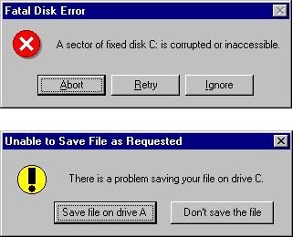
Sometimes it seems as if many dialog boxes were designed by programmers who have never had an intelligent conversation with another human being. A message such as "A sector of fixed disk C: is corrupted or inaccessible. Abort, Retry, Ignore?" (see Figure 6.22) has little meaning to the average user. It's kind of like a waitress asking you "We're out of soup or the kitchen is on fire. Abort, Retry, Ignore?" How would you answer? It's important to phrase questions (and choices) in a manner that the user can understand. In the prior example, a better message might be "There is a problem saving your file on drive C. Save file on drive A, Don't save the file?"
Figure 6.22 Which dialog box presents the clearest message?

When creating dialog boxes for your application, keep the user in mind. Does the message convey useful information to the user? Is it easily understandable? Do the command buttons present clear choices? Are the choices appropriate for the given situation? Keep in mind that it only takes one annoying message box to give a user a bad impression of your application.
If you're designing your own custom dialog forms, try to stick to a standard style. If you vary too far from the standard message box layout, users may not recognize it as a dialog box.
For More Information To learn more about dialogs, see "Dialog Boxes" earlier in this chapter.
It isn't always necessary to interrupt the user when an error occurs. Sometimes it's preferable to handle the error in code without notifying the user, or to warn the user in a way that doesn't stop their work flow. A good example of this technique is the AutoCorrect feature in Microsoft Word: if a common word is mistyped, Word fixes it automatically; if a less common word is misspelled, it is underlined in red so the user can correct it later.
There are a number of techniques that you can use; it's up to you to decide which techniques are appropriate for your own application. Here are a few suggestions:
For More Information To learn more about error handling techniques, see "Debugging Your Code and Handling Errors."