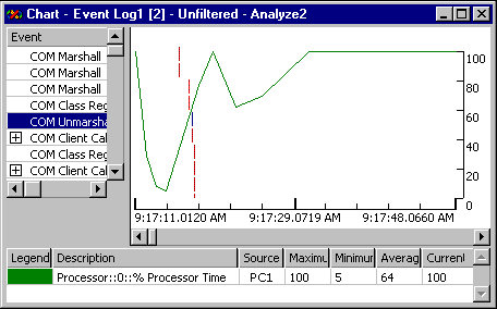
Use the Chart View when you want to understand an application's performance. The Chart View presents application performance data using a tree view of request-response pairs (for example, function call and return) and an associated Gantt chart that shows each pair's timing. Use the separator to resize. Each node visible in the tree has a corresponding Gantt entry. As new data that meets the filter criteria arrives, it is added to the view.
You can play back the events shown in the view. You can use standard VCR-like buttons to navigate forward or backward through events. You can also skip events until a different component is involved — this choice omits back-and-forth messages between the same two components.
The event playback is animated. You can adjust the animation's speed, and that speed is remembered.
When you select an event, the event, its parent events, and all its child events are selected. If you want to select a group of events for a particular time range, you can click and drag the mouse in the Gantt chart portion of the view. If necessary, you can refine the display by zooming.
The following picture shows what the Chart View looks like.

You can augment the Chart View by adding or removing application performance data and Windows NT® Performance Monitor data. This information is overlaid on the Chart view. You can use this overlaid view to see whether lengthy times for request-response pairs correspond to high values in processor usage or other dynamic event data.
Performance Monitor data is plotted on a line chart. To add Performance Monitor data, you add a line graph for the counter in which you are interested to the Chart View. See Adding and Removing Line Graphs in the Chart View for step-by-step procedures.
When you add a new event type, or as new data arrives, the new data is added to the graph. This means that the viewer scales data so that it can be added, because multiple data items are plotted at the same time. Within the graph, the X-axis represents time and the Y-axis represents the scaled values associated with events. Whenever a new line is added to the graph, an entry is added to the legend at the bottom of the tool window.
When you add a line graph for a particular Performance Monitor counter, the counters are graphed differently depending on the units of the data in the counter. Performance Monitor data can be in any of the following units:
Data expressed as a percentage is always graphed such that the minimum value is 0 and the maximum value is 100.
Data expressed as raw numbers or as rates is graphed such that the minimum value is mapped to the bottom of the chart (0 on the right), the maximum data value is mapped to the top of the chart (100 on the right), and values between the minimum and maximum are mapped proportionately into the 0 - 100 range. This means that the percentage a data value is between the minimum and maximum is graphed.
For example, suppose a data series consisted of the following numbers: 10, 15, 20, and 15. In the chart, a line would be graphed from the bottom (10) to the middle (first 15), to the top (20), and back to the middle (last 15). The corresponding percentages would be 0%, 50%, 100%, and 50%.
The best way to think of the lines in a line graph is that they show the relationship between the data at given times. The data value can be steady, rising, or falling. Graphing the lines this way makes it easy to see a trend.
Adds a line chart showing dynamic event data. The line chart is overlaid on the Chart View. You can use an overlaid line chart to correlate Visual Studio Analyzer events to system information, such as processor usage.
Controls whether the view is linked to the current autofilter, so that when you change the filter, the changes are immediately reflected in the view and in all other views that are linked to the current autofilter.
Controls whether the view changes during playback to highlight each event as it occurs.
Controls whether the view is linked to other open views, so that when you select an event in any open view, that event is also selected in every other open view.
Clears the currently applied filter from the view. If the filter is linked to other open views through AutoFilter, the filter will clear from those views as well.
Adjusts the amount of data shown in the Chart View so that a greater or lesser time range is shown.
Sizes the selected view to fit within the window.