Buttons are controls that start actions or change properties. There are three basic types of buttons: command buttons, option buttons, and check boxes.
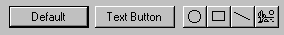
A command button, also referred to as a push button, is a control, commonly rectangular in shape, that includes a label (text, graphic, or sometimes both), as shown in Figure 7.7.
Figure 7.7 Command buttons
When the user chooses a command button with mouse button 1 (for pens, tapping), the command associated with the button is carried out. When the user presses the mouse button, the input focus moves to the button, and the button state changes to its pressed appearance. If the user moves the pointer off the command button while the mouse button remains pressed, the button returns to its original state. Moving the pointer back over the button while pressing the mouse button returns the button to its pressed state.
When the user releases the mouse button with the pointer on the command button, the command associated with the control starts. If the pointer is not on the control when the user releases the mouse button, no action occurs.
You can define access keys and shortcut keys for command buttons. In addition, you can use the TAB key and arrow keys to support user navigation to or between command buttons. The SPACEBAR activates a command button if the user moves the input focus to the button.
Note 
For more information about navigation and activation of controls, see Chapter 8, "Secondary Windows."
The effect of choosing a button is immediate with respect to its context. For example, in toolbars, clicking a button carries out the associated action. In a secondary window, such as a dialog box, activating a button may initiate a transaction within the window, or apply a transaction and close the window.
The command button's label represents the action the button starts. When using a text label, the text should follow the same capitalization conventions defined for menus. If the control is disabled, display the label of the button as unavailable.
Include an ellipsis (...) as a visual cue for buttons associated with commands that require additional information. Like menu items, the use of an ellipsis indicates that further information is needed, not simply that a window will appear. Some buttons, when clicked, can display a message box, but this does not imply that the command button's label should include an ellipsis.
You can use command buttons to enlarge a secondary window and display additional options, also known as an unfold button. An unfold button is not really a different type of control, but the use of a command button for this specific function. When using a command button for this purpose, include a pair of "greater than" (>>) characters as part of the button's label.
In some cases, a command button can represent an object and its default action. For example, the taskbar buttons represent an object's primary window and the Restore command. When the user clicks on the button with mouse button 1, the default command of the object is carried out. Clicking on a button with mouse button 2 displays a pop-up menu for the object the button represents.
You can also use command buttons to reflect a mode or property value similar to the use of option buttons or check boxes. While the typical interaction for a command button is to return to its normal "up" state, if you use it to represent a state, display the button in the option-set appearance, as shown in Table 7.4.
Note
For more information about the appearance of different states of buttons, see Chapter 13, "Visual Design."
Table 7.4 Command Button Appearance
|
Appearance |
Button state |
|
|
Normal appearance |
|
|
Pressed appearance |
|
|
Option-set appearance |
|
|
Unavailable appearance |
|
|
Option-set, unavailable appearance |
|
|
Mixed-value appearance |
|
|
Input focus appearance |
You can also use command buttons to set tool modes for example, in drawing or forms design programs for drawing out specific shapes or controls. In this case, design the button labels to reflect the tool's use. When the user chooses the tool (that is, clicks the button), display the button using the option-set appearance and change the pointer to indicate the change of the mode of interaction.
You can also use a command button to display a pop-up menu. This convention is known as a menu button. While this is not a specific control provided by the system, you can create this interface using the standard components.
A menu button looks just like a standard command button, except that, as a part of its label, it includes a triangular arrow similar to the one found in cascading menu titles, as shown in Figure 7.8.
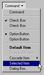
Figure 7.8 A menu button
A menu button supports the same type of interaction as a drop-down menu; the menu is displayed when the button is pressed and allows the user to drag into the menu from the button and make menu selections. Like any other menu, use highlighting to track the movement of the pointer.
Similarly, when the user clicks a menu button, the menu is displayed. At this point, interaction with the menu is the same as with any menu. For example, clicking a menu item carries out the associated command. Clicking outside the menu or on the menu button removes the menu.
When pressed, display the menu button with the pressed appearance. When the user releases the mouse button and the menu is displayed, use the option-set appearance. Otherwise, the menu button's appearance is the same as a typical command button. For example, if the button is disabled, display the button using the unavailable appearance.
An option button, also referred to as a radio button, represents a single choice within a limited set of mutually exclusive choices that is, in any group of option buttons, only one option in the group can be set. Accordingly, always group option buttons in sets of two or more, as shown in Figure 7.9.
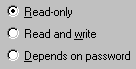
Figure 7.9 A set of option buttons
Option buttons appear as a set of small circles. When an option button choice is set, a dot appears in the middle of the circle. When the choice is not the current setting, the circle is empty. Avoid using option buttons to start an action other than the setting of a particular option or value represented by the option button. The only exception is that you can support double-clicking the option button as a shortcut for setting the value and carrying out the default command of the window in which the option buttons appear, if choosing an option button is the primary user action for the window.
You can use option buttons to represent a set of choices for a particular property. When the option buttons reflect a selection with mixed values for that property, display all the buttons in the group using the mixed-value appearance to indicate that multiple values exist for that property. The mixed-value appearance for a group of option buttons displays all buttons without a setting dot, as shown in Figure 7.10.

Figure 7.10 Option buttons with mixed-value appearance
If the user chooses any option button in a group with mixed-value appearance, that value becomes the setting for the group; the dot appears in that button and all the other buttons in the group remain empty.
Limit the use of option buttons to small sets of options, typically seven or less, but always at least two. If you need more choices, consider using another control, such as a single selection list box or drop-down list box.
Each option button includes a text label. (If you need graphic labels for a group of exclusive choices, consider using command buttons instead.) The standard control allows you to include multiple line labels. When implementing multiple line labels, use top alignment, unless the context requires an alternate orientation.
Define the option button's label to represent the value or effect for that choice. Also use the label to indicate when the choice is unavailable. Use sentence capitalization for an option button's label; only capitalize the first letter of the first word, unless it is a word in the label normally capitalized.
Note
For more information about labeling or appearance states, see Chapter 13, "Visual Design."
Because option buttons appear as a group, you can use a group box control to visually define the group. You can label the option buttons to be relative to a group box's label. For example, for a group box labeled Alignment, you can label the option buttons as Left, Right, and Center.
As with command buttons, the mouse interface for choosing an option button uses a click with mouse button 1 (for pens, tapping) either on the button's circle or on the button's label. The input focus is moved to the option button's label when the user presses the mouse button, and the option button displays its pressed appearance. If the user moves the pointer off the option button before releasing the mouse button, the option button is returned to its original state. The option is not set until the user releases the mouse button while the pointer is over the control. Releasing the mouse button outside of the option button or its label has no effect on the current setting of the option button. In addition, successive mouse clicks on the same option button do not toggle the button's state; the user needs to explicitly select an alternative choice in the group to change or restore a former choice.
Assign access keys to option button labels to provide a keyboard interface to the buttons. You can also define the TAB or arrow keys to allow the user to navigate and choose a button. Access keys or arrow keys automatically set an option button and set the input focus to that button.
Note
For more information about the guidelines for defining access keys, see Chapter 4, "Input Basics." For more information about navigation
and interaction
with option buttons, see Chapter 8, "Secondary Windows."
Like option buttons, check boxes support options that are either on or off; check boxes differ from option buttons in that you typically use check boxes for independent or nonexclusive choices. As in the case of independent settings in menus, use check boxes only when both states of the choice are clearly opposite and unambiguous. If this is not the case, then use option buttons or some other form of single selection choice control instead.
A check box appears as a square box with an accompanying label. When the choice is set, a check mark appears in the box. When the choice is not set, the check box is empty, as shown in Figure 7.11.
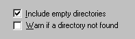
Figure 7.11 A set of check boxes
A check box's label is typically displayed as text and the standard control includes a label. (Use a command button instead of a check box when you need a nonexclusive choice with a graphic label.) Use a single line of text for the label as this makes the label easier to read. However, if you do use multiple lines, use top alignment, unless the context requires a different orientation.
Define a check box's label to appropriately express the value or effect of the choice. Use sentence capitalization for multiple word labels. The label also serves as an indication of when the control is unavailable.
Group related check box choices. If you group check boxes, it does not prevent the user from setting the check boxes on or off in any combination. While each check box's setting is typically independent of the others, you can use a check box's setting to affect other controls. For example, you can use the state of a check box to filter the content of a list. If you have a large number of choices or if the number of choices varies, use a multiple selection list box instead of check boxes.
When the user clicks a check box with mouse button 1 (for pens, tapping) either on the check box square or on the check box's label, that button is chosen and its state is toggled. When the user presses the mouse button, the input focus moves to the control and the check box assumes its pressed appearance. Like option buttons and other controls, if the user moves the pointer off the control while holding down the mouse button, the control's appearance returns to its original state. The setting state of the check box does not change until the mouse button is released. To change the control's setting, the pointer must be over the check box or its label when the user releases the mouse button.
Define access keys for check box labels to provide a keyboard interface for navigating to and choosing a check box. In addition, the TAB key and arrow keys can also be supported to provide user navigation to or between check boxes. In a dialog box, for example, the SPACEBAR toggles a check box when the input focus is on the check box.
Note
For more information about guidelines for defining access keys, see Chapter 4, "Input Basics." For more information about navigation and supporting interaction for controls with the keyboard, see Chapter 8, "Secondary Windows."
If you use a check box to display the value for the property of a multiple selection whose values for that property differ (for example, for a text selection that is partly bold), display the check box in its mixed-value appearance, as shown in Figure 7.12.
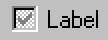
Figure 7.12 A mixed-value check box (magnified)
If the user chooses a check box in the mixed-value state, the associated value is set and a check mark is placed in it. This implies that the property of all elements in the multiple selection will be set to this value when it is applied. If the user chooses the check box again, the setting to be unchecked is toggled. If applied to the selection, the value will not be set. If the user chooses the check box a third time, the value is toggled back to the mixed-value state. When the user applies the value, all elements in the selection retain their original value. This three-state toggling occurs only when the control represents a mixed set of values.


