List Boxes
A list box is a convenient, preconstructed control for displaying a list of choices for the user. The choices can be text, color, icons, or other graphics. The purpose of a list box is to display a collection of items and, in most cases, support selection of a choice of an item or items in the list.
List boxes are best for displaying large numbers of choices that vary in number or content. If a particular choice is not available, omit the choice from the list. For example, if a point size is not available for the currently selected font, do not display that size in the list.
Order entries in a list using the most appropriate choice to represent the content in the list and to facilitate easy user browsing. For example, alphabetize a list of names, but put a list of dates in chronological order. If there is no natural or logical ordering for the content, use ascending or alphabetical ordering for example, 09 or AZ.
List box controls do not include their own labels. However, you can include a label using a static text field; the label enables you to provide a descriptive reference for the control and keyboard access to the control. Use sentence capitalization for multiple word labels and make certain that your support for keyboard access moves the input focus to the list box and not the static text field label.
Note 
For more information about navigation to controls in a secondary window, see Chapter 8, "Secondary Windows." For more information about defining access keys for control labels, see Chapter 4, "Input Basics." For more information about static text fields, see "Static Text Fields" later in this chapter.
When a list box is disabled, display its label using an unavailable appearance. If possible, display all of the entries in the list as unavailable to avoid confusing the user as to whether the control is enabled or not.
The width of the list box should be sufficient to display the average width of an entry in the list. If that is not practical because of space or the variability of what the list might include, consider one or more of the following options:
- Make the list box wide enough to allow the entries in the list to be sufficiently distinguished.
- Use an ellipsis (...) in the middle or at the end of long text entries to shorten them, while preserving the important characteristics needed to distinguish them. For example, for long paths, usually the beginning and end of the path are the most critical; you can use an ellipsis to shorten the entire name: \S ample\...\Example.
- Include a horizontal scroll bar. However, this option reduces some usability, because adding the scroll bar reduces the number of entries the user can view at one time. In addition, if most entries in the list box do not need to be horizontally scrolled, including a horizontal scroll bar accommodates the infrequent case.
When the user clicks an item in a list box, it becomes selected. Support for multiple selection depends on the type of list box you use. List boxes also include scroll bars when the number of items in the list exceeds the visible area of the control.
Arrow keys also provide support for selection and scrolling a list box. In addition, list boxes include support for keyboard selection using text keys. When the user presses a text key, the list navigates and selects the matching item in the list, scrolling the list if necessary to keep the user's selection visible. Subsequent key presses continue the matching process. Some list boxes support sequential matches based on timing; each time the user presses a key, the control matches the next character in a word if the user presses the key within the system's time-out setting. If the time-out elapses, the control is reset to matching based on the first character. Other list box controls, such as combo boxes and drop-down combo boxes, do sequential character matching based on the characters typed into the text box component of the control. These controls may be preferable because they do not require the user to master the timing sequence. However, they do take up more space and potentially allow the user to type in entries that do not exist in the list box.
When the list is scrolled to the beginning or end of data, disable the corresponding scroll bar arrow button. If all items in the list are visible, disable both scroll arrows. If the list box never includes more items that can be shown in the list box, so that the user will not need to scroll the list, you may remove the scroll bar.
When incorporating a list box into a window's design, consider supporting both command (Cut, Copy, and Paste) and direct manipulation (drag and drop) transfers for the list box. For example, if the list displays icons or values that the user can move or copy to other locations, such as another list box, support transfer operations for the list. The list view control automatically supports this; however, the system provides support for you to enable this for other list boxes as well.
Note 
For more information about disabling scroll bar arrows, see Chapter 6, "Windows."
List boxes can be classified by how they display a list and by the type of selection they support.
Single Selection List Boxes
A single selection list box is designed for the selection of only one item in a list. Therefore, the control provides a mutually exclusive operation similar to a group of option buttons, except that a list box can more efficiently handle a large number of items.
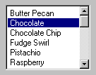
Define a single selection list box to be tall enough to show at least three to eight choices, as shown in Figure 7.13 depending on the design constraints of where the list box is used. Always include a vertical scroll bar. If all the items in the list are visible, then follow the window scroll bar guidelines for disabling the scroll arrows and enlarging the scroll box to fill the scroll bar shaft.

Figure 7.13 A single selection list box
The currently selected item in a single selection list box is highlighted using selection appearance.
The user can select an entry in a single selection list box by clicking on it with mouse button 1 (for pens, tapping). This also sets the input focus on that item in the list. Because this type of list box supports only single selection, when the user chooses another entry any other selected item in the list becomes unselected. The scroll bar in the list box allows the mouse user to scroll through the list of entries, following the interaction defined for scroll bars.
Note 
For more information about the interaction techniques of scroll bars, see Chapter 6, "Windows."
The keyboard interface uses navigation keys, such as the arrow keys, HOME, END, PAGE UP, and PAGE DOWN. It also uses text keys, with matches based on timing; for example, when the user presses a text key, an entry matching that character scrolls to the top of the list and becomes selected. These keys not only navigate to an entry in the list, but also select it. If no item in the list is currently selected, when the user chooses a list navigation key, the first item in the list that corresponds to that key is selected. For example, if the user presses the DOWN ARROW key, the first entry in the list is selected, instead of navigating to the second item in the list.
If the choices in the list box represent values for the property of a selection, then make the current value visible and highlighted when displaying the list. If the list box reflects mixed values for a multiple selection, then no entry in the list should be selected.
Drop-down List Boxes
Like a single selection list box, a drop-down list box provides for the selection of a single item from a list of items; the difference is that the list is displayed upon demand. In its closed state, the control displays the current value for the control. The user opens the list to change the value.
Figure 7.14 shows the drop-down list box in its closed and opened state.

Figure 7.14 A drop-down list box (closed and opened state)
While drop-down list boxes are an effective way to conserve space and reduce clutter, they require more user interaction for browsing and selecting an item than a single selection list box.
Make the width of a closed drop-down list box a few spaces larger than the average width of the items in its list. The open list component of the control should be tall enough to show three to eight items, following the same conventions of a single selection list box. The width of the list should be wide enough not only to display the choices in the list, but also to allow the user to drag directly into the list.
The interface for drop-down list boxes is similar to that for menus. For example, the user can press the mouse button on the current setting portion of the control or on the control's menu button to display the list. Choosing an item in the list automatically closes the list.
If the user navigates to the control using an access key, the TAB key or arrow keys, an UP ARROW or DOWN ARROW, or ALT+UP ARROW or ALT+DOWN ARROW displays the list. Arrow keys or text keys navigate and select items in the list. If the user presses ALT+UP ARROW, ALT+DOWN ARROW, a navigation key, or an access key to move to another control, the list automatically closes. When the list is closed, preserve any selection made while the list was open. The ESC key also closes the list.
If the choices in a drop-down list represent values for the property of a multiple selection and the values for that property are mixed, then display no value in the current setting component of the control.
Extended and Multiple Selection List Boxes
Although most list boxes are single selection lists, some contexts require the user to choose more than one item. Extended selection list boxes and multiple selection list boxes support this functionality.
Extended and multiple selection list boxes follow the same conventions for height and width as single selection list boxes. The height should display no less than three items and generally no more than eight, unless the size of the list varies with the size of the window. Base the width of the box on the average width of the entries in the list.
Extended selection list boxes support conventional navigation, and contiguous and disjoint selection techniques. That is, extended selection list boxes are optimized for selecting a single item or a single range, while still providing for disjoint selections.
Note 
For more information about contiguous and disjoint selection techniques, see Chapter 5, "General Interaction Techniques."
When you want to support user selection of several disjoint entries from a list, but an extended selection list box is too cumbersome, you can define a multiple selection list box. Whereas extended selection list boxes are optimized for individual item or range selection, multiple selection list boxes are optimized for independent selection. However, because simple multiple selection list boxes are not visually distinct from extended selection list boxes, consider designing them to appear similar to a scrollable list of check boxes, as shown in Figure 7.15. This requires providing your own graphics for the items in the list (using the owner-drawn list box style). This appearance helps the user to distinguish the difference in the interface of the list box with a familiar convention. It also serves to differentiate keyboard navigation from the state of a choice. Because the check box controls are nested, you use the flat appearance style for the check boxes. You may also create this kind of a list box using a list view control.
Note 
For more information about the flat appearance style for controls in a list box, see Chapter 13, "Visual Design."

Figure 7.15 A multiple selection list box
List View Controls
A list view control is a special extended selection list box that displays a collection of items, each item consisting of an icon and a label. List view controls can display content in four different views.
|
View |
Description |
|
Icon |
Each item appears as a full-sized icon with a label below it. The user can drag the icons to any location within the view. |
|
Small Icon |
Each item appears as a small icon with its label to the right. The user can drag the icons to any location within the view. |
|
List |
Each item appears as a small icon with its label to the right. The icons appear in a columnar, sorted layout. |
|
Report |
Each item appears as a line in a multicolumn format with the leftmost column including the icon and its label. The subsequent columns contain information supplied by the application displaying the list view control. |
The control also supports options for alignment of icons, selection of icons, sorting of icons, and editing of the icon's labels. It also supports drag and drop interaction.
Use this control where the representation of objects as icons is appropriate. In addition, provide pop-up menus on the icons displayed in the views. This provides a consistent paradigm for how the user interacts with icons elsewhere in the Windows interface.
Selection and navigation in this control work similarly to that in folder windows. For example, clicking on an icon selects it. After selecting the icon, the user can use extended selection techniques, including region selection, for contiguous or disjoint selections. Arrow keys and text keys (time-out based matching) support keyboard navigation and selection.
As an option, the standard control also supports the display of graphics that can be used to represent state information. For example, you can use this functionality to include check boxes next to items in a list.
Tree View Controls
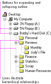
A tree view control is a special list box control that displays a set of objects as an indented outline based on their logical hierarchical relationship. The control includes buttons that allow the outline to be expanded and collapsed, as shown in Figure 7.16. You can use a tree view control to display the relationship between a set of containers or other hierarchical elements.

Figure 7.16 A tree view control
You can optionally include icons with the text label of each item in the tree. Different icons can be displayed when the user expands or collapses the item in the tree. In addition, you can also include a graphic, such as a check box, that can be used to reflect state information about the item.
The control also supports drawing lines that define the hierarchical relationship of the items in the list and buttons for expanding and collapsing the outline. It is best to include these features (even though they are optional) because they make it easier for the user to interpret the outline.
Arrow keys provide keyboard support for navigation through the control; the user presses UP ARROW and DOWN ARROW to move between items and LEFT ARROW and RIGHT ARROW to move along a particular branch of the outline. Pressing RIGHT ARROW can also expand the outline at a branch if it is not currently displayed. Text keys can also be used to navigate and select items in the list, using the matching technique based on timing.
When you use this control in a dialog box, if you use the ENTER key or use double-clicking to carry out the default command for an item in the list, make certain that the default command button in your dialog box matches. For example, if you use double-clicking an entry in the outline to display the item's properties, then define a Properties button to be the default command button in the dialogbox when the tree view control has the input focus.


