
For more information about static text fields, see "Static Text Fields" later in this chapter.
Windows includes a number of controls that facilitate the display, entry, or editing of a text value. Some of these controls combine a basic text-entry field with other types of controls.
Text fields do not include labels as a part of the control. However, you can add one using a static text field. Including a label helps identify the purpose of a text field and provides a means of indicating when the field is disabled. Use sentence capitalization for multiple word labels. You can also define access keys for the text label to provide keyboard access to the text field. When using a static text label, define keyboard access to move the input focus to the text field with which the label is associated rather than the static text field itself. You can also support keyboard navigation to text fields by using the TAB key (and, optionally, arrow keys).
Note
For more information about static text fields, see "Static Text Fields" later in this chapter.
When using a text field for input of a restricted set of possible values, for example, a field where only numbers are appropriate, validate user input immediately, either by ignoring inappropriate characters or by providing feedback indicating that the value is invalid or both.
Note
For more information about validation of input, see Chapter 8, "Secondary Windows."
A text box (also referred to as an edit control) is a rectangular control where the user enters or edits text, as shown in Figure 7.17. It can be defined to support a single line or multiple lines of text. The outline border of the control is optional, although the border is typically included when displaying the control in a toolbar or a secondary window.
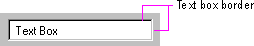
Figure 7.17 A standard text box
The standard text box control provides basic text input and editing support. Editing includes the insertion or deletion of characters and the option of text wrapping. Although individual font or paragraph properties are not supported, the entire control can support a specific font setting.
You can also use text boxes to display read-only text that is not editable, but still selectable. When setting this option with the standard control, the system automatically changes the background color of the field to indicate to the user the difference in behavior.
A text box supports standard interactive techniques for navigation and contiguous selection. Horizontal scrolling is available for single line text boxes, and horizontal and vertical scroll bars are supported for multiple line text boxes.
You can limit the number of characters accepted as input for a text box to whatever is appropriate for the context. In addition, you can support auto-exit for text boxes defined for fixed-length input; that is, as soon as the last character is typed in the text box, the focus moves to the next control. For example, you can define a five-character auto-exit text box to facilitate the entry of zip code, or three two-character auto-exit text boxes to support the entry of a date. Use auto-exit text boxes sparingly; the automatic shift of focus can surprise the user. They are best limited to situations involving extensive data entry.
A rich-text box, as shown in Figure 7.18, provides the same basic text editing support as a standard text box. In addition, a rich-text box supports font properties, such as typeface, size, color, bold, and italic format, for each character and paragraph format property, such as alignment, tabs, indents, and numbering. The control also supports printing of its content and embedding of OLE objects.
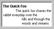
Figure 7.18 A rich-text box
A combo box is a control that combines a text box with a list box, as shown in Figure 7.19. This allows the user to type in an entry or choose one from the list.
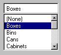
Figure 7.19 A combo box
The text box and its associated list box have a dependent relationship. As text is typed into the text box, the list scrolls to the nearest match. In addition, when the user selects an item in the list box, it automatically uses that entry to replace the content of the text box and selects the text.
The interface for the control follows the conventions supported for each component, except that the UP ARROW and DOWN ARROW keys move only in the list box. LEFT ARROW and RIGHT ARROW keys operate solely in the text box.
A drop-down combo box, as shown in Figure 7.20, combines the characteristics of a text box with a drop-down list box. A drop-down combo box is more compact than a regular combo box; it can be used to conserve space, but requires additional user interaction required to display the list.
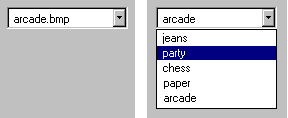
Figure 7.20 A drop-down combo box (closed and opened state)
The closed state of a drop-down combo box is similar to that of a drop-down list, except that the text box is interactive. When the user clicks the control's menu button the list is opened. Clicking the menu button a second time, choosing an item in the list, or clicking another control closes the list.
Provide a static text field label for the control and assign an access key. Use the access key so the user can navigate to the control. You can also support the TAB key or arrow keys for navigation to the control. When the control has the input focus, when the user presses the UP ARROW or DOWN ARROW or ALT+UP ARROW or ALT+DOWN ARROW key, the list is displayed.
When the control has the input focus, pressing a navigation key, such as the TAB key, or an access key or ALT+UP ARROW or ALT+DOWN ARROW to navigate to another control closes the list. When the list is closed, preserve any selection made while the list was open, unless the user presses a Cancel command button. The ESC key also closes the list.
When the list is displayed, the interdependent relationship between the text box and list is the same as it is for standard combo boxes when the user types text into the text box. When the user chooses an item in the list, the interaction is the same as for drop-down lists the selected item becomes the entry in the text box.
Spin boxes are text boxes that accept a limited set of discrete ordered input values that make up a circular loop. A spin box is a combination of a text box and a special control that incorporates a pair of buttons (also known as an up-down control), as shown in Figure 7.21.
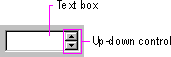
Figure 7.21 A spin box
When the user clicks on the text box or the buttons, the input focus is set to the text box component of the control. The user can type a text value directly into the control or use the buttons to increment or decrement the value. The unit of change depends on what you define the control to represent.
Use caution when using the control in situations where the meaning of the buttons may be ambiguous. For example, with numeric values, such as dates, it may not be clear whether the top button increments the date or changes to the previous date. Define the top button to increase the value by one unit and the bottom button to decrease the value by one unit. Typically, wrap around at either end of the set of values. You may need to provide some additional information to communicate how the buttons apply.
By including a static text field as a label for the spin box and defining an associated access key, you can provide direct keyboard access to the control. You can also support keyboard access using the TAB key (or, optionally, arrow keys). Once the control has the input focus, the user can change the value by pressing UP ARROW or DOWN ARROW.
You can also use a single set of spin box buttons to edit a sequence of related text boxes, for example, time as expressed in hours, minutes, and seconds. The buttons affect only the text box that currently has the input focus.
You can use static text fields to present read-only text information. Unlike read-only text box controls, the text is not selectable. However, your application can still alter read-only static text to reflect a change in state. For example, you can use static text to display the current directory path or the status information, such as page number, key states, or time and date. Figure 7.22 illustrates a static text field.
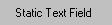
Figure 7.22 A static text field
You can also use static text fields to provide labels or descriptive information for other controls. Using static text fields as labels for other controls allows you to provide access-key activation for the control with which it is associated. Make certain that the input focus moves to its associated control and not to the static field. Also remember to include a colon at the end of the text. Not only does this help communicate that the text represents the label for a control, it is also used by screen review utilities.
Note
For more information about the layout of static text fields, see Chapter 13, "Visual Design." For information about the use of static text fields as labels and screen review utilities, see Chapter 14, "Special Design Considerations."
A shortcut key input control (also known as a hot key control) is a special kind of text box to support user input of a key or key combination to define a shortcut key assignment. Use it when you provide an interface for the user to customize shortcut keys supported by your application. Because shortcut keys carry out a command directly, they provide a more efficient interface for common or frequently used actions.
Note
For more information about the use of shortcut keys, see Chapter 4, "Input Basics."
The control allows you to define invalid keys or key combinations to ensure valid user input; the control will only access valid keys. You also supply a default modifier to use when the user enters an invalid key. The control displays the valid key or key combination including any modifier keys.
When the user clicks a shortcut key input control, the input focus is set to the control. Like most text boxes, the control does not include its own label, so use a static text field to provide a label and assign an appropriate access key. You can also support the TAB key to provide keyboard access to the control.