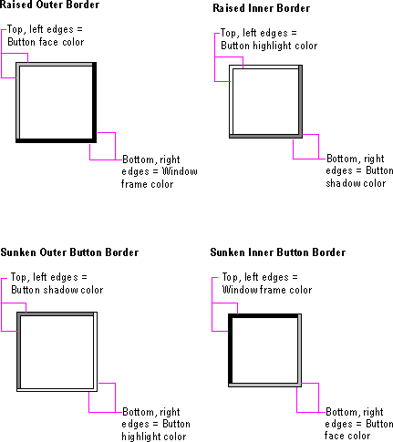
Windows provides a unified visual design for building visual components based on the border styles shown in Figure 13.2.
The basic border styles are based on standard system color settings.

Figure 13.2 Basic border styles
|
Border style |
Description |
|
Raised outer border |
Uses a single-pixel width line in the button face color for its top and left edges and the window frame color for its bottom and right edges. |
|
Raised inner border |
Uses a single-pixel width line in the button highlight color for its top and left edges and the button shadow color for its bottom and right edges. |
|
Sunken outer border |
Uses a single-pixel width line in the button shadow color for its top and left border and the button highlight color for its bottom and right edges. |
|
Sunken inner border |
Uses a single-pixel width line in the window frame color for its top and left edges and the button face color for its bottom and right edges. |
Note 
The DrawEdge function automatically provides these border styles using the correct color settings. For more information about this function, see the documentation included in the Microsoft Win32 Software Development Kit (SDK).
If you use standard Windows controls and windows, these border styles are automatically supplied for your application. If you create your own controls, your application should map the colors of those controls to the appropriate system colors so that the controls fit in the overall design of the interface when the user changes the basic system colors.