Font and Size
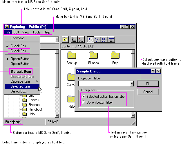
The default system font is a key metric in the presentation of visual information. The default font used for interface elements in Windows (U.S. release) is MS® Sans Serif for 8-point. Menu bar titles, menu items, control labels, and other interface text all use 8-point MS Sans Serif. Title bar text also uses the 8-point MS Sans Serif bold font, as shown in Figure 13.22. However, because the user can change the system font, make certain you check this setting and adjust the presentation of your interface appropriately rather than assuming a fixed size for fonts or other visual elements. Also adjust your presentation when the system notifies your application that these settings have changed.
Note 
The GetSystemMetrics (standard windows elements), SystemParameters-Info (primary windows fonts), and GetStockObject (secondary windows fonts) functions provide the current system settings. The WM_SETTING-CHANGE message notifies applications when these settings change. For more information about these APIs, see the documentation included in the Win32 SDK.

Figure 13.22 Default font usage in windows
The system also provides settings for the font and size of many system components including title bar height, menu bar height, border width, title bar button height, icon title text, and scroll bar height and width. When designing your window layouts, take these variables into consideration so that your interface will scale appropriately. In addition, use these standard system settings to determine the size of your custom interface elements.
The system defines the size and location of user-interface elements in a window based on dialog box units, not pixels. A dialog box unit is the device-independent measure to use for layout. One horizontal dialog box unit is equal to one-fourth of the average character width for the current system font. One vertical dialog box unit is equal to one-eighth of an average character height for the current system font. The default height for most single-line controls is 14 dialog box units. Be careful when using a pixel-based drawing program because this may not provide an accurate representation when you translate your design into dialog box units.
Note 
Your application can retrieve the number of pixels per base unit for the current display using the GetTextMetrics function. For more information about this function, see the documentation included in the Win32 SDK.
If a menu item represents a default command, the text is bold. Default command buttons use a bold outline around the button. In general, use nonbold text in your windows. Use bold text only when you want to call attention to an area or create a visual hierarchy.
Avoid displaying any secondary window larger than 263-dialog bases units x 263-dialog box units. The recommended sizes for property sheets are 252-dialog box units wide x 218-dialog box units high, 227-dialog bases units wide x 215-dialog box units high, and 212-dialog box units x 188-dialog box units high. These sizes keep the window from becoming too large to display at some resolutions, and still provide reasonable space to display supportive information, such as Help windows, that apply to the dialog box or property sheet.
For easy readability, make buttons a consistent length. However, if maintaining this consistency greatly expands the space required by a set of buttons, it may be reasonable to have one button larger than the rest.
Similarly, when using tabs, try to maintain a consistent width for all tabs in the same window (and same dimension). However, if a particular tab's label makes this unworkable, you can size it larger, and maintaining a smaller, consistent size for the other tabs. If a tab's label contains variable text, you may want to size the tab to fit the label, up to some reasonable maximum, after which you truncate and add an ellipsis.
Provide toolbar buttons in at least two different sizes: 24-pixels wide x 22-pixels high and 32-pixels wide x 30-pixels high. This includes the border. The image size you include as the button's label should be 16 x 16 pixels and 24 x 24 pixels, respectively. It is best to center the image on the button's face. Use the smaller size as your default presentation and provide an option for users to change the size. Be certain that you include button images to support all visual states for the buttons.
Note 
For more information about common toolbar images, see Chapter 7, "Menus, Controls, and Toolbars."
For larger buttons on very high resolution displays, you can proportionally size the button to be the same height as a text box control. This allows the button to maintain its proportion with respect to other controls in the toolbar. You can stretch the image when the button is an even multiple of the basic sizes. Alternatively, you can supply additional image sizes. This may be preferable, because it provides better visual results.
Toolbar buttons generally have only graphical labels and no accompanying textual label. You can use a tooltip to provide the name of the button.

