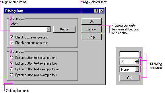
Group related components together. You can use group box controls or spacing. Leave at least four dialog box units between controls. Although you can also use color to visually group objects, it is not a common convention and could result in undesirable effects when the user changes color schemes.
Maintain a consistent margin (seven dialog box units is recommended) from the edge of the window. Use spacing between groups within the window. Figure 13.23 shows the recommended spacing.

Figure 13.23 Recommended layout and spacing of controls and text
Position controls in a toolbar so that there is at least a window's border width from the edges of the toolbar. Use at least four dialog box units spacing between controls, unless you want to align a set of related toolbar buttons adjacently. Use adjacent alignment for toolbar buttons that are related. For example, when using toolbar buttons like a set of option buttons, align them without any spacing between them.