In some sense, the Chart view is the most interesting view. Seeing the system counters respond in real time as the computer operates is both educational and visually interesting.
To select various options that govern how the chart appears on the screen, choose Chart from the Options menu. This brings up the Chart Options dialog box. One option you can choose here is to select between two basic modes: graph and histogram. Graphs are useful for looking at a counter value over time. Histograms lose the historical perspective but are useful for looking at many counters at one time. First let's take a look at a full-blown graph in all its glory.
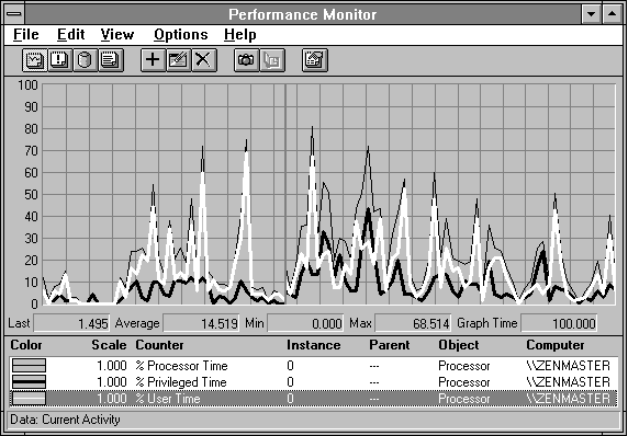
In Figure 2.23 we show a chart in graph mode. All chart display options are active.
Figure 2.23 All chart display options in graph mode of current activity
A Performance Monitor chart always displays between 0 and 100 data points for each counter shown. This is a key attribute of these charts.
Notice the vertical line in the middle of the chart. This is the Time Line. It is always red and it occupies a space just beyond the last observed value. It moves to the right when the display is updated at the end of each Time Period. It wraps to the left edge of the chart at the end of the Time Period following the 100th data point plotted. This scheme is different from many performance monitors, which scroll the display to the left on each data point. This scrolling is resource-intensive, adding to the monitor overhead. Windows NT Performance Monitor works like a hospital's heart monitor, and causes much less overhead than scrolling.
The vertical scale to the left of the chart is displayed by default. It always starts at zero. If you want to have it start elsewhere, export the data to a spreadsheet for analysis. By always starting at zero, this axis always has a clear meaning. The default upper limit of this axis is 100, but you can change this by selecting Options from the Chart menu, then typing a different number in the Vertical Maximum box. For your vertical maximum, you can use any positive number from a decimal number less than one up to about two billion.
You can add horizontal and vertical gridlines, if you want. You can choose one or the other or both. They add to the cost of updating the display, and so are not activated by default. The horizontal gridlines are sometimes useful, but the vertical gridlines are rarely interesting. To add or remove gridlines, choose Options from the Chart menu, and then check or clear the Vertical Grid and Horizontal Grid boxes.
The legend below the chart is displayed by default, but you can remove it if you want by clearing the Legend box in the Chart Options dialog box. The legend describes each chart line. The legend shows the following pieces of information about the line:
When you add a new counter to a chart, that legend item is automatically selected.
Note By pressing BACKSPACE you can highlight the chart line corresponding to the current Legend selection. The selected line becomes a wide white line. If you change your legend selection, the new selection is highlighted. You can change your legend selection by scrolling with the arrow keys. HOME, END, PAGEUP, and PAGEDOWN also work within the Legend window. Pressing BACKSPACE a second time removes the highlight. This is extremely useful if you are charting multiple lines.
For the counter currently selected in the legend (whether or not it is highlighted), the counter's last value, average, maximum, and minimum are shown in the value bar. The value bar is displayed by default. Pressing the Delete key will delete the counter currently selected in the legend.
The counter's average, maximum, and minimum are calculated using only the values currently shown on the chart. When you graph real-time activity, once the Time Line wraps around and starts overwriting previous counter values, these statistics reflect only the last 100 observations. If you need more history than this, you should be logging the data (see "Log View," later in this chapter).
If you add a counter while a chart of real-time data is displayed, the zero values up to the first valid value are not counted in the value bar statistics. If a data value is too large to fit in its value bar window, it is displayed in scientific notation.
You have to have the Legend displayed in order to display the value bar, because the Legend is used to select the line displayed by the value bar.
If you make the Performance Monitor window small enough, the Legend (and hence the value bar) are not displayed. Increasing the size again causes them to reappear. Try it. Pretty cool, eh?
As you know, you can change the time interval at which the chart is updated. To change the time interval, choose Chart from the Options menu, and then type the interval in the Interval box.
Because there are at most 100 data points, you can multiply 100 times the time interval to get the number of seconds displayed on the full chart. This product is shown as the Graph Time in the value bar. Graph Time indicates the time span (in seconds) the chart currently is capable of displaying.
In the Chart Options dialog box, you can select the Manual Update option instead of specifying a time interval. In this case, the chart updates only when you specify taking a snapshot. This is useful for observing counters during a particular event. You take a snapshot of the counters, then cause the event of interest to occur. Then take another snapshot. The counter values you observe apply to the event bracketed by the snapshots. To take a snapshot, choose the Update Now command from the Options menu, or click the camera icon on the toolbar, or use the CTRL+U hot key.
Even when you are charting data at a regular interval, you can also obtain manual snapshots between the regular time interval snapshots. If you have time interval currently set to one minute, for example, you might want to see data sooner if you notice a particular slowdown.
You can clear the current chart data with the Clear Display command from the Edit menu. This leaves your selections in place but starts the chart over again from the left edge. You can clear all your selections and stop charting altogether by choosing the New command from the File menu. This creates a new settings file and clears your old settings.
Here's a fine point for the record. When you add a counter to a chart, you'll notice a slight delay before the chart begins to draw. In order to display the first point on the chart, two data snapshots are required. This is because most of the counters are displayed as a rate or a percentage, as discussed in "What a Counter Counts," earlier in this chapter. To form a rate or a percentage, we need the value of the counter at the start and at the end of a time interval:
rate = counter[end] counter[start] / timer[end] timer[start]
What happens is this: you press the Add button and the first snapshot is taken at the end of the first time interval. The second snapshot is taken at the end of the second time interval. Thus the first data point requires two time intervals to elapse before it can be displayed. After the first point displays, the start of the next time interval is the end of the previous one. So a new data point displays when each time interval elapses.
The other primary mode of looking at counters is a vertical bar chart, the histogram. This is very useful for looking at many instances of a given counter at one time. Take a look at Figure 2.24.
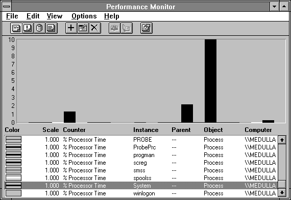
Figure 2.24 Chart histogram mode: a view of many processes' % Processor Time
In Figure 2.24 you see the % Processor Time of many processes. This might be something we would do if we wanted to see how much the various processes on our computer were using the processor. What the histogram mode gives up in history, it makes up for by clarifying the values of many similar counters.
An especially useful feature in histogram mode is the highlighting mentioned in the previous section. By pressing BACKSPACE, you can turn the bar belonging to the currently selected counter to white. Because this color is not otherwise used, it will help you to locate the instance you're interested in.
All the other display options for charts apply to both graph mode and histogram mode. Mercifully, we won't repeat our descriptions of them.
When you select a counter to chart, you can also specify how the line or bar representing the counter displays. To do so, use the Color, Scale, Width, and Style boxes at the bottom of the Add To Chart dialog box, which was shown in Figure 2.12.
The Color box specifies the color representing the counter. When you add a counter to the chart, the selection in the Color box automatically advances to the next color. This lets you add several counters at once, and each is assigned a new color.
Tip If you are adding many counters at once, the color selection wraps and thus is reused. Each time the colors wrap, the line width increases automatically. So although there may be two red counters, the second one is thicker. This creates a potentially annoying side effect: when you select the black color at the end of the Color list box, the width will increment automatically for the next color. To manually choose a counter line's width, use the Width box.
If you have a line that is one pixel wide (the default width), you can assign a line style to distinguish it from other lines.
Our stingy boss won't buy us a color printer, so we have to print all the examples in this book in black and white. I'm sure your boss is more magnanimous, but in the off chance that is not the case, you can use line style and width to great advantage in preparing a chart for printing. You will notice us doing so throughout this text.
Line width and style are ignored in histogram mode. If you have multiple red counters, you will want to use the BACKSPACE highlighting feature mentioned above to distinguish between them.
We've saved the best for last: the scale factor. Performance Monitor multiplies the scale factor times the counter value and the resulting product is charted instead of the original counter value. This applies to both graphs and histograms. The default scale factor for a counter is assigned by the counter's designer. This multiplier is chosen so that typical values plotted lie between 0 and 100 and the counter can be easily viewed on the default vertical axis. For example, Processor: Interrupts/sec is typically a counter in the range from 125 to 1000. By having a default scale of 0.1, this counter usually appears in the visible portion of the chart, from 12.5 to 100. The default scale is only a guess, however, and you may need to adjust a counter's scale to your situation.
The value bar data are not scaled, so you can always find the unscaled value of a counter in the value bar.
The scale factor selected when the Add button is pressed is applied to all the counters currently selected. So if you are selecting multiple counters, the scale factor is applied to all of them. If the Default scale is chosen, they are all charted with their individual default scale factors.
The scale factor does not change after adding a counter to the chart. Therefore, if you select a value of 0.001 for the scale of some counter, remember to change it to something reasonable for the next counter you select.
The only way to determine the default scale factor for a counter is to chart it. Then you can read the default value from the Legend. This is usually not a problem, but in case it is, you can find the default scale factors for the counters included in Windows NT in Appendix A.
If you select a counter in the legend, you can alter its display properties by choosing the Edit Chart Line dialog box from the Edit menu or the toolbar. You can only alter the properties of one counter at a time.
You can delete a chart counter by selecting the line in the legend and then choosing Delete from the Edit menu, or by pressing the Delete key.