Continuing our example, the next thing you'll do is export the chart. Now you have all 528 data points in a format suitable for a spreadsheet or database application. It's trend analysis time! Once you import this file into your application, you will get another huge reduction in data storage requirements. You are now in a position to plot 3-D charts, annotate them with sound and videos of your network humming along, and so on.
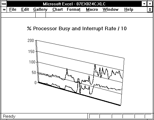
The next figure is an example showing the growth in processor utilization and interrupt rate on a server over a period of several months. The processor usage has climbed to near 75% at the right of the chart, and the interrupt rate is 1,180 per second. Time to order that second processor!
Figure 8.3 Processor-usage growth on a server over several months
You can automate a lot of this using Microsoft Test for Windows NT or a similar tool. If you do this by recording your actions, then wherever you can, use keystrokes instead of mouse movements to navigate. This makes the MS Test script more readily portable to different display resolutions.