Theme Elements
A theme is made up of settings in several categories:
General Settings — These are the settings which are consistent throughout the theme
-
The name of the theme
-
The font for the body text and the font for the headings
-
The image for the top-level navigation bar buttons
-
The background image enabled by the “Background Image” option
Basic Graphics — These are the theme elements applied when the “Active Graphics” option is not selected
-
An image for the page header
-
A horizontal rule graphic
-
Three levels of GIF bullets
-
An image for the horizontal navigation bar button
-
An image for the vertical navigation bar button
-
An image for the Home, Next, Previous, and Up navigation buttons
Active Graphics — These are the theme elements applied when the “Active Graphics” option is selected
-
An image for the page header (which may be animated)
-
A horizontal rule graphic (which may be animated)
-
Three levels of GIF bullets (which may be animated)
-
Three images for the horizontal navigation bar buttons, to create a hover button (normal, hovered, pressed)
-
Three images for the vertical navigation bar buttons, to create a hover button (normal, hovered, pressed)
-
Three images for the Home, Next, Previous, and Up navigation buttons, to create a hover button (normal, hovered, pressed)
Basic Colors — These are the colors applied when the “Vivid Colors” option is not selected
-
Default text color - usually dark or black
-
Colors for active, normal and visited hyperlinks
-
Colors for 3D table borders - usually automatic/gray
-
Page background color - usually very light or white
Vivid Colors — These are the colors applied when the “Vivid Colors” option is selected
-
Default text color
-
Colors for active, normal and visited hyperlinks
-
Colors for 3D table borders
-
Page background color
Theme images are the same size in all themes. This allows the user to switch the themes without affecting the layout of the page.
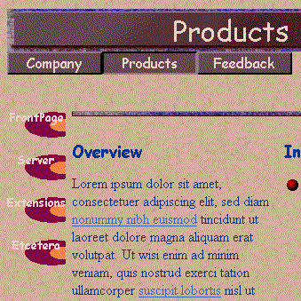
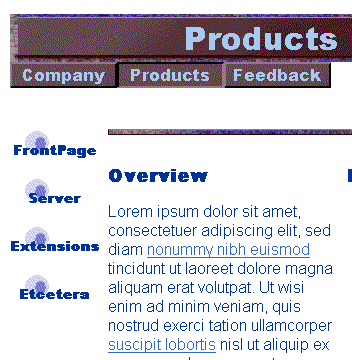
Here is an example of what the same page might look like in two different themes:
