The best way to determine how many processes produced the threads in the queue is to chart the processor time used by each process.
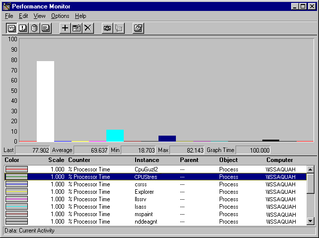
The following figure is a histogram of Processor: % Processor Time for all processes running when the queue in the previous graph was measured:

Despite the large queue, this chart makes it evident that a single process, represented by the tall, white bar, is using much more than its share of the processornearly 80% on average. If multiple processes were at work, no single bar would be so tall and there would be multiple bars at nearly the same height.