![]()
This article assumes you're familiar with
ActiveX, VBScript, HTML
Download the code (10KB)
|
This article may contain URLs that were valid when originally published, but now link to sites or pages that no longer exist. To maintain the flow of the article, we've left these URLs in the text, but disabled the links.
|
|
Corralling the Web: An ActiveX Control Roundup Paul Sanna |
| Is your Web-based app kinda pokey? There's a wide selection of commercially available controls that can help you brand your site. |
|
First
came the VBX, and it was good. Well, it was OK. Then OLE controls
hit the scene, and they were better. Today, we have ActiveX™
components, which can be used both in Web pages and standalone
applications. There are a lot of OLE controls out there that have
been upgraded for use in the new world of the Web. Here, I'll
be looking at a few of the most popular choices, seeing how they
work, and giving real examples of each. Visual Components Visual Speller 2.0
|
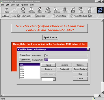 |
| Figure 1: Visual Speller 2.0 |
|
As with any
custom control, the best part of using Spell Checker is the minimal
amount of coding you have to do to get great functionality and
features. By placing the control on the form and adding one or
two dozen lines of code, you can check spelling of a block of
text, see a list of suggested replacements for words the checker
can't find in the dictionary, correct misspelled words, add words
to a custom dictionary you specify, and more. In addition, users
can customize a number of options with no coding on your part,
including the relative amount of memory the control consumes,
whether acronyms should be checked, which dictionary to use, and
more. You can even completely ignore all the built-in functionality the control provides if you want. Instead, you can customize the behavior of the control, such as disabling display of the standard "Word Not Found in Dictionary" dialog box, and roll your own functionality using the control's event and property procedures. Sample code for adding this control to a page is shown in Figure 2 My only problem with Visual Speller 2.0 as a Web-enabled package wasn't with the control but with the specifications and support provided with it. To programmatically customize the control's behavior, you work with a bunch of the control's properties. Unfortunately, the help file only showed the symbolic values for the properties. Because VBScript doesn't do constants, I was forced to spelunk my way through the sample apps provided with the demo download zip file to find a BAS file that would show the value of the constants described in the help. But hey, it was no big deal. MicroHelp MhIni Control
|
|
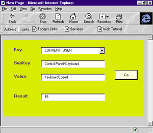
| Figure 3: mhIni control from MicroHelp |
|
A
must-have for anyone's custom control toolbox is the mhIni control
now available from MicroHelp. The mhIni control (see Figure
3), part of the
company's OleTools collection, makes it a snap to set and retrieve
data from either 16-bit INI files or the Windows® registry.
If you've ever written a wrapper function around one or more of
the ProfileString group of API functions or forgotten to initialize
a string passed to the Windows API, you'll find welcome stability
in this control. If you're setting or retrieving values in the
registry, you can forget about the nuisance of getting a handle
to the key you want to work with. Though it certainly raises security
issues, the mhIni control gives a Web page access to the browsing
workstation's registry easily and cleanly. To work with either INI files or the registry, you set the Action property of the control to an appropriate numeric value for the task you want to perform, such as setting a registry key value or removing an INI file entry, assign its metadata value to the appropriate properties, such as the key and subkey you're interested in, and set a control's text or a variable against the property that will contain the value you want. In addition to its get and out functions (used to retrieve and set INI and registry values), the control also can help enumerate key values, comment/uncomment settings in INI files, and encrypt values (see Figure 4). Microsoft Calendar
|
|
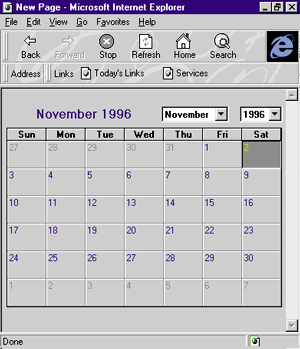
| Figure 5: Microsoft Calendar component |
|
A
number of calendar controls are available from different developers,
but the Microsoft® Calendar component (see Figure
5) is probably
the best of the four I looked at. In addition, the control's extensive
set of event, property, and method procedures make it flexible
and adaptable to whatever application you implement it in. Programming the Microsoft Calendar component is a snap. There are enough design-time-settable properties that you needn't write much code to implement the component. Come runtime, two methods, HideControl and ShowControl, make it easy to display the control when it is needed to select a date and to hide it when the control is no longer needed. When a user has selected a date by double-clicking on the control or by pressing the Enter key, you can easily trap the date selected by evaluating the Value property. In addition, you can determine separately the year, month, and day of the date the user has selected with different properties, rather than having to parse the Value property. Another property will tell you the number of days in the month of the selected date. This saves you from a switch statement where you would have to evaluate the month selected, then return the number of days in the month (if only I remembered that darn rhyme). Finally, a number of methods such as NextDay or PreviousMonth can help you change the context of the date control via code, something the user does by clicking on different buttons and combo boxes directly on the control. Figure 6 shows sample code to get this control on a page. DameWare ChkList
|
|
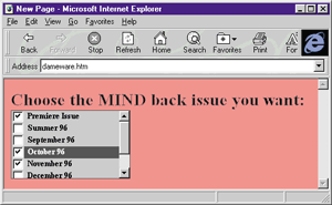
| Figure 7: ChkList component from DameWare |
|
A few
developers have made integrated checklist controls available,
and the ChkList ActiveX component (see Figure
7) from DameWare
Development is a pretty good implementation. Figure
8 shows a few
examples of the ChkList control. Benefits of this control? Well,
your users get a break from the tired multi-select list boxes,
and the graphical elements of the control definitely gives your
page an esthetic boost. ProtoView InterAct
|
|
| Figure 9: InterAct control from ProtoView |
|
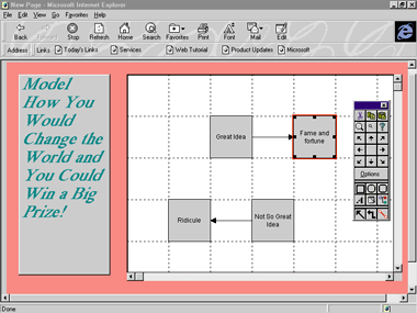
The InterAct
control uses a traditional interface to let a user draw, process,
and model. The user places shapes, known as entities, selected
from a toolbox on a work area, and then formats them with text
and color. Next, the user draws lines between the entities describing
their relationship. This functionality helps the user to model
a process, such as publishing a magazine, creating an entity-relationship
(ER) diagram, or whatever. If your user doesn't like the default
appearance of different shapes, or dislikes the default relationship
the tool creates between entities, no problem. These can be changed
by working with the control's interface of classes and rules.
To implement this ActiveX component, add it to your Web development environment, then draw an InterAct work area on the HTML page. That's it! To use the component, your user right-clicks on the work area and makes the menu choice to display the InterAct toolbox. The toolbox includes all of the controls your user will need to create a diagram. The toolbox gives you quick access to zoom controls; cut, copy, and paste buttons; and all of the entity and relation drawing tools. One of the best parts of this tool is that it doesn't lose any of its glitter used as a component as compared to the runtime application, which is also part of the downloadable package. Your user can save diagrams they create while using the component , as well as loading existing controls and editing them. The diagrams are saved in a proprietary format. After you draw a work area for the control on an HTML page, a robust set of properties, events, and methods make it possible to customize the behavior of the component. For example, you can specify what occurs after the user has created an entity, drawn a relation, or saved a diagram, and you can define classes and rules for the component in advance. Another option is using data supplied by your user somewhere on the page to create a diagram completely programmatically. |
|
| Figure 11: Result of code in Figure 10 |
|
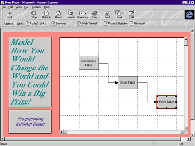
The code snippet
in Figure 10 demonstrates
how you can create entities and relations in code. Figure
11 shows the control
after the code is run. The code first checks to see if a specific
rule exists that draws a line between two rectangles. If the rule
doesn't exist, it is created. Next, three entities are created
in the diagram, and then relationship lines are drawn between
each. This control certainly isn't Visio or ERwin, two of the
top modeling/diagramming tools. But it's pretty nice for a downloadable
control. Visual Components First Impression
2.0
|
|
| Figure 12: First Impression 2.0 |
|
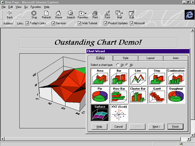
Like the InterAct control, the
user of this control runs the show by right-clicking over the
work area to display a context menu. The user can start a wizard
that walks through the steps of creating a chart, or chart his
own course, working on whatever component of the chart he chooses
at any time, such as chart type, the axis label, chart title,
format options for specific data series, and more. Tabbed dialog
boxes pop up all over the place, displaying dozens of options.
One of the most interesting options the control provides is whether
the display metrics are optimized for printing or screen display. The data that drives the chart can come from one of two sources. Your user can supply the data manually via a grid on one of the chart's property sheets, or the data can be provided programmatically. You could create a grid control somewhere in your Web app where you can either control or help your user supply the data via code. If you're really in the mood, you could give the user the option to specify some other source of data, such as ODBC. Obviously, you'd need to implement this yourself. When the chart appears as the user wants, it can be saved to a property format, as well as in bitmap and metafile formats. In addition, the user can load existing charts onto the page where the control is placed. The user can also print the chart directly form the work area on the page, as well as specify the printer, page setup options, and the like. Implementing the First Impression chart control is a no-brainer. You simply add the control to the tool you're using to design your Web page, select the control, and then draw the work area on the page in which the chart will appear. The default chart will appear on the page as soon as it is loaded into a browser. If you do nothing else, the user will have full access to specify data for the chart and format it. The default chart and its supporting data are not particularly interesting, so you may want to program the data used to drive the chart and its options when the Web page is loaded. Otherwise, visitors to the page where the First Impression control is loaded will be forced to stare at a particularly dull chart. The control comes with a very robust API that lets you not only define how the chart is formatted and what data is charted, but also the behavior of the control's user interface as well. For example, you can specify when certain pop-up dialog boxes appear. Of course, you can build the chart completely from code. The First Impression API comes in the form of an object hierarchy that gives you access to every option exposed in the user interface. A well-documented API reference is provided with the control; in addition, the help file assists with basic charting concepts with the respect to the control, so you don't have to guess about the result of firing an event or method from code. Figure 13 shows the source code for a simple chart-based page. First Impression is a dynamite control. If your application has any requirement for charting, this control may be the one to use. Crescent
Internet ToolPak
FarPoint
Technologies Spread 2.5
|
|
| Figure 15: Spread 2.5 from FarPoint Technologies |
|
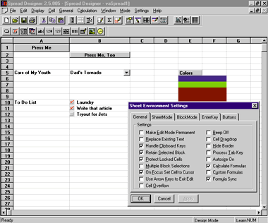
Another nicety of Spread Designer is its mode
selection. What's one of the biggest nuisances when designing
Web pages? Testing them? Ding! Correct. This is not the case with
Spread Designer. Just choose Run-Time Mode from the menu, and
your spreadsheet will run as it will when a user sees it on a
Web page (or close to it). The range of options you can specify for the control is staggering. Want to limit the number of rows and columns? No problem. Want to lock certain cells? No problem. Want to implement custom functions? You got it. How about defining movement of the cursor and block selection behavior? No problem! Colors, fonts, row and column headings and gridlines? You've got to be kidding. Want a mansion and a yacht? Well… Another nifty feature of the control is the type assignment you can make to individual cells. A cell can be formatted to display a dropdown list that shrinks and grows as you change the height and width of the column and row, a button (choose from two state or push button), a checkbox, plain, boring data, or about seven other types. Spread 2.5 leaves little to risk when your user starts running the control because you have the capability to completely customize and control what they can and can't do. The Spread Designer makes it simple and extremely intuitive to specify options for the control. As much as you can customize the runtime behavior control of the control, if you want to give your user the capability to do anything with the data they've entered, such as saving it to a file, you'll have to program this yourself. Again, no problem. The control's API is solid, and any behavior or property that could not be designed in advance, or that you chose not to design in advance, can easily be handled in code. In addition, any of the properties or behaviors specified from Spread Designer, naturally, can be specified and modified in scripting code. The API gives you all the capabilities to finish the implementation of the control, such as a provision for saving to a proprietary file, binding the spreadsheet to a data source, copying and pasting, and more. The on-line documentation supplied with the control also is excellent. There are of course hundreds of other great ActiveX components available for you to exploit—I've only touched upon a few here that I've found particularly useful. With the free-for-the-downloading beta version of the Visual Basic 5.0 Control Creation Edition that Microsoft recently made available (check out msdn.microsoft.com), the task of actually creating an ActiveX component has become much less difficult. Expect to see a bumper crop of new, innovative components in the coming weeks. 
See the sidebar "NCompass Labs".
For further information contact:
DameWare Development From the January 1997 issue of Microsoft Interactive Developer. |