![]()
|
This article may contain URLs that were valid when originally published, but now link to sites or pages that no longer exist. To maintain the flow of the article, we've left these URLs in the text, but disabled the links.
|
|
Image Composer Takes a Quantum Leap
Brian Johnson |
| Now shipping as part of the FrontPage 98 package, Image Composer 1.5 makes it easier than ever to create stunning graphics for your Web site. |
|
If there was one piece of software last year that showed promise but that needed a little more polish, it was Microsoft® Image Composer. For those Web designers, like myself, who fell in love with this product, Image Composer represented a better way to manipulate images. Image Composer treats images as objects that are all part of the same composition. This makes combining these images much easier than with a traditional image editing program. It makes so much sense you wonder why anybody would do it any other way. But a number of problems kept Image Composer 1.0 from becoming the default image editor on many user's machines. I'm happy to report that Microsoft has dealt with most of these issues with aplomb.
On the Surface
|
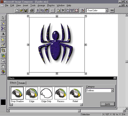
A big change in Image Composer 1.5 is the naming scheme for the interface element. The composition guide is now called the composition space. The area outside the composition space that was formerly referred to as the "void" is now called the workspace. New in version 1.5 are guidelines called composition guides, which are used to adjust the size of the composition space. These changes aren't particularly straightforward for Image Composer veterans, but they make a lot more sense for new users.
One final user interface change of note involves the shortcut keys for the various palettes, which have been changed to reflect their new positions on the toolbar. This change might cause you a stumble or two at first if you're used to calling up the palettes with a keyboard shortcut, but the changes are really very intuitive. Alt+1 invokes the Selection pointer, Alt+2 opens the Arrange palette, Alt+3 opens the Cutout palette, and so on. If you can recognize the icons for the various palettes, you can easily call them up with a keyboard shortcut by counting down from the top. The exception is the Color Tuning palette, which is opened with an Alt+= combination.
Buttons
Image Composer's new Button Wizard makes creating button images a breeze. The wizard is opened by selecting the Insert | Button menu item. Using the Button Wizard, you select a button style, the number of buttons to create, and the text for each. After you create your buttons, they'll be piled on top of one another in the workspace, so you'll need to drag them apart to deal with them individually.
Figure 2 shows the Button Wizard in action. Notice that
you have a number of styles to select from when creating
a new button.
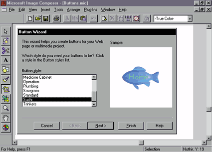 |
| Figure 2: The Button Wizard in action |
|
Once you've created a button, it will actually consist of a group of objects. Right-clicking on the group will bring up a popup menu containing an Edit Button selection. This item opens the Button Editor, a tool that allows you to further customize the button you've created. You can see the Button Editor in Figure 3. The Size tab lets you preview your changes before you commit them to the button. |
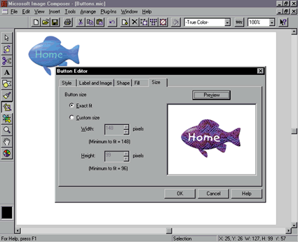 |
| Figure 3: Previewing the changes to a button on the Size page |
|
The Button Wizard isn't the be-all, end-all button design tool, but its ability to refine the buttons it creates should satisfy most designers. Remember that a button created by the Button Wizard is a group. You can explode the group and work with the individual button components if you need to.
Plug-ins
|
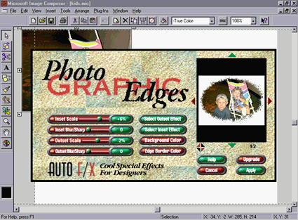 |
| Figure 4: The Photo Graphic Edges plug-in in Image Composer 1.5 |
|
In Image Composer, plug-in filters are accessed from the Plug-Ins menu. A plug-in acts on the currently selected sprite. This is a little different from most image editing programs, where a plug-in is usually run on a selection. When the plug-in is opened, you see the editing program's plug-in interface, which usually includes a preview of the filter on the current sprite. The screen in Figure 4 is a shot of the Auto F/X Photo Graphic Edges plug-in run on a photographic sprite in Image Composer. The plug-in upgrade is an important step in the development of Image Composer. Artists can spend hundreds (if not thousands) of dollars a year on plug-in filters. Any time you can do most of your work in a single program you save time and money.
Text Handling
|
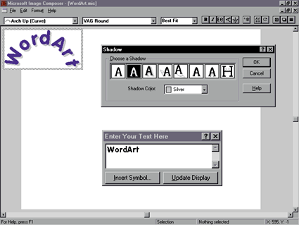 |
| Figure 5: WordArt in Image Composer |
|
There's one problem that you should be aware of with text in Image Composer: on normal text sprites, the program tends to cut off parts of the first and last letters in a line of text. There was no fix available for this annoyance at the time of this writing, but an easy workaround is to just add a space to the beginning and the end of any line of text you create.
OLE
|
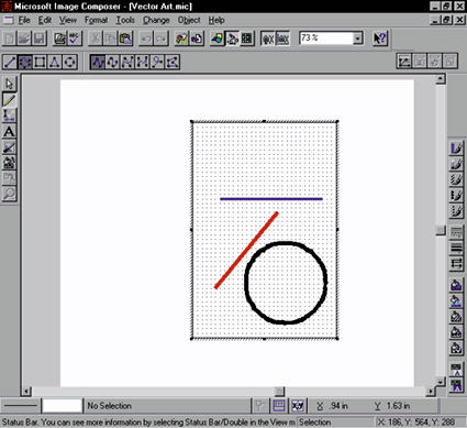 |
| Figure 6: A vector object is created inside Image Composer |
|
OLE in-place activation gives you the ability to edit vector drawings within Image Composer and then treat what you've created as a native sprite. To demonstrate, I added a drop shadow to the vector object from Figure 6; the results are shown in Figure 7. Notice that the shadow effect follows the lines in the drawing, not the perimeter of the object. (I was pleasantly surprised by this!) Even after you edit the object and add an effect like a drop shadow, you can usually get back to the original object by double-clicking on it. If you do this and it works, you'll see a dialog box letting you know that you'll lose any effects that you've added in Image Composer if you proceed. |
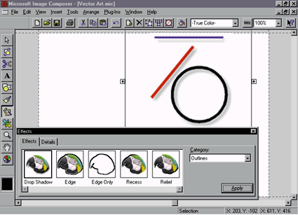 |
| Figure 7: The Drop Shadow effect applied to a vector object |
|
Sprite-based editing and OLE go together well. For artists who work with many different programs, Image Composer is just the ticket for "mixed media."
Conclusion
|
From the April 1998 issue of Microsoft Interactive Developer.