December 1998
Control Spy Exposes the Clandestine Life of Windows Common Controls, Part III
Download controlspy.exe (2,914KB)
Mark Finocchio is a software design engineer on the Microsoft Windows NT team. He specializes in system-level user interface controls. He can be reached at markfi@microsoft.com.
|
I introduced
a utility suite known as Control Spy in the first two parts of this series (the July and September 1998 issues of MSJ). Control Spy is a useful tool for learning about, testing, and experimenting with the common controls. One Control Spy exists for each of the 22 common controls. This series of articles should serve as a developer's guide and reference to all the common controls, intended for all experience levels. I cover important messages, notifications, styles, and structures, along with information such as control clarifications, common problems, and workarounds.
In this final article, I'm going to cover the remaining new and updated controls. In addition, for completeness, the two unchanged controls will also be discussed. Again, the controls I refer to as "new" are those that were considered only in "preview" as of Microsoft® Internet Explorer 3.0.
Pager
To assign a child window to the Pager, the child control first needs to be created as a child of the Pager so that the child can be clipped to the Pager and displayed correctly. All notifications coming from the control will be forwarded to the Pager's parent. Any time a common control is used as a child that normally resizes itself based on the parent's size (like toolbars and status bars), make sure to create it with the CCS_NORESIZE style. This prevents the control from resizing itself and gives the Pager the ability to size it. After the child has been created, the Pager needs its window handle (using PGM_SETCHILD) so that it can manipulate its position. While using Pager Control Spy, many PGN_CALCSIZE notifications are logged. It must respond to these notifications to tell the Pager the desired scrollable size of the contained window. The child will be resized based on your feedback (less any border width and height, if specified). The size of the child opposite the scrollable direction will be that of the Pager. It will, at the minimum, be at least the size of the Pager in the scrollable direction. To force a PGN_ CALCSIZE, use PGM_RECALCSIZE. Pressing the Pager buttons automatically scrolls the child window. Several messages are available to change the look of these buttons. The scroll position can be set manually with PGM_SETPOS, but this message produces erratic results and causes the child control to be drawn at the wrong position. Another message that causes painting problems is PGM_SETBORDER. This message sets the gap between the Pager and contained control, but this gap isn't updated correctly. Also, the Pager control doesn't support the mouse wheel. If you want to supply your own child control in Pager Control Spy, a keyword called custom is defined in the parser that maps to a window handle. The source code will need to be edited to add the new control. The Pager scroll buttons are constantly changing states. They gray out and disappear dynamically. The current state of any button can be checked: |
|
| Also, try setting the look of the buttons: |
Rebar
The Rebar holds other windows in its bands. A band can have any combination of a gripper bar, a background bitmap, an image, a text label, and a child control. The bands can be moved around by the user within the confines of the control. They can be minimized and maximized by clicking on the gripper bar. Rebar doesn't support dragging bands off the control like you see in the Visual C++® Developer Studio® and Microsoft Office 97. The standard common control styles (those with the CCS prefix) are also supported. When using common controls as children (like toolbars and status bars) that resize their width based on the size of the parent, these children must be created with the CCS_NORESIZE style. Otherwise, they will always attempt to size themselves to the control and display incorrectly. Rebar bands can be referred to by index or ID. IDs are assigned to bands when the band is created or its properties are changed. For Rebars, index 0 is always the first band displayed in the control, even if users move the bands around. To convert a band's ID to an index, use RB_ IDTOINDEX. Like many of the other common controls, all properties are summed up into one structure. In this case, it's REBARBANDINFO. The actual Rebar's properties are described by REBARINFO. This structure is very small and currently only supports associating an Image List with the control. In contrast, REBARBANDINFO has many members. This makes sense since a Rebar's bands make up its content. All of the messages Rebar supports are focused around its bands. To insert a band, set a band's properties (RB_SETBANDINFO), or retrieve a band's properties (RB_GETBANDINFO), a REBARBANDINFO structure is required. The REBARBANDINFO has several members that you would expect, like the band's style, color, text label, background image, and unique identifier. Almost half of the members are just for specifying the band's dimensions. A good start when initializing these dimension members is the minimum child size (cxMinChild and cyMinChild) and the length of the band (cx). The minimum child sizes ensure that the child window isn't automatically sized smaller than it should be, thus cutting the child control off. Setting the length of the band seems pretty straightforward, as long as you understand that other bands must be displayed in a limited space—you might not see what you thought you asked for. There are other dimension members available. Some only have an effect if variable height bands are in use (specified by RBBS_VARIABLEHEIGHT). An ideal width (cxIdeal) can also be specified. This width is optionally used when maximizing the band. A good message to be aware of is RB_SIZETORECT. This message tells the Rebar to find the best layout of its bands for a specified rectangle. Other messages exist to move specific bands: RB_MOVEBAND, RB_MAXIMIZEBAND, and RB_MINIMIZEBAND. The default colors of bands can be set with RB_SETBKCOLOR and RB_SETTEXTCOLOR. Color changes take effect for bands that are added after these messages are used. Corresponding messages are available to retrieve color information. The palette the Rebar uses for displaying its contents is set with RB_ SETPALETTE. To find out what portion of a band is located at a given point, use RB_ HITTEST. Query a band's size with RB_GETRECT and RB_GETBANDBORDERS. Rebar generates several notifications (prefixed with "RBN") to keep its parent informed of events. Such events include band deletion, layout changes, and band dragging notifications. A Rebar doesn't use a palette unless a band is using a bitmap for its background. Even though an image can be used as part of a band's label, it isn't enough to get the Rebar to use and realize a palette. The bands of a Rebar can be displayed vertically with CCS_VERT. If this style is used, the bands aren't resized to accommodate the full width of their labels. So, if a label is too long, it will get cut off. To get around this behavior, set the minimum height of the child control larger than the width of the label. RB_INSERTBAND inserts a band into a Rebar. If Rebar Control Spy isn't loaded yet, load it up so that the following can be sent to the Rebar control: |
|
| A new band is inserted after the other bands. This band doesn't contain a child window. Control Spy defines the custom keyword in the parser so you can add your own child control to a band. When child controls are created, make sure they are children of the Rebar control. Since child windows are destroyed along with their parents, there is no need to destroy them explicitly.
Now, to assign a background image and change the label for the first band in the control, you can use something like the following: |
|
| The first band will have its background changed. Additionally, the text label will change, or one will be added if it wasn't previously using one. Initially, I only wanted to include a statement that just changed the background image of the band. Doing that caused Rebar Control Spy to crash! After further investigation (and some frustration), I realized that the Rebar was changing things in my structure that I didn't expect.
Control Spy creates a text buffer dynamically for REBARBANDINFO to hold the band label regardless if you use it or not. After the message is sent, the buffer is freed (along with the structure). After RB_SETBANDINFO was sent, the REBARBANDINFO lpText member (the pointer to the label buffer) had changed. So when Control Spy went to free the buffer, it was an invalid pointer. I know I didn't specify the member as valid in the mask, but I didn't expect the control to actually change it! I checked other controls—and even other Rebar messages—and didn't see this behavior happen again. The lesson learned from this was that, when specifying structure members that aren't valid, it is conceivable that the control might use them for its own purposes. Now for the conclusion of the discussion on the updated common controls. Again, these updates come in the form of additions of messages, notifications, styles, and members of structures. Some controls have only minor changes, while others have gone through substantial ones.
Toolbar
Although CreateWindowEx can be used for creating toolbars, the CreateToolbarEx function is available too. This function saves some steps by allowing complete creation of the toolbar (buttons included) in one call. Toolbars support the set of global common control styles. A misconception about toolbars is that the buttons within them are child button windows. They aren't; they are drawn and updated by the toolbar. Toolbars provide some functionality that you might not be aware of. A button layout customization dialog is available for use via the CCS_ADJUSTABLE style. The customization dialog appears when the user double-clicks the toolbar (but not on a button), or if it receives the TB_CUSTOMIZE message. At that point, TBN_BEGINADJUST, TBN_CUSTHELP, TBN_ ENDADJUST, TBN_GETBUTTONINFO, TBN_QUERYDELETE, TBN_QUERYINSERT, TBN_RESET, and TBN_TOOLBARCHANGE notifications can be generated by the control during the life of the dialog. See the Toolbar Control Spy source for information on responding to these notifications to support the customization dialog. Toolbars also support automatic saving and retrieval of button layout information in the registry with TB_SAVERESTORE. Toolbar buttons are added with TB_INSERTBUTTON and TB_ADDBUTTONS. They both use the TBBUTTON structure, which defines properties of the buttons. It contains no handles or pointers to data. Rather, images and labels are specified by index. The structure also includes state and style information along with the button's command identifier. Images are associated with the control by using TB_ADDBITMAP or by specifying an Image List with TB_SETIMAGELIST. Many of the standard button images used by the shell are accessible through TB_ADDBITMAP. Strings can be added with TB_ADDSTRING. Many styles are defined for the overall control and for buttons. Buttons can be placed in a checkbox toggle mode (TBSTYLE_CHECK) and can be grouped together (TBSTYLE_GROUP and TBSTYLE_CHECKGROUP). Separators are added as normal buttons with the TBSTYLE_ SEP style. Buttons can be in several states, including TBSTATE_CHECKED, TBSTATE_ENABLED, and TBSTATE_PRESSED. Most of the toolbar messages refer to individual buttons by their unique command identifiers that were assigned at creation. A button's index is its physical position on the screen, index 0 being the left (or top) button of the toolbar. Use TB_COMMANDTOINDEX to convert between the two. Tooltips are activated by specifying the TBSTYLE_ TOOLTIPS style. The toolbar control sends TBN_GETINFOTIP notifications when tooltip text is required. Tooltip text is specified through the NMTBGETINFOTIP structure used with the notification. To place other controls on the toolbar (like a standard combobox), a few things need to be kept in mind. You will most likely want combobox notifications to go to another window (like the toolbar's parent). However, the combobox should still be placed as a child right on the toolbar. Creating the combobox first as a child of some window other than the toolbar and then doing a SetParent to the toolbar is a valid operation. The combobox (as with other Windows controls) will still notify its original creation parent. This behavior is intended. To make enough room on your toolbar for child controls, consider using separators. The toolbar control has been updated with many messages, including button positioning, dimensions, layout, and padding messages. The new TBSTYLE_FLAT toolbar style has been added, along with transparency support (TBSTYLE_TRANSPARENT), so background images can show through the control. Toolbars can now use up to three Image Lists. These Image Lists are for the normal, hot, and disabled button states. To set the Image Lists, use the TB_ SETIMAGELIST, TB_SETHOTIMAGELIST, and TB_SETDISABLEDIMAGELIST messages. A new dropdown toolbar button style (TBSTYLE_DROPDOWN) has been added to display a small down arrow button next to the Toolbar button. Pressing the arrow button generates a TBN_DROPDOWN notification that can be handled by displaying a context menu. To further support drag and drop, insertion mark messages (TB_SETINSERTMARK, TB_GETINSERTMARK, and TB_ INSERTMARKHITTEST) have been added. The TBBUTTONINFO structure is now available for setting attributes of buttons, and is used with TB_ GETBUTTONINFO and TB_SETBUTTONINFO. These messages are similar to the other modern controls in that item attributes can be changed all at once and masks are used. Image callbacks are available through these messages. The new TBN_GETDISPINFO notification supports this callback. To access the new Explorer bitmap images, use TB_LOADIMAGES. There are a few issues with toolbars you need to keep in mind. If the control is disabled, none of the buttons work. However, the buttons are not grayed out. To get around this, get the count of buttons (with TB_BUTTONCOUNT) and change the state of all buttons (for example, with TB_SETSTATE or TB_SETBUTTONINFO) by removing the enabled flag (TBSTATE_ENABLED). Another issue involves the toolbar customization dialog. If a disabled Image List is associated with the control and the flat toolbar style is being used, the customization dialog box will display the disabled images incorrectly. To get more familiar with toolbars, try the following messages in Toolbar Control Spy: |
|
| Try associating a hot Image List with the control: |
|
| Control Spy's parser defines three Image Lists for you to use: imagelist (normal), HotIL, and DisabledIL. While in flat mode, running the cursor over buttons will display the hot Image List.
Tooltip
Tooltips are no different than any other control in that they have window handles and are created with CreateWindowEx. They always have the WS_POPUP and WS_EX_ TOOLWINDOW styles. (Do not use WS_CHILD during creation.) Tooltip windows are constantly shown and hidden. Since they are normal windows, they can be positioned in the z-order. You can also make them the topmost window to avoid being obstructed by other windows. Tooltips pop up when the mouse cursor hovers over areas called tools. Tools are registered with the Tooltip control with TTM_ADDTOOL. Each tool is described by a TOOLINFO structure. Either a window handle or a rectangular region identifies a tool's area. Tooltips determine what tool they are over based on mouse messages to the individual tools. These messages (such as WM_MOUSEMOVE) must be forwarded to the Tooltip control with TTM_RELAYEVENT. To capture these mouse messages, either the tool windows must be subclassed or a "get message" (WH_GETMESSAGE) hook must be installed. Control Spy uses a hook for the Tooltips around its interface. Additionally, Tooltip Control Spy creates another Tooltip control and three tools. One of the tools is subclassed "explicitly" while the other two are subclassed "implicitly." Since you can have the Tooltip control subclass tool windows on your behalf when tools are added, I refer to this as an implicit subclass. For this type of subclass, the TTF_SUBCLASS flag is used in the TOOLINFO structure. Tooltip controls support several messages for tool maintenance and to control the look of the popup window. Use TTM_DELTOOL to remove tools and TTM_GETTOOLINFO to get tool information based on window handle and identifier. Despite its name, TTM_ENUMTOOLS is used to retrieve information on a single tool based on index. Tool index values are set internally by the control and are not unique. Indexes change as tools are inserted and removed. To get information about the tool in which a tip is being displayed, use TTM_GETCURRENTTOOL. TTM_SETTOOLINFO sets an existing tool's properties. The Tooltip control has been updated to support tracking tooltips. While the control is in tracking mode, a tooltip window can be forced to stay active (TTM_TRACKACTIVATE) and move on the screen (TTM_TRACKPOSITION). The display position can be relative to the tool or in absolute screen coordinates (specified by TTF_ABSOLUTE in TOOLINFO). Tools require the TTF_TRACK flag for tracking support. It's up to the application to move the tip window with TTM_TRACKPOSITION (it won't happen automatically when using TTF_SUBCLASS). Only one tracking tool may be active at a time. When tracking mode isn't active, tips don't display for tools with the TTF_TRACK flag. In addition to tracking support, several other messages have been added to the control along with various updates to structures that support the changes. Display duration times can be controlled with TTM_GETDELAYTIME and TTM_SETDELAYTIME. Margin sizes are set with TTM_ GETMARGIN and TTM_SETMARGIN. TTM_GETMAXTIPWIDTH and TTM_SETMAXTIPWIDTH control the tooltip's maximum display width in pixels. Color can be manipulated with TTM_ GETTIPTEXTCOLOR, TTM_SETTIPTEXTCOLOR, TTM_GETTIPBKCOLOR, and TTM_SETTIPBKCOLOR. If you want to remove a displayed tooltip immediately, use TTM_POP. Finally, to force a redraw, use TTM_UPDATE. By default, the maximum width of a tip window is set to -1. This means that the entire tooltip exists on a single line. Since tooltip text can get very long, multiple lines of tip text would be ideal. To make this happen, set the maximum tip width (with TTM_SETMAXTIPWITH) to any positive value. After that, the text can be broken at spaces and will always be broken at newlines (\n). In addition, & characters will be converted to underscore characters. To stop this behavior, use the TTS_NOPREFIX style. Normally, tooltip windows aren't displayed for disabled controls. To get around this, two steps are required. To give developers more flexibility, the Tooltip control sends itself the TTM_WINDOWFROMPOINT message when it needs to query for the control under the current cursor position. By default, it uses WindowFromPoint, which doesn't return handles of disabled controls. By subclassing the actual Tooltip control, you can change the behavior of this message. Specifically, ChildWindowFromPoint must be called since it will detect a disabled child given a point. This handle must be returned from your TTM_WINDOWFROMPOINT handler. Next, any mouse message coming in must be checked for its cursor position. If this position is actually over a disabled control (again, ChildWindowFromPoint is used to check), the message (MSG structure) must be altered. First, make a copy of the message (MSG) structure. Next, the hwnd member must be changed to hold the disabled control's handle. You must change the point of origin (lParam member) relative to the disabled control's client area. Finally, relay the message to the Tooltip control. Tip windows will now show for disabled controls. In essence, you've fooled the control by simulating the events that occur for enabled controls. To try out some of the features described previously, run Tooltip Control Spy and enter the following statements: |
|
| This statement alters the properties of one of the tools so that it now has tracking tooltip support. The Control Spy parser recognizes the parent and tool0 keywords as global handle variables defined in the source code.
It's worth explaining how tools are identified by the Tooltip control. If you want the Tooltip control to identify tools by window handle, use TTF_IDISHWND with the uFlags member of the TOOLTIP structure. The uId member will hold the handle. If TTF_IDISHWND isn't used, the hwnd member specifies the handle of the window that contains a rectangular area (defined by the rect member) to be used as the tool. The uId member then holds a unique, application-defined identifier for the tool. Additionally, callbacks can be used by specifying LPSTR_TEXTCALLBACK for the lpszText member. TTN_ GETDISPINFO is sent by the Tooltip control to notify the tool's parent when callback text is needed. To identify the tool, use the idFrom member of the passed NMHDR structure. To continue with the example, turn on tracking mode: |
|
| Now, move the tip window around: |
|
| Turn off tracking: |
|
| Finally, make some simple appearance changes: |
Trackbar
The slider thumb is used to select values in a Trackbar control. To set the position programmatically, use TBM_SETPOS. This sets the logical position, which is simply an integer value within the current Trackbar range. The thumb can be resized with TBM_SETTHUMBLENGTH as long as the TBS_FIXEDLENGTH style is in use. To control the amount the thumb moves in response to keyboard input (such Page Up) or when the center channel is clicked, use TBM_SETPAGESIZE. The Trackbar generates normal WM_ HSCROLL and WM_VSCROLL notifications. However, these notifications contain more detailed information about the nature of the operation in their parameters and is specific to the control. Trackbars also support selection ranges when the TBS_ ENABLESELRANGE style is used. A Trackbar in this mode has a wide channel that displays a thick line representing the current selection range. TBM_SETSEL sets this range. TBM_SETSELSTART and TBM_SETSELEND are 32-bit versions of TBM_SETSEL. Corresponding messages are available for retrieving selection information. Selection range messages only affect the control in a visual way. The control doesn't support selection of the range via user input by default. The developer must add this functionality by handling notifications from the control. The Trackbar control has been updated to support buddy windows and tooltips. Up to two buddy windows are supported. They are set with TBM_SETBUDDY and retrieved with TBM_GETBUDDY. Trackbars automatically position buddy windows at the extremes of the control. This saves you the step of calculating the positions yourself if you want to place text or icons at each end. To enable tooltip support, use the TBS_TOOLTIPS style. The value of the Trackbar will display as the thumb is moved. Placement of the tooltip window relative to the thumb is handled by TBM_SETTIPSIDE. To gain more control over the positioning of the tick marks, use TBM_SETTIC. Given a position, this message will place a mark at that point. However, if TBM_SETTICFREQ was used previously, TBM_SETTIC won't place tick marks correctly. Additionally, TBM_GETTIC and TBM_ GETPTICS won't return useful information other than a sequence of numbers up to the count of tick marks. So, to set tick marks, use either TBM_SETTICFREQ and TBS_AUTOTICKS, or just TBM_SETTIC. Also keep in mind that the control stores tick mark information in an internal array in the order that they have been set. Using TBM_GETTIC or TBM_GETPTICS reflects this. Try the following statements in Trackbar Control Spy to get more familiar with the control (but first, open the Styles dialog and turn on TBS_AUTOTICKS and TBS_ENABLESELRANGE): |
|
| Notice how close the tick marks are. Now have the control automatically space the marks based on a frequency: |
|
| Finally, set the selection range: |
Tree View
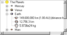
An item's properties (such as label, picture, and state) are summed up in the TVITEM structure. This structure is used directly when setting (TVM_ SETITEM) and retrieving (TVM_ GETITEM) an item's properties. It's even used within other structure such as TVM_INSERTITEM's TVINSERTSTRUCT and notification message structures. Unlike other controls, a handle uniquely identifies each item. These handles are of type HTREEITEM and are not like normal window handles. Removing items is done with TVM_ DELETEITEM. To locate an item relative to another, use TBM_GETNEXTITEM. Tree Views don't have a find item message available. However, the Tree View performs an incremental search based on keyboard input from the user. This search happens on the same level as the currently selected item. For information on the current incremental search string, use TVM_GETISEARCHSTRING. Tree View controls support two Image Lists: normal and state. State images are placed to the left of normal images. These Image Lists are handled by TVM_GETIMAGELIST and TVM_SETIMAGELIST. Several styles control the look and behavior of the control. TVS_HASBUTTONS, TVS_HASLINES, and TVS_ LINESATROOT determine if the control has + and - buttons and lines. TVS_EDITLABELS allows for in-place user editing of item labels. The control doesn't automatically update labels internally that are edited this way. It's up to the developer to handle notifications (such as TVN_ BEGINLABELEDIT and TVN_ENDLABELEDIT) coming from the control to actually change the label. Another handy notification is TVN_GETDISPINFO, which is used by the control to query for callback information for display purposes. Tree View controls support label, image, selected image, and child callbacks. A child callback allows the application to keep track of whether an item has children. If an item has children, its visual properties reflect that (a + or - button is displayed next to it). Using this callback, an item can look like it has children even though it might not. This way, the children can be added only when the item is expanded (you will receive a TVN_ITEMEXPANDING) to save time and memory. The Tree View control has been updated in many ways. By default, Tooltips are used to display labels automatically when the mouse cursor is over an item whose label is not entirely visible. To prevent this behavior, use the TVS_ NOTOOLTIPS style. To change the look of the Tooltip control, its handle is accessible with TVM_GETTOOLTIPS. Parent items can now have a partially expanded state. This occurs when TVM_EXPAND is used with the TVE_EXPANDPARTIAL flag. Child items are shown, but the parent's plus sign doesn't turn negative. This is useful for situations where some, but not all, of the child items are known. Waiting for child information through a network request might cause this scenario. A new style has been added to cause expansion if an item is clicked once. Use TVS_SINGLEEXPAND to gain this effect. Other new styles include checkbox support (TVS_CHECKBOXES), entire row selection (TVS_FULLROWSELECT), tooltip text callback requests (TVS_INFOTIP), and hot tracking with underline (TVS_TRACKSELECT). New messages have also been added. The colors of the Tree View can be manipulated with TVM_GETBKCOLOR, TVM_SETBKCOLOR, TVM_ GETTEXTCOLOR, and TVM_SETTEXTCOLOR. Insertion marks can be drawn on the control with TVM_SETINSERTMARK for use with drag and drop operations. The insertion mark's color is accessed with TVM_SETINSERTMARKCOLOR and TVM_GETINSERTMARKCOLOR. To set a new height for all items in the control, use TVM_SETITEMHEIGHT and TVM_GETITEMHEIGHT. Finally, to set the height of individual items, the TVITEM structure has been updated to TVITEMEX, which includes an iIntegral member for this purpose. This TVITEMEX structure may be used in place of TVITEM. There are some issues concerning the Tree View control that you might run into. Retrieving the last visible item in the control with TVM_GETNEXTITEM and the TVGN_ LASTVISIBLE flag always returns the last item in the tree (even if it's not visible). Changing the background color of the control doesn't change the background color under the lines and buttons in the control. To avoid this problem, temporarily turn the TVS_HASBUTTONS style off, change the background color, and then turn the button style back on. Finally, the lines between items appear broken when an individual height is set for an item. This is because individual heights are intended for use with custom draw. One of the most difficult Tree View messages is TVM_ INSERTITEM. Load Tree View Control Spy and try adding an item: |
|
| This statement will add an item called My Tree View Item after the third child of the first root item. The item will appear in the bold state. Callbacks will be used for regular and selected images; Control Spy will handle these callbacks (TVN_GETDISPINFO) automatically. The root item handle is designated in the Control Spy parser as root. Additionally, node0, node1, node2, and so on are defined as handles of children off the root item. The state member of the TVITEMEX structure is actually packed with three different values: item state, overlay image, and state image to display. Macros are used to pack the values. The Tree View Control Spy parser uses the slash syntax to separate the value into parts.
Now, try setting the text color and using the insertion mark: |
|
| Finally, activate an in-place edit: |
Up-Down
The CreateUpDownControl function creates an Up-Down control, associates a buddy window, and sets the upper and lower limit of the control all in one call. CreateWindowEx can be used instead, in which case a UDM_SETBUDDY message sets the buddy window and UDM_SETRANGE sets the value extremes. A buddy window is simply a sibling window handle stored by the Up-Down control. When using the UDS_SETBUDDYINT style, the Up-Down control will send WM_SETTEXT messages to the buddy window with a formatted numeric string. The string content depends on the UDS_NOTHOUSANDS style, any previously sent UDM_SETBASE message, and the current value of the control. Other styles affect the appearance of the control. UDS_ ALIGNLEFT and UDS_ALIGNRIGHT styles cause the Up-Down control to appear as if it's part of the buddy window. The buddy window's width is decreased to accommodate this. UDS_HORZ creates an Up-Down control with right and left arrows. Use UDS_ARROWKEYS to let users change the control's value with the keyboard arrow keys. The parent window is notified of changes within the Up-Down control with UDN_DELTAPOS, WM_HSCROLL, and WM_VSCROLL notifications. The Up-Down control has been updated to allow for full 32-bit value ranges via UDM_SETRANGE32 and UDM_GETRANGE32. Even though 32-bit ranges are supported, the Up-Down control still offers its original 16-bit UDM_GETPOS and UDM_ SETPOS. To set large values, set the text directly in the buddy window. Every time an Up-Down arrow button is selected, the control gets the current text from the buddy window to handle values entered by the user. Another issue with the Up-Down control is the control's width. By default, the width of a newly created Up-Down control is that of the system-defined vertical scroll bar. Changing the width must be done manually with SetWindowsPos or MoveWindow after creation. Last, UDS_NOTHOUSANDS doesn't display commas past the first three digits of a number. UDM_SETACCEL sets the rate of change within the control using an array of UDACCEL structures. As an arrow button is held down, values change consistently. Each UDACCEL structure defines how many seconds to wait before the newly defined delta is used for value changes. Up-Down Control Spy provides an array of three structures. Run it and try the following: |
|
| It turns out that the first accelerator element in the array is used immediately even if the time delay is nonzero. This is by design. To keep things straight, use zero seconds for the first element of your array.
If you aren't using Control Spy and haven't previously set the range of the control, it might seem like it's acting counter to what you would expect. This is because, by default, the control initializes itself with a lower limit of 100 and an upper limit of 0. To change this behavior, simply use UDM_SETRANGE or UDM_SETRANGE32. The next two controls have not been updated as of Internet Explorer 4.0. I've included them to be complete and to introduce Control Spy's support for them.
Drag List Box
The notification message comes in as a regular message. WM_NOTIFY and WM_COMMAND aren't used. The wParam of this message is a control identifier of the listbox in use and the lParam is a pointer to a DRAGLISTINFO structure. This structure contains a drag state code, a handle to the listbox in use, and a point with the current x and y cursor coordinates. The drag state code can be DL_BEGINDRAG, DL_CANCELDRAG, DL_ DRAGGING, or DL_DROPPED. You have to display the dragging arrow and move the items around. Some help with this is available: LBItemFromPt retrieves an index of the item at the current point in a listbox, and DrawInsert draws and removes the insertion graphic. Load Drag List Box Control Spy to see how the Drag List Box control operates. After completing a drag operation, normal listbox messages are used to move the item. Control Spy defines a special function called ProcessDragListNotification for handling the notifications. To be complete, all the standard listbox messages are supported by the Control Spy parser. Keep in mind that the Drag List Box notifications recorded by Control Spy are actually found in the DRAGLISTINFO structure; they aren't sent directly to the parent.
Hot Key
Hot Key controls have only three messages and one notification. HKM_GETHOTKEY and HKM_SETHOTKEY retrieve and set the information displayed in the control. Virtual key codes and modifiers (such as Alt, Ctrl, and Shift) are used with the control. Virtual key codes are defined in the Platform SDK with the VK prefix. Control Spy supports these defines, as well as single quote character notation for the characters A-Z and 0-9 since no equivalent VK define is available. The EN_CHANGE notification is sent when the user changes the control's contents. The HKM_SETRULES message defines invalid key modifier combinations along with the default modifier to use if an invalid one is entered. For example, say the Ctrl key is invalid and you want to replace it with the Alt key. Run Hot Key Control Spy and try the following: |
|
| Now, try setting the hot key to an invalid entry: |
|
| The control supports WM_SETFONT to change its font.
Conclusion
From the December 1998 issue of Microsoft Systems Journal.
|