This article may contain URLs that were valid when originally published, but now link to sites or pages that no longer exist. To maintain the flow of the article, we've left these URLs in the text, but disabled the links.

Michael Hyman
|
It's Only a Paper Moon
'm no longer quite sure what to make of the computer industry. So many things change. So many things stay the same. But one thing I definitely know is that I could use a vacation. A real vacation, far away from the winter gloom of Seattle. With that in mind, I set out on the Web in search of sun-drenched beaches. With images conjured from using Bryce 2, I imagined rich clouds reflecting off of waves by endless stretches of sand. Or maybe a palm tree swaying in the breeze.
Not surprisingly, the first hit brought me to a naughty
Web site that had very little to do with vacations. And then, after bouncing around sites describing Acapulco, Kauai, and the Bahamas, and after being sorely tempted by bikinis on Negril, I found myself on another site filled with "sun" hits: Sun Microsystems. I happened across the Java-enabled version of the main page. It was reasonably cool.
Cool enough, in fact, that I thought I'd try reproducing
it using Dynamic HTML. After all, while there are many
great things about Java—read about them in my book, Visual J++™ for Dummies (IDG Books Worldwide, 1997), it is not very good at layout. In contrast, HTML is a superb way to lay out visual displays and Web pages. I figured a Dynamic HTML version of the page would provide the interactive flexibility of the Java version along with the layout sophistication of HTML.
|

|
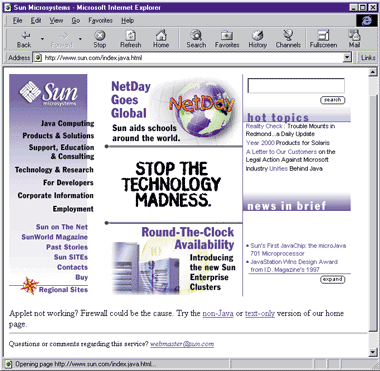
| Figure 1: The Java-enabled Sun Page |
Sun's Java-enabled page is broken up into three regions (see Figure 1). The left side of the page contains a set of topics over a gradient background. The middle has typical banner ads focusing on Sun products. The right side has a custom marquee and links to various Sun articles.

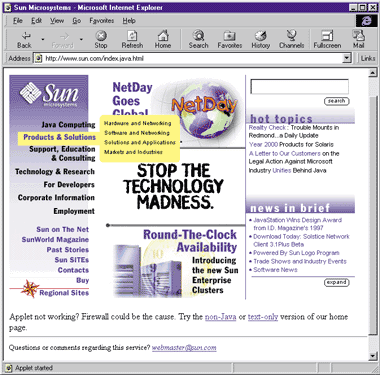
| Figure 2: Mousing over a topic |
The left side of the page is the most interesting part. Mousing over a topic highlights it and brings up a list of additional topics, as shown in Figure 2. Mousing over the popup topics highlights them. Clicking on them brings up a new HTML page showing additional information. Mousing away from the popup hides it. As I often do when looking at pages, I checked out the HTML source. The excerpt in Figure 3 shows it's just one big Java applet with lots of parameters.
The Dark Side of the Moon
I decided to make a page that would use similar interface techniques. Because the Sun page is reasonably complex, I broke the process into three steps:
- Creating the general layout
- Creating popup menus
- Adding jumps to the popup menus and menu topics
The Sun page contains many different regions. There is a background image containing the gradient and the Sun logo. There's text on top of that for the various topics. Mousing over the text brings up the popup menus, which extend over the middle section. And then there are the middle and right columns.
In keeping with this layout, I broke my page into four main parts—the topics text, the topics background, the popup menus, and the rest of the page. Unlike the fixed-width applet on the Sun page, I made my page dynamically resizable. To do so, I simply sized each of the regions as a percentage of the whole page.
The Sun page uses a GIF containing the Sun logo and a background gradient. In my continual quest to reduce bandwidth, I decided to get the same look without using any images. To do so, I used one of my favorite Dynamic HTML tricks: I first set the background color for the entire page to silver, and set the margins so that the body would consume the entire page.
<BODY topmargin=0 leftmargin=0 BGCOLOR=silver>

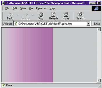
| Figure 4: Creating a beautiful gradient |
Next, I put a fuchsia <DIV> on the page and sized it to consume the left 25 percent of the page. I applied an alpha filter to the <DIV> and used the style parameter to make it a linear alpha filter so that, instead of applying the alpha blending uniformly across the <DIV>, the alpha amount changes from left to right. I set the initial alpha value to 0 so the entire silver background would show, and set the final opacity to 80 percent so the end of the <DIV> would appear mostly fuchsia. Looking at Figure 4, you can see this creates a beautiful gradient. Unlike downloading an image—as was done on the Sun site—this technique consumes very little bandwidth and is resolution-independent.
 <DIV id=grad style="position:absolute;
	width:25%; height:100%; top:0; left:0;
	background-color:fuchsia;
	filter:alpha(opacity=0, finishopacity=80, style=1)">
 </DIV>
I completed my basic layout by adding a title and some general text to the page.
Don't Look Now, Ethel
To keep some connection with the Sun site, I decided to make a site paying homage to the moon. Having created the background, my next challenge was to create the popup menus. These needed to have the following behaviors:
- Mousing over a topic displays a popup containing additional information about the topic and highlights the topic.
- Mousing to another topic displays a different popup and unhighlights the previous topic.
- The popup stays up even if you mouse away from a topic. That allows you to mouse into the popup without having it disappear.
- Mousing off of the top or bottom of the topic list area unhighlights any topics and hides any popups.
At first this might sound a little daunting. After all, the behavior I just described is far more complex than the typical mouseover highlighting you'll see. No worries—all it took was a little DHTML trickery.
First, I created the topic text by positioning a <DIV> on top of the gradient, but slightly overlapping into the second part of the page. This emulates the part of the Sun page where the menu items extend over the gradient and into the middle section of the page. I right-justified all of the text in this <DIV> so that no matter how short or long my topics were, they would always line up on the edge of the <DIV>.
 <DIV style="position:absolute; top:20%; height:20%; width:28%; font-size:16pt;
 font-weight:bold; font-family:arial; text-align:right"></DIV>
|
|
I then added a set of topic items to this <DIV>. I made each of these topics a <DIV>, and assigned them all the
same ID:
|
 <DIV id=topic>Sightings</DIV>
 <DIV id=topic>Telescopes</DIV>
 <DIV id=topic>Online news</DIV>
 <DIV id=topic>Phases</DIV>
|
|
I created the popup text corresponding to each of these topics by placing each one in its own <DIV> and, as with the topics, gave them all the same ID:
|
 <DIV id=hint>Texas</DIV>
 <DIV id=hint>Learn about telescopes used by the professionals.</DIV>
 <DIV id=hint>Is it true that the moon is waning?</DIV>
 <DIV id=hint>It's almost time for the full moon.</DIV>
|
|
Next, I added event handlers for onmouseover and onmouseout to the <DIV> containing the topic items:
|
 <DIV style="position:absolute; top:20%; height:20%; width:28%; font-size:16pt;
 font-weight:bold; font-family:arial; text-align:right" onmouseover="highlight()" onmouseout="unhigh()"></DIV>
|
|
The highlight function, which is called when the mouse moves over any of the topics, provides the core functionality of the page. It relies on two variables: curHint and curTopic. These contain a reference to the hint that is currently displayed (if any) and to the topic that is currently highlighted (if any). The function begins by checking whether a hint is still visible. If so, it hides that hint and gets rid of any topic highlighting:
|
 if ((curHint != null) && (curHint.style.visibility == "visible")) {
     curTopic.style.backgroundColor = "";
     curHint.style.visibility = "hidden";
 }
|
|
Next, the function makes sure that the mouseover occurred on a topic. After all, since I trapped events on the <DIV> containing the topics, I will also get mouseovers for that <DIV>. If the mouse is over a topic, I set curTopic to that element and highlight it by changing its background color.
|
 if (event.srcElement.id == "topic") {
     curTopic = event.srcElement;
     curTopic.style.backgroundColor = "yellow";
|
|
Then I determine which popup to show. To do so, I walk through all of the topics to determine which one was moused over. I use this index value to find the corresponding popup. In other words, if I moused over the second topic, I would show the second popup:
|
 for (i = 0; i < topics.length; i++)
     if (event.srcElement == topics[i]) {
         curHint = hints[i]
         curHint.style.visibility = "visible"
     }
|
|
The mouseout handler, unhigh, is simpler. It hides the current popup and clears the highlighting of the current topic, but only if the user moved the mouse over another topic or over the gradient background. As a result, the popup will stay visible if you mouse over it:
|
 function unhigh() {
     if ((event.toElement.id == "topic") || (event.toElement.id == "grad")) {
         curHint.style.visibility = "hidden"
         curTopic.style.backgroundColor = ""
     }
 }
|
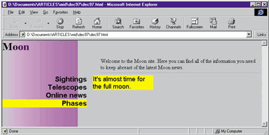
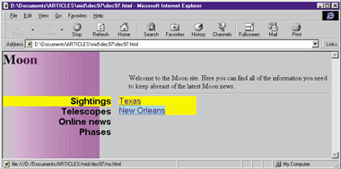
You can see this code in action in Figure 5, where mousing over one of the topics displays a popup menu.
|
 |
|
Figure 5: A Popup Menu
|
The Final Touches
Last, but not least, I need to add the jumps. On the Sun site, the popups for each topic contained only menu items. With HTML, there is no need to be so restrictive. Instead, I'll allow any HTML to show up inside the popup. Making jumps is as simple as adding anchor tags. For example, the following popup provides a jump as well as some text:
|
<DIV id=hint>Learn about <A HREF="scopes.html">telescopes</A> used by the professionals.</DIV>
|
|
Since the Sun site highlights the jumps when the user moves over them, I've done that as well, employing a technique similar to the one I used for highlighting the topics. I simply add mouseover and mouseout handlers to the <DIV> that contains all of the hints. These handlers then highlight any anchors that are moused over:
|
 function onHint() {
     if (event.srcElement.tagName == "A")
         event.srcElement.style.backgroundColor = "cyan";
 }

 function offHint() {
     if (event.srcElement.tagName == "A")
         event.srcElement.style.backgroundColor = "";
 }
|
Take a look at Figure 6 to see this code in action.
|
 |
|
Figure 6: Mousing over an anchor
|
The Sun site also lets you jump to a linked area when you click on one of the topics. There are two ways I could add this capability. The easiest would be to simply add anchor tags around any of the topics and let HTML do the work for me. Although this is a fine solution, I decided to take a slightly different approach. After all, the Sun site provides no feedback to indicate that clicking on a topic name will jump to an area, and provides no feedback to indicate when you have traversed a link.
I added my own onclick handler for the topics. It checks to see if there is a property for the object containing an HREF to jump to. This uses another cool Dynamic HTML trick. You can add whatever properties you want to elements and then query for them from script. Such properties are aptly called expando properties. For example, the following HTML adds an expando property to one of the topics:
|
<DIV id=topic jump="scopes.html">Telescopes</DIV>
|
|
I then check for this property in the onclick handler and jump to the URL accordingly:
|
 function jump() {
     if (event.srcElement.jump)
         document.location.href = event.srcElement.jump
 }
|
From the January 1998 issue of Microsoft Interactive Developer.
![]()
