As you know, one of the most important components of any Web site's functionality is its navigation menu. However, just because it's important, that doesn't mean that it has to take up unnecessary space. In fact, if you use the technique we're about to demonstrate, the menu won't take up any space at all until you're ready to use it.
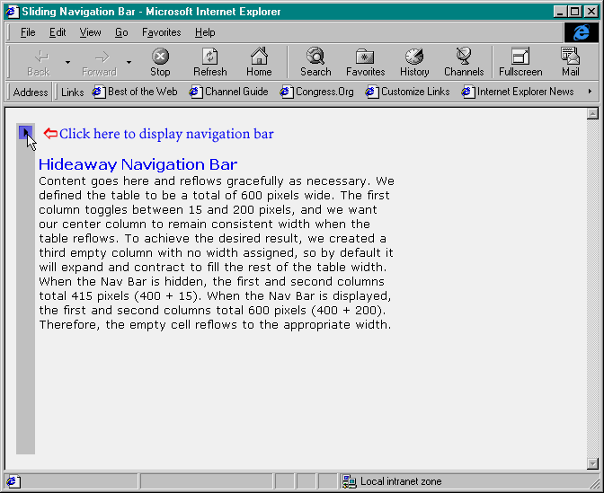
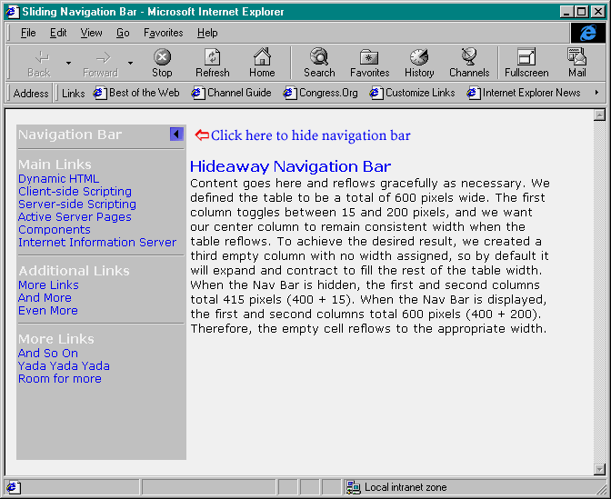
The navigation menu we're going to create is patterned after the way the Favorites menu works in Internet Explorer 4.x (IE4). When you don't need it, the menu conveniently hides, as shown in Figure A. But at the click of a button, it slides out from the left side of the screen, as shown in Figure B. In this article, we'll show you how to use Dynamic HTML to create this hideaway menu.
Since this technique relies on Dynamic HTML, it's fully functional only in IE4. Unless you have the luxury of designing sites for an IE4-only audience (e.g., an intranet), be sure to check the results in multiple browsers. For tips on programming for multiple browsers, refer to the article NAME TO BE SUPPLIED in the MONTH issue of Microsoft Web Builder.
Starting with styleLet's start by defining the styles that we'll be using on our page. First, of course, create a new HTML file. Then insert the following code in the HEAD section of the new file:
<style>

BODY {
   font-family: verdana;
   font-size: 13;
   text-align: left
}

TD {
   font-family: verdana;
   font-size: 13;
   text-align: left
}

H1 {
   font-family: verdana;
   font-size: 16;
   font-style: normal;
   font-weight: bold;
   margin-bottom: 1;
   background-color: white;
   color: blue;
}

.HideNavBar {
   display:none;
}

.ShowNavBar {
   display:"";
}

.NavHead {
   font-family: verdana;
   font-size: 14;
   font-style: normal;
   font-weight: bold;
   background-color: silver;
   color: white;

}

.Item {
   text-decoration: none;
   cursor: hand;
   font-family: verdana;
   font-size: 12;
   font-style: normal;
   background-color: silver;
   color: blue;
   height: 30
 }
.Highlight {
text-decoration: none;
cursor: hand;
font-family: verdana;
font-size: 12;
font-style: italic;
background-color: white;
color: red
}</style>You can see that we defined a style for the BODY, TD, and H1 tags. Some of the BODY styles, such as font-size, don't carry over into table cells, so it's best to handle their formatting with their own style definition. We also created several classes of our own. Let's take a look at each one.
The classes ShowNavBar and HideNavBar simply define the visibility of an object using the Display property. When the Display property is set to none, the affected element is not displayed and no space is allocated for it. To make an element visible (the default state), set Display to "". When you toggle the value of the Display property dynamically, IE4 redraws the page to make (or reclaim) space for the affected element.
The last three classes we define are NavHead, Item, and Highlight. We'll use these classes on the navigation bar to format each heading and menu item. We'll use the NavHead class for the menu headings, and the default class for each navigation link will be Item. The Highlight class shares most of the same attributes as Item, but we change the style to italic as well as changing the font and background colors. As you'll see later, we'll change an item's class to Highlight in response to a mouseover event to create a dynamic effect.
Putting it on the tableNext, we'll create a table to contain our navigation bar and content. The table will actually be made up of three columns. The first column will hold the navigation bar itself. The second column will contain the content. The third column will be empty, but it will adjust as the navigation expands and collapses, allowing the content column to maintain the correct dimensions. Here's the table's basic framework:
<TABLE WIDTH=600 HEIGHT=100% BORDER=0 CELLPADDING=2>
<TR>
<TD ID="NavColumn" BGCOLOR="silver" VALIGN="top" WIDTH=15>
<!-- Navigation column -->
</TD>
<TD VALIGN="top" WIDTH=400>
<!-- Content column -->
</TD>
<TD>
<!-- Filler column -->
</TD>
</TR>
</TABLE>So that we can use script to reference the navigation column, we set the ID attribute of the first table to NavColumn. The total table width is 600 pixels, which is equal to the width of the maximized navigation bar plus the width of the content column. We set the navigation column's original width to 15 and set the content column's width to 400. Since the last column doesn't include a width attribute, it will automatically adjust to fill the space vacated by the disappearing menu to fill the 600-pixel table.
Push the button for serviceNow that we've hammered out the framework for our disappearing navigation menu, let's build the menu. We'll start by creating two GIF images that we'll use as buttons—one to display the menu and one to hide it. For our buttons, we need to create the following two simple GIF images:
<9851ico1.bmp} <9851ico2.bmp}
To create your own buttons, you can use an image editor such as Microsoft Image Composer. We'll name the button that displays the navigation menu navon.gif, and we'll call the one that hides the menu navoff.gif. To position the button on the page, place the following IMG tag in the navigation column of our table:
<IMG ID=NavButton src="navon.gif" height=15 width=15 align=right style="margin-top:
1; margin-left: 1; margin-right: 1" onclick="ToggleNav()">We've set this IMG tag's ID to NavButton so that we can reference it with JScript to change its properties. We used the onclick event to call the ToggleNav function, which controls switching the menu on and off. We'll look at the ToggleNav function a little later.
The menu, pleaseNow let's create the navigation menu itself. The HTML for the menu is contained within a DIV. By using the DIV, we'll be able to dynamically change the attributes of the menu, particularly the display attribute, via script. To create the menu, simply place the following code after the IMG tag in the navigation column:
<DIV ID="NavBar" Class="HideNavBar">
<SPAN CLASS="NavHead">Navigation Bar</SPAN><HR>
<SPAN CLASS="NavHead">Main Links</SPAN><BR>
<A HREF="dhtml.HTM" CLASS="Item" onmouseover="MouseOn()"
onmouseout="MouseOff()">Dynamic HTML</A><BR>
<!-- more menu items -->
</DIV>In an effort to conserve space, we've included only one menu item in the code above. The complete listing for this sample menu will follow the article.
We've named our DIV NavBar and assigned it the class HideNavBar so that it won't be displayed when the page is loaded. The headings for our menu are enclosed within SPAN tags with the class NavHead for formatting. We simply use horizontal rules (<HR>)to separate sections of the menu. Finally, each navigation menu item is a link and is, therefore, referenced in an anchor tag (<A>) with the Item class. Notice that the onmouseover and onmouseout events trigger the MouseOn and MouseOff functions, respectively. These functions change the formatting of the menu items to give a dynamic effect as the pointer scrolls on and off each of them. Let's take a look at each of the functions in detail.
Making menu items dynamicTo highlight menu items as the pointer passes over them, we created two functions: MouseOn and MouseOff. These functions consist of the following code, which should be placed below the table in your document:
<script>
function MouseOn() {
if (window.event.srcElement.className == "Item") { window.event.srcElement.className = "Highlight";
}
}
function MouseOff() {
if (window.event.srcElement.className == "Highlight") {
window.event.srcElement.className = "Item";
}
}
</script>These two functions are pretty straightforward. In fact, we did most of the work when we defined the classes with the STYLE tag at the beginning of the article. The MouseOn function simply checks the current class name of the element that triggered the event. If the class is Item, the function changes the class to Highlighted so that the menu item takes on the characteristics of the Highlighted class. The MouseOff function does exactly the opposite: If the element's class is Highlighted, it changes it back to Item. You can see the behavior of the menu items in Figure C.
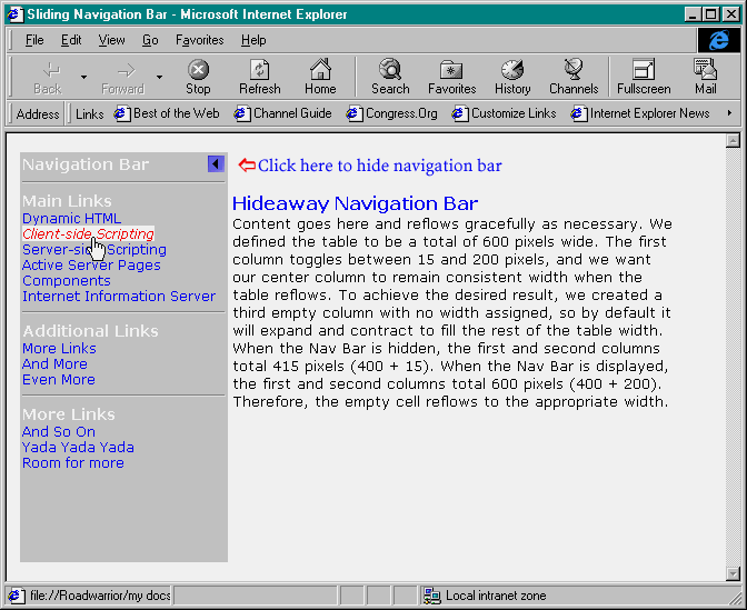
Menu items come alive when the pointer passes over them.
Figure C: Bringing it all togetherIf you've gotten this far and you're still not sure how everything fits together, read on. Remember when we discussed the IMG tag? The onclick event triggered a function called ToggleNav, which we promised to show you later. The ToggleNav function controls the expanding and hiding of the menu. The function consists of the following code placed in the HEAD section of your document:
<script>
function ToggleNav() {
if (NavBar.className == "ShowNavBar") {
NavBar.className = "HideNavBar";
NavColumn.width = 15;
NavButton.src = "images/navon.gif";
NavMsg.src = "images/display.gif";
}
else {
NavColumn.width = 200;
NavBar.className = "ShowNavBar";
NavButton.src = "images/navoff.gif";
NavMsg.src = "images/hide.gif";
}
}
</script>Let's break it down. First, when the user clicks the navigation menu button, the click event calls the ToggleNav function. The first thing the ToggleNav function does is determine the current class of NavBar, the DIV that contains our menu. If the current class name is ShowNavBar, the function proceeds to hide the navigation menu. Otherwise, the function displays the navigation menu. Let's look at how the function completes each task.
Hide…To hide the navigation bar, we first change the NavBar class to HideNavBar (from the STYLE section). Next, we set the width of the table cell, NavColumn, to 15 (the default). Finally, we change the SRC attribute of the IMG tag, NavButton, to images/navon.gif, the button the user clicks to display the navigation menu. For our example, we created an image that resides in the content section of the table and instructs the user to click the navigation button to display (or hide) the menu. We also change the SRC of that image, but that step is optional.
…and seekTo show the navigation bar, we complete a similar series of steps. First, we change the NavBar class to ShowNavBar. Next, we set the width of NavColumn to 200, the width of the expanded menu. Finally, we swap the images of our navigation button and instructional message. Our navigation bar is now fully displayed and ready to be toggled out of sight again at the click of a button. The complete code for our example is shown in Listing A.
ConclusionThis is one more technique that truly takes advantage of the power of Dynamic HTML. The ability to change the attributes of HTML elements on the fly gives the DHTML author a new level of control over the client document. Even though this technique currently works only with IE4.x, it will be well worth your time to experiment with it. You may even want to use client-side or server-side (ASP) scripting to deliver a DHTML-enhanced page for your IE4 users. They'll be glad you did!
Listing A: Source for hideaway navigation menu
<HTML>
<HEAD>
<META NAME="GENERATOR" Content="Microsoft Developer Studio">
<META HTTP-EQUIV="Content-Type" content="text/html; charset=iso-8859-1">
<style>
BODY {
font-family: verdana;
font-size: 13;
text-align: left
}
TD {
font-family: verdana;
font-size: 13;
text-align: left
}
H1 {
font-family: verdana;
font-size: 16;
font-style: normal;
font-weight: bold;
margin-bottom: 1;
background-color: white;
color: blue;
}
.HideNavBar {
display:none;
}
.ShowNavBar {
display:"";
}
.NavHead {
font-family: verdana;
font-size: 14;
font-style: normal;
font-weight: bold;
background-color: silver;
color: white;
}
.Item {
text-decoration: none;
cursor: hand;
font-family: verdana;
font-size: 12;
font-style: normal;
background-color: silver;
color: blue;
height: 30
}
.Highlight {
   text-decoration: none;
   cursor: hand;
   font-family: verdana;
   font-size: 12;
   font-style: italic;
   background-color: white;
   color: red
 }
</style>
<script>
function ToggleNav() {
if (NavBar.className == "ShowNavBar") {
NavBar.className = "HideNavBar";
NavColumn.width = 15;
NavButton.src = "images/navon.gif";
NavMsg.src = "images/display.gif";
}
else {
NavColumn.width = 200;
NavBar.className = "ShowNavBar";
NavButton.src = "images/navoff.gif";
NavMsg.src = "images/hide.gif";
}
}
</script>
<TITLE>Sliding Navigation Bar</TITLE>
</HEAD>
<BODY BGCOLOR="WHITE">
<TABLE WIDTH=600 HEIGHT=100% BORDER=0 CELLPADDING=2>
<TR>
<TD ID="NavColumn" bgcolor=silver valign=top width=15>
<IMG ID="NavButton" src="navon.gif" height=15 width=15 align=right
style="margin-top: 1; margin-left: 1; margin-right: 1" onclick="ToggleNav()">
<DIV ID="NavBar" Class="HideNavBar">
<SPAN CLASS="NavHead">Navigation Bar</SPAN>
<HR>
<SPAN CLASS="NavHead">Main Links</SPAN><BR>
<A HREF="dhtml.HTM" CLASS="Item" onmouseover="MouseOn()" onmouseout="MouseOff()">
Dynamic HTML</A><BR>
<A HREF="client.HTM" CLASS="Item" onmouseover="MouseOn()" onmouseout="MouseOff()">
Client-side Scripting</A><BR>
<A HREF="server.HTM" CLASS="Item" onmouseover="MouseOn()" onmouseout="MouseOff()">
Server-side Scripting</A><BR>
<A HREF="asp.HTM" CLASS="Item" onmouseover="MouseOn()" onmouseout="MouseOff()">
Active Server Pages</A><BR>
<A HREF="com.HTM" CLASS="Item" onmouseover="MouseOn()" onmouseout="MouseOff()">
Components</A><BR>
<A HREF="iis4.HTM" CLASS="Item" onmouseover="MouseOn()" onmouseout="MouseOff()">
Internet Information Server</A><BR>
<HR>
<SPAN CLASS="NavHead">Additional Links</SPAN><BR>
<A HREF="more.HTM" CLASS="Item" onmouseover="MouseOn()" onmouseout="MouseOff()">
More Links</A><BR>
<A HREF="andmore.HTM" CLASS="Item" onmouseover="MouseOn()" onmouseout="MouseOff()">
And More</A><BR>
<A HREF="evenmore.HTM" CLASS="Item" onmouseover="MouseOn()" onmouseout="MouseOff()">
Even More</A><BR>
<HR>
<SPAN CLASS="NavHead">More Links</SPAN><BR>
<A HREF="soon.HTM" CLASS="Item" onmouseover="MouseOn()" onmouseout="MouseOff()">
And So On</A><BR>
<A HREF="yada.HTM" CLASS="Item" onmouseover="MouseOn()" onmouseout="MouseOff()">
Yada Yada Yada</A><BR>
<A HREF="room.HTM" CLASS="Item" onmouseover="MouseOn()" onmouseout="MouseOff()">
Room for more</A><BR>
</DIV><BR>
</TD>
<TD ID="ContentColumn" valign=top WIDTH=400>
<IMG ID=NavMsg src="display.gif" height=20 width=375 align=left>
<BR><BR>
<H1>Hideaway Navigation Bar</H1>
Content goes here and reflows gracefully as necessary. We defined the table to be
a total of 600 pixels wide. The first column toggles between 15 and 200 pixels, and
we want our center column to remain consistent width when the table reflows. To achieve
the desired result, we created a third empty column with no width assigned, so by default
it will expand and contract to fill the rest of the table width. When the Nav Bar is hidden,
the first and second columns total 415 pixels (400 + 15). When the Nav Bar is displayed,
the first and second columns total 600 pixels (400 + 200). Therefore, the empty cell flows
between 15 and 185 pixels.
<BR>
</TD>
<TD><!-- Filler column --></TD>
</TABLE>
<script>
function MouseOn() {
   if (window.event.srcElement.className == "Item") {
      window.event.srcElement.className = "Highlight";
   }

}

function MouseOff() {
   if (window.event.srcElement.className == "Highlight") {

      window.event.srcElement.className = "Item";
   }
}

</script>
</BODY>
</HTML>Copyright © 1998, ZD
Inc. All rights reserved. ZD Journals and the ZD Journals logo are trademarks of ZD
Inc. Reproduction in whole or in part in any form or medium without
express written permission of ZD Inc. is prohibited. All other product
names and logos are trademarks or registered trademarks of their
respective owners.