Greg Lowney
Director of Accessibility, Microsoft Corporation
July 1998
All developers want to make their software visually appealing, flashy, and eye-catching. They also want to make it easy to use. The two goals don't have to conflict, but unfortunately what often looks good to designers and programmers can be annoying to customers with differing tastes, and unusable for customers with eyestrain, low vision, or color blindness.
Let's look specifically at color, and how it can be employed to either enhance your product or make your product impossible to use.
Color BasicsWhy should you care about how you use color? Because for millions of people, color is absolutely critical.
Nearly nine million people in the United States alone have severe visual impairments, and a much larger number have minor vision problems. Many require a reasonably high contrast between text and the background to be able to read. They may even need a particular scheme, such as very light text on a dark background, to prevent the background from "bleeding" over and obscuring the foreground text. Other people consider the default color scheme quite legible, but find that it causes eyestrain over longer periods of time. Still others, including nearly 10 percent of males, have some form of color blindness that makes certain color combinations unreadable. People with some types of dyslexia find it much easier to read text using certain colors.
Color is also important for earning the "Designed for Windows" logo. To qualify for the logo, applications must support the High Contrast option in Control Panel, and in the future they will be required to avoid conveying information by color alone. Both of these areas are addressed below.
Finally, color can contribute to overall usability. People feel more comfortable and can work longer when software provides pleasing colors that are easy to read. Usability studies at Microsoft show that a surprisingly large number of people without disabilities mention difficulty reading small text, or black text on a gray background. We've addressed this by providing ways to adjust the appearance of our software, such as the Display and Accessibility Options in Control Panel and the Internet Options in Internet Explorer.
But it's also up to you to determine how your application will do. In general:
Always provide an alternative to conveying information by color alone.
Color helps get your message across, but information conveyed only through color is unusable to many people. Users may rely on a very limited color scheme, or use a handheld computer with a monochrome display, or rely on utilities that "read" the text on the screen out loud, and these seldom convey information that's only represented by colors. So even if color is your primary or default means of conveying information, be sure to provide alternatives.
Here are some examples of options you can provide:
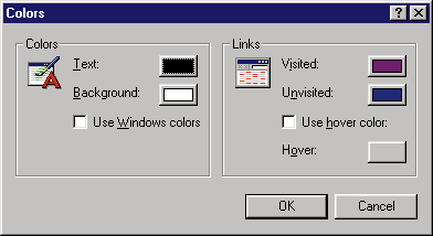
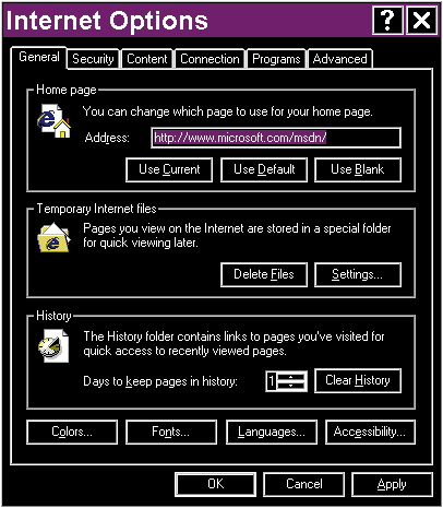
Allow the user to customize all colors, either through Control Panel or through your own user interface.
Some applications use fixed colors to prevent the user from selecting an "ugly" color scheme that would make the application look unattractive. However, a user will never complain about a color scheme that he or she chooses. They will complain about fixed colors they don't like.
You can make your application responsive to the customer's needs by doing the following:
Use colors selected through Control Panel where appropriate.
When possible, an application should use the standard system colors that the user has selected through Control Panel. This is easiest to accomplish when an element in the application’s window corresponds to a usage handled by Control Panel, such as window background, window text, button face, dialog-box text, and so on. By using the color combinations that the user has explicitly chosen, you reduce the chance that colors will make your application unusable. You also provide colors that please the user without having to add more options. For a complete list of system colors, see the description of the GetSysColor function in the Microsoft Platform Software Development Kit (SDK).
You can use Control Panel colors beyond their original meaning. For example, the user’s choice of window text color and background is probably a safe combination to use for almost any purpose.
Remember to check the system colors not only when your application starts, but also every time the system settings change. You can recognize this when you get a WM_SETTINGSCHANGE message.
Using Private Colors
Allow the user to customize colors that are private to your application.
If you use colors for elements that do not correspond to system colors selected in Control Panel, you should provide your own means for adjusting the colors. For example, if you design a calendar application that uses different background colors to indicate various types of events, allow the user to select the colors used.
If you can't bear to clutter your user interface with more options, at minimum support a registry key that selects the colors instead of hard-coding them. Then you can provide a .reg file that the user can edit to adjust these settings.
You may also want to provide a "Default Colors" button if you are worried that users will create a mess they can't get out of.
Letting Windows Do It For YouIn many cases Windows can support proper colors for you automatically. All the standard Windows controls use the colors that the user selects through Control Panel, and they even support the High Contrast option described below.
The same support is found in the Microsoft HTML Control, which is part of Microsoft Windows® 98 and is also included with Internet Explorer. Many applications are using HTML to display everything from documents to dialog boxes, and the Microsoft HTML Control lets you use color in a rich fashion while also providing the user with full control over the display when they need it. For more information on this, see Internet Explorer information on our Accessibility Web site, at www.microsoft.com/enable/.
Background CountsNo matter its color, anything can be unreadable if it doesn't show up well against its background. To make things legible:
Always use colors in proper foreground/background combinations.
Your application should always use system colors in their proper foreground/background combinations to ensure that they have reasonable contrast. The user will never choose a button text color that is the same as the button face color, so these will always be legible when used together. However, the user may alter the color scheme so that system colors that normally contrast, such as button text and window background, might be the same color on their systems. If your application draws using colors that are not specifically designed to be used in combination, the information may be completely invisible.
Always draw foreground objects in foreground colors and fill backgrounds with background colors. Drawing these reversed can make reading difficult, or even painful, for some users. For example, large areas of bright colors can be painful for people with some types of visual impairments. It's acceptable to reverse the colors in small areas, but it's even better to use the Control Panel colors specifically designed for that purpose. For example, rather than simply inverting text when it's selected, use the GetSysColor function to determine the appropriate color for the highlighted text (COLOR_HIGHLIGHTTEXT) and highlighted background (COLOR_HIGHLIGHT).
The following list shows some combinations that are safe to use and others that are not.
| Combination | Status |
| Window Text on Window Background | Safe |
| Button Text on Button Face | Safe |
| Window Text on Button Face | Unsafe because unrelated colors are mixed |
| Button Text on Window Background | Unsafe because unrelated colors are mixed |
| Window Background on Window Text | Unsafe because colors are reversed |
| Button Face on Button Text | Unsafe because colors are reversed |
The same rules apply when using private colors that the user can select in your application. Draw foreground objects in colors the user has selected for the foreground, and background objects in colors selected for the background.
Coloring Graphic ObjectsWhen possible, be prepared to draw monochrome images that contrast with the background color.
Graphical objects present special challenges. To ensure that your images contrast with any background the user selects, convert images to monochrome (meaning a single set of foreground and background colors, not necessarily black and white), and then map those foreground and background colors to the corresponding Control Panel colors. For example, a button face should always be drawn in the standard system color (COLOR_3DFACE), and an image on a button should be drawn in the standard button text color (COLOR_BTNTEXT). If the image is drawn inside a window rather than on a button, it is more appropriate to use the COLOR_WINDOW and COLOR_WINDOWTEXT values instead of the button colors.
Here are some ways an application can display buttons that have pictures on them instead of text:

Draw text on a plain, contrasting background to make it much easier to read.
Text is most legible when drawn against a plain background of a contrasting color. Text drawn over a varied background, such as a wash of colors, a bitmap image, or lines, may be illegible for many users because the image can distract from or blend with the edges of letters making them hard to recognize. This is especially true when the screen is magnified, or viewed with altered colors.
If you use such backgrounds, you should provide an option to omit the image and revert to a plain background. Here are some methods you can use:
Increase legibility whenever the High Contrast option is selected.
A user may find that color choices make a system or application unusable, even preventing them from using menus or dialog boxes to correct the problem. That's why Windows provides the High Contrast Option in Control Panel.
This option asks Windows and applications to adjust their appearance for increased legibility. As a convenience, it can also select from a number of appearance schemes that are optimized for legibility. Shared systems can be configured to let the user choose this setting with a single hot key, in case the current colors prevent them from using Control Panel. (The High Contrast option is available in Microsoft Windows 95 and Windows 98, and will also be supported in Windows NT® 5.0.)
This feature lets you design any default appearance, yet still provide entrance for your customers. It is also the last resort the customer can use in emergencies. If there is only one time that you make your user interface customizable, this should be it.
When your application starts, or when you get the WM_COLORCHANGE message, check this setting by calling the SystemParametersInfo function with the SPI_GETHIGHCONTRAST value. When the option is set, you should at minimum take the following steps:
If you want to go further, you can also take other steps that are discussed in this article:
There are some places where you don't have to change your colors. These include palettes or samples where the user selects a color, and any third-party controls or embedded objects that you don't control.
Also, keep in mind that the High Contrast requirement is not specific to any particular color scheme. Being compatible with any one color scheme can be a matter of coincidence, but picking up system colors ensures that you're compatible with any scheme.
Learn MoreIf you want to learn more about making your applications usable by a wider range of individuals, check out these resources:
How does your application stack up in its use of color? It's easy to find out.
Go into the Accessibility Options in Windows 95 or Windows 98 Control Panel and turn on the High Contrast option. Or simply choose one of the High Contrast schemes that are included with Windows. Do menus, dialog boxes, and other controls use the selected colors? Does text contrast with its background? Are graphics on toolbar buttons distinguishable? In short, can you still use the application?
Your application might already work fine, and it probably won't take much work to correct any small problems you find.
A lot of people will thank you for it.