|
This article may contain URLs that were valid when originally published, but now link to sites or pages that no longer exist. To maintain the flow of the article, we've left these URLs in the text, but disabled the links.

This article assumes you're familiar with Cascading Style Sheets and
JScript
Download the code (203KB)
|
Slideshows Made Easy with Dynamic HTML
Lanie Kurata and Jacqueline Sowell
|
|
Like PowerPoint shows, but hate the large footprint? Soup up your presentation and make it available to any Internet Explorer 4.0 user through the magic of Dynamic HTML.
|
Inspired by the cool Web-based slide show presentations we've been seeing at every Microsoft® event where Dynamic HTML (DHTML) is discussed, we set ourselves the task of creating a similar presentation. These presentations work just like PowerPoint®, yet capitalize on the power of the extensive document object model and scripting support in Microsoft Internet
 Explorer 4.0. PowerPoint 97 supports saving presentations as HTML, but it does not support DHTML. In other words, all animation effects are lost once the slideshow is converted to HTML. By contrast, using DHTML to build a presentation makes flying text, mouseover text highlighting, fading in of images, and dissolves between
pages possible.
A number of the slides presented here were derived from last November's Professional Developers Conference slides. Those slides, of course, were authored in PowerPoint 97.
We decided that, rather than worrying about laying out our own slides, we could borrow ideas from existing slides and then strive for the same effects using DHTML. We were
quite successful in replicating just about everything the PowerPoint slides do and have been impressed with the capabilities of DHTML.
We created a presentation consisting of seven slides, each demonstrating a different visual effect you would expect from a PowerPoint slideshow. Our slideshow looks best when viewed at an 800X600 resolution and running Internet Explorer 4.0 in full-screen mode. (There is a difference between running the browser full-screen and running it in a maximized window. To run full-screen, click on the Fullscreen icon from the Internet Explorer 4.0 toolbar. This causes the browser to run with the most screen real estate possible, displaying neither borders nor menus.)
Applying a Transition to an Image
Transitions are one of the cool new features brought to you by DHTML. With transitions, you can implement
fast and easy visual effects on your Web pages with simple HTML and very minimal script. Transitions are particularly useful when moving from one slide to the next (these are referred to as interpage transitions in DHTML) or to progressively render a graphic image on a page for a more subtle fade-in effect.
To apply a transition to an image, you first define the image and specify the desired transition. In the following code, the reveal transition filter is applied inline to the <IMG> tag through the Cascading Style Sheets (CSS) filter attribute. Two attributes must be specified; the ID attribute must be set to refer to this image element in script, and the CSS visibility attribute must initially be set to hidden so the image transitions from being invisible to visible.
|
<IMG ID="MyImg" src="pdc97.jpg"
STYLE="filter:revealTrans(Duration=3.0, Transition=1);
visibility:hidden">
Transitions can be applied to text as well. When applying transitions on text, define a <DIV> or a <SPAN> block so that the filter attribute can be specified inline. Be sure to specify a height, a width, or position:absolute, otherwise
the filter will not be recognized as an object, resulting in a scripting error.
Getting the transition to take effect in DHTML is a three-step process. First, using the Apply method, apply the transition without causing an immediate repaint. Next, make the necessary property changes. In the sample code below, the image transitions from being invisible to visible, so the visibility property of the image is set to visible. This is not always the case. You could also transition from one image to another. In that case, you'd set the src property of the image to the URL of the image you're transitioning to. You complete the transition using the Play method.
The filter attribute defined in the first step is accessed through script by using the filters collection of the MyImg object (named with the ID attribute of <IMG> tag). The filters collection returns all the filters defined for that element. To access the first and only filter defined in the sample, you would specify the zero-based index as follows:
MyImg.filters[0]
We've encapsulated these three steps into the applyTransition function, which takes the image object to be transitioned as a parameter. The applyTransition function shown below should be generic enough to implement any desired transition in your own application.
 <SCRIPT>
 function applyTransition (oImg)
 {
    oImg.filters[0].Apply();
    oImg.style.visibility = "visible";
    oImg.filters[0].Play();
 }
 </SCRIPT>
The next step in applying the transition is to figure out when it should start. One way to do this is to start the transition as soon as the page loads by calling the applyTransition function on the <BODY> tag's onload event.
<BODY onload="applyTransition(MyImg)" ... >
Note how the pointer to the MyImg object is passed to the function with no quotation marks. Incorrectly enclosing it in quotation marks (as in "MyImg") results in the string "MyImg" being passed instead of the MyImg object, so no transition takes place.
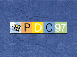
Figure 1 shows the cover page, S1.HTM. The slide demonstrates a Box Out reveal transition. You can see the whole presentation right here.

| Figure 1: Presentation Cover Page |
Changing Text Color Character
by Character
Letter-by-letter animation is very straightforward once you start thinking of each character as a separate entity rather than as a whole word. Changing text effects at the character level requires that each letter occupy a separate container, such as a <DIV>, <SPAN>, or table cell. Which container you choose depends on whether you want a break after the element, as in a <DIV>, or no break, as with a <SPAN> or table cell.
We used the table cell container to demonstrate color cycling effects for text. The code shown here could be transferred to any object you might want to use. In addition, it represents the fastest way to achieve such effects because no CSS positioning is necessary, unlike so many CSS-related animation effects.
First, create the HTML table containing a cell for each object. Think of it as one cell per text effect when constructing the table. The table example below includes a whole word in the first cell and a single character in each ensuing cell. Of course, what you include depends on what you are trying to communicate.
Next, design the default appearance of the table. Each cell inherits the CSS attributes of the table as a whole. Capitalize on this ability by setting font attributes here. If a CSS value contains multiple nonhyphenated words, remember to enclose the value in quotation marks.
 <STYLE>
   TABLE    {  font: 40pt "Comic Sans MS";color: black;  }
 </STYLE>
Now it's time to prepare the elements for scripting. You must assign the same ID to every cell used in the JScript™ array that's necessary for cycling through the colors. No cell width is specified in the file thus far. All letters are equidistant, which is a problem where separate words are present and run together. Cell width can be designated using a class for the affected cells. Or, as in the following example, an empty cell can be inserted between the cell containing the first word and the one containing the second. Either technique results in "Dynamic" and "HTML" being offset appropriately.
 <TABLE>
    <TR>
       <TD ID=tblColorChange>Dynamic</TD><TD></TD>
       <TD ID=tblColorChange>H</TD>
       <TD ID=tblColorChange>T</TD>
       <TD ID=tblColorChange>M</TD>
       <TD ID=tblColorChange>L</TD>
    <TR>
 </TABLE>
 <MARQUEE ID=celSlide>Slideshow</MARQUEE>
Next, add a marquee after the table. The CSS letter-spacing attribute adjusts the spacing in the marquee text to have full impact, while also expanding column width the necessary amount. In the sample code, the marquee ID attribute is specified as celSlide. This name is accessed in the <STYLE> tag by preceding the ID with the pound sign.
 <STYLE>
    #celSlide    {  letter-spacing: 10;color: cyan;  }
 </STYLE>
Scripting the array comes next. Use the new Array constructor to designate the elements to loop through. In the sample, the ID of the table cells is set equal to the new Array constructor. The variable iCurrentCELL is passed as the index value of each item in the array. This variable is initially set to zero.
 var iCurrentCELL = 0;
 tblColorChange = new Array(iCurrentCELL);
Use the style object to code the color changes. We wrote a function that loops through the array, setting the CSS color property equal to a variable. Our function does so twice, once for looping upward (sColor2) and once for looping downward (sColor1). This way the colors change from left to right and vice versa.
 function cycleColors()
 {
    if (bAscending)
     {
     with(document.all)
     celColorChange[iCurrentCELL].style.color = sColor2;
     iCurrentCELL++;

      if (iCurrentCELL > 4)
        {
         bAscending = false;
         iCurrentCELL = 4;
        }
     }
    else
     {
       with(document.all)
      celColorChange[iCurrentCELL].style.color = sColor1;
          iCurrentCELL—;
         if (iCurrentCELL == 0)
        {
         bAscending = true;
         changeColors();
        }
     }
 }
Switch statements based on iColorLoop will assign a color to each cell on the fly. Below, the changeColors function enforces four cases. Each case assigns a CSS color value to the variables sColor1 and sColor2. Remember that the style object recognizes a string for color settings, but the document object accepts only hexadecimal input.
 function changeColors()
 {
    switch (iColorLoop)
    {
      case 0:
           sColor1 = "yellow";
           sColor2 = "orange";
           break;
      case 1:
           sColor1 = "hotpink";
           sColor2 = "purple";
           break;
      case 2:
           sColor1 = "aqua";
           sColor2 = "blue";
           break;
      case 3:
           sColor1 = "lightgreen";
           sColor2 = "green";
    }

  iColorLoop++;
  if (iColorLoop > 3)
      iColorLoop = 0;
 }
Finally, set up a timer to govern the rate at which colors change. Decide what action should initiate the code you have written, then call the setInterval method in the corresponding event. This code starts the timer after the window has loaded by calling the cycleColors function every 100 milliseconds.
<BODY onload="setInterval('cycleColors()',100)">
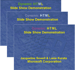
S2.HTM (see Figure 2) displays our title page. The slide cycles the colors through the words "Dynamic HTML." The slide also flies the authors' names diagonally into position, a technique we'll describe later.

| Figure 2: Color Cycling in Text |
Manipulating Text Effects for Mouse Events
Activating text in response to mouse events requires
minimal scripting and is achieved largely through CSS rules and the className property. The code for text effects created this way is succinct and easy to maintain. For more
information on assigning styles, see "Changing Element
Styles" in the Internet Client SDK (available on the SBN
Web Snapshot CD).
First, use CSS styles to generate the default appearance of the document. Create the default look by setting styles on the highest-level container feasible. In our case, the <BODY> element is the best choice. If your design involves more variation, setting styles on lower-level containers such as <DIV> might better fit your needs. Elements in your document inherit the style attributes set at the parent container level. When animating text, for example, set the default font characteristics on the <BODY> element in the style sheet.
The following example demonstrates two ways of denoting style information within the <STYLE> element. The first technique lists the full CSS attribute name, such as background-color.
 <STYLE>
    BODY { background-color: black;color: gold;font:
           24pt sans-serif} </STYLE>
The second specifies the composite attribute name and lists multiple values after it.
 <STYLE>
   BODY  { background-color: black;color: gold;font: 24pt sans-serif}
   UL.ActivateTextEffect  {  color: orange;letter-spacing: 2; }
 </STYLE>
A composite attribute encompasses multiple properties. For instance, you can use the attribute background to set the value for any background attribute, such as background-color, background-image, and background-attachment. In the first example, values for font size and font family are set in a space-delimited list following the property name font. Assigning values in this manner can save development time.
The next step in creating your text is to write a style rule for activated text. Decide on the font characteristics you want to signify highlighted text. Next, make a CSS rule. A CSS rule consists of a selector and a style declaration. The second example shown above demonstrates how to apply a style to a specific group of elements. The rule consists of the selector, UL.ActivateTextEffect, and the style declaration in the curly braces. This means that all UL tags of the class ActivateTextEffect will receive the specified style values. The UL.ActivateTextEffect syntax indicates that ActivateTextEffect is a subset of all UL tags. This style syntax is applicable to any element type. Style rules make it easy to alter multiple CSS attributes simultaneously and to maintain them in a single location.
The next step is to add calls to the CSS rule into the appropriate tags. Determine what event should cause the style change. In this case, the onmouseover event is the most intuitive catalyst for
activating text. Add the event name into the element tag, then access the CSS class through the className property in the
ensuing code. The following code uses this.className, which is simply a more generic technique for calling the element.
 <BODY>
    <UL onmouseover = "this.className = 'ActivateTextEffect'"
        onmouseout = "this.className = ';'">Part I: DHTML Text        Features
    </UL>
 </BODY>
The corresponding event, onmouseout, is the logical candidate for restoring the text to the document default settings. Restore the default settings by setting the className for the element equal to a string containing a semicolon. The next section of the article will demonstrate how to apply a whole new style sheet on the mouseout event.
Finally, copy and paste the event code to all the <UL> headings, or whatever tags you want to draw attention to. Remember that JScript is case-sensitive, even when the code is located within HTML tags.

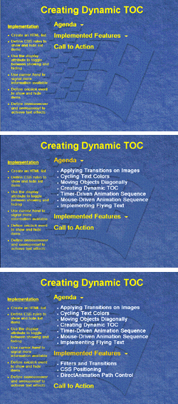
| Figure 3: Mouseover Highlighting |
S3.HTM (see Figure 3) shows a typical agenda page that displays an overview of the topics that will be covered in the presentation. The slide demonstrates the mouseover highlighting effects just described, as well as showing and hiding elements on a list, which is discussed next.
Creating a Dynamic Table of Contents
The ability to hide and show information on demand is one of the great innovations in DHTML. Scarce screen real estate makes getting the big picture difficult—that is, unless content lists with headings that reflect the hierarchy of topics can be expanded and collapsed at will. The next sample slide shows how to create an expandable table of contents with code that you can reuse without modification. This code degrades gracefully because browsers that do not support the CSS attributes simply display the whole contents list.
First, make an HTML list that represents your table of contents. Use an unordered list:
 <UL>Agenda
    <LI class=white>Applying Transitions to Images
    <LI class=white>Cycling Text Colors
    <LI class=white>Moving Objects Diagonally
    <LI class=white>Creating Dynamic TOC
    <LI class=white>Timer-Driven Animation Sequence
    <LI class=white>Mouse-Driven Animation Sequence
    <LI class=white>Implementing Flying Text
 </UL>
Next, signal that more information is available. Without some indication, the user will not know that subheadings exist. One way to provide such user interface cues is a down-arrow icon next to each top-level heading. You could also use DHTML to activate <UL> tag text and transform the cursor into a hand when the mouse pointer passes over it. The latter effect can be created in a central location by using CSS rules. The following example adds style definitions for an unordered list to those we already specified:
 <STYLE>
   BODY { background-color: black;color: gold;
          font: 24pt sans-serif}
   UL   { cursor: hand; }
 </STYLE>
The next step is to define the style rules for hiding and displaying list items. This uses the full power of CSS selectors. Only simple selectors have been used so far—selectors that apply to a single tag or attribute (such as UL.ActivateTextEffect). We can use contextual selectors. A contextual selector is applied to elements based on their position in the document structure; it consists of multiple simple selectors.
 <STYLE>
   BODY { background-color: black;color: gold;
          font: 24pt sans-serif}
   UL { cursor: hand; }
   UL LI { display: none;font: 18pt;list-style:square; }
   UL.showList LI { display: block; }
    .defaultStyles UL { color: gold; }
    UL.defaultStyles LI { display: none; }
 </STYLE>
|
Figure 4 explains each selector shown in this code.
Now it's time to add inline events. You should include events for displaying and hiding the list. First, create an onclick event that assigns the showList CSS selector to all <UL> tags. Next, define an ondblclick event that assigns the defaultStyles selector to all <UL> tags. Be sure to let the user know how to collapse the list, whether you use a separate event, as is modeled here, or write code that toggles the list display by using a single event.
You can create the onmouseover event to generate active text effects of the sort described previously. Let's explore a different way to achieve these effects; instead of changing style sheets by reassigning the className property, style information is defined inline. In the onmouseover event, the new style is set inline through the style object in the code. This technique involves manipulating style properties as opposed to style attributes.
Defining the onselectstart event is important because it allows control over whether text can be selected. Users frequently click-drag or double-click the mouse when only a single click is called for, as in the case of expanding the contents list. These two mouse actions cause text to be selected, which indicates that it can be edited. Coding the onselectstart event to return false prevents such a miscue by canceling the event. The returnValue property of the event object is used in the following code.
|
 <HTML>
   <BODY>
   <UL onclick = "this.className = 'showList';"
       ondblclick = "this.className = 'defaultStyles';"
       onmouseover = "this.style.color = 'orange';"
       onselectstart = "event.returnValue = false;">Agenda
       <LI class=white>Applying Transitions to Images
       <LI class=white>Cycling Text Colors
       <LI class=white>Moving Objects Diagonally
       <LI class=white>Creating Dynamic TOC
       <LI class=white>Timer-Driven Animation Sequence
       <LI class=white>Mouse-Driven Animation Sequence
       <LI class=white>Implementing Flying Text </UL>
 </BODY>
 </HTML>
|
|
Use event bubbling to streamline the code you write here. Mouse, selection, and keyboard events all bubble, so you can place the onselectstart code at the document level and make no mention of it on the individual tags it contains. Doing so saves binding to the onselectstart event on every single <UL> tag in the table of contents. If your document contains other items that should allow text selection, then enclose your contents list in a <DIV> and trap event bubbling at that level. For more information, see the discussion of event bubbling and the event object in the Internet Client SDK.
|
<BODY onselectstart="event.returnValue = false;">
|
In S3.HTM (see Figure 3) clicking on the top headings causes the list to expand and collapse—a fairly common DHTML trick.
Animating a Sequence of Elements
The classic way to implement animation is to define a series of elements, making each one appear in succession. After all, an animated movie is nothing but a series of images drawn by an artist that are displayed on screen one after another.
Dynamic positioning, CSS, and the document object model together bring animation to the Internet with minimal code. The manner in which each element in the series appears on the page could vary. It could be flown into the page or gradually faded in using any one of the transition patterns exposed by the filter attribute. Or it could simply become visible through the visibility property of the
element. Although animation is generally timer-driven, you could animate a sequence of elements on a page in response to a mouse click for better control. We'll describe both of
these techniques.
The first thing to do when animating is decide what display resolution you intend to support. This can be critical as you begin to position various elements on your page. Ideally, every element should be visible to the user with minimal scrolling. When a target resolution has been defined, it is best to configure your system accordingly before you author pages. All the slides discussed here, for instance, were designed for an 800X600 display.
The next step is to position all necessary elements on the page. Until there is a tool available that makes positioning elements on an HTML page as easy as dragging and dropping at the desired location, the only way to do this is through trial and error. Although these elements will be animated into the page and might not be visible initially at runtime, you want them to be visible at this point in the authoring process so you can position them perfectly on the screen.
When positioning elements on a page, determine whether to use absolute or relative positioning. Absolute positioning usually works best for animation. With absolute positioning, the element is removed entirely from the normal flow of the document and is set to the location specified in the top and left attributes. Specifying a relative position positions the element at an offset from its normal position in the flow. Experiment with both values and decide what works best for your page.
Assign an ID to every element that will be animated. These elements will be scripted later, and are therefore easily referenced through an ID. Set the visibility attribute to hidden for each element that will be animated. This property then will be set to visible as the element is animated into the page.
|
 <IMG ID="CDFWindow" SRC="cdf.gif" WIDTH=448 HEIGHT=448
 STYLE="top:100; left:270; position:absolute; visibility:hidden">
|
Once you've done all that, define the animation sequence. In a simple animation sequence, the order in which each element appears in the sequence needs to be specified. The code below creates a sequence array to define this order. The array is initialized in the window's onload event handler.
|
 function window.onload()
   {
      // Using the IDs assigned to each element, define the order
      // of elements in the animation sequence
      sequence = new Array (CDFWindow, CDF1, CDF2, CDF3, CDF4);

      // initialize where you are in the sequence
      currentSequence=0;
       ...
   }
|
In more complicated animation sequences, it may be necessary to define the manner in which each element is animated onto the screen. For instance, the author may want to fly some elements in and transition others. In this case, a custom attribute, such as animationType, may be set for each element. When the time comes to animate the element, this attribute will be retrieved (using getAttribute), and the element is animated accordingly. For simplicity, both of the following samples animate all elements in the sequence in the same manner, and therefore do not define this animationType attribute.
Another way to specify the animation sequence on a
page is to define a custom element, which, like custom attributes, is accessible through the object model. Scott Isaacs' book, Inside DHTML (Microsoft Press, 1997), has a sample that demonstrates this with a user-defined <SEQUENCE> element.
The next step is where the difference in the timer-driven versus the mouse-driven approach to animation lies. When animating on a mouse click, you'll set up the onclick event handler to animate the element, as in this example.
|
 if (numClick < sequence.length)
 {
       i = numClick;

       // Determine the type of animation to apply
       var animationType = sequence[i].getAttribute("animationType",false);

       // if no animationType was specified, default to Transition
       if (null == animationType)
         animationType = 0;

       // Fly from Right
       if (animationType == 1)
       {
          sequence[i].style.pixelLeft = document.body.offsetWidth
          sequence[i].style.visibility= "visible";
          window.setTimeout ("FlyFromRight (sequence[i],270);",10);
       }

       // Apply a Transition
       else if (animationType == 0)
          ApplyTransition (sequence[i]);
  }

     numClick++;
|
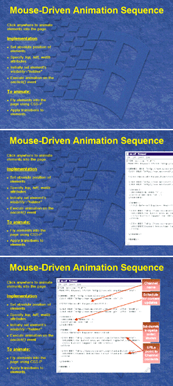
Figure 5 shows a mouse-driven animation sequence where the first of four images flies into the page the first time the user clicks on the page, while the three others transition in sequentially on the succeeding clicks using the WipeLeft transition.
|
 |
|
Figure 5: Mouse-driven Animation
|
|
When animating on a timer, you set up the timer, and then execute the animation sequence. Where you set up the timer will depend on when you want your animation sequence to begin. Often you want animation to start as soon as the document loads, so the setInterval method is called on the window's onload event. This particular timer fires every three seconds.
|
 function window.onload()
   {
    ...
    // setup the timer
      iTimerID= window.setInterval("Animate()",3000);

   }
|
As for executing the animation sequence, the following code simply applies a transition to each element in the sequence. When the end of the sequence is reached (that is, currentSequence == sequence.length), the timer is stopped. Implementation details of the applyTransition function were discussed previously.
|
 <SCRIPT>
   function Animate()
   {
       // Apply a Transition
       applyTransition (sequence[currentSequence++]);

       // stop when end of animation sequence is reached!
       if (currentSequence == sequence.length)
          window.clearInterval(iTimerID);

   }
 </SCRIPT>
|
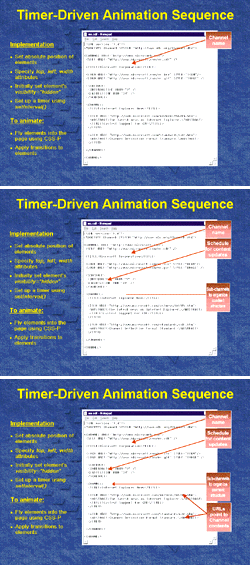
S4.HTM, shown in Figure 6, is visually identical to the page shown in Figure 5. The only difference is that the animation on this slide is timer-based; each element in the sequence executes every three seconds.
|
 |
|
Figure 6: Time-based Animation
|
Making Text Fly
With dynamic positioning, it is possible to create simple animated effects such as flying text by manipulating the position of elements on a page over time. Flying text is common in slideshow presentations, say, to make each main
bullet point fly in from the right and appear independently of the others.
The <MARQUEE> element, with the behavior attribute set to slide, provides a similar functionality by scrolling text as specified by the direction attribute (that is, up, down, left, or right). <MARQUEE> is currently supported only in Internet Explorer and is limited to vertical and horizontal scrolling, whereas flying text through positioning gives the Web author complete freedom to move text around.
Making text fly with the <MARQUEE> element in Internet Explorer is simple. Just enclose the text you want
to fly in <MARQUEE> and </MARQUEE> tags. Note that this element takes HTML-formatted text between the start and end tags.
|
 <MARQUEE behavior=slide>
    <UL>
       <LI class=yellow>Use DHTML to differentiate your content
       and create compelling Web sites
    </UL>
 </MARQUEE>
|
Next, define the flying area through the width and height attributes, depending on the flying direction specified. Positioning the marquee element on the page using the position, top, and left CSS attributes might also be appropriate.
When flying horizontally (with direction set to left or right), the height attribute seemingly gets ignored and, as such, need not be specified. Regardless of the height specified, only one line of text is scrolled. If multiple lines of text need to be scrolled horizontally together, insert line breaks using the BR element.
|
 <MARQUEE width=700 style="position:absolute; top: 180"
 ...
 direction=left>
 <UL>
     <LI class=yellow>Use the Document Object Model (DOM)<br>
     to create interactive documents
 </UL>
 </MARQUEE>
|
|
Finally, specify all other appropriate attributes to control flying speed and number of times to scroll.
|
 <MARQUEE width=700 style="position:absolute; top: 180" loop=1
 SCROLLAMOUNT=10 SCROLLDELAY=20 behavior=slide direction=left>
|
|
Implementing these steps causes text to fly as soon as the page comes up. But this might not always be appropriate. In some cases, Web authors would like to send text flying on demand—say on a mouse click or timer, as in a slideshow presentation. The way to do this is through the marquee's start and stop methods, as illustrated in the following code:
|
 <SCRIPT>
 function window.onload()
 {
     Marquee1.stop();      // Set marquee to stop initially
 }
|
 function document.onclick()
 {
     Marquee1.start();     // Marquee1 is the ID of the MARQUEE
 }
 </SCRIPT>
|
|
Implementing flying text with CSS positioning, although simple, involves a little more work than with the <MARQUEE> element because you have to manipulate the position of the element yourself. First, position the elements on the page. It is best to do this with the rest of the elements laid out on the page so you can visualize where everything fits. This can be done with the help of style sheets. The following sample defines a global style sheet with a <STYLE> element, specifying fonts, colors, and margins to be used.
|
 <STYLE>
     ...
 LI.yellow {font-size: 25pt; font-weight:600; font-family:Arial,Helvetica;
 color: gold; margin-top:.2in; margin-bottom: 0.2in; margin-left:0.5in;
 margin-right:0.5in; }
     ...
 </STYLE>
|
When positioning elements, decide whether to use static, absolute, or relative positioning. Static positioning , the
default, leaves the object to flow with the rest of the document. Relative positioning locates the element at an offset from its normal position in the flow. Absolute positioning
removes the object from the flow, allowing you to specify a fixed location.
With the style sheet defined above, the following sample uses relative positioning—text is positioned somewhere near the element's position in the document (that is, to the left, right, top, or bottom). The sample uses a <DIV> element and sets the appropriate CSS attributes for the text block. Note that the visibility property is initially set to hidden so that the text is not visible until flown in. (This might not be necessary in every case, although it is recommended.)
|
 <DIV ID=Text1 style="position:relative; visibility: hidden">
     <LI CLASS=yellow>Use DHTML to differentiate your content and create compelling Web sites
 </DIV>
|
When the destination location is determined, it is time to set up the element for flying. Position the element on the edge of the screen opposite the flying direction; that is, to fly an element right to left, position the element on the right edge of the screen. It is important to place the element right at the edge of the screen, and not on some random coordinate offscreen, so that the text immediately becomes visible on the page as it flies in.
The following sample flies the first block of text vertically, from the top down, and calculates the initial y-coordinate position for the element.
|
 <SCRIPT>
   Text1.style.pixelTop = document.body.offsetTop
   Text1.offsetTop - Text1.offsetHeight;
 </SCRIPT>
|
|
Initializing the position can be done either on the onload event or when just about ready to fly. Set the visibility property to "visible" when ready to fly the text into the page.
|
Text1.style.visibility= "visible";
|
|
On a timer, call the function to fly the text in. The timer is set up using setTimeout or setInterval.
|
window.setTimeout ("FlyFromTop (Text1,0);",10);
|
Finally, fly the text in, adjusting the pixelTop or pixelLeft property for flying top to bottom or left to right.
The following function takes a pointer to the object being flown and a stop value, the pixelTop value at which flying stops.
|
 function FlyFromTop (oDiv,stopY)
 {
     oDiv.style.pixelTop += 10;
     if (oDiv.style.pixelTop >= stopY)
         oDiv.style.pixelTop = stopY;
     else
     {
         copyDiv = oDiv;
         copyY   = stopY;
         window.setTimeout (
            "FlyFromTop (copyDiv,copyY);", 10);
     }
 }
|
Three other functions have been similarly defined in the sample pages, to fly from right, fly from left, or fly from bottom to handle flying from all directions.
|
 |
|
Figure 7: Flying Text
|
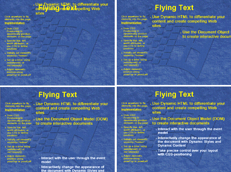
S6.HTM (see Figure 7)shows a typical "call to action" slide, which is part of almost every Microsoft slideshow presentation. It not only sums up the points made throughout the presentation, but also ensures that the audience is aware of what they need to do to successfully adopt the technology. The slide demonstrates how to fly text into view on demand—in this case, on a mouse click.
Making Text Fly in Geometric Patterns
Flying text at its simplest—vertical and horizontal scrolling—can be created using the <MARQUEE> element, as we showed you previously. If diagonal text paths are what you seek, the dynamic positioning power of CSS is the best choice. Achieving results takes more up-front effort, but once you have a few routines for calculating different slopes you will be able to adapt them quickly to generate unique effects.
To simplify the slideshow, we decided to incorporate this feature into the title page, as shown in Figure 2. This slide, in addition to demonstrating cycling colors, flies the authors' names down from the upper-left corner of the client window to midpage. As the text stops, the words "Microsoft Corporation" appear underneath it. From the start, there is one essential point to remember: text elements, like any object, must be positioned properly to be moved around the page. Of the three values for positioning—absolute, relative, and static—absolute is best suited to text animation. Remember, static positioning leaves the object to flow with the text as the browser window is resized. Relative positioning situates an element at an offset to where it belongs in the text flow. By contrast, absolute positioning removes the object from the text flow altogether. In other words, a positioned object can be layered behind or in front of flowed elements on the page as well as dynamically repositioned.
First, create a container for the text and then use CSS rules to position it. The following example shows a positioned <DIV> element that will start by default at (0,0) in the client window. Because the coordinate system in Internet Explorer is flipped, (0,0) is located at the top-left corner of the client window. In addition, it is important to note here that an element's coordinates are also measured from its own upper-left corner.
|
 <STYLE>
 BODY { background-color: black;color: gold;font: 36pt bolder sans serif; }
 .DiagonalText { position: absolute;top: 0;left: 0;width: 200; }
 </STYLE>
|
The next step is to write a function that calculates slope. Time to dust off your algebra. Remember y = mx + b, where y controls the vertical and x the horizontal position, b the offset from the horizontal axis, and m the slope? For a steeper or shallower slope change the value of m.
The code below uses this formula to achieve a diagonal descent for the specified <DIV>. The left property of the style object for divMove is then set equal to iHorizontal. Also, the top property for divMove is set equal to iVertical. In this way, the <DIV> is moved down and right as the loop variable i is incremented.
|
 var i;
 var iVertical=0;
 var iHorizontal=0;

 function moveDiv()
 {
   for(i = 0;i < 10;i++)
     {
        iHorizontal += 1;    // slope is 1; horizontal increment is 1
        iVertical = iHorizontal; // vertical change equals horizontal
        divMove.style.top = iVertical;
        divMove.style.left = iHorizontal;
     }
 . . .
 }
|
Next, set the speed at which the text will progress. Invoke the setInterval method to control how frequently the moveDiv function is executed. Without an interval, the division moves too quickly for the eye to see. The following example calls setInterval within a function that can be coded into the body_onload event if desired.
|
 var vTimerID;

 function setTimer()
 {
   vTimerID=window.setInterval("moveDiv()",40);
 }
|
You can experiment with the actual interval—a larger value slows the interval. The setting of 40 milliseconds shown above achieves fairly smooth text movement.
Executing the clearInterval method of the window object stops the interval started in the setTimer function. This method is best placed in the moveDiv function so that a variable can track the number of iterations performed and stop execution at a set point in time. In the following example, the interval is cleared through a call to the variable vTimerID once iInterval has recorded more than 25 loops.
|
 function moveDiv()
 {
 . . .
   iInterval++;
   if(iInterval > 25)
      {
         window.clearInterval(vTimerID);  // stop DIV movement

         applyTransition(divToggle);      // display second DIV
      }
 }
|
Many DHTML text animation effects are so easily created that they will lose their mystique once the secrets get out. That is the case for toggling visibility. In this case, instead of simply setting visibility to "visible" after the interval is stopped, a transition is applied to the <DIV> for a more subtle effect.
Earlier, we employed the CSS display attribute to control table of contents visibility. In that task, it is important to use display rather than visibility because toggling display reflows the static elements on the page, causing the contents list to appear under the <UL> tag in which it is nested. In the sample above, the visibility property is used. The flying text is contained within a positioned <DIV> and stands outside the flow of static elements. Consequently, the functionality
offered by the display property is unnecessary here. In addition, the visibility property offers a slight performance
advantage because it does not force the page elements to
be reflowed.
Finally, create repeating loops using arrays. The for loop as coded in the moveDiv function calculates new coordinates on the fly. This structure is optimal as used for a single action. For repetitive text animations, an array is preferable. Although less streamlined than a simple loop, an array wins performance gains by caching the calculations that it would otherwise make repeatedly during program execution.
Making Text Fly through an Oval Path
Thus far, you've already seen three ways to fly text—horizontally, vertically, and diagonally. Now let's fly text through a path—in this particular case, an oval. Previously we manipulated the position of elements on a page over time through dynamic positioning. Although flying text over a more complex path through positioning is possible, it requires a geometric algorithm. The sample described next uses the DirectAnimation path control, which makes implementation very easy with a few lines of code. By specifying a target object to be moved, the path control moves the object around the page in a geometric pattern over time. One limitation to using the path control is that it's specific to Internet Explorer 4.0.
The path control requires that you set the top and left properties (or CSS attributes) of the target object. The text being defined here is the target object. The top and left attributes have been set below.
Deciding whether to use absolute or relative positioning depends on the text location with respect to the rest of the document. Remember, absolute positioning removes the object from the default flow of the document, allowing the object to be positioned as specified in the (top,left) attributes; relative positioning locates the object at an offset from where it's supposed to be in the flow.
|
 <span ID="TextToFly" STYLE="position: absolute; top: 125; left:70;
 font: bold 20pt 'Arial'; color:white">
 http://msdn.microsoft.com/psdk/inetsdk/help
 </span>
|
Next, insert a DirectAnimation path control. Being an ActiveX® control, the path control is inserted into the page with an <OBJECT> element, specifying the correct CLASSID. This CLASSID is unique to the path control and should be specified exactly as shown in the sample below. Specify the parameters to the path control as follows:
- Duration specifies how long it takes (in seconds) to fly the text through the entire path.
- Shape specifies the oval path to fly the text through. With the absence of a tool that sizes and positions the oval as appropriate, the only way to specify the correct parameters to this Oval method is by trial and error.
- AddTimeMarkerX sets a time marker (specified in seconds) that fires an event when playback reaches that marker position, where X is the nth time marker set. In the sample below, the time marker is set at the halfway point, at which time text flying stops. Because the path's duration has been set to two seconds, the time marker is set to one second.
- Target specifies the identifier of the target object to follow the path.
|
 <OBJECT ID="pthOval"
     CLASSID =
         "CLSID:D7A7D7C3-D47F-11D0-89D3-00A0C90833E6">
     <PARAM NAME="Duration" VALUE="2">
     <PARAM NAME="Shape"
            VALUE="Oval(-1400,100,1400,200)">
     <PARAM NAME="AddTimeMarker1"
            VALUE="1.0, HalfwayPt, 0">
     <PARAM NAME="Target" VALUE="TextToFly">
 </OBJECT>
|
|
When the onplaymarker event fires as a result of the HalfwayPt time marker defined above, the text stops flying at its current position.
|
 <SCRIPT FOR="pthOval" EVENT= onplaymarker("HalfwayPt")>
     pthOval.Stop;
 </SCRIPT>
|
A one-line script sets the text to flying.
|
 <script>
     pthOval.Play;
 </script>
|
|
S7.htm, shown in Figure 8, is our slideshow's exit page. It flies the URL "http://msdn.microsoft.com/psdk/inetsdk/help" through an oval path. This exit page was actually used at the end of every slideshow at last year's PDC, showing the Microsoft logo and the URL for the PDC site.
|
 |
|
Figure 8: Geometric Flying
|
In this case, most of the content described in the article focused on DHTML, which is discussed in the Internet Client SDK. Therefore, the URL to the latest Internet Client SDK docs is displayed instead, so readers can easily refer to that site for more information.
Putting it All Together
Now that we've got the slideshow à la DHTML basics down, you're probably wondering how we pulled all seven of these slides together into one slideshow.
When creating each of these slides, as in any slideshow presentation, we decided to use a common background image. To set a background image in HTML, you typically set the background attribute of the <BODY> element to the image URL. Doing so, however, causes the image to be tiled behind the content, which isn't the effect we wanted in our presentation. Because there is no attribute that prevents tiling, we instead specified a separate <IMG> element for our background image, stretched it to fit the entire screen (setting width and height to 100 percent), and gave it a negative z-index value to ensure it always stayed lowest in the stacking order of the elements on the page. Here's the resulting <IMG> tag:
|
 <IMG src="background.jpg"
      STYLE="position:absolute; left:0; top: 0;
      width:100%; height: 100%; z-index:-100" >
|
After the background image was set, navigation between slides was next on our list of features to implement. If you're a PowerPoint user, there are two ways you expect to navigate between slides: first, clicking anywhere on the slide should take you to the next slide; and second, dragging your mouse to the lower-left corner of the slide should pop up a menu that takes you to any of the slides. For our purposes, we decided to implement the first navigation method and slightly modified the second.
The first is easily achieved by simply providing an onclick event handler that sets window.location.href to the next slide's URL. For the second one, we've made four buttons that slide up into view as you mouse over the lower- left corner of the slide. These buttons take you to the first, previous, next, and last slides. Here is how they've been defined on the page:
|
 <DIV ID=navBar STYLE="visibility:hidden; position:absolute; width: 200;
 height:28; top:550; left:10">
   <INPUT TYPE="IMAGE" style="filter:alpha(opacity=40)" TITLE= "First"
     SRC="first.gif">
   <INPUT TYPE="IMAGE" style="filter:alpha(opacity=40)" TITLE= "Previous"
     SRC="prev.gif">
   <INPUT TYPE="IMAGE" style="filter:alpha(opacity=40)" TITLE= "Next"
     SRC="next.gif">
   <INPUT TYPE="IMAGE" style="filter:alpha(opacity=40)" TITLE= "Last"
     SRC="last.gif">
 </DIV>
|
When any one of these buttons is clicked, we navigate to the appropriate page (first, previous, next, or last). The resulting onclick handler, combining the first and second navigation methods described, looks like the code below. Note how cancelBubble is set to true once the onclick is handled for any of the four input-type buttons. Bubbling is canceled so that the event does not continue firing unnecessarily as it proceeds up the hierarchy.
|
 <BODY onload= "pauseStart();"
       onmousemove="slideNav();"
       onclick= "switchSlides();"
       BGCOLOR=BLACK LEFTMARGIN=0 TOPMARGIN=0 BOTTOMMARGIN=0 RIGHTMARGIN=0>

 function switchSlides()
 {

      // if any of the navigation buttons were pressed,
      // determine which button was pressed, and
      // set cancelBubble = true;
      if (event.srcElement.tagName == "INPUT")
      {
         // go to next or previous
         if (event.srcElement.title == "First")
            location.href= "s1.htm";

         else if (event.srcElement.title == "Previous")
            location.href = "s1.htm";

         else if (event.srcElement.title == "Next")
            location.href = "s3.htm";

         else if (event.srcElement.title == "Last")
            location.href = "s7.htm";


         // cancelBubble so it doesn't bubble up
         event.cancelBubble = true;
      }

      else
         location.href="s3.htm";


 }
|
The code to move the navigation buttons onto and off of the slide is the same code used to fly text into the slide (in this case, FlyFromBottom and FlyFromTop). As with flying text, a <MARQUEE> could have been used to slide these navigation buttons into view as the mouse is dragged onto the screen's lower-left corner. Also notice how the alpha filter was used for the navigation buttons. They would've worked just as well without it, but adding the filter gave it a more subtle effect as the buttons blended in with the background.
Finally, just as in PowerPoint, we decided to throw in interpage transitions so that, as a user navigates from slide to slide, a Box Out transition is applied. Interpage transitions are part of the filters and transition effects DHTML provides. Implementing these in your pages is as easy as adding the following line in the <HEAD> section of your HTML file. You specify the type of transition and duration, as well as whether the transition should occur while the following page is loaded or as it is exited.
|
 <META http-equiv="Page-Enter"
       CONTENT="RevealTrans(Duration=2,Transition=1)">
|
A word of warning on transitions: in Internet Explorer 4.0, they are not highly optimized. Your page takes a measurable performance hit while a transition completes. If you can help it, use transitions sparingly.
Conclusion
The topics presented in this article employ many of the hottest features in Internet Explorer 4.0: CSS positioning and formatting, transitions and filters, and the DirectAnimation path control. Not only are the visual effects exciting, but the Web pages containing them download quickly. DHTML files are compact, and the DirectAnimation control is usually pre-installed with Internet Explorer 4.0.
The only remaining question is whether we met the challenge. Does our DHTML slideshow presentation equal or surpass what we could have created in PowerPoint 97? Well, PowerPoint 97 has the wizards and ready-made effects that make generating a presentation a snap. However, DHTML in Internet Explorer 4.0 offers scripting power and inexhaustible possibilities for original visual effects. The DHTML slideshow presentation that we created for this article convinced us that DHTML is the wave of the future.
For a complete resource on the Internet Explorer document object model and CSS, access the Internet Client SDK at http://msdn.microsoft.com/psdk/inetsdk/help/.

|
From the May 1998 issue of Microsoft Interactive Developer.
![]()
