
by Jeffrey P. McManus
Reprinted with permission from Visual Basic Programmer's Journal, 11/98, Volume 8, Issue 13, Copyright 1998, Fawcette Technical Publications, Palo Alto, CA, USA. To subscribe, call 1-800-848-5523, 650-833-7100, visit www.vbpj.com, or visit The Development Exchange
Use VB6's new user-interface controls to display your data, choose a date from a graphical calendar, and control your scrollbars.Visual Basic 5 gave you a rich selection of controls, but VB6 ups the ante by offering a number of handy new user-interface controls. Most support VB's new database-access functionality, and a few are specifically geared toward use with ActiveX Data Objects (ADO). While a few of the controls I'll show you are retreads of old favorites, such as the DataGrid and DataList controls, VB6 has enough new controls to keep you up for a few nights figuring what they are and how they're useful. I've stayed up a few nights with them myself, so I'll try to give you a head start.
I've provided a list of all the new controls in VB6, including their formal names, as displayed in the Project References dialog, and their OCX file names (see Table 1). Note that some controls, notably the Windows Common Controls, replace versions of the controls that have shipped with previous versions of VB. This article was written with a late beta version of VB6, so how you implement these controls might have changed a bit by the time you read this.
| Control Name | Reference | File Name |
| ADO Data Control | ADO Data Control 6.0 | MSADODC.ocx |
| Coolbar Control | Microsoft Windows Common Controls-3 6.0 | COMCT332.ocx |
| DataGrid Control | Microsoft DataGrid Control 6.0 | MSDATGRD.ocx |
| DataList and DataCombo Controls | Microsoft DataList Controls 6.0 | MSDATLST.ocx |
| DataRepeater Control | Microsoft DataRepeater Control 6.0 | MSDATREP.ocx |
| DateTimePicker Control | Microsoft Windows Common Controls-2 6.0 | MSCOMCT2.ocx |
| Flat Scrollbar Control | Microsoft Windows Common Controls-2 6.0 | MSCOMCT2.ocx |
| Hierarchical FlexGrid Control | Microsoft Heirarchical FlexGrid Control 6.0 | MSHFLXGD.ocx |
| ImageCombo Control | Microsoft Windows Common Controls 6.0 | MSCOMCTL.ocx |
| MonthView Control | Microsoft Windows Common Controls-2 6.0 | MSCOMCT2.ocx |
Table 1: VB6's New Controls. This list of VB6's new controls includes their formal names, as displayed in the Project References dialog, and their OCX file names.
are you my data?You'll need a database for many of the demonstration features in this article, so start by creating an Open Database Connectivity (ODBC) data source name (DSN) for the biblio.mdb database. Use the ODBC Control Panel applet to do this. In the ODBC Data Source Administrator, select the System DSN tab, then click on the Add button. From the list of ODBC drivers, choose the Microsoft Access Driver. Then, in the ODBC Microsoft Access dialog, enter the data source name, MyBiblio. Finally, locate the database biblio.mdb on your disk by clicking on the Select button. The database should be in the VB6 directory. Once you've done this, you're ready to rock.
One of the biggest no-brainer controls in VB6 is the ADO Data control. Although the concept of a Data control hasn't changed much since it was first introduced in VB3 (that is, a quick demonstration that looks good in as little time and with as little code as possible), the guts of the ADO Data control have changed significantly. With ADO you now can use non-SQL data sources—for a taste of that, check out the information on the MSDataShape provider later in this piece.
Start by adding Microsoft ADO Data Control 6.0 (OLE DB) to your project using the Project Components menu, then create an instance of the ADO Data control on a form. Set the control's ConnectionString property to point to your data source. To point to an ODBC DSN, use a string such as this one:
DSN=MyBiblio;
To point to a data source without using a DSN (a so-called "DSN-less connection"), include the driver and database information in the ConnectionString, like this:
DRIVER={Microsoft Access Driver (*.mdb)};DBQ=d:\vs98\vb98\biblio.mdb
In the RecordSource property of the ADO Data control, enter the name of the table you want to use—in this case, Authors. Finally, let the control know you're referring to a table (as opposed to a SQL string or stored procedure) by setting the CommandType property to 2 - adCmdTable. This should be enough information for the control to permit you to edit and browse records.
Note that while this example uses ODBC to connect to the data source, you aren't limited to ODBC when using the ADO Data control. You can bypass ODBC directly by entering a reference to the Microsoft Jet provider in place of the ODBC data source. Such strings look like this:
Provider=Microsoft.Jet.OLEDB.3.51;Data Source=d:\vs98\vb98\biblio.mdb
Next, create one or more text boxes on the form. Set the DataSource property of each control to the name of the ADO Data control (by default, ADODC1). Then, set the DataField property of each control to the name of the field you want the control to store. For the Authors table, use the Author and Year Born fields. Again, note that the VB properties window drops down to display the list of available fields, just like the DAO Data control.
Note that when you right-click on the ADO Data control at design time, you get a Property Page dialog that gives you easy access to the control's design-time properties. But, aside from this and the control's support for OLE DB data sources, the ADO Data control works nearly identically, at least in principle, to the DAO and RDO Data controls.
The Data control was never the greatest thing since sliced bread, although it's a great way to test a database connection, create quick, codeless prototypes, or demonstrate VB to people who don't know any better. I include the ADO Data control here because it's new to VB6, and because a few of the other new controls depend on it. For an example project that shows how the ADO Data control works, see the project file ADOData.vbp in the code package accompanying this article.
datagridThe DataGrid control is similar to the data-aware DBGrid control that shipped with VB5. This new DataGrid control can bind to the ADO Data control. However, it lacks a few of the old DBGrid control's features. DBGrid is still shipped with VB6 for backwards compatibility, but is no longer installed by default. Specifically, the DataGrid control doesn't have the RowBuffer object, which supports the unbound mode offered by the DBGrid control. This makes sense, since the DataGrid control can't be used in unbound mode, nor can it be bound to Data controls other than the ADO Data control.
However, in ADO 2.0 you have a new option—the ability to create Recordset objects on the fly, without ever connecting to a database. This lets you create, an application whose user-interface controls are bound to the Data control, but whose Data control isn't actually "bound" to a database Aside from compatibility with the ADO Data control, the only other advantage the control offers is size—the old DBGrid OCX is over 500 kilobytes (K), while the new DataGrid control is a comparatively svelte 252K.
To use the DataGrid control, create an ADO Data control, then assign the grid's DataSource property to the name of the ADO Data control. When you run the application, the data provided by the ADO Data control is displayed in rows and columns in the grid. An example project is in the project file DataGrid.vbp in the code package accompanying this article.
Make a list, check it twiceThe DataList and DataCombo controls are new controls that replicate the functionality of VB5's DBList and DBCombo controls. The controls permit your application to bind to two Data controls. One control supplies the list of choices provided by the list, while the second connects the data entered into the control into a field in the database.
To use either of the DataList controls, first use the Project Components menu to add the Microsoft DataList Controls 6.0 to your project. You'll know the controls are new and improved when they're added to your toolbox because, well—their icons are blue. Aside from that, the controls work pretty much the same as the old DBList controls.
Start using the DataCombo control by creating an ADO Data control. Set the Data control's ConnectionString property to DSN=MyBiblio, which is the ODBC data source name you created earlier. Next, set its RecordSource property to this SQL statement:
SELECT *
FROM Titles
This is all you should need to get the Data control to connect to the data source. While you're at it, create an instance of the DataCombo control to bind to the PubID field, as well as two conventional text boxes to display the Title and ISBN fields from the Titles table.
Next, bind the user interface to the data. Start with the text boxes and connect them to the Publishers table by assigning both of their DataSource properties to Adodc1. Assign the first text box's DataField property to Title and the second text box to the DataField called ISBN. Connect the DataCombo control to the ADO Data control by setting its DataSource property to Adodc1, then setting its DataField property to PubID. This displays the publisher ID in the combo box, but it won't display the list of publishers to choose from in the Publishers table. You can now launch the application to demonstrate that this is the case.
To display the list of publishers, create a second ADO Data control to represent the Publishers table. I do this by copying and pasting the original Data control. When you do this, VB asks you if you want to create a control array. Answer No—the control will be named Adodc2. Change the new control's RecordSource property to this SQL statement:
SELECT PubID, Name
FROM Publishers
This provides a list of publishers from which to choose. Since the user won't typically use this Data control for navigation or updates, set the control's LockType property to 1 - adLockReadOnly, and its Visible property to False.
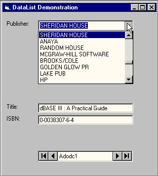
To assign this new Data control to the list portion of the combo box, assign the DataCombo control's RowSource property to the Data control Adodc2, and set the control's ListField property to the name of the field you want to display in the list (the field called Name). Finally, to indicate that the PubID from the publishers list should be saved to the PubID field of the Title when the user chooses from the list, assign the BoundColumn property of the DataCombo to the field PubID. That does it—the application now displays a textual list of publishers, even though it's only storing their IDs in the database (see Figure 1).

Figure 1: DataList. You can now see a list of all the publishers, with IDs stored in the database.
This application has problems, though. Aside from the fact that creating user interfaces that directly bind to databases violates the tenets of client-server architecture, this thing runs dog slow. On my 133-MHz Pentium laptop, the app took over 15 seconds to load. This is because the Publishers table has over 8,000 records. I did this intentionally, to show the limitations of working with Bound List controls. They have their place, but you don't want to bind them to data sources with potentially limitless numbers of members. Limit the lists to a few hundred at most, and your applications should be OK. You'll find the example application in the project file DataList.vbp in the code package accompanying this article.
repeat yourselfThe DataRepeater control is a unique new control that converts any ActiveX control into something like a grid control or a Microsoft Access subform. If you've never worked with a subform, think of it as a control that represents the "many" of a one-to-many relationship between data elements. Rather than being stuck with using rows in a grid control to display the many relationship, the DataRepeater lets you use any ActiveX control or combination of controls to display related records. And, you don't need to have a one-to-many relationship to use the DataRepeater—it's appropriate anytime you want to create a control that displays data in repeating rows.
To use the DataRepeater control, first create an ActiveX control project. Name the UserControl TitleList and name the project DRCtrl. In the UserControl designer, create text boxes and labels for the Title and ISBN fields side by side. Name one text box txtTitle and the other txtISBN. Next, create Property procedures for the control that corresponds to the text boxes. Use this code:
Public Property Get Title() As String
   Title = txtTitle.Text
End Property

Public Property Let Title(ByVal strNew _
   As String)
   txtTitle.Text = strNew
   PropertyChanged "Title"
End Property

Public Property Get ISBN() As String
   ISBN = txtISBN.Text
End Property

Public Property Let ISBN(ByVal strNew _
   As String)
   txtISBN.Text = strNew
   PropertyChanged "ISBN"
End Property
Once you've created Property procedures for Title and ISBN, mark them as data-bound by selecting the Tools, Procedure Attributes menu and clicking on the Advanced button in the dialog. Indicate that both the ISBN and Title properties are data aware by clicking on the check box labeled "This property is data-bound." Also click on the box labeled "Show in DataBindings collection at design time." Make sure you do this for both the Title and ISBN fields.
You're now done with the control; which is fully bindable to a data source, such as an ADO Data control. However, before your new control will work with the DataRepeater, it must be registered on your system, which means compiling it to an OCX. Do this by using the File, Make menu.
Next, create a new Standard EXE project. In the Project Components menu, add the ADO Data control and the Microsoft DataRepeater. Set up the ADO Data control as you did in the previous examples, by assigning its data source to the Titles table. Assign the DataRepeater's DataSource property to Adodc1, then assign its RepeatedControlName property to the control class of your control, which should appear in the drop-down list in the properties window as DRCtrl.TitleList. As soon as you select the control, one or more instances (depending the height of the control) will appear inside the DataRepeater control.
You'll now need to assign fields from the ADO Data control to the DataRepeater control. To do this, right-click on the DataRepeater. In the Property Page dialog, click on the RepeaterBindings tab. In the PropertyName combo, select ISBN, then select the corresponding data field in the DataField combo and click on Add. Do the same for the Title field, then click on OK. That's it! Run the application, and you should be able to scroll through multiple records (see Figure 2).
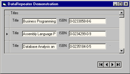
Figure 2: DataRepeater. You can easily scroll through the database for the book titles and ISBN numbers.
Although this example uses an ActiveX control that you build yourself to demonstrate the DataRepeater control, note that you don't need to use your own control to use a DataRepeater—any database-aware ActiveX control will do. If you want to quickly get started with the DataRepeater, replace the TitleList control in this example with the Masked Edit control, a database-aware ActiveX control that ships with Visual Basic. An example project containing the TitleList control that uses the DataRepeater is in the project group DRGroup.vbg in the code package accompanying this article.
FIND THE TIMEThe DateTimePicker control and MonthView controls are new to VB6. Both controls work in a similar way, permitting users to choose a date from a graphical calendar. The MonthView control represents the graphical calendar itself, while the DateTimePicker is essentially a calendar-enabled combo box, permitting you to conserve space on a form while providing the same graphical date-picking functionality as the MonthView control.
To use DateTimePicker or MonthView, use the Project Components menu to add Microsoft Windows Common Controls-2 6.0 to your project. Next, create an instance of the DateTimePicker control on your form. The first thing that appears is the calendar (see Figure 3). The clunky bold lettering and childish-looking red circle denoting the current date aren't quite as elegant as similar user-interface widgets you'll see in Microsoft Outlook, or even in the third-party ActiveX Calendar controls that have been around for years. But, you can make the control look cooler.
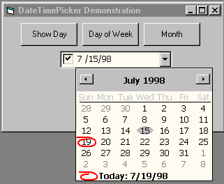
Figure 3: Date TimePicker. Maybe this calendar isn't as elegant as the one Microsoft Outlook, but you can easily change its appearance.
In my demonstration I changed the control's default font to 9-point Tahoma, the same font used by Outlook, then changed the CalendarBackColor property to &H8000000F&, the special color code corresponding to the Button Face setting in Control Panel. This makes the drop-down calendar a soothing shade of gray.
In addition to dropping down a calendar, you can use the control to let users choose Time values by setting the control's Format property to 2 - dtpTime. At the same time, you'll want to set the control's UpDown property to True. This gets rid of the calendar drop-down, replacing it with a spin control. Using the spin control, users can adjust the value displayed in the control with the mouse, instead of typing in on one of those pesky, old-fashioned keyboards.
The control also lets you do certain types of validation. The MaxDate and MinDate properties prohibit users from entering dates that fall outside a specified range. When you need to programmatically inspect the date or time entered by the user, the control's Value property is your choice. The Value property returns a familiar Visual Basic Date value. If you prefer, you can also retrieve Numeric values corresponding to the selected month, day of the week, week of the year, and so on. Use this simple code:
Private Sub cmdDayOfWeek_Click()
   MsgBox DTPicker1.DayOfWeek
End Sub

Private Sub cmdMonth_Click()
   MsgBox DTPicker1.Month
End Sub

Private Sub cmdDay_Click()
   MsgBox DTPicker1.Day
End Sub
An example project that illustrates how to use the control is in the project file DateTimePicker.vbp in the code package accompanying this article.
don't be sharp, be flatThe FlatScrollBar control is an all-new ActiveX control in VB6. Like the MonthView and DateTime controls, you can find the FlatScrollBar in MSCOMCT2.OCX, the Microsoft Windows Common Controls-2. Add this package to your project with the Project Components menu to use the FlatScrollBar control.
The FlatScrollBar looks and functions different from the conventional Scrollbar controls. First off, the control can act as both a horizontal and vertical scrollbar. This eliminates two separate controls cluttering up your toolbox, as was the case with the intrinsic HScrollBar and VScrollBar controls. Use the Orientation property to determine whether your FlatScrollBar is aligned vertically or horizontally.
Another novel feature lets you control the behavior of the arrows at either end of the scrollbar. Using the Arrows property (also settable at design time), you can disable either one or both of the scrollbar's arrows, thereby preventing users from scrolling in one direction or another. Finally, your scrollbars can indicate clearly to the user whether he's at the end of a scrollable range of data.
I found that the FlatScrollBar's inconspicuous new design makes the control almost too subtle—it doesn't jump out at you like the intrinsic scrollbar does, so it could get lost in your interface design. This is easily fixed, however. By setting the control's Appearance property at design time, you can make the control appear three-dimensional (similar to the "classic" scrollbar controls) or put it in "tracking" mode. When the control is tracking, its buttons and drag thumb pop up automatically when the mouse pointer passes over it. This makes for a very modern-looking interface widget indeed.
You'll find an example project in the project file FlatScrollbar.vbp in the code package accompanying this article. This project contains an example that shows the differences between the normal HScrollBar and new FlatToolBar controls.
Heirarchical flexgridThe Hierarchical FlexGrid control is another all-new control, the latest in a growing series of grid controls. This one lets you easily display relationships between related records, as when a publisher comprises multiple books. Representing this kind of relationship has traditionally been a challenge to the user-interface designer, but no more. The HFlexGrid control makes displaying hierarchical data easy, compact, and intuitive, and it also supports multiple, cascading relationships.
To use the Hierarchical FlexGrid control, start a new project and use the Project Components menu to add Microsoft Hierarchical FlexGrid Control 6.0 to your project. HFlexGrid is database aware, so you'll hook it up to an ADO Data control. Because you need to work some data-shaping magic to make the data display properly, populate the control with code, instead of design-time settings. This code should do the trick:
Private Sub Form_Load()

Dim strConn As String
strConn = "Provider=MSDataShape.1;" & _
   "Data Source=MyBiblio;"

Dim strSh As String
strSh = "SHAPE {SELECT Name, PubID " & _
   "FROM Publishers} AS " & _
   "Publishers APPEND ({SELECT " & _
   "Title, PubID FROM Titles} AS " & _
   "Titles RELATE PubID TO PubID) " & _
   "AS Titles"

With Adodc1
   .ConnectionString = strConn
   .RecordSource = strSh
End With

Set MSHFlexGrid1.DataSource = Adodc1

End Sub
Notice that the RecordSource property of the ADO Data control is set to a variant of SQL. This is a Shape command, and it's the native language of the MSDataShape provider. It permits you to do a number of additional things with related data sets involving retrieving and manipulating related sets of data.
When you run this code, a control appears (see Figure 4). You should be able to use the control to expand and roll up the list of publishers and titles, making it easy for you to browse the list, even though it contains thousands of members. The code for this example is in the project file HFlexGrid.vbp in the package accompanying this article.
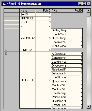
Figure 4: HFlexGrid. Browsing your list of publishers isn't too tough with this control, which lets you display relationships between related records.
chill out with coolbarThe CoolBar control is a new type of Toolbar control. This highly flexible and graphically distinctive control is used in Internet Explorer as well as the Microsoft Office apps. Microsoft made it available shortly after VB5 shipped, as a download from the VB Owner's Only Web site (http://premium.microsoft.com/vbasic/), but the control is now available out of the box with VB6.
To use the CoolBar control, add Microsoft Windows Common Controls-3 6.0 to your project using the Project Components menu, then add an instance of the CoolBar control to your form. After the control is on your form, set the Align property of the control to 1 - vbAlignTop. From there, right-click on the control to set its other design-time properties.
CoolBars contain one or more Band objects. A band is a region of the control that can contain other controls, and bands can also be moved and resized by the user at run time. The CoolBar control initially has three bands when you deposit it on a form. You can add additional bands at design time or in code.
One of the most interesting features of the CoolBar is the fact that it can contain other controls (see Figure 5). Normally, placing a control on a container control is straightforward. I usually create a control, cut it, then paste it into the container. Unfortunately, telling the CoolBar control about the contained control isn't as straightforward. If you don't explicitly designate the contained control as a child of one of the toolbar's bands, it won't resize and move along with the band. This is a major gotcha, since you can make a band impossible to resize if you inadvertently resize it underneath a non-child control.
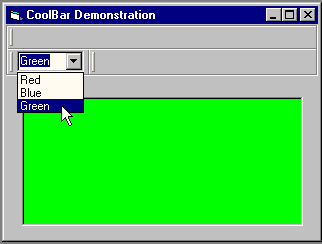
Figure 5: Cool CoolBar. Controls within a control are a cinch with VB6's new CoolBar control, although you'll sweat for a few minutes getting it done. And, the color is pretty funky.
The example for this control doesn't require much code. You can find it in the project file CoolBar.vbp in the code package accompanying this article.
Get graphic with ImageComboThe ImageCombo control's main bragging point is its ability to display graphics alongside items in its drop-down list, but its power goes much further than that. For example, rather than storing its list items as an array, ImageCombo displays them as a collection of ComboItem objects. This lets you do all kinds of nifty tricks not possible with the conventional ListBox or ComboBox controls, including storing a string as a key with each object in the drop-down list, instead of the puny Long integer you're limited to with the conventional List controls. By letting you store a string in each list ComboItem's Key property, you have more flexibility determining which item in the drop-down list was chosen by the user.
To get started with the ImageCombo control, add Microsoft Windows Common Controls 6.0 to your project using the Project Components menu. Create a ImageCombo and an ImageList control on your form. The ImageList control stores the images used by the ImageCombo control.
Rather than adding items to the combo list with the AddItem method, as you would with a conventional ListBox control, you add items to the control's ComboItems collection instead. For example, to add an item to the drop-down, use this code:
Set ciCurrent = _
   ImageCombo1.ComboItems.Add
ciCurrent.Text = "List Item"
To add images alongside the items you create in the list, use the Image property of the ComboItem object. Be careful—the Image property doesn't represent an actual image. Instead, it refers to an index of an image stored in the ImageCombo's associated ImageList control. So, assuming your ImageList control has three images stored in it, the code to populate the ImageCombo control with three list items looks like this:
Private Sub Form_Load()
   Dim ciCurrent As ComboItem
   Dim x As Long

   Set ImageCombo1.ImageList = _
      ImageList1

   For x = 1 To 3
      Set ciCurrent = _
         ImageCombo1.ComboItems.Add
      ciCurrent.Text = "Item " & x
      ciCurrent.Image = x
      ciCurrent.Key = "Item " & x
   Next

End Sub
At run time, you'll need code to determine which item the user clicked on. Use the SelectedItem property to do this. SelectedItem is a ComboItem that represents the selected item—the equivalent of the ListIndex property of the conventional ListBox or ComboBox controls. For example, this code displays a message box with the key of the selected list item:
Private Sub ImageCombo1_Click()
    MsgBox "You chose the item " & _
        "with key: " & _
        ImageCombo1.SelectedItem.Key, _
        vbExclamation
End Sub
The complete demonstration is in the project file ImageCombo.vbp in the code accompanying this article.
VB6's new user-interface controls give you more power than ever to make manipulate data, control lists, and generally make VB do what you want. It's definitely worth losing sleep over.
Download the code for this article here