![]()
This article assumes you're familiar with Internet Explorer 4.0 and
Visual C++
Download the code (184KB)
|
This article may contain URLs that were valid when originally published, but now link to sites or pages that no longer exist. To maintain the flow of the article, we've left these URLs in the text, but disabled the links.
|
|
Internet Client SDK Part III: Common Controls
Aaron Skonnard |
| Internet Explorer 4.0 introduces a slew of new and updated custom controls. The Technology Preview release of Visual C++ 5.0 includes new classes that make it easy to use these controls in your programs. |
|
Have you been wondering how to give your applications the cool new Microsoft® Internet Explorer 4.0 look? You've probably noticed the new transparent toolbar. If you installed Internet Explorer 4.0 with shell integration, you've also probably noticed that the tree and list controls in Windows® are more like Internet controls, with single-click and hot-tracking features. This new look is available through the Internet Explorer 4.0 version of the Windows common control library.
In my first article on the Internet Client SDK (in the October 1997 issue of MIND), I discussed how to use Web browsing objects in Visual C++® or Visual Basic®-based applications. My second article (in the December 1997 MIND) focused on the WinInet API. Most developers incorrectly assume that the Internet Client SDK (also known as the Internet Explorer 4.0 Author's Toolkit or, colloquially, the INetSDK) only consists of those two things: Internet programming functions or controls. But in-the-know MIND readers are aware that the Internet Client SDK consists of much more, including the new user interface and shell integration standards introduced with Internet Explorer 4.0. Since most of the user interface changes can be traced back to the Windows common control library, the Internet Client SDK offers a detailed section explaining the new common control library features and how they can be used. A few articles have already been written on the subject. For instance, Strohm Armstrong wrote a two-part series featured in the October and November 1996 issues of Microsoft Systems Journal that covered many of the new controls and features. More recently, Paul DiLascia wrote about using the transparent (flat) toolbar in the August and October 1997 issues of MSJ. If you haven't read these articles, I recommend that you do so. The sample apps found in each demonstrate various new features and controls. I'll provide a high-level overview to all the new features and controls available in the Internet Explorer 4.0 version of the common control library. If a particular topic has already been explained sufficiently elsewhere, I'll just point you in the right direction.
Visual C++ 5.0 Technology Preview
The new common control look has become so popular lately that developers have been searching for ways to make it happen in their apps. Before this upgrade, it was difficult for MFC developers to integrate the new common control features into their applications. This was mostly due to the lack of C++ class wrappers. Also, when developers tried to use the new control features in their existing MFC architectures, other problems occurred in areas such as painting. The Visual C++ 5.0 Technology Preview for Internet Explorer 4.0 is Microsoft's way of showing developers that these new features are here to stay as part of the Microsoft developer strategy. With the preview, you'll get a handful of sample applications. Two illustrate many of the new common control features described in this article: CmnCtrl1 and CmnCtrl2. Assuming you've installed the preview, you can find the samples in the following location: DevStudio\preview\ vc\samples (where DevStudio is the location of the original Visual C++ 5.0 DevStudio directory). I'll refer to screenshots from these two sample applications throughout the rest of this article. My own sample application, IE40Controls, demonstrates some of the new common controls and various features left out of CmnCtrl1 and CmnCtrl2. It implements the transparent toolbar, image lists, new status bar features, the IP Address control, extended combobox, and list view extended styles. You can download the sample here; it was written and compiled using the Visual C++ 5.0 Technology Preview.
Common Control Overview
If you want to give your program the ability to determine which version of comctl32.dll is installed on the user's system, check out the following function found in the Internet Client SDK's common controls documentation: |
HRESULT GetComCtlVersion(LPDWORD pdwMajor, LPDWORD pdwMinor);
 #define _WIN32_IE 0x0200
 #include <commctrl.h>
InitCommonControlsEx
Before you can use any of the common controls, you must call InitCommonControlsEx. With the Visual C++ 5.0 Technology Preview, MFC takes care of this for you. InitCommonControlsEx is responsible for registering all of the common control classes:
 BOOL InitCommonControlsEx(
     LPINITCOMMONCONTROLSEX lpInitCtrls
 );
 typedef struct tagINITCOMMONCONTROLSEX {
     DWORD dwSize;
     DWORD dwICC;
 } INITCOMMONCONTROLSEX, *LPINITCOMMONCONTROLSEX;
Toolbar Many of the existing common controls have been updated with new features in the Internet Explorer 4.0 version of the common control library. Since you're probably familiar with these controls, I'll only cover the new features.
If you've been dying to get the new Internet Explorer 4.0-style toolbar into your own applications, look no further. The toolbar control offers four new features (see Figure 5). The new flat/transparent look (see Figure 6) can be achieved by simply setting an additional toolbar style: TBSTYLE_ FLAT. If you want the toolbar button bitmaps to change with the button state, you must also provide the toolbar control with an image list corresponding to each button state. For instance, the Internet Explorer 4.0 toolbar uses different image lists for the normal, hot, and disabled button states; as your mouse moves over a button (making it "hot"), the normal button bitmap changes to the hot button image.
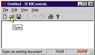
Remember, in order to create the toolbar control or any other common control, you must register the control's class by calling InitCommonControlsEx. Then, you can use CreateWindowEx to create the control window with the following code:
 HWND hwndTB;
 INITCOMMONCONTROLSEX icex;
 // Register the toolbar classes
 icex.dwSize = sizeof(INITCOMMONCONTROLSEX);
 icex.dwICC = ICC_BAR_CLASSES;
 InitCommonControlsEx(&icex);

 // Create the toolbar control.
 hwndTB=CreateWindowEx(WS_EX_TOOLWINDOW, TOOLBARCLASSNAME, NULL,
                       WS_CHILD | WS_VISIBLE | WS_CLIPCHILDREN |
                       WS_CLIPSIBLINGS | CCS_NODIVIDER |
                       CCS_NOPARENTALIGN | CCS_NORESIZE | TBSTYLE_FLAT,
                       0,0,0,0, // Make it zero, Let owner resize it.
                       hwndParent, NULL, g_hinst, NULL);
For example, to create a transparent toolbar, you only need to modify one line of code in CMainFrame::OnCreate. Make the call to CToolBar::Create look like this:
m_wndToolBar.CreateEx(this, TBSTYLE_FLAT);
 m_wndToolBar.GetToolBarCtrl().SetImageList(g_pImageListNoColor);
 m_wndToolBar.GetToolBarCtrl().SetHotImageList(g_pImageListColor);
Status Bar The new status bar control offers the new features described in Figure 8. Not only can you change the background color of a status bar, you can also display icons in the status bar (see Figure 9). Furthermore, if tooltip support is enabled for the status bar and the text associated with a part is too big to display or has been replaced with an icon, tooltips will be used to display the text. A few new messages have also been added to help determine whether the status bar is in simple mode. (Simple mode means the status bar has only one pane and displays one line of text; owner draw and tooltips are not supported in simple mode.)
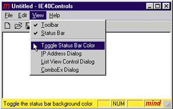
If you want to use these new features in your MFC applications, simply call the appropriate method. For example, to change the background color to yellow and put the application's icon in the status bar, just add the following lines of code to the end of CMainFrame::OnCreate:
 (m_wndStatusBar.GetStatusBarCtrl()).SetBkColor(RGB(240,240,70));
 (m_wndStatusBar.GetStatusBarCtrl()).SetIcon(4, ::LoadIcon(AfxGetInstanceHandle(),
 MAKEINTRESOURCE(IDR_MAINFRAME)));
Tooltips
Although the new tooltip control offers only one new enhancement, it's definitely worth looking at. The way tooltips have always worked is quite simple. If you hold your mouse over a tool that has a tip (for approximately 1/2 second), the tip window will pop up in a fixed position relative to the cursor. After the user moves off the tool or clicks the mouse, the tip will disappear.
The new tracking tooltip feature allows the tooltip to move with the cursor. To achieve this, your application must first activate the tracking tooltip through the TTM_TRACKACTIVATE message. Then your application needs to supply the tooltip with each desired display position (updating it as the mouse moves, and so on) through the TTM_TRACKPOSITION message. When you want the tooltip to go away, you need to deactivate the tooltip through the TTM_
TRACKACTIVATE message. This enhancement creates the effect of a smooth moving tooltip that follows your cursor.
If you're hungry for more information on how to use this new tooltip feature, check out "Previewing the Common Controls DLL for Microsoft Internet Explorer 4.0, Part II," by Strohm Armstrong, in the November 1996 issue of MSJ. Armstrong goes into much more detail on how to implement this feature in your applications.
Image Lists
An image list is nothing more than a collection of same-size images stored as one screen device bitmap; each image in the list can be referred to by its index. Image lists are very useful for managing the icons and bitmaps used by the common controls. For example, as I mentioned earlier, the new toolbar control uses image lists to store the button bitmaps associated with the different button states.
The image list control offers new features to simplify the manipulation of the images in the list (see Figure 10). For example, a new function, ImageList_Copy, allows you to copy or swap images within the same image list. If you want to make an exact copy of an existing image list, you can do so through the ImageList_Duplicate function. The ImageList_SetImageCount function allows you to dynamically change the number of images in the list. If the number is decreased, any overflow images are freed. If the number is increased, the ImageList_Replace function must be called to add images to the new image slots. Finally, you have more control over drawing an image list through the ImageList_DrawIndirect function. This function takes a structure that specifies some of the drawing details.
List View Control The list view control is loaded with new features (see Figure 11). The columns update only applies to a list view control in report view. In report view, the list view control columns now support images and dynamic ordering (each column header can have an image associated with it). Also, the column structure has been revamped to allow dynamic column ordering. In other words, your application can change the order of the columns on-the-fly. In fact, if you set the LVS_EX_HEADERDRAGDROP style, the list view control implements dynamic column ordering for you, allowing you to drag the column header to the new desired location. In my opinion, this is one of the list control's best new features. If you've ever tried to implement dynamic column ordering yourself, you'll appreciate this new feature.
Many of the new additions to the list control are in the form of new extended window styles. I've already mentioned my favorite, LVS_EX_HEADERDRAGDROP. Are you tired of having to override the list view control to implement full row selection? If so, LVS_EX_FULLROWSELECT should boost your energy level. Also, if you've ever wanted to produce the grid look, now you can use LVS_EX_GRIDLINES to add horizontal and vertical lines to the list view control. In addition, if you want to give the list view an Internet feel, use LVS_EX_ONECLICKACTIVATE, which also enables hot tracking for the control.
When you want to modify one of the list view control's extended styles, use the SetExtendedStyle and GetExtendedStyle methods. For example, create a dialog with an embedded list control (name the list control m_List). Then, you can add the following lines of code in the dialog's InitDialog method:
 DWORD dwExStyles = m_List.GetExtendedStyle();
 m_List.SetExtendedStyle(
     dwExStyles |
     LVS_EX_FULLROWSELECT |
     LVS_EX_GRIDLINES |
     LVS_EX_HEADERDRAGDROP |
     LVS_EX_ONECLICKACTIVATE
     LVS_EX_CHECKBOXES |
     LVS_EX_FLATSB |
     LVS_EX_TRACKSELECT);
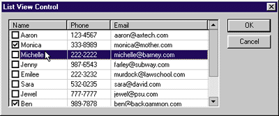
The list view control also introduces a few new concepts. One is the idea of list view working areas. These working areas are rectangular regions the control uses to arrange its items. For example, if you want two types of items in the list control to be displayed separately but within the same list, you can create two work areas side-by-side with a 100-pixel space between them. Then you can specify which item goes to which working area, further customizing and organizing the list view control.
Although not as new as working areas, virtual list view is much more practical for today's applications. In the past, many programmers found the list view control limiting
because it couldn't handle a large number of items. Now,
programmers can unleash the virtual list view with the LVS_OWNERDATA style, which allows the control to handle a near infinite number of items. Specifically, the control
can support an item count up to a DWORD. If you've had limit problems in the past, you might want to check out
this new feature. Once again, Armstrong does an excellent job of explaining the virtual list view in the article mentioned above. He even provides a virtual list view sample application (VListVw).
Tab Controls The tab control now supports two new
extended styles: TCS_EX_FLATSEPARATORS and TCS_ EX_REGISTERDROP (see Figure 13). TCS_EX_FLATSEPARATORS tells the tab control to draw separators between the tab items; TCS_EX_REGISTERDROP makes the tab control generate a TCN_GETOBJECT notification when an object is dragged over the tab. The latter makes it possible for the tab control to be an OLE drop target.
The tab control also supports some other handy styles that were added to Internet Explorer 3.0. The TCS_HOTTRACK style gives the tab control hot tracking, where items under the pointer are highlighted automatically. The TCS_
VERTICAL style makes the control more flexible by allowing the tabs to be placed vertically instead of horizontally.
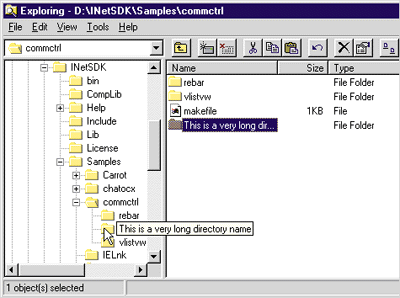
Tree View Controls Like the list view control, the tree view control is also packed full of new features (see Figure 14). Probably one of the most useful features is the new tooltip support. The tree view control will display an item's text in a tooltip when it's not entirely within the view area (see Figure 15). Like most other common controls, the tree view also supports hot tracking and even single-click expansion. A new item state, TVIS_EXPANDPARTIAL, was added to give the tree control enough flexibility to show that a subtree was only partially expanded (due to an error or other condition). For example, if a subtree is expanded but not all of the items are able to be displayed, the node will still display a + symbol.
Progress Bar Control Next time you use Internet Explorer 4.0, watch the progress bar that shows up in the status bar when a page is being downloaded. Did you notice it's no longer segmented? In the past, the common control progress bar was broken down into little blocks. Now you can make it a smooth progress bar by setting the PBS_SMOOTH style (see Figure 16). You can even make the progress bar vertical through the PBS_VERTICAL style. Figure 17 describes the new progress bar control features.
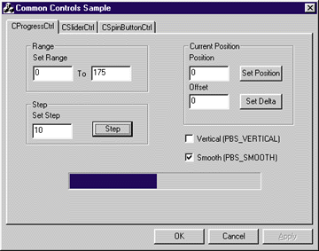
The progress bar now supports a full 32-bit range of values when you use the PBM_SETRANGE32 message. Since this range uses signed integers, you can set values from 0x7FFFFFFF to –0x7FFFFFFF.
Property Sheets With the exception of a new notification message and modified structures, not much has changed with the property sheet control. Like the tab control, the PSN_GETOBJECT notification has been added, making it possible for the property sheet to be an OLE drop target (see Figure 18).
Header Controls Since the list view control uses the header control, I've already discussed many of the header control's new features (see Figure 19). As you probably remember, dynamic column ordering and drag-and-drop manipulation are among my favorites. The header control also supports hot-tracking, callback items, and image lists. In addition, a header control item can simultaneously display text, a bitmap, and an image. How's that for increased flexibility?
Trackbar Controls The updated trackbar control now supports buddy windows and tooltips (see Figure 20). A trackbar can have up to two buddy windows. By default, these windows are positioned at the end of the trackbar. If you want to assign a different window to be a buddy, use the TBM_SETBUDDY message. If you need to get the HWND of one of its buddy windows, use the TBM_GETBUDDY message.
Up-Down Controls The final updated control that I'll discuss in this article is the up-down control. Not much has changed with the up-down control except, like the progress bar, it now supports a full 32-bit (signed) range through the UDM_SETRANGE32 and UDM_ GETRANGE32 messages. Although not officially implemented, the up-down control also will support hot-tracking.
Internet Explorer 4.0 New
Common Controls
Besides all these updated common controls, the Internet Explorer 3.0 and Internet Explorer 4.0 versions of the common control library also introduce a handful of brand new controls, including the rebar, extended combobox, date and time picker, month calendar, IP address, and the flat scroll bar. Strohm Armstrong covered the rebar, extended combobox, and date and time picker controls in great detail in the October 1996 issue of MSJ. My sample application demonstrates all these new controls (except for the rebar control, since Paul DiLascia did such a good job). Figure 21 lists the new classes added to MFC in the Visual C++ 5.0 Technology Preview release.

Rebar Control
The rebar control is one of the coolest new additions to the common control family (see Figure 22). Maybe that is why it's also referred to as the coolbar. The rebar control is a container control capable of hosting one or more bands. A band can contain only one child window. Along with the child window, each band can also have a gripper, a text label, and a bitmap associated with it.
This control has been around since the Internet Explorer 3.0 version of the common control library. Hence, it has already been covered fairly well. If you're interested in using this control in your MFC applications, refer to the CRebarCtrl documentation along with Paul DiLascia's article in the
October 1997 issue of MSJ.
ComboBoxEx Control
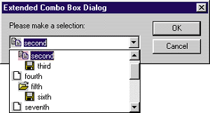
Figure 23 shows the new ComboBoxEx control. The ComboBoxEx control is nothing more than an owner drawn extension to the regular combobox; the extension provides item images (through image lists) and item indentations. Since the control uses owner draw tasks to accomplish this new look, CBS_OWNERDRAWFIXED and CBS_HASSTRINGS are implied and don't need to be supplied when creating this control.
Date and Time Picker Control
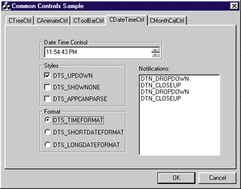
The date and time picker control (see Figure 24) provides a standard interface for exchanging date and time information with the user. You can decide how you want the information displayed to the user through a format string. Currently there are three standard format strings: DTS_SHORTDATEFORMAT ("1/1/98"), DTS_LONGDATEFORMAT ("Monday, January 1, 1998"), and DTS_TIMEFORMAT ("12:00:00 PM"). Or you can set your own format string (see the Internet Client SDK documentation for formatting details). If you're querying the user for a date, the picker control uses a drop-down calendar to aid the user. Furthermore, the control supports most standard keyboard combinations for user input like up and down arrows, end and home, and + or –.
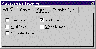
Month Calendar Control As you probably already figured out, the month calendar control is much like the dropdown calendar used in the date and time picker control. The month calendar control provides a calendar style interface for querying the user for dates (see Figure 25). This control also allows you to customize it somewhat
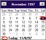 |
| Figure 25: Month Calendar |
IP Address Control
The IP address control is one of the newest common controls; it was recently introduced in the Internet Explorer 4.0 version of the common control library. If you need to query the user for an IP address in your application, use this new control. The control looks like an edit box separated into four three-digit fields (see Figure 26). Despite its look, it's not an edit control (so don't try to send it EM_xxx messages). Each field in the control only accepts numeric input. Once three digits have been entered into a field, the focus automatically moves to the next field.
To extract the IP address from the control,
you can use four utility macros: FIRST_IPADDRESS, SECOND_IPADDRESS, THIRD_IPADDRESS,
and FOURTH_IPADDRESS. As expected, each macro returns the numeric value associated with that field in the IP address.

Flat Scroll Bars
Like the IP address control, flat scroll bars are also new to the Internet Explorer 4.0 version of the common control library. The flat scroll bar is functionally identical to the normal scrollbar. The only difference is in its appearance. The list view control supports flat scroll bars through the LVS_EX_FLATSB extended style (see Figure 12). To use flat scroll bars, you must first call InitializeFlatSB and pass in the handle to the window. Then, instead of using the standard scroll bar API, use the FlatSB_xxx versions. For instance, to set the scroll bar position, use FlatSB_SetScrollPos.
Custom Draw
The Internet Explorer 3.0 version of the common control library introduced an exciting new concept: custom draw. Custom draw is not a common control but a service that many of the common controls provide. Basically, custom draw allows you to customize the drawing of a common control without having to implement owner draw. For example, if you want the text for different tree view items to be painted red, custom draw is a quick and easy solution. If you want to change the font for a particular item in a common control, custom draw lets you do it.
Your application can implement custom draw by simply handling the custom draw notifications documented in the Internet Client SDK. Currently, seven of the common controls support custom draw: header, list view, tree view, rebar, toolbar, tooltip, and trackbar. For more information on using custom draw, see the Internet Client SDK documentation and with Strohm Armstrong's article in the October 1996 issue of MSJ.
Conclusion
There are so many new features in the Internet Explorer 4.0 common control library, it's hard to cover them all. In this article, I've shown you all of the new Internet Explorer updates to the common control library. Even more importantly, I've described the brand new common controls available in the Internet Explorer 4.0 version of the library. Even though I tried to cover everything, I may have missed some new features. For that reason, be sure to refer to the Internet Client SDK documentation for complete and official information on these
controls. Also, remember to review the MSJ
articles mentioned throughout this article for more detailed information on some of these topics. There are also plenty of sample applications available that offer practical examples on how to use these controls. Here is a summary of what each mentioned sample application
has to offer:
From the February 1998 issue of Microsoft Interactive Developer.