Rod Stephens
Have you ever thought how unfair it is that Microsoft uses controls they don’t give the rest of us? The VB IDE is decorated with such things as dockable tool bars, floating windows, menus containing bitmaps, and buttons that don’t show their borders until the mouse moves over them. This month, Rod Stephens shows how to build the last of these.
Every few months, someone asks me how to build homemade buttons. Most recently I was asked by someone who wanted a button without a three-dimensional border. I basically said, "Build a control, use mouse events to update the button’s appearance, and so on. Now, go away and build it. Don’t bother me anymore right now because I have a column to write." Then it occurred to me that if I answered him in a column, I might not have to answer this question so often. So here it is. A homegrown button control that I call PopButton.
This control provides a single event, Click, that fires when the user clicks on the button. It has an Enabled property that determines whether or not the control responds to mouse events.
The control also provides four picture properties. DownPicture is the image shown when the button is pressed. UpPicture is the control’s image when the mouse is over the button but the button isn’t pressed. InactivePicture is the image displayed when the mouse is not over the button and no mouse buttons are pressed. (The buttons at the top of the VB IDE are usually in this state.) The last picture property, DisabledPicture, determines what the button looks like when the button’s Enabled property is set to False.
You can use these properties to provide a button similar to a standard CommandButton. You can draw images that include bevels to make the button look pressed or released. If you give the InactivePicture and UpPicture bevels so the image looks released, and if you give the DownPicture bevels to make the image look pressed down, you get a fairly standard-looking button control.
You can also use these properties to make a button that only shows its borders when the mouse floats over it. Simply omit the bevels from the InactivePicture image. When the mouse moves over the button, the UpPicture image appears and displays the bevels.
The PopButton control contains four Image controls and delegates its picture properties to them. For example, the following code shows how the control delegates its UpPicture property to the imgUp Image control. The other picture properties are nearly identical to this one.
' Return the up picture.
Public Property Get UpPicture() As Picture
   Set UpPicture = imgUp.Picture
End Property
' Set the up picture.
Public Property Set UpPicture(ByVal New_UpPicture _
   As Picture)
   Set imgUp.Picture = New_UpPicture
   PropertyChanged "UpPicture"
End Property
The control delegates its Enabled property to the UserControl object. This is slightly complicated by the fact that the control must display a different picture when it’s enabled. The Property Let procedure changes the picture shown by the control if necessary.
' Return the control's Enabled state.
Public Property Get Enabled() As Boolean
   Enabled = UserControl.Enabled
End Property
' Set the control's Enabled state.
Public Property Let Enabled(ByVal New_Enabled _
   As Boolean)
   UserControl.Enabled() = New_Enabled
   PropertyChanged "Enabled"

   ' See whether the control is enabled.
   If New_Enabled Then
      ' Control is enabled, display the Inactive pic.
      If Picture = imgDisabled.Picture Then _
         Set Picture = imgInactive.Picture
   Else
      ' Control is enabled, display the Disabled pic.
      If Picture <> imgDisabled.Picture Then _
         Set Picture = imgDisabled.Picture
   End If
End Property
Delegating the Enabled property to the UserControl object has a wonderful side effect–when the UserControl’s Enabled property is set to False, the control doesn’t receive any mouse events. It gets no MouseDown, MouseMove, or MouseUp events, so it doesn’t need to handle them. It just sits there happily displaying its disabled picture. Of course, when the control is enabled, handling these events is a bit more involved.
Current events
There are many ways the user might interact with the control using the mouse. The user could press a mouse button down and then drag the mouse over the control. The user could move the mouse over the control, press a mouse button, and then release the button. The user could move the mouse over the control, press a button, drag the mouse off the control, and then release the button. There are lots of confusing combinations. If you experiment with a normal CommandButton for a while, you’ll see how many possibilities there are.
While the interaction with the user seems complicated, the control can handle all of these situations relatively simply. There are really only three events to consider: MouseDown, MouseMove, and MouseUp. For each of these, the control must figure out which image to display.
MouseDown is easy. When the control receives a MouseDown event, the mouse must be over the control and a mouse button is down. The control should display its Down picture.
MouseUp is also reasonably straightforward. When the user presses a mouse button over the control, the control receives a MouseUp event when the button is released. It receives this event whether or not the mouse is still over the control. The control can check the event handler’s X and Y parameters to see whether the mouse is still over the control. If the mouse has moved away, the control displays its Inactive picture. If the mouse is still over the button, the control displays its Up picture and raises its Click event.
The MouseMove event handler is slightly more complicated. When the control receives a MouseMove event, either the mouse is over the control, or the user pressed the mouse down over the control and then dragged it off with the button still pressed. If a button isn’t pressed, the mouse must be over the control or it wouldn’t get the MouseMove event. In that case, the control displays its Up picture. If a button is pressed, the event handler checks its X and Y parameters to see whether the mouse is still over the control. If the mouse has been dragged away, the control displays its Inactive picture. If the mouse is over the control, it displays its Down picture.
There’s one last user interaction to consider. The UserControl object has a MouseMove event that fires when the mouse enters and moves over the control. Unfortunately, there’s no MouseLeave event that fires when the mouse leaves the control. If the mouse sits over the control with no button pressed, the control displays its Up picture. It won’t be able to tell when the mouse leaves.
PopButton uses a timer to solve this problem. When the mouse is over the control and a button isn’t pressed, the control enables its tmrMoveOff timer. When the timer fires, it uses the GetCursorPos API function to find the mouse’s position and see if it’s still over the control. If the mouse has moved away, the timer displays the Inactive picture and then disables itself.
Listing 1 shows the most interesting parts of the PopButton control’s code. The MouseDown, MouseMove, MouseUp, and tmrMoveOff_Timer event handlers display different pictures as different events occur. Function MouseIsOverButton uses the GetCursorPos API function to return True if the mouse is over the control.
Listing 1
. The MouseDown, MouseMove, and MouseUp events and the tmrMoveOff control display different pictures when different events occur.' User has clicked on the button, display the Down pic.
Private Sub UserControl_MouseDown(Button As Integer, _
Shift As Integer, X As Single, Y As Single)
Set Picture = imgDown.Picture
' We'll get MouseMove events as the mouse
' moves so we don't need the timer.
If tmrMoveOff.Enabled Then tmrMoveOff.Enabled = _
False
End Sub
' Either the mouse is over the control or the user
' pressed the mouse down over the button, then dragged
' it off.
Private Sub UserControl_MouseMove(Button As Integer, _
Shift As Integer, X As Single, Y As Single)
' See whether a button is pressed.
If Button = 0 Then
' No button is pressed. The mouse must be over the
' button. Display the Up image.
If Picture <> imgUp.Picture Then Picture = _
imgUp.Picture
' Enable the timer to know when the mouse moves
' off the button.
If Not tmrMoveOff.Enabled Then _
tmrMoveOff.Enabled = True
Else
' A button is down. See if the mouse is over
' the button.
If (X >= 0) And (X <= ScaleWidth) And _
(Y >= 0) And (Y <= ScaleHeight) Then
' Mouse is over button, show Down pic.
If Picture <> imgDown.Picture Then _
Picture = imgDown.Picture
Else
' The mouse isn't over the button, show the
' Inactive pic.
If Picture <> imgInactive.Picture Then _
Picture = imgInactive.Picture
End If
End If
End Sub
' The user released the mouse. If we're over
' the control, raise the Click event.
Private Sub UserControl_MouseUp(Button As Integer, _
Shift As Integer, X As Single, Y As Single)
' See if we're over the button.
If MouseIsOverButton() Then
' The mouse is over the button, display the Up pic.
If Picture <> imgUp.Picture Then Picture = _
imgUp.Picture
' Fire the Click event.
RaiseEvent Click
Else
' The mouse isn't over the button.
' Display the Inactive image.
If Picture <> imgInactive.Picture Then _
Picture = imgInactive.Picture
End If
' Disable the timer if it's enabled.
If tmrMoveOff.Enabled Then tmrMoveOff.Enabled =
False
End Sub
' See if the mouse is over the control.
Private Function MouseIsOverButton() As Boolean
Dim pt As POINTAPI
' Get the cursor's screen coordinates.
GetCursorPos pt
' Convert into control coordinates.
ScreenToClient hwnd, pt
' See if the point is over the control.
MouseIsOverButton = (pt.X >= 0) And _
(pt.X <= ScaleWidth) And _
(pt.Y >= 0) And (pt.Y <= ScaleHeight)
End Function
' See if the mouse is over the button.
Private Sub tmrMoveOff_Timer()
' See if the mouse is over the button.
If Not MouseIsOverButton() Then
' The mouse is no longer over the button.
' Display the Inactive picture.
Picture = imgInactive.Picture
' Disable the timer until the mouse
' moves back over the control.
tmrMoveOff.Enabled = False
End If
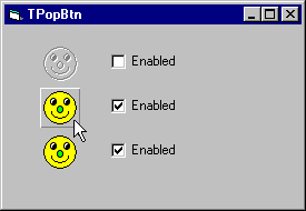
End SubExample program TPopBtn, which is available in the accompanying Download file and is shown in Figure 1, demonstrates the PopButton control. In Figure 1, the top button is disabled. The mouse is floating over the second button, so it’s displaying its Up picture. The mouse isn’t over the last button, so it shows its Inactive picture.
Summary
PopButton gives you complete control over every pixel in the images it displays. You can make the images display borders or not, display borders only when the mouse moves over it, or make the Inactive picture blank so the control is completely hidden until the mouse comes near. You can even make all of the control’s pictures completely different. For example, you could make the Up picture show a darkened light bulb and make the Down picture show one glowing.
You can also use the event handling techniques demonstrated by PopButton to make other kinds of buttons. You can make check boxes, option buttons, tristate buttons, and all sorts of other objects that respond to mouse events in similar ways.
Download ROD1299.exe
Rod has written gobs of books about Visual Basic programming, including Bug Proofing Visual Basic and Ready-to-Run Visual Basic Code Library. His book Custom Controls Library shows how to build 101 different ActiveX controls like this one. Learn more or download some of the hundreds of example programs at
www.vb-helper.com. RodStephens@vb-helper.com.