![]()
This article assumes you're familiar with Dynamic HTML
Download the code (2KB)
|
This article may contain URLs that were valid when originally published, but now link to sites or pages that no longer exist. To maintain the flow of the article, we've left these URLs in the text, but disabled the links.
|
|
DHTML Localization on the
Windows Update Site
Nick Dallett |
| With 31 languages served, the Microsoft Windows Update site has to be flexible enough to allow fast updating. The architect of the site's localization provides some guidance for when you're speaking to the world. |
|
One of the least understood and most overlooked aspects of Dynamic HTML site design is internationalization. The vast majority of Web developers have worked in a single language, creating a Web site for a company that will do business in one or perhaps two countries.
Unfortunately for Web developers, the increasingly global economy often demands that sites be developed for multiple languages. Sites must be developed with flexibility in mind so that translating the site is simply a matter of translating the words, and does not require a full site redesign. While this requirement is important for sites that must be viewable in two or three languages, it becomes absolutely critical as the number of translations increases. Microsoft® Windows® Update, the Web site extension of Windows 98 and the upcoming Windows 2000, is currently published in 31 different languages, and new content is published in each of those languages every two weeks. Maintaining a site of this magnitude in so many languages, with so much updated content, would be a technical nightmare without solid guidelines and procedures for site and content development. This article will describe the guidelines that I developed while localizing the Windows Update site (http://windowsupdate.microsoft.com) into two of the most challenging languages for English language developers—Arabic and Hebrew, the bidirectional, or "BiDi," languages. The challenge posed for English-speaking developers by these two languages lies in their reading order. Unlike English text, which flows on the page from left to right, Arabic and Hebrew flow right to left. A properly designed BiDi site will be a mirror image of the equivalent English site. The ramifications are enormous, and not just for text. Images that point "forwards" must now point in the other direction. Buttons on dialogs such as the familiar OK and Cancel must be reversed. Mixed-language phrases must be carefully cast to preserve the reading order of each language.
The DIR Attribute
|
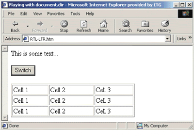 |
| Figure 2: Left-to-Right Alignment |
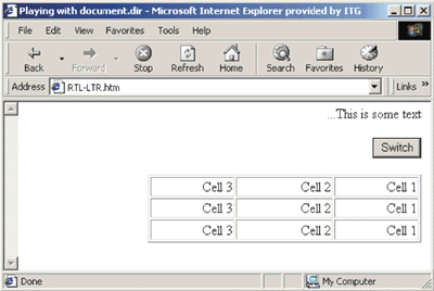 |
| Figure 3: Right-to-Left Alignment |
|
Unfortunately, this simple example doesn't take into consideration the complex positioning that is applied to HTML elements on real-world sites. Let's jump right into a real-world example, see the types of problems I encountered localizing Windows Update, and look at how establishing formatting guidelines helped to resolve most of those problems with a minimum of bother.
Figure 4 shows the product catalog as it appears on the English Windows Update site. |
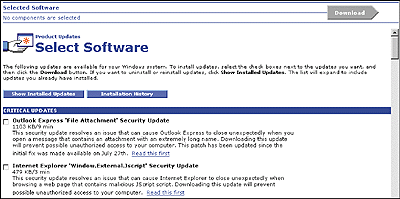 |
| Figure 4: The Product Catalog in English |
Figure 5 shows the same site as it appears after translation into Arabic and the addition of DIR=RTL to reverse the reading order. Note the following problems:
|
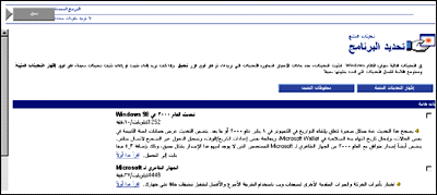 |
| Figure 5: The Translation to Arabic with Glitches |
|
Directional Images
Images can cause real headaches for localization. Many Web sites use images that contain English words (including the Windows Update, Microsoft, and Microsoft Network logos on the Windows Update site). Often these images have to be recreated at great expense in the local language. In this case, I have a slightly less onerous problem: images whose left-to-right orientation on the page convey meaning. For localization in general, and the BiDi languages in particular, it is best that developers avoid directional images or images with text altogether. For example, in this scenario, the hand holding the window icon could well be replaced by two hands, seen (symmetrically) head on. The Download arrow could be replaced by a rectangular Download button. In this case, though, I'm dealing with the reversal of an existing site, so I must use other means to work with existing images. To provide a single code base that renders correctly in either direction, it's not enough to simply provide alternate images for the BiDi versions of the site. You have to include script in the page that dynamically changes the images based on the rendering mode being used. Since the Windows Update site supports only Internet Explorer 4.0 and 5.0, I was able to use a Cascading Style Sheets (CSS) filter on the images on the site to effect this change. The filter, flipH, which is installed with both Internet Explorer 4.0 and 5.0, flips any element horizontally so that it displays as a mirror image. The following is the inline script that will determine the direction of the images: |
|
|
Because the actual Windows Update site uses an automated preprocessing step to determine the value of conditional variables, you won't be able to see this code if you view the page's source. This is the client-side script equivalent of the actual code used.
Unwanted Left-alignment of Text
Elements Running Off the Right Side
|
|
|
Note the margin-right attribute. This style was applied to the section headings to ensure that the DIV ran flush to the right edge of the page. For the RTL case, this results in a DIV whose origin is to the right of the actual display by 15 pixels.
Generally, pages should be designed so that CSS styles are horizontally symmetrical. Any element with a margin-right style should have an equivalent margin-left. While this requires more up-front design time and somewhat limits a developer's freedom in the initial coding of a site, it results in fewer headaches during localization. My fix for this particular problem was to use preprocessing to change margin-right to margin-left. I could also have accomplished this by having translators reverse hardcoded left and right parameters in the stylesheet.
Bad Borders on the Download Button
|
|
| You could use either of the previous two approaches to change this attribute: dynamically writing the tag using script, or allowing translators to make the change manually. In the latter case, the inline style would have to be moved to a global stylesheet to be readily localizable. This means creating a new class that consolidates the ButtonG class with the individual style for the Download button: |
|
| The values of the border-left and border-right attributes could then be swapped by translators to produce correct reversal: |
|
| Figure 6 shows the Arabic product catalog after applying these changes to the page. |
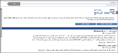 |
| Figure 6: Arabic Product Catalog with Fixes |
|
CSS Positioning Issues in BiDi Design |
|
CSS positioning presents special problems for bidirectional Web sites. Figure 7 shows the EULA dialog after translation to Arabic and application of the RTL attribute. |
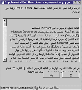 |
| Figure 7: Problems with Absolute Positioning |
| The buttons on the EULA dialog had been positioned using absolute CSS positioning. Not only do the buttons overlap the text, but the order of the buttons is fixed—the Yes button is fixed on the left side, the No to its right. Here is the code: |
|
| In this case, absolute positioning was superfluous; if the position attributes had been left off the buttons, the buttons would self-align naturally. Removing the position, top, and left attributes (shown in blue) from the style on the button causes the button to align more naturally below the text. In addition, allowing Internet Explorer to control the flow allows the button positions to be correctly reversed (see Figure 8). |
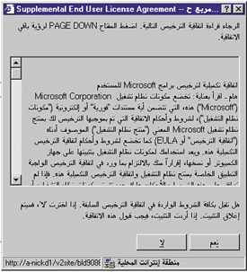 |
| Figure 8: Position Attributes Removed |
| Specifying relative positioning can be problematic as well. The BiDi version of Internet Explorer 5.0 has a bug that causes text to disappear from the page when position:relative is specified in the stylesheet for that text. This is easily remedied by replacing position:relative with margins on elements that specify their offset from other elements. This way, you are specifying the attributes of the element with respect to its own size, rather than with respect to the position of other elements. For example, rather than specifying |
|
| try this: |
|
|
Bidirectional Tables
If you take another look at the sample page in Figure 2, you'll see that I used a table to position several columns of text. Note how well the table reformats itself when DIR=RTL is applied to the <HTML> tag, as shown in Figure 3. In fact, tables turn out to be the best and most reliable way to ensure that your content is correctly reversed when moving from LTR to RTL, provided you do not specify alignment on the table cells. A nested table can be used to format a complex HTML form, for example. The form will reverse correctly when the page is set to use the RTL reading order. Tables can be used to align text to the right of the page without using align=right by using empty, oversized table cells to push content to the right. In the following code, note the oversized cell whose width is set to 700 pixels and the 30 pixel spacer cells used to position the text. Since the text is enclosed in cells that precisely define its right and left edges, applying DIR=RTL to the <HTML> tag results in a perfectly reversed table. Figures 9 and 10 show the resulting table in both standard and RTL formats. |
|
| Another advantage of positioning using tables is that they resize gracefully—something that cannot be said of a page with absolutely positioned text. When this page is resized, the oversized cell used to push Item 4 to the right will shrink and expand to fill whatever space is necessary to have Item 4 just reach the edge of the page. |
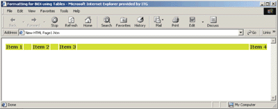 |
| Figure 9: Using Spacer Cells |
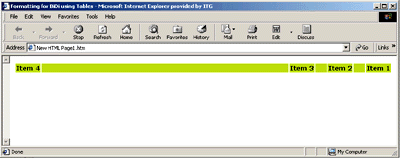 |
| Figure 10: and then applying DIR=RTL |
|
Known Issues
Six Rules to Make Your Life Easier
|
|
|
|
http://www.w3.org/TR/REC-html40/struct/dirlang.html and http://msdn.microsoft.com/workshop/author/dhtml/reference/properties/dir.asp |
|
From the October 1999 issue of Microsoft Internet Developer.
|