
Fortunately, Excel 2000's PivotChart feature provides a great interactive method for looking at different cuts of data. In this article, we'll show you some PivotChart report basics. We'll show you how easy it is to create the chart and then add and remove data as necessary. In addition, we'll filter the results based on the contents of a specific field and limit the items that Excel displays for each data element.
PivotChart overview
The PivotChart feature is new to Excel and works in conjunction with PivotTable reports. A PivotChart report uses a PivotTable for its source data, which lets the chart become interactive. You can create PivotChart reports from any chart type except XY (Scatter), Bubble, or Stock. PivotChart reports provide dynamic views of data. You change a PivotChart's appearance the same way you change a PivotTable report--by dragging and dropping fields. This feature lets you quickly re-orient the chart and compare different data. Also, the PivotChart supports the same filtering capabilities as PivotTable reports. Now, that we've covered a few basics, let's create a PivotChart report.
Creating a PivotChart report
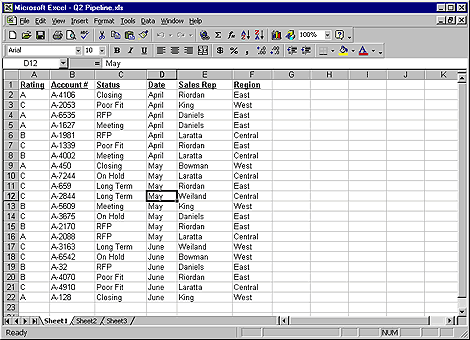
To begin, open a blank workbook and replicate the data shown in Figure A. Don't worry about entering all the Account # items correctly--they're irrelevant to our analysis. When you've finished, save the file as Q2 Pipeline.
Figure A: We'll use this data to build a PivotChart
report.
To add the PivotChart, click in any one of the cells in the data range. Then, open the Data menu and select PivotTable And PivotChart Report to start the wizard that builds your report.
On the PivotTable And PivotChart Report Wizard - Step 1 Of 3 dialog box, select the PivotChart (With PivotTable) option and click Next. Excel automatically selects the range that contains the insertion point. Click Next to move to the Wizard's last step.
At this point, things begin to look different if you're accustomed to creating PivotTable reports with Excel 97. In the earlier version, the PivotTable Wizard prompts you to specify the report's data layout. You can still access the familiar layout dialog box by clicking the Layout button, but you don't have to. Excel 2000 now allows you to configure a PivotTable directly in a worksheet.
So, to insert the PivotTable, select either a new or existing worksheet. Your choice only affects the PivotTable. Excel always creates the PivotChart on a new worksheet. To finish working with the wizard, select the New Worksheet option and click Finish.
When you do, Excel creates a new worksheet for both the PivotTable and the PivotChart reports, then switches to the blank PivotChart layout, as shown in Figure B. Notice that Excel automatically displays the floating PivotTable toolbar. The data source fields from your range appear as buttons on the toolbar's lower panel.
Figure B: Excel now lets you fill in the chart layout right on
your worksheet.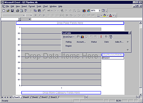
To better understand how PivotTable data translates to a PivotChart, click Sheet4 to switch to the PivotTable report. The PivotTable, as shown in Figure C, is also blank. When Excel converts your table to a chart, it changes the tables' row fields into category fields on the chart. Column fields in the PivotTable become series fields in the PivotChart. Excel also transfers page and data fields accordingly between a PivotTable and a PivotChart.
Figure C: We'll populate the blank PivotTable to construct the
PivotChart.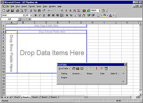
To create the chart, we'll need to add a few fields to the PivotTable. To do so, drag the Region button from the PivotTable toolbar to the blue outlined worksheet area entitled Drop Page Fields Here. Next, drag the Rating button to the area labeled Drop Row Fields Here. Finally, drag the Rating button again, this time to the Drop Data Items Here area. As you drag fields, Excel reformats the PivotTable to resemble the example shown in Figure D.
Figure D: Adding data to your PivotTable is as easy as
drag-and-drop.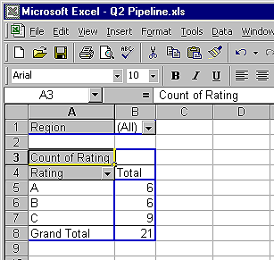
Now, let's take a look at the results in the PivotChart. To do so, click on the Chart1 tab. As you can see, the PivotChart displays each sales territory's totals for A, B, and C ratings in a column chart. As you make changes to the PivotTable, Excel alters the PivotChart accordingly, and vice versa. Next, we'll add a data series to the chart.
Working with the PivotChart
To begin, drag the Sales Rep button from the toolbar to the blue box on your chart labeled Drop More Series Fields Here. When you do, the chart changes to a stacked column format and displays totals for each rating by sales rep. At this point, your PivotChart should resemble the one shown in Figure E.
Figure E: Adding a data series creates a Stacked Column
chart.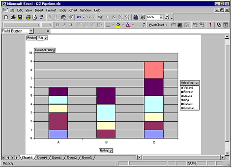
You can change which items Excel displays in the chart by choosing a
new item from the dropdown list associated with each field. This process
works the same with both PivotTables and PivotCharts.
Working with the page field
The page field filters the data that Excel displays in the report. Currently, our chart's page field, Region, shows every record. However, by changing the page field item, you can configure the report to show results for a specific region only.
To do so, click on the dropdown arrow next to the Region button. When the dropdown list appears, select West, as shown in Figure F. Finally, click OK. When you do, Excel changes the chart to reflect the sales lead ratings for the Western region sales reps: Weiland, King, and Bowman.
Figure F: Change the page field item to filter your
results.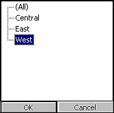
Risks of changing the layout
Upon closer examination, however, you'll notice that the chart doesn't look quite right. Although the chart shows the correct data, the Value Axis still displays 0.5 increments. Keep this in mind, when you change a PivotChart's view. This behavior occurs because Excel doesn't maintain the PivotChart's formatting when you change the view. For this reason, hold off making any formatting modifications until the chart's layout becomes more stable.
Changing data fields
Let's look at how to add and remove fields on your PivotChart after you've already set it up. Fortunately, it's no harder to change the PivotChart at this point than it is when you set it up initially--all your actions are drag-and-drop. To illustrate this point, we'll change the field that the chart uses for its data series. Before we add a new series, though, we'll need to remove the existing one. To do so, click the Sales Rep button on the chart, (make sure you don't click on the dropdown arrow) and drag it off the side of the chart. When a large red X appears under the mouse pointer, release the mouse button. The blue outline for the data series drop area reappears on the chart.
Now, click the Display Fields icon on the PivotTable toolbar to display the field list. The PivotTable toolbar changes to a floating toolbar, again showing field names in the bottom section. Drag the Status button to the Drop More Series Fields Here drop area.
Using the same technique, change the PivotChart category to use the Sales Rep field. Next, drag the Count Of Rating button off the chart and replace it with Status. Then, reset the Region page field to display data for all regions, as shown in Figure G. Finally, dock the PivotTable toolbar.
Figure G:To reformat the chart, drag fields into the drop
areas.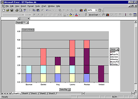
Displaying specific items
Another powerful feature of PivotChart reports is the ability to choose which items the chart displays in its category or data series sections. For example, our chart currently shows the status of leads for each sales rep, for all regions. Suppose we want to determine which reps generated the strongest leads. To create this output, we want to configure the chart to total leads only if the sales rep is about to close the deal, or if a prospect has sent in a Request For Proposal (RFP). To change the chart, click the dropdown arrow next to the Status button. Then, deselect all the options except Closing and RFP, as shown in Figure H. Finally, click OK. Excel shows only the reps with strong sales leads--it dropped Weiland. You can use this same technique when you want to change category items.
Figure H: You can limit which items are displayed for data
series and category fields.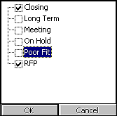
Notes
We've shown you how simple it is to create a PivotChart from scratch. However, you can also use pre-existing PivotTables as a PivotChart's source. To do so, right-click on the PivotTable and select PivotChart from the shortcut menu. Or, click on the PivotTable and then click the Chart Wizard icon.
Conclusion
In this article, we've shown you how to add, remove, and filter data in PivotChart reports. If you're analyzing data, but you're not sure what you're looking for, the visual nature of these charts makes it easy to identify patterns of information.
Copyright © 1999, ZD
Inc. All rights reserved. ZD Journals and the ZD Journals logo are trademarks of ZD
Inc. Reproduction in whole or in part in any form or medium without
express written permission of ZD Inc. is prohibited. All other product
names and logos are trademarks or registered trademarks of their
respective owners.