Ken Bergmann
MSDN Content Development Group
March 1997
The CONCON sample is associated with this article. For installation instructions and sample code associated with this article and related Banking articles, please go to Banking Samples: Installation Overview.
With the advent of ActiveX™ controls, and the onslaught of tools that make control creation easier, the task of creating user interfaces continues to shrink in complexity. In other articles, you’ve seen how to create and script controls. You may have seen how to design controls for easy programmability, and even how to take advantage of automatic download functionality so that users can get and dispense your controls easily. In this article, I show you how to take this ease of use a little further.
Instead of simply creating controls that wrap some bit of algorithmic functionality and expose that functionality through automation, I’ll show you how to create controls that interact with other controls in an automated way. This isn’t the same as creating controls that perform client/server tasks, like the controls that were developed in Fred Pace’s article “Designing Intelligent Control Palettes in Visual Basic 5.0.” In that article, the concept of a control is extended from the notion of publishing algorithmic functionality to publishing data from a client/server system. A control palette isn’t just a generic control for data access, like in a data window or data-bound control. A control palette actually provides a custom interface to a unique system. The strength of a control palette is that it isn’t simply a more specialized version of a generic control, such as a special form of listview or a data-bound tree control. A control palette isn’t programmed; it is given minimal information, and then it simply exists. An example is the BankView control palette first put together in “Designing Intelligent Control Palettes with Visual Basic 5.0.” However, while this level of specialty is useful in many situations, in the case of enterprise systems there are other design approaches that can be equally rewarding. This article examines one of those and shows you the design process that went into it.
Creating a good user interface is hard. Enforcing user interface standards across multiple applications is even harder. Reusing user interface components is almost impossible. Even today, with ActiveX controls, developers often only focus on creating special versions of standard controls to add or enhance the functionality in their applications. However, creating interconnecting palettes is more than that.
Think about the number of systems in your average enterprise and how many of those systems use common or related elements—such as address information. How many systems and front ends does your company have (or have you written) to display address information? Usually there is that one good one and others of varying quality—one for every application you use. Okay, so it’s obvious that a company can have lots of different user interfaces. Now what about the storage format and manipulation routines for those interfaces? How vastly different and unique are they? If your company is typical, I’m sure you have one for each interface as well. Here is where a control palette would be useful. You could take the best bits of the best implementations and put together the best address control around, using standard storage and manipulation routines. It would be absolutely incredible—until you try to integrate this control with all the different systems, each with its own implementation of a person, or customer, or business. All that user interface code to touch! What a pain. Of course, if your person, or customer, or business was also a control, you could very easily update it to work with a new address control instead of driving a bunch of separate text box and combo box controls. Think of all that weird, nonstandard user-interface code you could get rid of. See where this is going?
In today’s enterprise, having only one way to get at your data is unrealistic. You need components that allow you to build a custom interface without having to really build a custom interface. Specialized versions of tree controls are useful, but standard access to customer data, both in the back end and the front end, is the really powerful side of palettes. And as you see from above, just creating palettes for your user-interface components isn’t enough. To be really snap-together compatible and truly reusable, the palettes you build have to have the ability to take advantage of other palettes. Truly reusable user interfaces don’t need code or even scripting to drive them. They simply are connected in the same space with other controls, and they work together seamlessly.
Think about the last time you used a third-party control. You had to figure out a programming model to drive the control. You had to know what methods to call, what properties to set, and what events were available. With interconnected controls, you don’t need that. You simply connect them together, point them at their data, and they drive each other and themselves. At least that’s the idea.
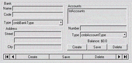
Next, you can see a working example of some interconnected controls. So as not to introduce a new model, this article will start with the BankView control palette and add and remove some stuff to create a working bank system. Here’s the control in its editor state:

Figure 1. The BankEx control
This version is called BankEx for Bank with extended functionality. I left it intact so that you would know I’ve really started with a fully functional control palette. I’ll hack it down to just the essentials for the rest of the sample. There are times when you need the full-featured, self-contained palette in your designs. There are other times when you want a bunch of small palettes that fit together like Lego blocks to create various types of system interfaces. The control palettes I ended up with are of the small, Lego variety. They are designed to be plugged together in several combinations for a mix-and-match approach to designing interfaces.
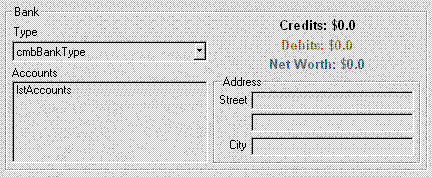
To get just the functionality I wanted for my Bank control, I took out the navigation system and instead allowed the Bank control to show the data for a single Bank only. I did this mostly because I wasn’t concerned with being able to edit Banks, but with being able to provide access to the accounts of a single Bank. Here’s the scaled-down view of the Bank:

Figure 2. The new Bank control
With a Bank control to provide access to accounts, I added two other palettes that would interconnect with each other and with Bank to form the system. Here’s a quick summary of the loose business rules I used.
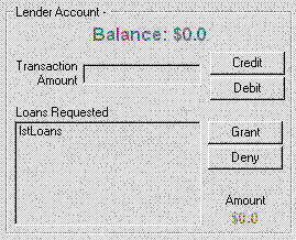
Visually and operationally, they are relatively simple; neither Patrons nor Lenders are designed to be programmable from code. I haven’t bothered with much in the way of security, prohibiting access, or validating payments, other than a simple transaction wrapper around transfers. For example, repaying a loan is simply updating the balances in two accounts, without checking whether an overdraft would occur or not. While adding support for these things wouldn’t be hard, it is outside the scope of this sample; so it has been left as an exercise for the reader. Here’s what the Patron and Lender user interfaces look like:

Figure 3. The Patron Control

Figure 4. The Lender Control
So, what exactly is it that makes this interesting? Well, by designing controls to connect to and use other controls, a user has to write very little, if any, code to use the pieces as a complete system. For example, the test project that comes with this sample has only this in the way of code:
If Not Bank1.Init() Then MsgBox “Didn’t Work”
Set Lender1.Bank = Bank1
Lender1.Refresh
Set Patron1.Bank = Bank1
Set Patron1.Lender = Lender1
Patron1.Refresh
Set Patron2.Bank = Bank1
Set Patron2.Lender = Lender1
Patron2.Refresh
Set Patron3.Bank = Bank1
Set Patron3.Lender = Lender1
Patron3.Refresh
To create this working sample, I simply dropped three Patrons, a Bank, and a Lender on a form. I set the DataSource and Code of the Bank, the AccountNumbers of the Patrons and Lender, and wrote the 12 lines of code shown above. That gave me a system to manage accounts and to grant or repay loans—a lot of power for very little output.
The real joy is when that inevitable call comes and I need to provide other custom interfaces that use these same business objects. When that day comes, it would be very easy to create whatever combinations were required by simply connecting them and letting them run. Here are several examples of some combinations that could be put together with just these three controls (adding a few more features to the controls, of course):
Now do you see what I’m getting at? It’s possible because control palettes can work together. Just creating custom ActiveX controls, or even designing control palettes, is not enough any more. Interconnected palettes is what I consider to be the next level in control development.
Now, those of you who are used to reading my articles might wonder that I haven’t really shown any code or new techniques in this article. That’s because this particular subject isn’t rocket science. Everything that went into the sample, while perhaps interesting, is pretty obvious and doesn’t need a lot of explaining. The real trick is thinking about how you build your user interfaces. Connecting even simple controls together is useful, but designing control palettes with the ability to interconnect is a powerful technique to master when creating user interfaces.