
Microsoft Corporation
August 1998
Click to open or copy the .zip file associated with this article.
Summary: Contains examples and tricks for creating navigation bars in Microsoft® Visual InterDev™ version 6.0. (48 printed pages) Also discusses how to customize layouts and themes to enhance your Web page content and visual presentation. You can view the information contained in this article in two ways: as a plain document or as an interactive Web application (available for download).
This article provides in-depth information about navigation bars, themes, and layouts, and serves as a sample Web application. As a working Web application, the site illustrates the concepts discussed on these pages.
The Designing Navigation Bars sample Web application is best viewed using Microsoft Internet Explorer 4.01 or later. Visit the Microsoft Internet Explorer Web site http://www.microsoft.com/ie/ for information about obtaining the latest version of Internet Explorer. To experiment with the sample Web application, download the files.
This article does not discuss databases or displaying data in Web pages, but instead focuses on the position of content, the visual appearance, and the use of navigation bars on pages. For information about integrating data in Web pages, see "Integrating Databases" and "Displaying Data on Your Web Page" in the Visual InterDev documentation included on the MSDN Library CD.
We also created this article in Visual InterDev 6.0 using .htm files. You can view the source and script for each page by downloading the files to your local machine.
This article consists of the following three major sections. Each section contains information to help you create and customize navigation bars, layouts, and themes in your Web application. We also provide examples whenever possible.
Covers creating navigation bars using a combination of site diagrams, the PageNavbar control, script, and custom HTML. See examples of how to create navigation bars that use DHTML and scriptlets and get a behind-the-scenes look at creating frame-based navigation bars.
Covers creating and modifying the elements that comprise a Visual InterDev layout. See examples of how to create layouts that include other files and get a behind-the-scenes look at creating a layout that uses expanding table cells.
Covers creating a new Visual InterDev theme. See examples of how to modify existing themes and tips for versioning your custom themes.
Navigation bars, or "navbars," display the hyperlinks related to the current page using textual and graphical elements. Navigation bars can be positioned at the top, left, right, or bottom of a page or in any combination of the above. For example, this page contains three functional navigation bars at the top of the page. The first navigation bar is the standard Microsoft navbar that allows you to access the main sections of the Microsoft Web site. The second navigation bar allows you to access the main sections of this article. The third navigation bar displays links to the three subsections within the main Navbar section of the article.
You can customize navigation bars to use different fonts, colors, and graphics to fit the design and purpose of the Web site.
Navbars can be simple text hyperlinks:

Or graphical hyperlinks:

In Visual InterDev you add navigation bars to your pages using layouts and the PageNavbar design-time control. You design your navigation links using site diagrams. The flexibility of the PageNavbar control allows you to create custom navigation bars using JavaScript, DHTML, and scriptlets. Site diagrams allow you to visually prototype and modify the navigation structure for your Web application by creating parent, child, and sibling relationships between pages.
In the Navbar section we'll discuss the following:
Layouts provide an easy method of positioning page elements, such as navigation bars and page content, consistently on your Web pages. You can even use Visual InterDev to automatically apply a layout to all new pages added to the project.
In Visual InterDev a layout is an .htm file that uses the Layout design-time controls to position page elements. Each page uses a single layout, but each Web project can use multiple layouts. Visual InterDev provides more than 15 different layouts for each page. You can use the existing layouts or you can create your own custom layouts.
In the Layouts section, we'll talk about:
Microsoft Visual InterDev provides more than 50 professionally designed themes for you to use in your Web application. Visual InterDev themes use a combination of cascading style sheets and graphics to create a consistent visual appearance. You can use these themes as is or you can modify them to meet your needs. You can also create new themes.
For more information about cascading style sheets, see the W3C's Web site at http://www.w3.org/style and the "CSS Attributes" section of the Platform SDK.
In the Themes section, we'll talk about:
In Visual InterDev you create navigation bars by applying layouts or adding the PageNavbar control to a page and then designing the navigation structure for a page. Site diagrams provide a graphical method of designing the navigation structure for a Web application. The PageNavbar control uses the navigation structure to identify the parent, child, and sibling links for a page. The graphic below is a site diagram showing a portion of the navigation structure for this Web application. For example, the Navbar page in the navigation structure shown below has three child pages: Creating Navbars, Customizing Navbars, and Navbar Samples.
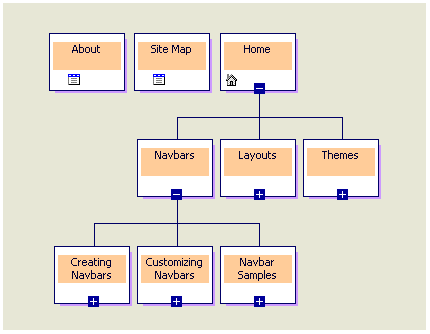
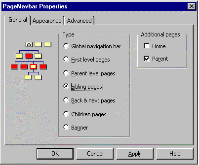
Once you have added navigation bars to a page and designed the navigation structure, you can then select which links appear on each navigation bar. The PageNavbar Properties dialog box allows you to specify which links appear on the navigation bar based on the navigation structure you create for each page. For example, you would select the Sibling pages option in the dialog box below to create the third navigation bar on this page. As you can see in the preceding site diagram, the Creating Navbars, Customizing Navbars, and Navbar Samples pages are siblings of each other in the navigation structure.
In this section we'll talk about:
At the most basic level, a navigation bar is simply a series of hyperlinks to other pages displayed as text or images or a combination of both. In Visual InterDev you add the PageNavbar design-time control to a page and then use site diagrams to design the navigation structure for the Web site to design navigation bars.
Navigation bars can appear as simple text:

Or graphical buttons:

Or even DHTML:

When you work on a page in the HTML editor, navigation bars appear as the PageNavbar control icon. For example, the navigation bars for this page are shown here as they appear in the HTML editor.

Creating navigation bars consists of the following steps:
You can add navigation bars to your Web pages in two ways: automatically or manually. Applying a layout to your Web pages automatically adds the PageNavbar design-time control to a page. If you do not want to use layouts, you can also drag the PageNavbar control from the Toolbox onto a page.
To apply a layout to your Web project
To add the PageNavbar control to a single page
Note If the PageNavbar control does not appear on the Toolbox, add the control to the Toolbox using the Customize Toolbox dialog box available from the Tools menu.
Site diagrams allow you to define the navigation structure for a Web application. The navigation structure determines what links appear on the navigation bar when you select parent, child, sibling, or global type links. Each page must appear in a site diagram if you intend to use the PageNavbar control to create navigation bars for your Web application.
To create a site diagram
You can now add existing pages to the site diagram or create new pages in the site diagram. For more information, see "Adding Pages to a Site Diagram" and "Designing Site Navigation" in the Visual InterDev documentation included on the MSDN Library CD.
You can use the PageNavbar Properties dialog box to define the links that will appear on the navigation bar for each page.
To define navigation bar links for a page
Note The graphic on the General tab of the PageNavbar Properties dialog box illustrates the relationship and the links that will appear on the navigation bar based on the hierarchy you choose.
In Visual InterDev you can customize navigation bars to use different fonts, colors, and graphics to fit the design of the Web site. You can also include custom HTML to generate navigation bar links using JavaScript, DHTML, or scriptlets. The flexibility of the PageNavbar control allows you to continue using any existing HTML, script, fonts, or graphics you have to create navigation bars.
In this section, we'll talk about the ways you can customize navigation bars using:
The PageNavbar control allows you to use replaceable parameters, called tokens, to help you create custom navigation bars. Tokens act as placeholders for information that is provided at run time, such as the exact URL or theme for a page. The HTMLFragment and CurrentHTMLFragment properties of the PageNavbar control accept tokens.
You can also use tokens on the Appearance tab of the PageNavbar Properties dialog box in the Link template and Current page template options.
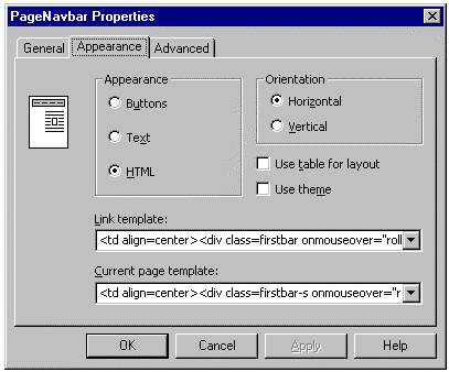
The Link template and Current page template properties provide several examples to give you an idea of the ways to use tokens. For example, the following custom HTML creates a standard text link to a URL:
<a href=#URL#>#LABEL#</a>
The text used for the link will be the label assigned to the page in the site diagram. The URL used for the link will be the URL of the page. Instead of manually entering in the URL and link text information, the tokens allow you to simply specify the type of information that should be inserted.
The following table lists the tokens available for the PageNavbar control.
| Token | Description |
#URL# |
Inserts the URL for each link in your custom HTML at run time. |
#LABEL# |
Inserts the page label for each link. |
#CLASS# |
Inserts the CSS class for the selected type of navigation bar. |
#THEME# |
Inserts the current theme settings for the link. |
You can use JavaScript to create custom navigation bars for your pages. This flexibility can be especially useful if you have existing JavaScript that creates navigation bars.
This example shows how to create a text link that displays the label for the URL in the status bar when the user moves the cursor over the link. This JavaScript example is available by default from the Link template option on the Appearance tab of the PageNavbar Properties dialog box.
<a href=#URL# onmouseover="window.status='#LABEL#'; return true;">#LABEL#</a>Move the cursor over the links and look at your browser's status bar as shown in the following example.

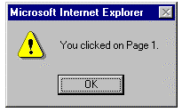
This example shows how to create a message box that displays the label for the link when the user selects the link. This example uses a combination of custom HTML in both the PageNavbar control and the actual .htm or .asp file.
<script>
function do_something (LABEL) {
     alert("You clicked on " + LABEL+ ".");
}
</script>
<input type=button onclick="do_something('#LABEL#')" value=#LABEL#>Click each button to display the message box as shown in the following example.

You can use DHTML to create custom navigation bars for your Web application. DHTML is an extension of HTML, supported in Internet Explorer 4.0 and later, that exposes a Web page and all the elements on it as scriptable objects. DHTML allows you to dynamically change the appearance, content, and behavior of a Web page directly in client script, without running server script. For more information, see the DHTML sections of the Web Workshop documentation.
This example shows how to create a navigation bar that changes link color when a user moves the mouse pointer over a link.
<a href=#URL#><span style="color: black;"
onmouseover="this.style.color='red'"
onmouseout="this.style.color='black'">#LABEL#</span></a>Move the cursor over the links to view the color change as shown in the following example.

This example shows how to create a navigation bar that changes the background color of the button as well as the color of the text when the user moves the mouse pointer over the button.
<style>
.off {
   color: black;
   width: 100;
   height: 20;
   text-align: center;
   border: 1 solid black;
   background-color: tan;
   margin-left: 30px;
}
.on {
   color: red;
   width: 100;
   height: 20;
   text-align: center;
   border: 1 solid red;
   background-color: black;
   margin-left: 30px;
}
</style>
<script>
function navbar_rollon () {
   window.event.srcElement.className = 'on';
}

function navbar_rolloff () {
   window.event.srcElement.className = 'off';
}
</script>
<div class=off onclick="location.href='#URL#'" onmouseover="navbar_rollon()" onmouseout="navbar_rolloff()">#LABEL#</div>
from the drop-down list. In the Orientation property, select 1-Vertical from the drop-down list.Move the cursor over the links to view the color changes as shown in the following example.

You can use scriptlets to create custom navigation bars for your Web application.
This example details how to create a navigation bar that shows a preview of each destination page within the navbar as you move the mouse pointer over the navbar links. The URL for the links appears above the preview window.
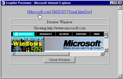
<script language="JavaScript">
function show_url(enteredURL) {
   tableHeading.innerText = "Showing " + enteredURL;
   preview.showurl(enteredURL);
}
</script> <table border=1>
<tr><td align="middle"> Preview Window</td>
</tr>
<tr><td id="tableHeading" align="middle">Mouse Over to Preview</td>
</tr>
<tr><td align="middle">
<OBJECT id=preview Width=400 Height=100
type=text/x-scriptlet VIEWASTEXT>
<PARAM NAME="URL" VALUE="Scriptlet.htm">
<PARAM NAME="Scrollbar" VALUE="0">
</OBJECT>
</td>
</tr>
<tr><td align="middle">
<input type="button" value="Close Window" onclick="window.close()">
</td>
</tr>
</table>
<html>
<head>
<title>URL filler</title>
<script language="JavaScript">
function public_showurl(enteredURL) {
   scriptlet.navigate(enteredURL);
}
</script>
</head>
<frameset>
   <frame src="" name=scriptlet scrolling=yes>
</frameset>
</html>
[<a href="#URL#" onMouseover="show_url('#URL#')"> [#LABEL#] </a> ]You can customize your navigation bars by using script, graphics, and fonts. The different types of navigation bars that you can create are almost endless. From a simple child navigation bar to the more complex drop-down menus, your only prerequisite is knowing how to use the PageNavbar control and site diagrams to create the desired effect.
This section contains samples of different types of navigation bars you can create with Visual InterDev.
In this section you'll see how to create:
This sample creates an expanding table of contents navigation bar for your pages.

This downloadable sample contains the following files:
ExpandingTOC.wdm contains the site diagram used to create the navigation structure. Products, Locations, and Downloads each have three child pages.
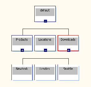
Default.htm uses script and the PageNavbar control to create the expandable table of contents navigation bar.
The following script appears in default.htm:
function show_children (INLABEL) {
   if (eval(INLABEL+".shown") == 1) {
      eval(INLABEL+".innerHTML = ''");
      eval(INLABEL+".shown = 0");
   }
   else {
      var loc = INLABEL + "_navbar";
      var text = eval(loc+".innerHTML");
      eval(INLABEL+".innerHTML = text");
      eval(INLABEL+".shown = 1");
   }
}
For this sample, four PageNavbar controls are used to simulate the expanding table of contents navigation bar. One control is used to display the initial list of unexpanded links.
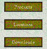
The other three PageNavbar controls are used to display the expanded list of links. When the user clicks a link on the initial navigation bar, the show_children function is called, causing the appropriate expanded link navigation bar to reveal itself on the page.
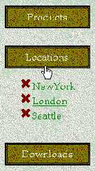
The PageNavbar control that displays the initial list of links is placed in a table. Next, the following HTML is added to the HTMLFragment property:
<td width=140 height=60 onclick="show_children('#LABEL#')" style="cursor: hand;" class="mstheme-vert-navtxt-g">#LABEL#</td></tr><tr><td><span id=#LABEL#></span></td></tr>
The three PageNavbar controls that display the expanded list of links are surrounded by a <SPAN> tag that contains the following properties:
style="display: none"For example:
<span id=Products_navbar style="display: none">
The three controls are also surrounded by <ul></ul> tags so that the expanded links appear as a bulleted list.
Each of the three PageNavbar controls uses the following custom HTML in the HTMLFragment property:
<li><a href=#URL#>#LABEL#</a></li>
The PageNavbar that displays the expanded product links uses the following in the AlternatePage property:
Samples/NavBars/ExpandingTOC/products.htm
The PageNavbar that displays the expanded location links uses the following in the AlternatePage property:
Samples/NavBars/ExpandingTOC/Locations.htm
The PageNavbar that displays the expanded download links uses the following in the AlternatePage property:
Samples/NavBars/ExpandingTOC/Downloads.htm
Drop-down menus can give your users the look and feel of a standard Microsoft Windows application, written entirely in DHTML. This sample shows how to create drop-down menu navigation bars on your page.

This downloadable sample contains the following files:
Menus.wdm is used to create the navigation structure for the navigation bars. For drop-down menus, you create a site diagram with multiple levels. The top-level menu relates to the children of the home page, while the contents of the drop-down menus relates to the children of the first-level pages. For each top-level menu item, you add an additional hidden navigation bar to your page.
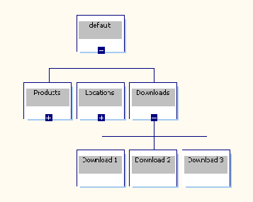
Script.js contains custom DHTML used to generate the drop-down menu effect of the navigation bar. By placing script.js in the _Layouts\MenuLayout folder, the script file is made available to any page that uses the MenuLayout layout.
Script.js contains the following code:
menu = new Object();
var sOpenMenuID = "";
var nMenuName = "";
var iTimerID;

function doMenu() {
   var eSrc = window.event.srcElement;
   window.event.cancelBubble = true;
   if (sOpenMenuID != "") {
      nMenuName = sOpenMenuID.substring(0,sOpenMenuID.length-7);
      document.all[nMenuName].style.display = "none";
      menu.shown = "";
   }
   if (eSrc.className=="clsMenuTitleHover") {
      eSrc.className = "clsMenuTitleClick";
      var nMenuName = eSrc.innerText;
      sOpenMenuID = nMenuName + "_Hidden";
      var eMenuText = document.all[sOpenMenuID].innerHTML;
      document.all[nMenuName].innerHTML = eMenuText;
      document.all[nMenuName].style.clip = "rect(0 0 0 0)";
      document.all[nMenuName].style.display = "block";
      menu.shown = nMenuName;
      menu.click = eSrc.id;
      nChunk = 25;
      iTimerID = window.setTimeout("showMenu(" + nMenuName + "),10");
   }
   else {
      if (menu.shown) {
         document.all[menu.shown].style.display = "none";
         document.all[menu.click].className = "clsMenuTitle";
      }
      show_hover();
   }
}

var nChunk;

function showMenu(eMenu) {
   eMenu.style.clip = "rect(0 100% " + nChunk + "% 0)";
   nChunk +=25;
   if (nChunk <= 100) {
      iTimerID = window.setTimeout("showMenu(" + eMenu.id + "),10");
   }
   else {
      window.clearTimeout(iTimerID);
   }
}

function show_hover () {
   var eSrc = window.event.srcElement;
   if (eSrc.className == "clsMenuTitle") {
      if (menu.shown) {
         document.all[menu.shown].style.display = "none";
         document.all[menu.click].className = "clsMenuTitle";
         nMenuName = eSrc.id.substring(3,eSrc.id.length);
         if (nMenuName) {
            eSrc.className = "clsMenuTitleClick";
            sOpenMenuID = nMenuName + "_Hidden";
            var eMenuText = document.all[sOpenMenuID].innerHTML;
            document.all[nMenuName].innerHTML = eMenuText;
            document.all[nMenuName].style.clip = "rect(0 0 0 0)";
            document.all[nMenuName].style.display = "block";
            menu.shown = nMenuName; menu.click = eSrc.id;
            nChunk = 25;
            iTimerID = window.setTimeout("showMenu(" + nMenuName + "),10");
         }
      }
      else {
         eSrc.className = "clsMenuTitleHover";
      }
   }
   else if (eSrc.className == "Menu") {
      eSrc.className = "MenuHover";
   }
}

function hide_hover () {
   var eSrc = window.event.srcElement;
   if (eSrc.className == "clsMenuTitleHover") {
      eSrc.className = "clsMenuTitle";
   }
   else if (eSrc.className == "MenuHover") {
      eSrc.className = "Menu";
   }
}
This script contains four functions used to create the drop-down menu navigation bar effect.
The layout.htm file located in _Layouts/MenuLayout contains a reference to script.js. Each page that uses this layout has access to the script.
For this sample, four PageNavbar controls are used to simulate the drop-down menu effect for the navigation bar. One control is used to display the menu names.

The other three PageNavbar controls are used to display the menu options.

The PageNavbar control that displays the initial menu names is placed within a <div> tag and a table.
<div class=top>
<table>
<tr>
[PageNavbar control here]
<td align=center>
</td>
</tr>
</table>
</div>
The following custom HTML was then added to the PageNavbar control:
<td align=center><div class=top><div id=top#LABEL# class="clsMenuTitle: onmouseover="show_hover()" onmouseout="hide_hover()">#LABEL#</div><div id=#LABEL# class="clsMenu"></div></div></td>
The control that displays the initial menu names also uses the following in the AlternatePage property:
Samples/NavBars/Menus/default.htm
Each of the PageNavbar controls that display the menu options are enclosed in a <div> tag that contains the following properties:
style="Display: none"For example:
<div ID="Products_Hidden" style="Display: none">
Each of the three controls also use the following custom HTML in the HTMLFragment property:
<span style="width:140;" class=Menu onclick="location.href='#URL#'" onmouseover='show_hover()' onmouseout='hide_hover()'>#LABEL#</span>
The PageNavbar that displays the Products menu options uses the following in the AlternatePage property:
Samples/NavBars/Menus/Products.htm
The PageNavbar that displays the Locations menu options uses the following in the AlternatePage property:
Samples/NavBars/Menus/Locations.htm
The PageNavbar that displays the Downloads menu options uses the following in the AlternatePage property:
Samples/NavBars/Menus/Downloads.htm
Many Web sites use frames to position content and navigation bars on a page. This sample shows how to create frame-based navigation bars on your page.
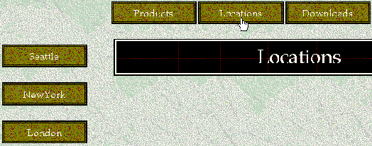
This downloadable sample contains the following files located in the Samples\NavBars\Frames folder:
Frames.wdm is used to create the navigation structure for the navigation bars.
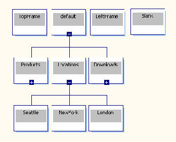
TopFrame.htm uses a single PageNavbar control and script to display the main navigation bar.
The following script was added to TopFrame.htm:
<script>
function loadFrame (label,inURL) {
   parent.content.location.href = inURL;
   var text = eval("parent.left."+label+".innerHTML");
   parent.left.show.innerHTML = text;
}
</script>
The PageNavbar control is placed in a table. The HTMLFragment property of the PageNavbar control in TopFrame.htm contains the following HTML:
<td width=137 height=60 onclick="loadFrame('#LABEL#','#URL#')" class=mstheme-horiz-navtxt-g style="cursor: hand;">#LABEL#</td>
The AlternatePage property is set to the following:
Default.htm
LeftFrame.htm contains three PageNavbar controls and is used to display the navigation bars in the left frame.
Each PageNavbar control is surrounded by a <span> tag that contains the following properties:
style="display: none"For example:
<span id="Products" style="display: none">
The HTMLFragment property of each PageNavbar control in LeftFrame.htm contains the following HTML:
<tr><td width=140 height=60
onclick="parent.content.location.href='#URL#'"
class=mstheme-horiz-navtxt-g style="cursor: hand;">
<a href=#URL# style="text-decoration: none" target=content>#LABEL#</a></td></tr>
The PageNavbar that displays the links for Products uses the following in the AlternatePage property:
Products.htm
The PageNavbar that displays the links for Locations uses the following in the AlternatePage property:
Locations.htm
The PageNavbar that displays the links for Downloads uses the following in the AlternatePage property:
Downloads.htm
The following <span> is added to the page just before the </Body> tag:
<span id="show">
</span>
Default.htm contains the following HTML:
<FRAMESET row="70,*" border=0><FRAME src="topframe.htm" name="top">

<FRAMESET cols"180, *" border=0><FRAME src="leftframe" name="left"><FRAME src="Blank.htm" name="content">
</FRAMESET>
</FRAMESET>
This HTML creates the framesets used to display the top and left navigation bars as well as the page content.
Layouts provide a means to manage the regions on a page and determine what content appears in those regions. Each page has five basic reigons: top, left, bottom, right, and content. Layouts allow you to customize placement of content on your Web pages and at the same time create a consistent and professional appearance. The layouts available with Visual InterDev also determine the placement of navigation bars on a page.
In this section we'll talk about:
A layout is a set of files that act as a template for the placement of navigation bars and content on a page. Each page can use only one layout, but each Web application can use multiple layouts. Layouts define how you use the five regions of a page shown here.
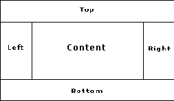
In Visual InterDev layout files are organized in individual folders under the _Layouts directory. By default, a layout folder contains three files.
| File name | Description |
| Layout.htm | Contains the actual HTML applied to the file when you choose a layout. |
| Name.inf | Provides information used by the Apply Theme and Layout dialog box to display the list of available layouts. |
| Preview.htm | Contains an example of the layout that you view when choosing a layout from the Apply Theme and Layout dialog box. |
Layouts insert HTML into pages to specify the position of the navigation bars and content on a page.
You can create your own layouts to meet the specific needs of your Web application. Layouts consist of three files organized in a single folder under the _Layouts directory. To define your own layout, you must create:
The first step in creating your own layout is to create a folder to hold your layout files. Layouts can be stored on the client or server. Each layout can be used in either individual or multiple projects.
By default, layouts are located under the _Layouts directory in your Web project. The _Layouts directory is created automatically when you apply a Visual InterDev layout to a page.
To create a new layout folder
Note If you have not applied a layout to the Web project or to a page, the _Layouts folder does not appear in the Project Explorer. We recommend that you apply a layout to a page to create the _Layouts folder.
If you want to use the layout in multiple Web projects, you must add the folder to your local machine in the drive:\Program Files\Microsoft Visual Studio\Vinterdev98\Layouts\ directory.
After you have created your new layout folder you should create the name.inf file. The .inf file must use the same name as your layout directory.
This name.inf file needs to contain the following information.
| Item name | Description |
| [Info] | Serves as the start line for the file. |
| Title=layoutname | Specifies the title that appears for the layout in the Apply Themes and Layouts dialog box. |
| Version=versionnumber | Specifies the version number for the layout. Newer versions overwrite older versions. |
Description=preview.htm |
Identifies the file that will appear in the Preview section of the Apply Themes and Layouts dialog box for the layout. |
To create a name.inf file
Enter the following:
[Info]Title= layoutname
Version= number
Description=Preview.htm
You can customize an existing layout.htm file or you can create a new layout.htm file from scratch. The layout.htm file contains several sections: a header, a footer, and the surrounding content. The header and footer sections are created using the Layout Header and Layout Footer design-time controls. A rough example of the sections for the layout.htm file is shown here.
The Layout controls can be added to the Toolbox using the Customize Toolbox dialog box available from the Tools menu. Once you have added the header and footer sections you can then add page elements in the header and footer sections, such as the PageNavbar control. The graphics below show how the Layout Header Start and Layout Header End controls appear on a page.


For this example, we will create a layout that uses a banner to display the page title.
To create a layout.htm file
Finally, you need to create a preview file that you view when you select the layout in the Apply Theme and Layout dialog box. A preview.htm for our sample layout might contain a graphic that looks like the following.

Layouts can be much more complex and they can include several navigation bars, script, or even DHTML. Visual InterDev contains 17 layouts that you can use as is or customize to suit your needs.
You can use layouts to provide access to common components, such as script files, to your pages. For example, if you use the same script in multiple pages, you can move the script to a .js file and include the script in a layout. Each page will then be able to use the script and you will only need to update the script in one location.
By including components, such as script files, in a layout, the updated version of the component is always available to the page.
In this section we'll talk about:
You can use layouts to provide pointers to commonly used files. Each page that uses the layout will then have access to the referenced item, such as script or a graphic. You will then be able to maintain the item in a single location while providing the item to multiple pages.
To include files in your layouts, you must add the file to the appropriate layout folder and then add a reference to the file in layout.htm. For example, if you want to include a company logo on each page, you can reference the graphic file from a layout.
This example explains how to add a reference to a script file in layout.htm. The script file includes functions for the PageNavbar control.
To include a file in a layout
In the Project Explorer, select _Layouts and select the folder that you want to add the file to.
<Script SRC="#Layout#/script.js">
</Script>
This HTML tells the page that the script file is located in the _Layouts directory of your project. Each page that uses that particular layout will also be able to use the functions located in the script file. If you make changes to the script file, you do not have to reapply the layout to view the changes.
An example of this technique can be found in the following file:
_Layouts\MenuLayout\layout.htmYou can use layouts to position navigation bars and content on a page, as well as to reference other files. Visual InterDev provides great flexibility in the number of ways you can customize layouts.
This section contains samples showing a few of the different ways you can customize layouts. See how to:
In Visual InterDev, layout information is inserted into a file after the <BODY> tag. One side effect of including the layout after the <BODY> tag is that the <BODY> tag does not get automatically modified by the layout. To modify attributes of the <BODY> tag, you need to do a bit of extra work. There are several ways to do this:
The sample below uses an inline style to modify the <BODY> tag.
This downloadable sample contains the following files:
Add the following style information to MenuStyles.css to modify the <BODY> tag.:
<style>
body {
margin-left: 0px;
margin-top: 0px;
}
</style>
Add a reference to MenuStyles.css in layout.htm.
<link href="#LAYOUT#/MenuStyle.css" rel=stylesheet type=text/css>
This sample creates a navigation bar that includes a cell that expands and contracts its size based on the size of the browser window. This sample displays the text contained in the right table cell flush against the right margin of the browser.
This downloadable sample uses the following file:
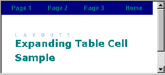
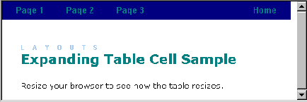
ExpandingTable.htm contains the following custom style information above the PageNavbar control in the page:
<STYLE>
.top {
font-family: arial;
 font-weight: bold;
 text-decoration: none;
 width: 75px;
 font-size: 10pt;
 color: #20b2aa;
 text-align: center;
 vertical-align: middle;
 }
.top A {
font-family: arial;
 font-weight: bold;
 text-decoration: none;
 width: 75px;
 font-size: 10pt;
 color: #20b2aa;
 text-align: center;
 vertical-align: middle;
 }
</STYLE>
The PageNavbar control on ExpandingTable.htm contains the following code in the HTMLFragment property:
<TD><SPAN class=top><A href=#URL#">#Label#</A></SPAN>
The AlternatePage property for the PageNavbar control uses the following:
Samples/NavBars/SampleNavBars/Default.htm
An extra table cell is added above the PageNavbar control to create the expanding table effect:
<TABLE bgColor=#191970 width=100%><TR><TD>
Visual InterDev provides more than 50 themes for you to use in your Web pages. You also have the option of creating your own custom themes to meet the needs of your Web application. You can use the existing Visual InterDev themes, modify the existing themes, or create your own themes from scratch.
In this section we'll talk about:
In Visual InterDev, a theme is a collection of graphics, formatting, fonts, and colors that are managed with cascading style sheets. Themes save you time by providing a quick method of creating visually consistent Web pages.
You can apply a single theme to the entire Web application or you can apply different themes to individual pages. Visual InterDev comes with a set of 50 predesigned themes for you to use. You can also install third-party themes or create your own.
In general, a theme includes custom:
A theme consists of several .css and graphics files contained in a single folder within the _Themes directory. Some themes files are required while others, such as graphics, are optional. To create a custom theme, you can edit an existing theme's files or add additional files to a theme.
Each theme folder must contain the following files.
| File name | Description |
| color0.css | Specifies the color of links, headings, and the page background color. |
| graph0.css | Controls text navigation bars. |
| theme.css | Controls the background image, font family, and font size. |
| custom.css | Controls graphical navigation bar links and unordered list bullets. |
| name.inf | Lists the theme name and version information. |
Note You must use the .css file names listed in the preceding table for themes to work properly in Visual InterDev.
Optional files:
The name used for the theme's folder and the .inf file must be the name of the theme. You specify the theme name within the .inf file.
To create a new theme
Note If you have not applied a theme to the Web project or to a page, the _Themes folder does not appear in the Project Explorer. We recommend that you apply a theme to a page to create the _Themes folder.
[info]
title=name
codepage=1252
version=number
readonly=true
refcount=1
For name, supply the name that will identify your theme in the Apply Theme and Layout dialog box. For number, supply a version number, such as 1.00, for the theme.
For more information about creating theme style sheets, see Appendix.
You can also modify existing Visual InterDev 6.0 theme files to customize the appearance of your pages. Third-party themes are also available for purchase. You can even add new graphics to existing themes to spice up your pages. For more information see the following section, "Customizing Themes."
Visual InterDev provides more than 50 different themes for you to use in your Web applications. You can also choose to create your own themes or modify existing themes to create the visual design for your site.
In this section we'll talk about:
You can modify existing Visual InterDev themes in a couple of ways. You can edit the theme .css files and you can add or remove graphics. To modify a theme .css file, you need to know which .css file contains the class you want to modify and which class contains the associated properties.
A theme consists of four .css files:
In general, color0.css contains all the color classes; theme.css contains font family, font size, and background image classes; graph0.css contains the text navigation bar classes; and custom.css contains the graphical navigation bar classes.
In this example, we'll explain how to change the background image of the Expedition theme to a new file, newimage.jpg. The background image information for the theme is contained in the theme.css file in the Body class.
BODY
{
     BACKGROUND-IMAGE: url(exptextb.jpg);
     FONT-FAMILY: Book Antiqua, Times New Roman, Times
}
Note You must have a file called newimage.jpg in the Expedition folder of the _Themes directory.
To change the background image
Theme.css will now use newimage.jpg for the page background:
BODY
{
     BACKGROUND-IMAGE: url(newimage.jpg);
     FONT-FAMILY: Book Antiqua, Times New Roman, Times
}
In this example, we'll modify the banner font size used by the PageNavbar control in the Expedition theme. The banner font information for the theme is contained in custom.css in the .mstheme-bannertxt-g class:
.mstheme-bannertxt-g
{
     font-family: Book Antiqua, Times New Roman, Times;
     font-size: 24pt;
     color: rgb(255,255,204);
     text-align: center;
     vertical-align: middle;
     background-image: url(expbannd.gif);
}
To change the banner text
The banner text will now use the new font size:
.mstheme-bannertxt-g
{
font-family: Book Antiqua, Times New Roman, Times;
font-size: 16pt;
color: rgb(255,255,204);
text-align: center;
vertical-align: middle;
background-image: url(expbannd.gif);
}
Visual InterDev uses theme version numbers to decide which theme files to keep if conflicts or changes are detected by the Apply Themes and Layouts dialog box. The name.inf file for each theme contains the version number. If you modify existing themes, you must increase the version number in the name.inf file so the Apply Theme and Layout dialog box does not discard your changes and use the original theme files.
When you create new themes from scratch, it is also good to include a version number. If you include a version number you can track the changes you make to the theme and assure that you are using the most current theme. You must also make sure that your new theme name is unique and doesn't conflict with an existing theme name.
To view the theme version number
For more information about the name.inf file, see the earlier section "Modifying an Existing Theme Class."
This appendix contains the cascading style sheet template information for Visual InterDev themes:
a:link
{
}
a:visited
{
}
a:active
{
}
body
{
}
table
{
}
h1
{
}
h2
{
}
h3
{
}
h4
{
}
h5
{
}
h6
{
}
.mstheme-bannertxt A:active
{
}
.mstheme-bannertxt A:link
{
}
.mstheme-bannertxt A:visited
{
}
.mstheme-bannertxt-g
{
}
.mstheme-bannertxt-g A:active
{
}
.mstheme-bannertxt-g A:link
{
}
.mstheme-bannertxt-g A:visited
{
}
.mstheme-bannertxt-s
{
}
.mstheme-bannertxt-s A:active
{
}
.mstheme-bannertxt-s A:link
{
}
.mstheme-bannertxt-s A:visited
{
}
.mstheme-horiz-navtxt A:active
{
}
.mstheme-horiz-navtxt A:link
{
}
.mstheme-horiz-navtxt A:visited
{
}
.mstheme-horiz-navtxt-g
{
}
.mstheme-horiz-navtxt-g A:active
{
}
.mstheme-horiz-navtxt-g A:link
{
}
.mstheme-horiz-navtxt-g A:visited
{
}
.mstheme-horiz-navtxt-gs
{
}
.mstheme-horiz-navtxt-gs A:active
{
}
.mstheme-horiz-navtxt-gs A:link
{
}
.mstheme-horiz-navtxt-gs A:visited
{
}
.mstheme-navtxthome A:active
{
}
.mstheme-navtxthome A:link
{
}
.mstheme-navtxthome A:visited
{
}
.mstheme-navtxthome-g
{
}
.mstheme-navtxthome-g A:active
{
}
.mstheme-navtxthome-g A:link
{
}
.mstheme-navtxthome-g A:visited
{
}
.mstheme-navtxtnext A:active
{
}
.mstheme-navtxtnext A:link
{
}
.mstheme-navtxtnext A:visited
{
}
.mstheme-navtxtnext-g
{
}
.mstheme-navtxtnext-g A:active
{
}
.mstheme-navtxtnext-g A:link
{
}
.mstheme-navtxtnext-g A:visited
{
}
.mstheme-navtxtprev A:active
{
}
.mstheme-navtxtprev A:link
{
}
.mstheme-navtxtprev A:visited
{
}
.mstheme-navtxtprev-g
{
}
.mstheme-navtxtprev-g A:active
{
}
.mstheme-navtxtprev-g A:link
{
}
.mstheme-navtxtprev-g A:visited
{
}
.mstheme-navtxtup A:active
{
}
.mstheme-navtxtup A:link
{
}
.mstheme-navtxtup A:visited
{
}
.mstheme-navtxtup-g
{
}
.mstheme-navtxtup-g A:active
{
}
.mstheme-navtxtup-g A:link
{
}
.mstheme-navtxtup-g A:visited
{
}
.mstheme-topbar-font A:active
{
}
.mstheme-topbar-font A:link
{
}
.mstheme-topbar-font A:visited
{
}
.mstheme-topbar-font-g
{
}
.mstheme-topbar-font-g A:active
{
}
.mstheme-topbar-font-g A:link
{
}
.mstheme-topbar-font-g A:visited
{
}
.mstheme-vert-navtxt A:active
{
}
.mstheme-vert-navtxt A:link
{
}
.mstheme-vert-navtxt A:visited
{
}
.mstheme-vert-navtxt-g
{
}
.mstheme-vert-navtxt-g A:active
{
}
.mstheme-vert-navtxt-g A:link
{
}
.mstheme-vert-navtxt-g A:visited
{
}
.mstheme-vert-navtxt-gs
{
}
.mstheme-vert-navtxt-gs A:active
{
}
.mstheme-vert-navtxt-gs A:link
{
}
.mstheme-vert-navtxt-gs A:visited
{
}
UL
{
}
UL UL
{
}
UL UL UL
{
}
mstheme
{
     separator-image: url(hr.gif);
     list-image-1: url(li1.gif);
     list-image-2: url(li2.gif);
     list-image-3: url(li3.gif);
     nav-banner-image: url(banner.gif);
     navbutton-horiz-normal: url(horiz.gif);
     navbutton-horiz-pushed: url(horizs.gif);
     navbutton-vert-normal: url(vert.gif);
     navbutton-vert-pushed: url(verts.gif);
     navbutton-home-normal: url(home.gif);
     navbutton-next-normal: url(next.gif);
     navbutton-prev-normal: url(back.gif);
     navbutton-up-normal: url(up.gif);
}
.mstheme-bannertxt
{
}
.mstheme-horiz-navtxt
{
}
.mstheme-vert-navtxt
{
}
.mstheme-navtxthome
{
}
.mstheme-navtxtnext
{
}
.mstheme-navtxtprev
{
}
.mstheme-navtxtup
{
}
.mstheme
{
     top-bar-button: url(top.gif);
     version: 1.0;
     navbutton-background-color: rgb(255,255,255);
}
.mstheme-topbar-font
{
}
body
{
}
h1
{
}
h2
{
}
h3
{
}
h4
{
}
h5
{
}
h6
{
}
This appendix contains the theme classes and class locations for Visual InterDev navigation bars.
| Class | Description | File |
| Body – Graphical | Background Image for Theme | Theme.css |
| Body – Color Background | Color for Theme | Color0.css |
| H1 – H6 (Font) | Font values for Headers | Theme.css |
| H1 – H6 (Color) | Color values for Headers | Color0.css |
| a:link | Color values for Links | Color0.css |
| a:visited | Color values for Visited Links | Color0.css |
| a:active | Color values for Active Links | Color0.css |
| UL (Images) | Images for UL bullets | Custom.css |
| .mstheme-bannertxt | Text Banner Navigation Bar | Graph0.css |
| .mstheme-bannertxt A:Link | Color Values for A:Links within Navigation Bar | Custom.css |
| .mstheme-bannertxt A:Visited | Color Values for A:Visited within Navigation Bar | Custom.css |
| .mstheme-bannertxt A:Active | Color Values for A:Active within Navigation Bar | Custom.css |
| mstheme-horiz-navtxt | Horizontal Text Navigation Bar | Graph0.css |
| .mstheme-horiz-navtxt A:Link | Color Values for A:Links within Navigation Bar | Custom.css |
| .mstheme-horiz-navtxt A:Visited | Color Values for A:Visited within Navigation Bar | Custom.css |
| .mstheme-horiz-navtxt A:Active | Color Values for A:Active within Navigation Bar | Custom.css |
| .mstheme-vert-navtxt | Vertical Text Navigation Bar | Graph0.css |
| .mstheme-vert-navtxt A:Link | Color Values for A:Links within Navigation Bar | Custom.css |
| .mstheme-vert-navtxt A:Visited | Color Values for A:Visited within Navigation Bar | Custom.css |
| .mstheme-vert-navtxt A:Active | Color Values for A:Active within Navigation Bar | Custom.css |
| .mstheme-navtxthome | Home Link in Text Navigation Bar | Custom.css |
| .mstheme-navtxthome A:Link | Color Values for A:Links within Navigation Bar | Custom.css |
| .mstheme-navtxthome A:Visited | Color Values for A:Visited within Navigation Bar | Custom.css |
| .mstheme-navtxthome A:Active | Color Values for A:Active within Navigation Bar | Custom.css |
| .mstheme-navtxtnext | Next Link in Text Arrow Navigation Bar | Graph0.css |
| .mstheme-navtxtnext A:Link | Color Values for A:Links within Navigation Bar | Custom.css |
| .mstheme-navtxtnext A:Visited | Color Values for A:Visited within Navigation Bar | Custom.css |
| .mstheme-navtxtnext A:Active | Color Values for A:Active within Navigation Bar | Custom.css |
| .mstheme-navtxtprev | Previous Link in Text Arrow Navigation Bar | Graph0.css |
| .mstheme-navtxtprev A:Link | Color Values for A:Links within Navigation Bar | Custom.css |
| .mstheme-navtxtprev A:Visited | Color Values for A:Visited within Navigation Bar | Custom.css |
| .mstheme-navtxtprev A:Active | Color Values for A:Active within Navigation Bar | Custom.css |
| .mstheme-navtxtup | Up Link in Text Navigation Bar | Graph0.css |
| .mstheme-navtxtup A:Link | Color Values for A:Links within Navigation Bar | Custom.css |
| .mstheme-navtxtup A:Visited | Color Values for A:Visited within Navigation Bar | Custom.css |
| .mstheme-navtxtup A:Active | Color Values for A:Active within Navigation Bar | Custom.css |
| .mstheme-bannertxt-g | Graphical Banner Navigation Bar | Custom.css |
| .mstheme-bannertxt-g A:Link | Color Values for A:Links within Navigation Bar | Custom.css |
| .mstheme-bannertxt-g A:Visited | Color Values for A:Visited within Navigation Bar | Custom.css |
| .mstheme-bannertxt-g A:Active | Color Values for A:Active within Navigation Bar | Custom.css |
| .mstheme-bannertxt-s | Text Banner Navigation Bar | Custom.css |
| .mstheme-bannertxt-s A:Link | Color Values for A:Links within Navigation Bar | Custom.css |
| .mstheme-bannertxt-s A:Visited | Color Values for A:Visited within Navigation Bar | Custom.css |
| .mstheme-bannertxt-s A:Active | Color Values for A:Active within Navigation Bar | Custom.css |
| .mstheme-horiz-navtxt-g | Horizontal Graphical Navigation Bar Item | Custom.css |
| .mstheme-horiz-navtxt-g A:Link | Color Values for A:Links within Navigation Bar | Custom.css |
| .mstheme-horiz-navtxt-g A:Visited | Color Values for A:Visited within Navigation Bar | Custom.css |
| .mstheme-horiz-navtxt-g A:Active | Color Values for A:Active within Navigation Bar | Custom.css |
| .mstheme-horiz-navtxt-gs | Horizontal Graphical Selected Navigation Bar Item | Custom.css |
| .mstheme-horiz-navtxt-gs A:Link | Color Values for A:Links within Navigation Bar | Custom.css |
| .mstheme-horiz-navtxt-gs A:Visited | Color Values for A:Visited within Navigation Bar | Custom.css |
| .mstheme-horiz-navtxt-gs A:Active | Color Values for A:Active within Navigation Bar | Custom.css |
| .mstheme-vert-navtxt-g | Vertical Graphical Navigation Bar Item | Custom.css |
| .mstheme-vert-navtxt-g A:Link | Color Values for A:Links within Navigation Bar | Custom.css |
| .mstheme-vert-navtxt-g A:Visited | Color Values for A:Visited within Navigation Bar | Custom.css |
| .mstheme-vert-navtxt-g A:Active | Color Values for A:Active within Navigation Bar | Custom.css |
| .mstheme-vert-navtxt-gs | Vertical Graphical Selected Navigation Bar | Custom.css |
| .mstheme-vert-navtxt-gs A:Link | Color Values for A:Links within Navigation Bar | Custom.css |
| .mstheme-vert-navtx A:Visited t-gs | Color Values for A:Visited within Navigation Bar | Custom.css |
| .mstheme-vert-navtxt-gs A:Active | Color Values for A:Active within Navigation Bar | Custom.css |
| .mstheme-navtxthome-g | Home Link in Graphical Navigation Bar | Custom.css |
| .mstheme-navtxthome-g A:Link | Color Values for A:Links within Navigation Bar | Custom.css |
| .mstheme-navtxthome-g A:Visited | Color Values for A:Visited within Navigation Bar | Custom.css |
| .mstheme-navtxthome-g A:Active | Color Values for A:Active within Navigation Bar | Custom.css |
| .mstheme-navtxtnext-g | Next Link in Graphical Arrow Navigation Bar | Custom.css |
| .mstheme-navtxtnext-g A:Link | Color Values for A:Links within Navigation Bar | Custom.css |
| .mstheme-navtxtnext-g A:Visited | Color Values for A:Visited within Navigation Bar | Custom.css |
| .mstheme-navtxtnext-g A:Active | Color Values for A:Active within Navigation Bar | Custom.css |
| .mstheme-navtxtprev-g | Previous Link in Graphical Arrow Navigation Bar | Custom.css |
| .mstheme-navtxtprev-g A:Link | Color Values for A:Links within Navigation Bar | Custom.css |
| .mstheme-navtxtprev-g A:Visited | Color Values for A:Visited within Navigation Bar | Custom.css |
| .mstheme-navtxtprev-g A:Active | Color Values for A:Active within Navigation Bar | Custom.css |
| .mstheme-navtxtup-g | Up Link in Graphical Navigation Bar | Custom.css |
| .mstheme-navtxtup-g A:Link | Color Values for A:Links within Navigation Bar | Custom.css |
| .mstheme-navtxtup-g A:Visited | Color Values for A:Visited within Navigation Bar | Custom.css |
| .mstheme-navtxtup-g A:Active | Color Values for A:Active within Navigation Bar | Custom.css |
| .mstheme-topbar-font | Text Global Navigation Bar | Theme.css |
| .mstheme-topbar-font A:Link | Color Values for A:Links within Navigation Bar | Theme.css |
| .mstheme-topbar-font A:Visited | Color Values for A:Visited within Navigation Bar | Theme.css |
| .mstheme-topbar-font A:Active | Color Values for A:Active within Navigation Bar | Theme.css |
| .mstheme-topbar-font-g | Graphical Global Navigation Bar | Custom.css |
| .mstheme-topbar-font-g A:Link | Color Values for A:Links within Navigation Bar | Custom.css |
| .mstheme-topbar-font-g A:Visited | Color Values for A:Visited within Navigation Bar | Custom.css |
| .mstheme-topbar-font-g A:Active | Color Values for A:Active within Navigation Bar | Custom.css |